Category Archives: Bishops

Bishop Rozanski of Springfield

15583692-large

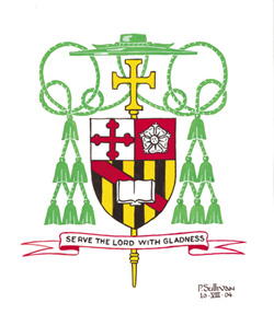
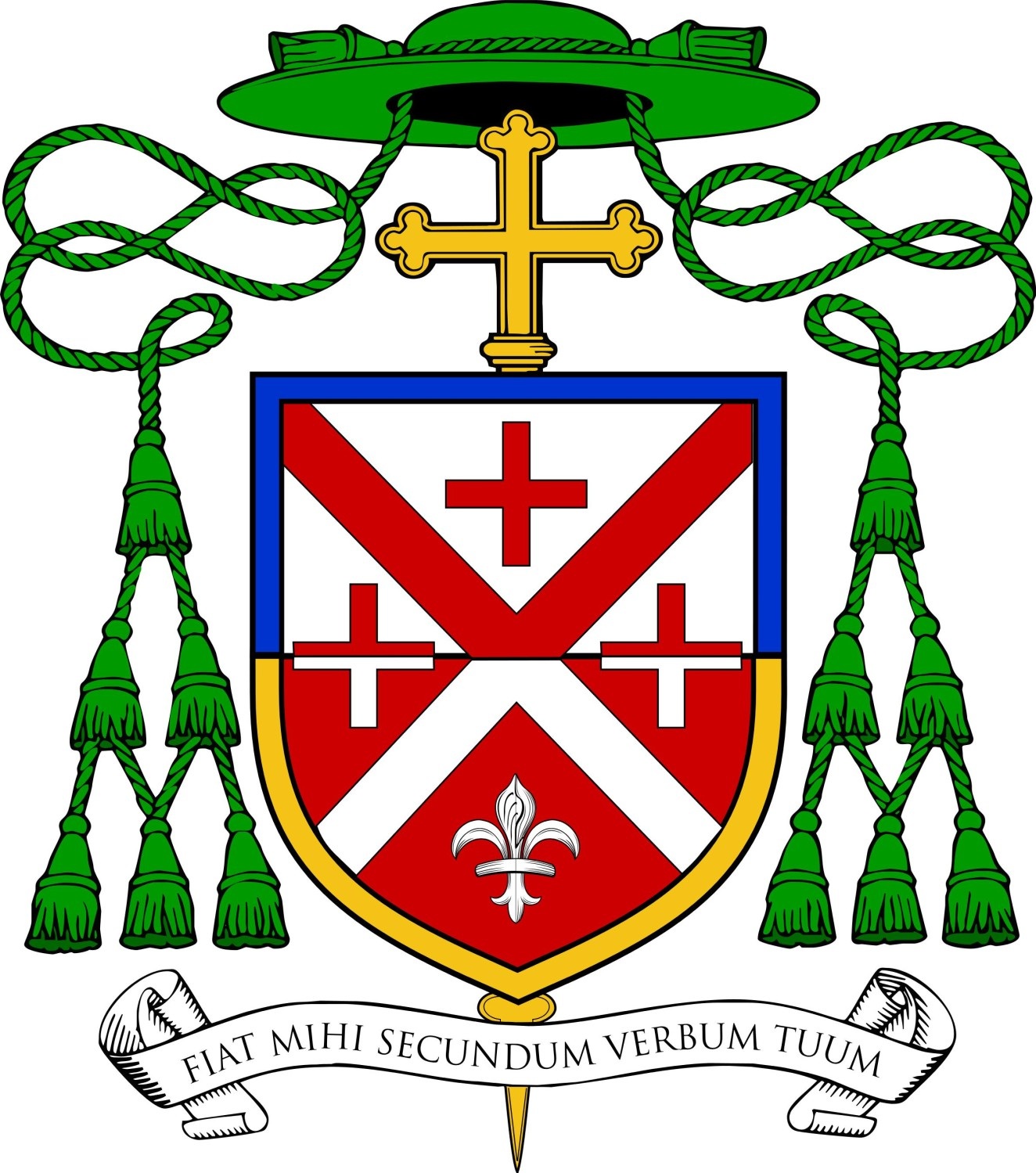
On August 12 Bishop Mitchell Rozanski, until now Auxiliary Bishop of Baltimore, will be installed as the IX Bishop of Springfield, Massachusetts. The coat of arms of the new bishop (above) combines his personal arms with those of the see of Springfield. (the four roundels with waves symbolize a field of springs and the cross is associated with St. Michael, patron of the cathedral.)

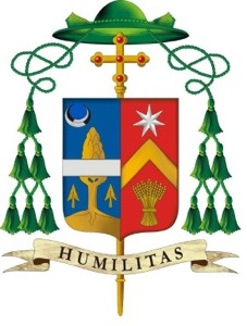
His personal arms (below) were assumed in 2004 at the time he became a bishop when he was appointed as Auxiliary in Baltimore.

RozanskiCrest

The small cross is symbolic of St. Michael (a name from which Mitchell is derived); the red and white colors allude to the national colors of Poland; the flower alludes to his surname which, in Polish, means “rose flower”. The lower portion uses the colors derived from the arms of Calvert, Lord Baltimore. The red bend (vertical stripe) and open book are for preaching the Word. The motto is taken from Psalm 100.

(Artwork by Paul Sullivan)

Bishop Jenik

Bishop_Jenik_Coat_of_Arms_2014

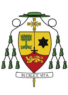
On August 4, 2014 Cardinal Dolan of New York ordained three Auxiliary Bishops for the Archdiocese. They are the Most Revs. Peter Byrne, John O’Hara and John Jenik. While I have not yet seen the coats of arms assumed by all three I did come across the interesting and distinctive coat of arms assumed by Bishop Jenik. He designed the coat of arms himself and I am not sure of the symbolism behind the design. Many might see this as strange because it does not follow the usual “lucky charms” notion of heraldry with an overloaded shield filled with charges meant to be a pictorial CV of the bearer. Good for him! Such heraldry is atrocious and all too common among the American Catholic hierarchy.

Rather, Bishop Jenik’s coat of arms is very simple. This is one of the earmarks of good heraldry. The use of black and white may make it stark but not knowing the meaning of the design there may very well be a good reason for the choice of these colors. In addition, since heraldry is, at its heart, about identification and nothing else, the design is clear to see and easily identifiable. Again, these are attributes of good heraldry. It reminds me of some of the most ancient heraldic designs that present clear images and use as few colors as possible.

I say hats off to Bishop Jenik for an excellent and unique design for his coat of arms!

(Artwork by Paul Sullivan)

Bishop Doran of Elphin, Ireland

crest of bishop kevin doran

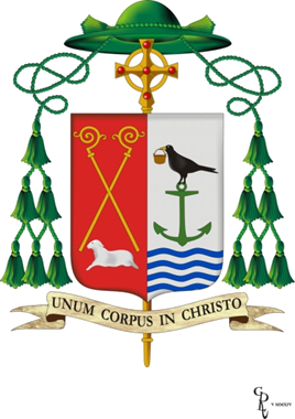
Father Kevin Doran is being ordained Bishop of Elphin, Ireland on July 13. The description of his coat of arms (above) taken from the website of the diocese:

In the right side of the shield (seen from the point of view of the one holding the shield) we find represented the Coat of Arms of the Diocese of Elphin; two golden crossed croziers surmounting a lamb as the central symbol reflecting Jesus, the Lamb of God who takes away the sins of the world.  The red (gules) color is the color of love, of blood; the infinite love of the Father who sent the Son to shed His blood for us, the ultimate act of love.

The personal arms of Bishop Kevin occupy the left side. This part of the shield is in silver (argent). The anchor, symbol of hope, is taken from the Doran family motto, Spes Ancora Vitae (Hope is the Anchor of Life).  The anchor is in green (vert), the symbolic colour of hope.

The blackbird references the legend of St. Kevin and the Blackbird, which is so well captured in the poem by Seamus Heaney. It reminds Bishop Kevin of the importance of fidelity to prayer and the relationship between prayer, compassion and service. The blackbird carries in his beak a copper pot, symbol of St Asicus, patron saint of the diocese of Elphin. St. Asicus was a coppersmith.

Fr. Kevin spent some years as parish priest of Glendalough, Co. Wicklow (The Valley of the Two Lakes). As he ministered to parishioners and pilgrims around the lakeshore, he was often reminded of the ministry of Jesus, much of which took place around the lake (or sea) of Galilee.  As he undertakes his new mission in the Diocese of Elphin, (a diocese bounded on one end by the River Shannon and on the other by the Atlantic Ocean), he takes the ministry of Jesus as his model and inspiration. This is the symbolism of the wavelets in the lower part of the shield.

A Franciscan Bishop

Image

The coat of arms above is that of Giuseppe Piemontese, OFM Conv who will be ordained on June 21 as the bishop of Terni-Narni-Amelia, Italy. A very pleasing design.

(…and if you say the name of the diocese very quickly the middle part sounds like you’re saying “Narnia”)

Some Australian Bishops’ Arms

In recent years I have often had the great good fortune to collaborate on the design or re-design of coats of arms for various prelates and corporate bodies within the Catholic Church in Australia. My acquaintance and growing friendship with Mr. Richard d’Apice, President of the Australian Heraldry Society as well as a member of the Collegium Ecclesiastica Exarandorum, led to his occasionally consulting with me on designs upon which he was working. These days he acts as the agent with the bishop in question and we consult back and forth via email on the design itself. This happy collaboration is then added to even further by the artistic abilities of Mr. Sandy Turnbull who is also a member of the Australian Heraldry Society. With ease and great efficiency Mr. Turnbull is able to take our ideas and sketches and turn them into first rate heraldic depictions. To date we have worked together on approximately 28 commissions. Here are some examples of our most recent collaborations:

The coat of arms of the Most Rev. Michael F. McCarthy of Rockhampton who will be ordained and installed on May 29th.

Image

The coat of arms of the Most Rev. Columba Macbeth-Green, OSPPE of Wilcannia-Forbes who will be ordained and installed on July 3rd.

Image


Bishop Carl Kemme of Wichita

Today, the Most Rev. Carl A. Kemme, a priest of the diocese of Springfield in Illinois will be ordained and installed as the bishop of Wichita, Kansas. His coat of arms (below) combines, or impales, the arms of the See (left) clearly based on those of Pope Leo XIII, with his personal arms (right). The design is clear, uncomplicated, and very nicely conceived. The artwork is well done.

20140501-113220.jpg

Bishop Smith (Auxiliary of Portland, OR)

Image

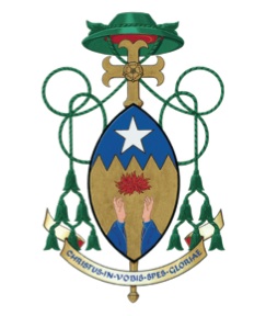
The Most Rev. Peter L. Smith will be ordained auxiliary bishop of the archdiocese of Portland in Oregon on April 29 by Archbishop Alexander Sample. The new bishop is a priest of that archdiocese. The shield is shaped like that of a Zulu warrior because the bishop was born in the province of KwaZulu-Natal in South Africa. The flame represents the Holy Spirit, the upraised hands prayer and worship, the gold field stands for devotion to Christ. The jagged division line represents several mountain ranges important to the bearer and the star Our Lady as well as the star of Bethlehem.

The rose on the episcopal cross supposedly stands for Portland, “the rose city”. The designer of this coat of arms, James Noonan, repeatedly likes to design distinctive external ornaments that are particular to each coat of arms which is really heraldically unsupportable. The blazon can only specify that which is on the shield, not the external ornaments.

Design: James Noonan

Artwork: Linda Nicholson

Bishop Burnette of Passaic

Image

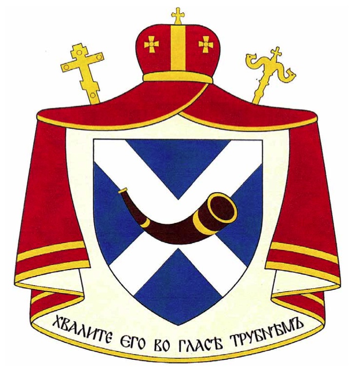
The arms of the Most Rev. Kurt Burnette, Ruthenian Byzantine Catholic Eparch of the Eparchy of Passaic which has parishes on the eastern seaboard of the USA from Connecticut to Florida. He was ordained and enthroned several months ago. Recently, Byzantine bishops in the USA have taken to using emblems composed of icons with the external ornaments of a coat of arms in a kind of hybrid. Bishop Kurt has chosen a genuine coat of arms. The motto is from Psalm 150 and says, “Praise him with the sound of the trumpet”. It alludes to the main charge of a hunting horn fashioned after the horn of Leys given to Alexander Burnett by Robert the Bruce in 1363. The Burnette family traces its origins back to the 11th Century. One of the bishop’s ancestors emigrated from Scotland to the American colony of New jersey in 1700. The cross of St. Andrew is a further allusion to Scotland as well as to the first called Apostle so revered in the Eastern Churches.

Bishop Manetti

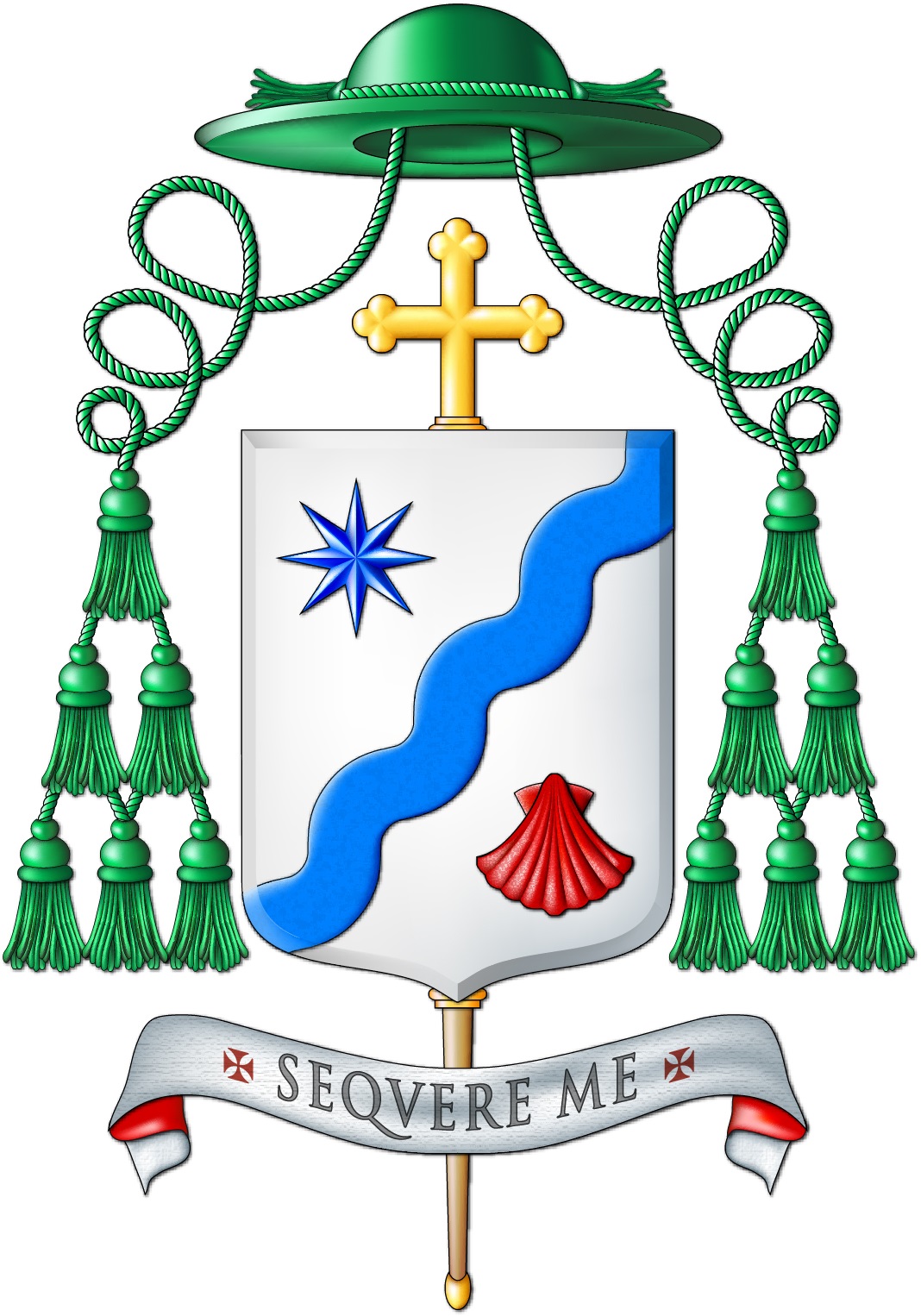
The arms (above) of the Most Rev. Stefano Manetti, installed April 13 as the Bishop of Montepulciano-Chiusi-Pienza, Italy. The wavy line is a reference to the waters of baptism; the star to Our Lady and the scallop shell to the pilgrim journey of faith. Very nice!

Image

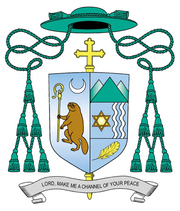
Bishop Scharfenberger of Albany

Thanks to the tireless efforts of one of my intrepid readers we see below the coat of arms of Edward Bernard Scharfenberger who will be ordained and installed today as the 10th Bishop of Albany, NY. The design of his arms is simple and clear and borrows from the arms associated with a family called Scharfenberger (the mountains). The star of David represents his mother, Miriam, who was of Jewish origin. The wavy lines allude to the various rivers associated with the bishop’s life and the golden feather in base is an allusion to both the Holy Spirit and the native Americans of upstate NY. My criticism would have to do mostly with this particular artistic rendering and so, I will refrain from commenting further as that is often simply a matter of taste. The beaver holding a crozier in the arms of the see come from the fact that the original name of Albany was “Beaverwyck” as it was a major outpost on the trade route for traders. It holds a crozier as an indication of Albany as the seat of a bishop. The crescent alludes to the Immaculate Conception, the titular of the cathedral church.

BISHOP_SHIELD


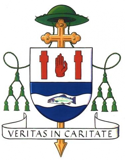
New Bishop of Derry, Ireland

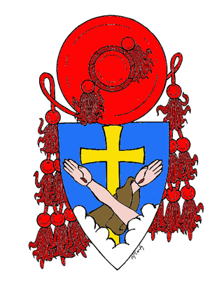
The Most Rev. Donal McKeown will be installed April 6 as the new bishop of Derry, Ireland. His arms (below) are briefly described on the diocesan website: The Bishop’s coat of arms takes some elements from the traditional McKeown family symbols – the salmon, which is an ancient Irish symbol of wisdom, and the red hand. However, the simple penal crosses now flank the One whose hands were pierced for the world’s salvation. The salmon reflects the words of the prophet Isaiah, who said “with joy you will draw water from the wells of salvation” (Is 12:3).

The Bishop’s motto “Veritas in Caritate” occurs in the Letter of Saint Paul to the Ephesians (4:15).

Image

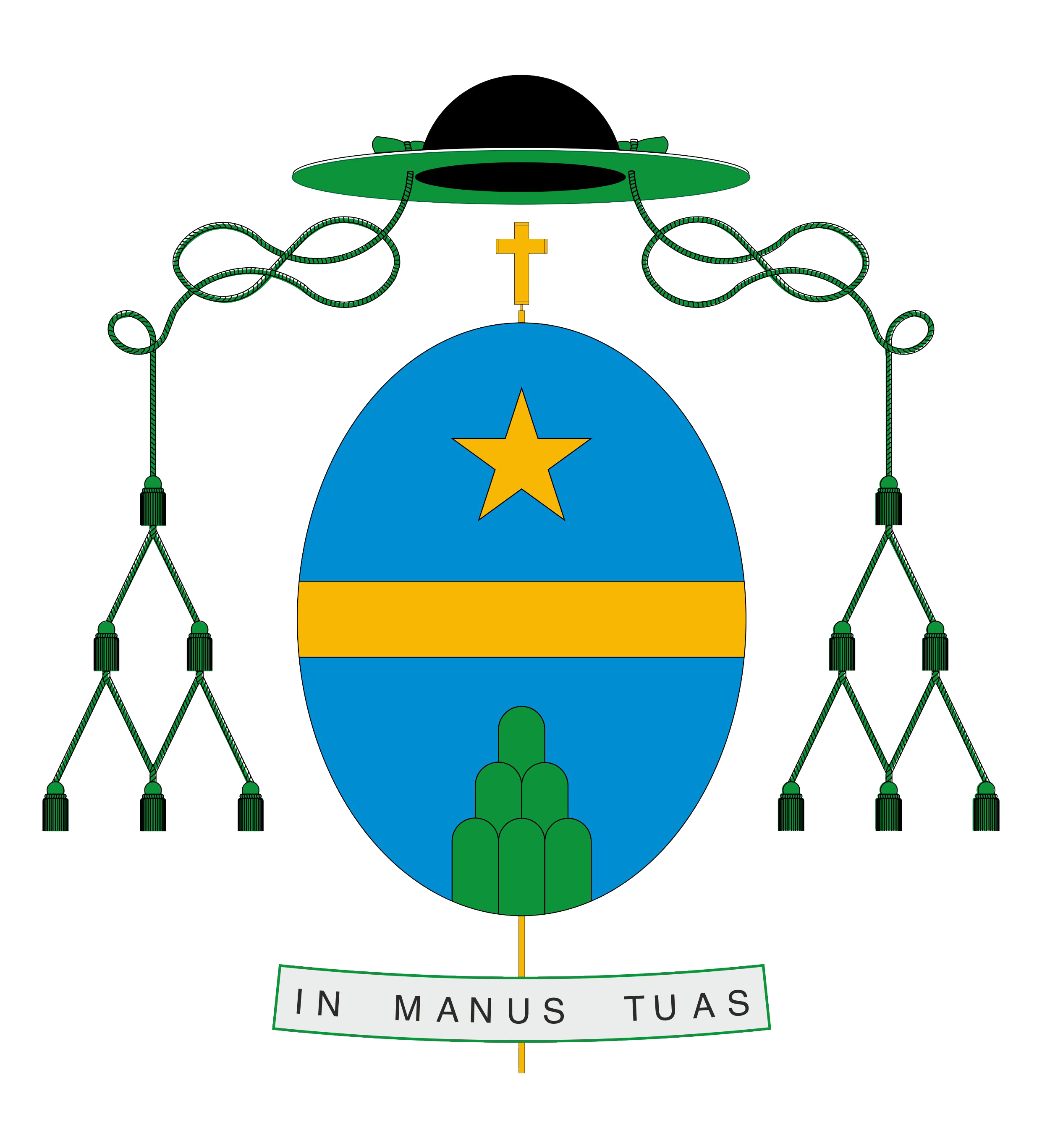
Bishop of Porto, Portugal

Image

The arms (above) of António Francisco dos Santos, newly installed bishop of Porto, Portugal. It is a simple and elegant design. Some would be critical of the green collé on a blue field but the so-called “tincture rule” isn’t so much a hard and fast rule as much as it is a custom as frequently honored in the breach than in the observance. Read Bruno Heim’s book, “Or and Argent” if you don’t believe me. My only criticism would be that the episcopal cross behind the shield is depicted as a teeny tiny one. It could be larger. I also find the choice of an oval shield (usually used by women in heraldry) as interesting, but not necessarily wrong as its use is not exclusive to females.


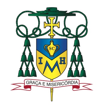
Bishop Myron Cotta

Earlier today the Most Rev. Myron Cotta was ordained as the Auxiliary Bishop of Sacramento, California. His newly assumed arms are below.

Image

The field is divided by an inverted chevron alluding to a carpenter’s square for St. Joseph and the San Joaquin Valley. In chief there is an amphora charged with the letters “SC” for sacred chrism. The bishop’s given name, Myron, is the Greek word for the sacred oil.

In base there appears a monogram composed of the letters “I”, “M” and “H”. This stands for (if you can believe it) the Immaculate heart of Mary with the “M” taking the most prominent place. The bishop has a great devotion to Our Lady under this title.

The motto translates to “Grace and Mercy” and is in Portuguese to reflect the bishop’s ethnicity as being from the Azores.

Well, there is an overabundance of the use of letters in this achievement. Someone clearly never heard that the use of letters in heraldry is considered port design. The “SC” on the amphora is, in my opinion, unnecessary. The amphora alone is a sufficient symbol for sacred oil. Why not actually depict the Immaculate Heart of Mary instead of abbreviating it? The monogram is an example of extremely poor design. It’s weak and not self evident where the image of the Immaculate heart would have been. In addition, since most people don’t know that the name Myron means sacred oil they will naturally assume that the gigantic “M” in the coat of arms stands for Myron and not for Mary.

This was done by Paul Sullivan. Not one of his best efforts.

Bishop Zglejszewski

The coat of arms (below) of Bishop Andrzej Zglejszewski who will be ordained titular bishop of Nicives and Auxiliary Bishop of Rockville Centre, NY on March 25. The bishop is a native of Poland but emigrated to the USA before ordination and was ordained for the Long Island diocese.

Image

The following description is from the program of his ordination: The symbolism to be found in Bishop Zglejszewski’s coat of arms begins with the colors, also called tinctures. The major part of the shield is painted white (argent) over red (gules), which recalls the national flag and coat of arms of Poland, where the Bishop was born. The blue (azure) found in the top half of the border joins these first two tinctures to recall the national colors of the United States of America, to which he immigrated in 1987. The gold (Or) of the lower half joins the white to recall the colors of the Vatican City-State. Blue and gold, together recalling the sea and sand of the island diocese, are the primary tinctures of the coat of arms of the Diocese of Rockville Centre, where he was ordained a priest in 1990 and which he will now serve as Auxiliary Bishop. The color blue at the top of the shield recalls that Mary is Queen of Heaven and Help of Christians, who spreads her protective mantle over her children. Our Lady is also symbolized by the fleur-de-lis at the bottom of the shield. This stylized lily has been used for many centuries to recall her virginal purity. Placed on the shield together with three Crosses, it alludes also to Mary, the faithful disciple, standing at the foot of the Cross of her Son on Calvary.

The saltire or “X” shape in the center of the shield is also known as Saint Andrew‟s Cross, after the Apostle who, according to tradition, was crucified on a Cross in this shape. Saint Andrew is the Bishop’s baptismal patron. Like the shield itself, the saltire is divided across the middle, in an arrangement called counterchanging: where the shield is red, it is painted white, and is red where the shield is white. This coloration allows for another layer of symbolism, in each of the parts of the saltire. The white bottom half of the saltire becomes a depiction of the carpenter‟s square, a traditional symbol of Saint Joseph, the Husband of Mary. The carpenter’s square appears to cover and protect the fleur-de-lis, symbolizing Saint Joseph’s protection both of Our Lady and of the Universal Church. The top half of the saltire, painted red, reminds one of the Holy Spirit, and the grace that he brings by his descent upon the newborn Church at Pentecost. The Bishop has dedicated much of his ministry to the study and service of Divine Worship, and this part of the saltire also recalls the grace of the Sacraments which is given to the Church through the power of the Holy Spirit and the sacrifice of Christ on the Cross.

The two crosses on either side of the saltire are also counterchanged, and symbolize not only the crosses on Calvary but also the passion and martyrdom of Saint Agnes, the patron of the Diocese of Rockville Centre. This heroic young woman faced martyrdom at the age of 13 in Rome; tradition says she was turned in to the authorities by suitors she had spurned because she made a vow of virginity to Christ. She bore a double cross: the “white martyrdom” of purity, and the “red martyrdom” that involved the shedding of her blood.

Bishop Baldacchino

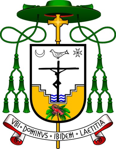
Below is an image from “The Florida Catholic” of the coat of arms of the newly ordained Auxiliary Bishop of Miami, the Most Rev. Peter Baldacchino. I am disappointed that the bishop chose to make no allusion to his baptismal patron, St. Peter, in the coat of arms. Similarly, I am disappointed that he passed up the obvious choice to have canting arms by depicting a baldacchino, or canopy, over an altar. In fact, it might have been interesting to depict the famous Bernini baldacchino of St. Peter’s Basilica as a way to combine the two. Instead, he has chosen a cluttered design filled with far too many charges in an attempt to create a “C.V. in pictures” which is precisely what a coat of arms is NOT.
Image

The description of the symbolism in the design is also from “The Florida Catholic”:

Dominating the coat of arms is Christ crucified. The Cross emerges as a sign of victory over death, represented by the waters of the baptismal font, the source of Christian life which communicates to every Christian the victory of Christ. The baptismal font is a reference also to his own rediscovery of baptism through the Neocatechumenal Way and to the work of evangelization: bringing people to live their baptism so that they may receive divine life.

Beneath the Cross and baptismal font is found an image of a palm tree upon which a lobster rests, a well-known symbol of the early Church, representing the mystery of salvation through baptism: a sea creature, accustomed to live in the waters of sin, through the work of the Holy Spirit, can leave behind its natural environment and live upon a palm tree, symbol of eternity and paradise.

Above the Cross hovers a dove, symbol of the Holy Spirit, who is the life of the Church, and without whom nothing can be done. In the upper part are found the moon, representing the Blessed Virgin Mary: “And a great sign was seen in heaven; a woman arrayed with the sun, and the moon under her feet, and upon her head a crown of twelve stars” (Rev 12:1); and the Cross of Malta, but also the star which leads the way to Christ. The palm tree is also a reference to the Archdiocese of Miami, and the lobster to the Turks and Caicos Islands, where Bishop Baldacchino ministered for 15 years. The coat of arms is completed by the three waves of the baptismal font representing the three rivers of the Archdiocese of Newark, where Bishop Baldacchino was ordained in 1996.

The motto translates to: “Where God is, there is joy”.