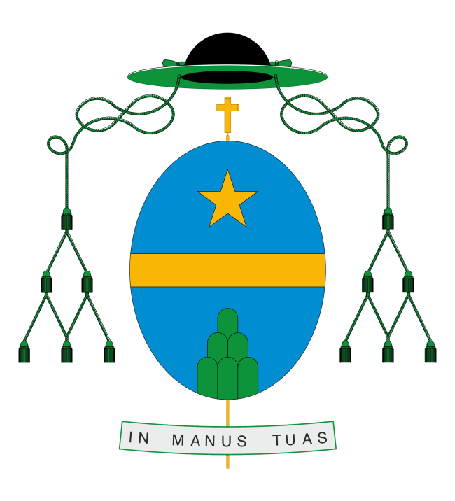
The arms (above) of António Francisco dos Santos, newly installed bishop of Porto, Portugal. It is a simple and elegant design. Some would be critical of the green collé on a blue field but the so-called “tincture rule” isn’t so much a hard and fast rule as much as it is a custom as frequently honored in the breach than in the observance. Read Bruno Heim’s book, “Or and Argent” if you don’t believe me. My only criticism would be that the episcopal cross behind the shield is depicted as a teeny tiny one. It could be larger. I also find the choice of an oval shield (usually used by women in heraldry) as interesting, but not necessarily wrong as its use is not exclusive to females.

DOS SANTOS (PORTO) shows us that there are two kinds of critics possible on coats of arms:
1- on the design
2- on the drawing
ad 1- Up to me the design is worth an ‘A’. It is as simple as can be.
ad 2- I agree most with father Guy, because of my taste. But critics on drawings are up to me more subjective. I don ‘ like this style but I see it as correct.
Critics on insufficient designs (like mgr. Baldachinno) are more objective, simply because all rules for a solid design and estetics have been demolished here.
I see forward to a well styled crest for the new bishop of Albany.
In Portuguese heraldry eclesiastic shields are traditionally oval. Ladys use losangular shields.