Recently, there have been several new bishops ordained and/or installed in the U.S. and in each case their new coats of arms are very disappointing. One of the most valuable sections of the famous book on ecclesiastical heraldry by the late (great) Bruno B. Heim entitled, Heraldry in the Catholic Church concerns the design and adoption of new coats of arms by clergy. In that section, among other pieces of advice, Heim cautions that the new armiger should seek out the advice of someone competent in heraldry and, in particular, ecclesiastical heraldry if they can. That person to be consulted may not be the one who actually does the artwork but they can advise on what is and, more importantly, isn’t appropriate in a coat of arms.
Sadly, none of these new bishops seems to have done that.
I would also add a piece of advice which I have found myself repeating so often over the years to clergy who wish to adopt a coat of arms that it has become, perhaps, the most important piece of advice I can offer. Your coat of arms is not your CV in pictures! A coat of arms is a unique mark of identification. It isn’t a pictorial mission statement, a review of every aspect of your life, a personal history in symbols, a catalogue of all your likes and dislikes or a statement on your ideas of ecclesiology and ministry.
Too many clergy, especially new bishops, don’t seem to understand this. As a result they do too much or they include things that are inappropriate. Let’s take a look.

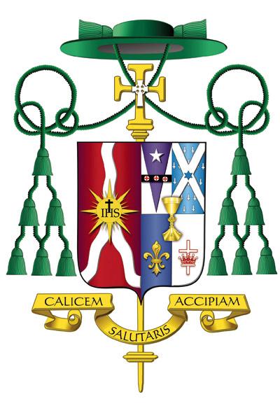
First, is the armorial bearings of Bishop Francis I. Malone (69) who was ordained and installed as the Third Bishop of Shreveport, Louisiana on January 28. The arms of the See of Shreveport are in the dexter impalement and they are not of any interest. However, the personal arms…oh boy! The chalice overall at the center is inappropriately placed and is also an almost photographic depiction of the bishop’s own personal chalice. Heraldry makes use of symbols, not portraits or photographs. An appropriate charge would be “a chalice” not a particular chalice.
The bishop has also quartered the field in such a way that he has marshaled arms that do not belong to him and appropriated them as his own. In the upper left and right of his arms he has, whole and entire, depicted the arms of the See of Philadelphia and the arms of the See of Little Rock; one because he was born there and the other because he served there as a priest. However, by including them entirely in his own arms it appears he is claiming jurisdiction over both! The better way to handle this would have been to borrow a single charge from each and incorporate them into the design of his own coat of arms rather than illicitly stealing the arms of two dioceses.
The charge on the lower left, the fleur-de-lis is fine and on the lower right the cross and crown is a logo used by his former parish which in and of itself is fine and even makes a nice heraldic charge but the overall arrangement is sloppy, and an attempt at a heraldic CV against which I warn people all the time.
Finally, the smaller Celtic cross superimposed over the episcopal cross which is an external ornament behind the shield is heraldically unsupportable. Whoever designed this coat of arms had the clear (and quite good intention) of including as many things from the bishop’s life and ministry as possible but arranged them in a way that suggests he really wasn’t that well versed in heraldic design to pull it off. Everything included in the coat of arms could have been correctly included in a more aesthetically pleasing manner if only someone who knew about heraldic design had been involved.

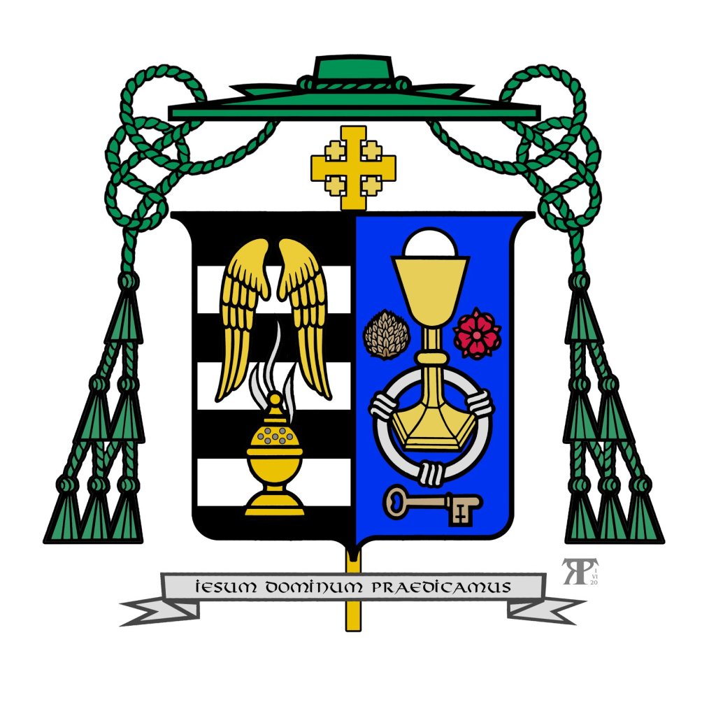
Second, is Bishop John McClory (56) a Detroit priest who was ordained and installed as the Fifth Bishop of Gary, Indiana on February 11. Again, the arms of the See are of no concern and, actually, are one of the better diocesan coat of arms in use in the USA with a nice reference to the Guardian Angels (titular patrons of the cathedral church).
This coat of arms is really rather nice. There is a good choice of the symbols to be used as charges. There are no tincture violations or indiscretions and, I would say the overall appearance of the coat of arms is aesthetically pleasing and harmonizes well with the arms of the See.
My criticism concerns the arrangement of the charges on the field which is rather like what has come to be known as the “lucky charms” style of heraldry. Namely, a bunch of charges scattered on the field and slapped onto a shield and called heraldry. In addition, trying to “personalize” the episcopal cross which is an external ornament which indicates the rank of the bearer and not a charge on the field which communicate the identity of the bearer is a mistake. It is in the form of a Jerusalem cross to indicate membership in the Equestrian Order of the Holy Sepulchre. This is not the way to depict such membership. Either a charge on the field would have been appropriate, or placing the Jerusalem cross near but outside the shield is also acceptable. In addition, the actual insignia of the Order can be depicted suspended below the shield by a black ribbon or, as a bishop, he could have placed the shield on the Jerusalem cross. But, shaping the episcopal cross to a personal preference is not an option.
Nevertheless, this is the best of the three.

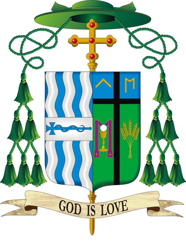
Finally, we have the armorial bearings of Bishop Donald DeGrood (54) a priest of St. Paul-Minneapolis who is being ordained a bishop and installed as the Ninth Bishop of Sioux Falls, South Dakota today, in fact, even as I write this post.
Ugh!
For the third time I take no issue with the arms of the See and also think it is one of the better designed diocesan coats of arms in the USA.
As for the personal arms he has, once again, tried to do too much. The tincture combinations are unfortunate and, actually, rather sad looking. The purple priest’s stole on a green field violates the so-called tincture “rule” which dictates that a metal on a metal and a color on another color should be avoided. The sheaf of wheat looks rather anemic (but, in fairness, that may simply be an issue involving this particular depiction of the arms). The charge of the gold letter “M” in the upper right is borrowed from the arms of St. John Paul II. There’s nothing wrong with that, per se. Many warn against using letters as charges but it is well known that John Paul II argued with Bruno Heim for maintaining the “M” in his arms which he has used as a bishop and cardinal. Certainly, that charge became widely known as John Paul’s coat of arms was used extensively during his historic 27-year-long pontificate.
However, in the official version of John Paul’s arms, painted by Bruno Heim himself, the letter “M” was depicted, correctly, as filling the whole space of the field on which it was depicted. So, the charge followed the contours of the shield shape upon which it appeared. This explains why one side of the “M” is longer than the other. However, depicting it this way, floating in the middle of the field, it is completely unnecessary, and also quite ridiculous to depict the “M” with one side shorter than the other. The “M” was not blazoned to be depicted that way, Rather, that was merely an artistic convention. There seems to be the erroneous and utterly stupid notion floating around out there that the “M” must be unevenly drawn to make it the “John Paul II M“. WRONG!
The black cross on a field that is blue and green is a bad choice of tinctures. Once again, it appears as though the new bishop consulted someone who was not very well acquainted with proper heraldic design.
These three represent a situation that is all too common in the Church in general and in the United States in particular. With all the competent assistance available, especially since the advent of the internet, it’s really rather sad that such amateurish and, in some cases, frankly ugly coats of arms continue to be created.
