You have, perhaps, heard the expression, “That’s not half bad” ? Well, sadly that can’t be said about the coat of arms that is the subject of this post. Unfortunately, the opposite is true; they are half bad.
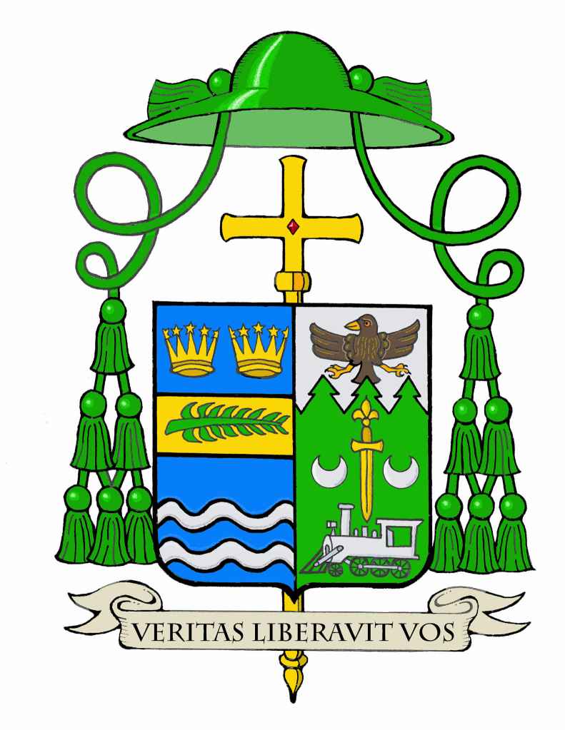
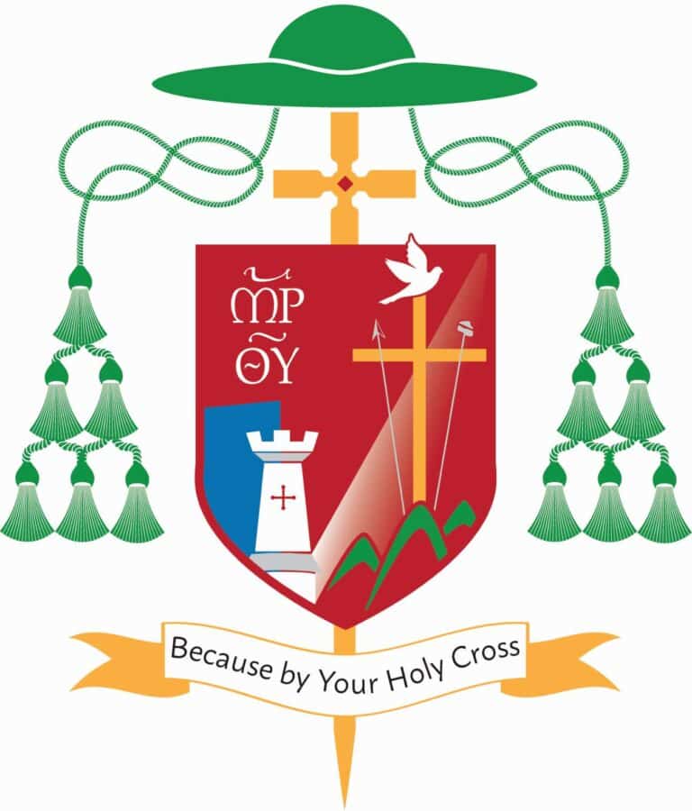
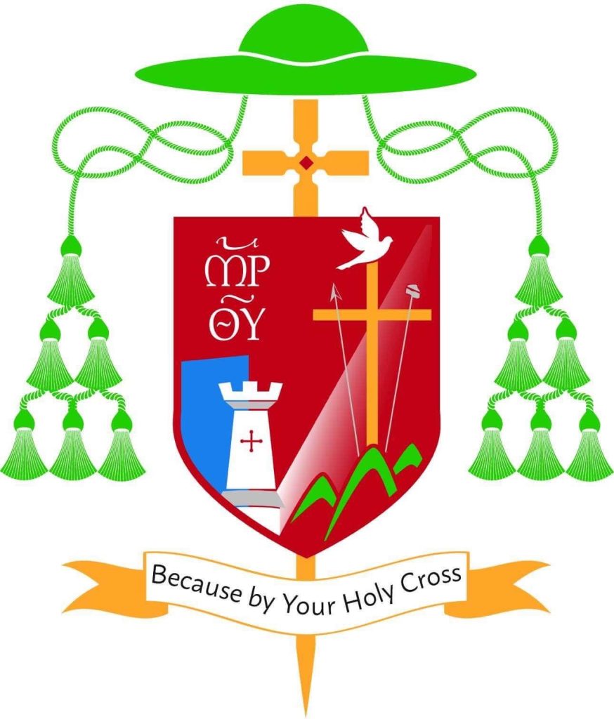
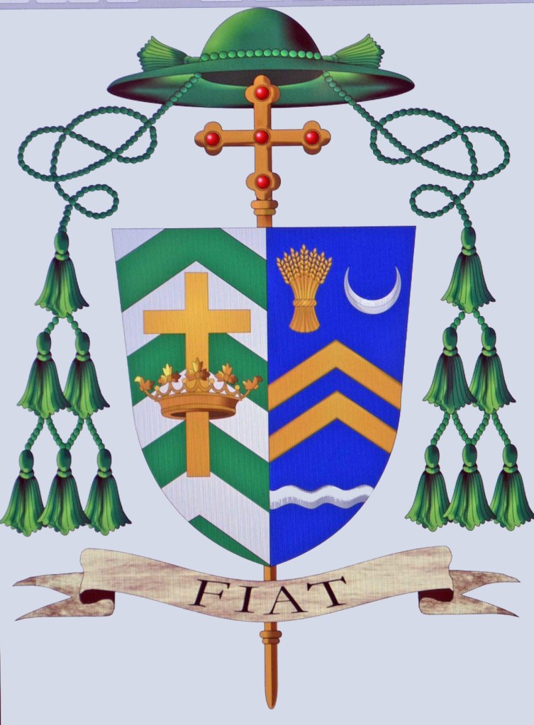
Elected as the VIII Abbot of St. Norbert Abbey, DePere, Wisconsin on January 15, 2026, Rt. Rev. Bradley Vanden Branden, O.Praem. (38) received the abbatial blessing from Bishop David Ricken of Green Bay, WI on April 18, 2026. Abbot Bradley has assumed the following armorial bearings:
A few comments to begin with. Norbertine Abbots frequently choose the more Continental, and older, custom of ensigning the shield with the mitre and abbatial crozier rather than use the galero. It’s not my preference but I know that it is done and certainly has been the long-standing custom of the Abbots of St. Norbert Abbey. So, I won’t call it “incorrect”. Rather, I’ll simply repeat that it isn’t my preference in light of the Instruction of St. Paul VI no longer to use the mitre in heraldic achievements of prelates. I will add that I’m also not a fan of those Norbertine and Cistercian Abbots who do use the galero but insist on it being white to mirror the color of the habit they wear. The color of the galero indicates the rank of the bearer, NOT what they wear. Bishops use a green galero but do not wear that color. The color assigned to the galero for the rank of Abbot is black with 12 black tassels suspended by black cords. The innovation of a Norbertine or a Cistercian Abbot using a white galero is quaint, but it undermines the system devised for the appearance of the various galeri to indicate the rank held. In other words, using a white one because one’s habit is white is, in my opinion, too idiosyncratic.
The arms of the Abbey are of no concern to me here. They are long in use and very well designed in the early 20th C. by none other than Pierre Chaignon La Rose. (That’s the half that isn’t bad in this case). However, I’m commenting on the sinister impalement containing the Abbot’s personal arms. The various things he wished to symbolize: family, place of origin, ethnicity, personal interests are not poor choices at all. However, their arrangement and execution would be with what I take issue.
The chief represents the Fox River in DePere flanked by two riverbanks in colors taken from the Vanden Branden coat of arms. So, if there is a coat of arms used by his family it might have been better to base the entire design on that coat of arms. However, I will say that using the colors from that coat of arms as a way of giving a nod to those arms is an acceptable and even laudable thing. However, the river appears to be represented as if on a map. Heraldry is about symbolism; not realism. It would be far better to depict a river in the traditional heraldic manner by means of a barrulet or bar wavy.
The main part of the field has the flaming heart of St. Augustine because Norbertines follow the Rule of St. Augustine on a triangle to represent the Holy Trinity. That’s fine, but the triangle is orange as an allusion to the Dutch House of Orange. As the explanation given on the Abbey’s social media states: “Besides orange being a favorite color of Abbot Vanden Branden, it is also the national color of the Netherlands. Abbot Vanden Branden’s maternal side of the family is Dutch, with roots near Heeswijk – the same locale as Berne Abbey, the mother abbey of St. Norbert Abbey.”
His favorite color? How cute but that doesn’t matter when it comes to a coat of arms. Orange doesn’t exist in the palette allowed in heraldic art. Full stop. It is also interesting to note that the coat of arms of the House of Orange—the ruling royal house of the Netherlands—contains blue and gold, but no attempt at depicting the color orange!
The symbols below that allude to a love of music and the liturgy. Here my issue is with their arrangement. There are two vertical images with a non-vertical image shunted to one side. Just from the point of view of aesthetics, to say nothing of balance, it would look much better with the thurible in the middle between the paschal candle and organ pipes. I also find the use of the field Sable to be rather dark. Instead of using black, the House of Orange (and the Netherlands) could have been alluded to by using a blue field and having the heart of St. Augustine on a gold triangle to use the colors from the arms of the House of Orange.
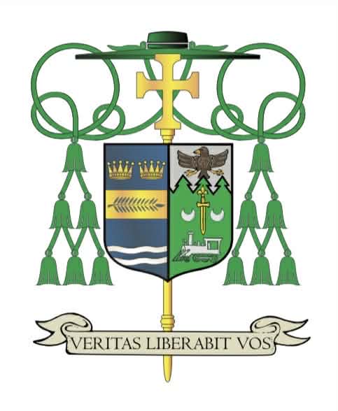
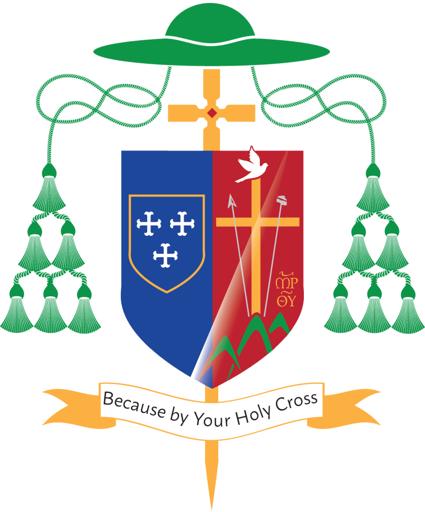
I have taken the liberty of making a rough sketch illustrating what I am talking about:
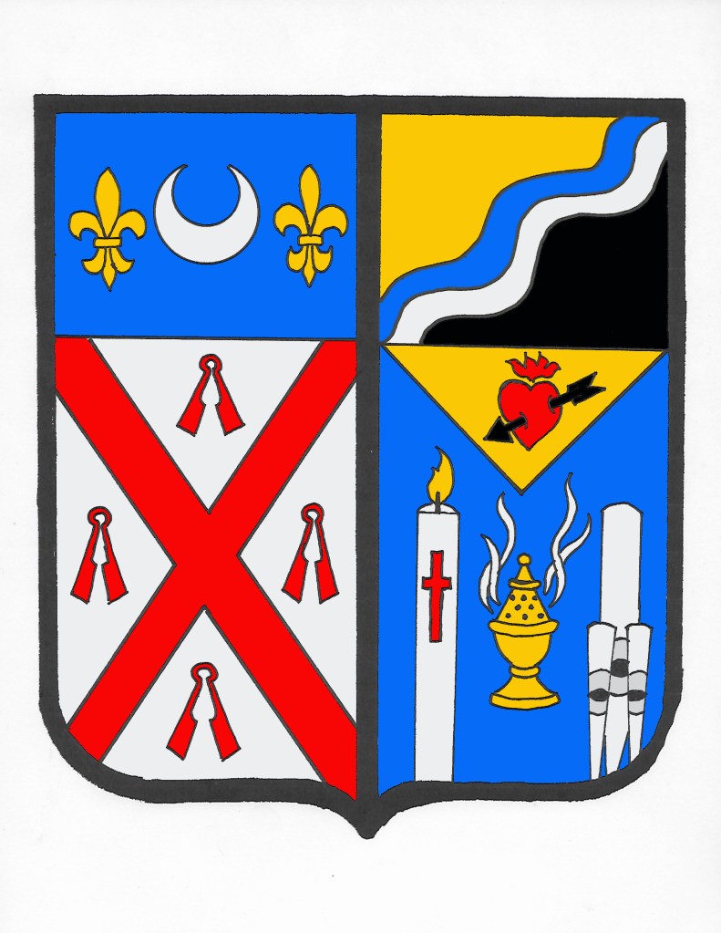
Here the gold and black from the Vanden Branden coat of arms is retained and the Fox River is depicted symbolically as a bend wavy and using counterchanging to avoid a tincture violation. Then the heart of St. Augustine is placed on a gold triangle and the rest of the field is blue (colors from the arms of the House of Orange). Then the thurible takes a central balanced place between the two more vertical symbols associated with the liturgy: the paschal candle and the organ pipes. Is my proposal radically different? No, it isn’t. But, it has the benefit of a brighter, more balanced and heraldically correct design.
It should be said that because coats of arms may lawfully be assumed in the United States, and– except where there is an established and recognized Heraldic Authority– they may be lawfully assumed in the Church throughout the world, the Abbot was certainly free to assume the design he desired. But, the question remains: does that make it good? Well, that is a subjective question and, I suppose, I’m forced to admit that because in matters of taste there can be no dispute it really only matters if the armiger is pleased with the design. However, there is still the further question: is it good heraldry? In this instance I would put it to you that the answer is no, it’s not. All of the desired elements to be symbolized make sense but they are arranged poorly. In addition, there are rules, conventions, traditions and customs in heraldic design and heraldic art that should be observed. For example, one cannot simply use whatever color one wishes because it appeals to them. There is a fixed color palette in heraldry.
I see the problem as two-fold. First, there is the misconception that a coat of arms has to “tell a story” about the armiger. WRONG. It must simply identify him. Here I can turn to a quote from La Rose in a 1925 letter to none other than Abbot Bernard Pennings, O.Praem., the first Abbot of St. Norbert. LaRose says: “The modern notion, which dates from the rapid decline of the art in the 17th century and later: that a coat-of-arms should be in more or less symbolic terms, a moral portrait of its owner, or in the case of an ecclesiastical coat, should even declare its owner’s religious programme, etc, etc, is wholly erroneous.”
The second part of the problem is that far too many prelates, when looking to assume a new coat of arms, seek out the advice of someone they perceive to be proficient in drawing or painting. They see heraldry only as an art form, not as a science. So, they don’t look for the advice of someone well-versed in heraldry. Instead, they may find a friend, or an acquaintance (or in this case a confrere) who is good at drawing and then they simply have that person put together a variety of symbols arranged cleverly and placed on a shield. This is the type of coat of arms that leads to “creative” ideas like using the armiger’s favorite color…whether it is permitted in heraldic art or not!
In the case of Abbot Vanden Branden’s coat of arms a simple consultation with a competent heraldist could have resulted in some much-needed advice that could have vastly improved this design with a few simple tweaks.