On August 28, 2026 HM King Harald V of Norway (89), who reigned from 1991, passed into eternal life. He was immediately succeeded by his son and heir, Crown Prince Haakon, who now reigns as King Haakon VIII.
Sincere condolences to HM the King and his family, especially his mother, Queen Sonja. King Harald will be buried on September 9. On September 1, 2026 King Haakon swore his oath of allegiance to the Constitution before the Storting, (the Norwegian Parliament) officially becoming king. There will not be a coronation but there will be a ceremony of consecration at St. Nidaros Cathedral in Trondheim at which the royal crown will be present as a symbol. That ceremony will take place at some later date. For King Harald, the benediction took place five months after he succeeded his father. In the case of King Olav V the benediction took place some nine months after his accession.
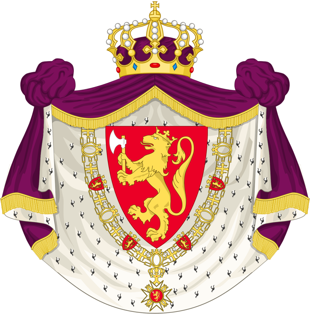
The royal coat of arms, designed in this form in 1905, is used by the royal family. Derived from the medieval arms of the Sverre dynasty, it is the arms of dominion of the Norwegian king. The national coat of arms has a slightly different style and was adopted in 1937. However, the king retains the use of the older style. In the coat of arms of the realm, a heraldic royal crown is placed directly on top of the shield. In the royal coat of arms, the shield of the arms of the realm is on a purple mantle lined with ermine with a royal crown on top. Three sides of the shield are surrounded by the collar of the Royal Order of St. Olav. The blazon is: Gules, a lion rampant Or, crowned Or, holding an axe Or with a blade argent.
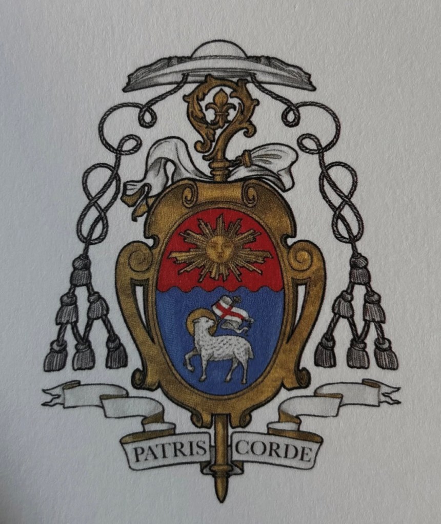
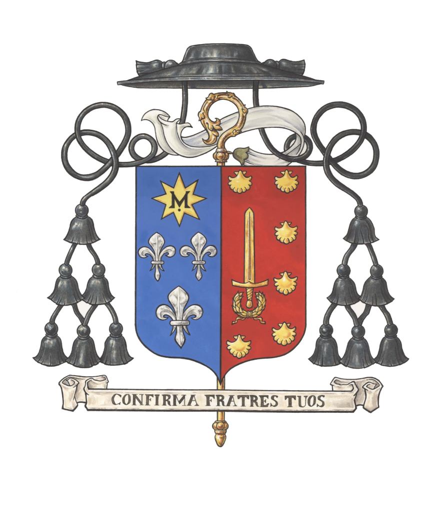
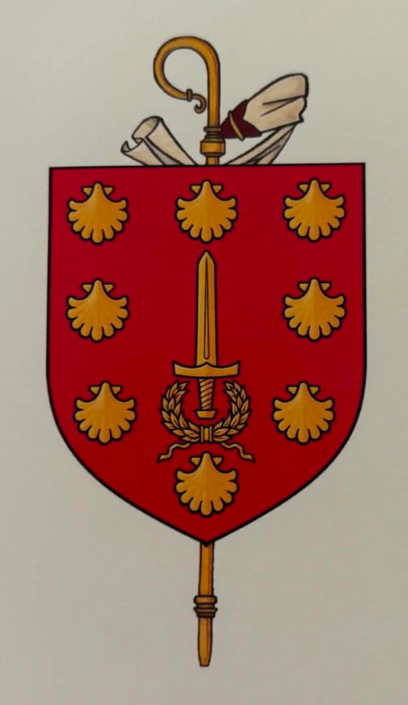
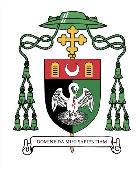
On Saturday, July 11, 2026, the Benedictine monks of Conception Abbey, in Conception, Missouri, elected Fr. Paul Sheller, OSB, (44) as their new abbot. He becomes the 11th abbot in Conception Abbey’s 153-year history. He received the abbatial blessing at Mass on August 30th.
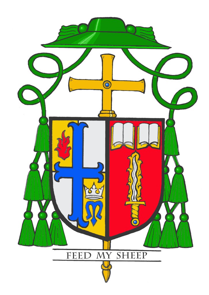
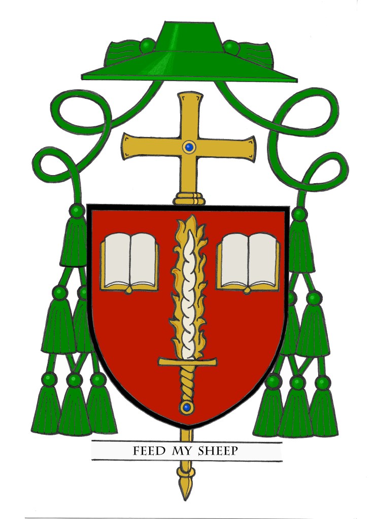
Abbot Paul’s armorial achievement displays the personal arms impaled with Conception Abbey’s coat of arms. His personal arms refer to both his patron saint’s attributes and the shells in bordure are canting charges for his surname.
The blazon is: Arms impaled. In the dexter Azure, in chief a star of eight points Or ensigned with the letter “M” Sable above three fleur-de-lis arranged two and one, Argent. (Conception Abbey) In the sinister Gules, a sword palewise point upwards with a laurel wreath surrounding the pommel within a bordure of escallop shells, all Or. (Abbot Paul Sheller).
The Abbot will also occasionally make use of his personal arms alone, which has the advantage of displaying the full bordure of shells due to the lack of an impalement.
The coat of arms was designed and executed by Fr. Pachomius Meade, OSB, a monk of Conception Abbey.
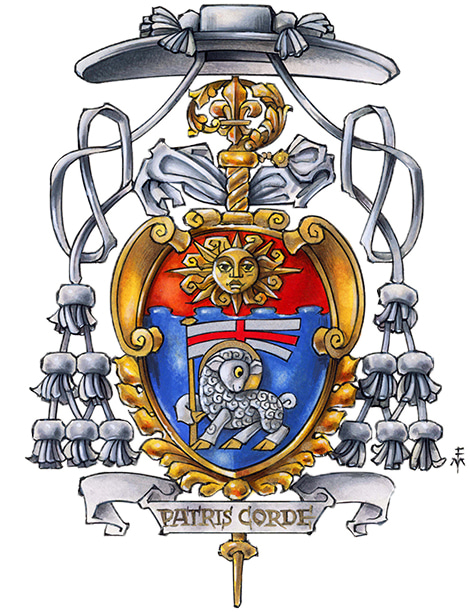
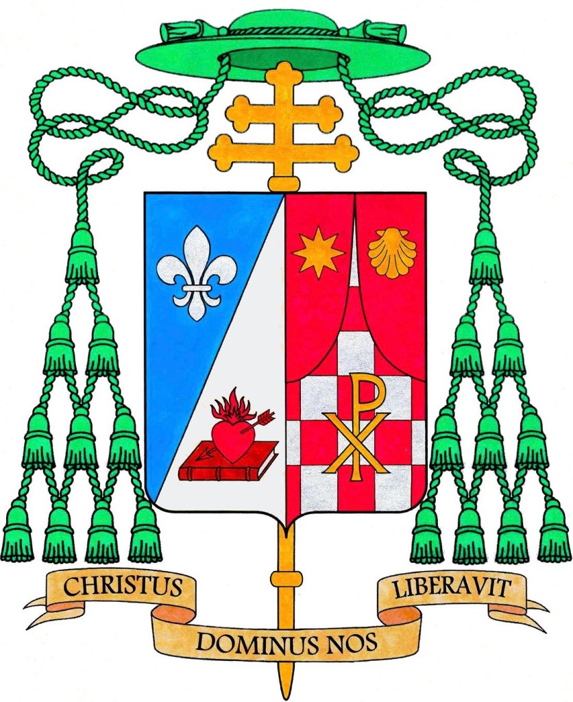
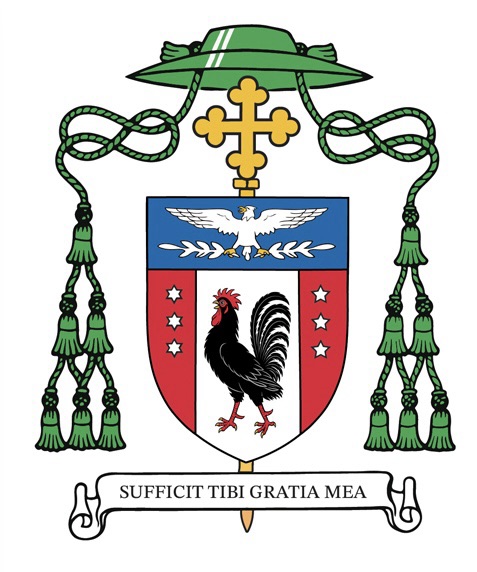
Petar Antun Rajič (born in June, 1959) is a Croatian/Canadian prelate who is the Prefect of the Papal Household, appointed by Pope Leo XIV in 2026. He worked in the diplomatic service of the Holy See from 1993 to 2026. An archbishop since 2009, he served as Nuncio to several countries between 2009 and 2026, most recently to Italy and San Marino from 2024 to 2026. From 2019-2024 he was Nuncio to Lithuania, a post in which he was succeeded by Archbishop Georg Gänswein, his predecessor as Prefect of the Pontifical Household.
His armorial bearings traditionally impale his personal arms with the coat of arms of the Pope under whom he serves.
Some time ago I was approached to design a revamped school seal for St. Thomas Aquinas High School in Edison, NJ in my own Diocese of Metuchen, NJ. The school was founded in 1969 when Edison was still in the Diocese of Trenton, NJ. In 1981, St. John Paul II separated the four northern counties of the Trenton diocese to erect the new Diocese of Metuchen and the school found itself under a new jurisdiction. Around the time of the diocese’s creation, the name of the school was changed to honor a bishop of Trenton and it became Bishop George Ahr High School. More recently, it was decided to return the school to its original name and patron saint which it had borne for its first 12 years of existence. So, the idea was to replace the Bishop Ahr H.S. school seal with something new to reflect the current situation.
The Bishop Ahr H.S. seal, really a coat of arms was a poorly designed hodge-podge with everything in it but the kitchen sink (see the image above). The less said about it; the better. It has been being used in a monochrome format utilizing the school colors (red & white) since the return to the name St. Thomas Aquinas H.S. Nevertheless, something different to mark the new era was desired. So, I was happy to undertake to do a new design based on an armorial seal. (see image below)
Coats of arms and seals aren’t the same thing. People often use the words as synonyms which they most definitely aren’t. Seals developed far longer ago than coats of arms, which really didn’t appear on the scene until the XII C. Prior to the advent of heraldry seals often contained portraits either of the owner of the seal or of his or her patron saint. Later, as coats of arms became common seals often depicted the owner’s armorial bearings or elements from it. But, this is not mandatory. I’m frequently asked, “Doesn’t Canon Law require a bishop to have a coat of arms?” The answer is NO, it doesn’t. Canon Law requires a bishop to have his own seal for the purposes of authenticating documents. However, there is no rule, or even the expectation that a bishop’s seal will be armorial. It may be composed of anything, any image, any symbol he wishes. Since, however, seals lend themselves to making use of armorial imagery the idea was design something for this high school that would look reminiscent of a coat of arms without actually being one.
NOTE: The school also makes extensive use of a school logo, a capital letter “A” divided by a diagonal line to display the school colors of red and white. That is used a lot on all sorts of items and will continue to do so. The desired seal is for more formal uses.
The seal is a traditional school seal with a circular shape. Around the perimeter of the circle is the simple legend, “Saint Thomas Aquinas High School”, and then centered in the bottom of the legend is the date 1969, that of the school’s foundation between two crosses to offset it from the rest of the legend.
The seal itself is armorial in nature, borrowing elements from the coat of arms of the Order of Preachers (Dominicans) to which the school’s patron, St. Thomas Aquinas, belonged. It also borrows from the coat of arms of the Diocese of Metuchen, where the school is located as well as the Diocese of Trenton, from which the Diocese of Metuchen was created and in the territory of which the school, had been located at the time of its founding in 1969. In addition, there are symbols of education and of St. Thomas Aquinas himself.
The seal is divided in quarters. Overall there is a cross, itself divided in quarters. In the upper left and lower right quadrants the cross is a white cross fleury (the ends of which terminate in a fleur-de-lis) on a black background. This mistaken directly from the coat of arms of the Order of Preachers which employs only the colors black and white—those of the Dominican habit— and such a cross. Also in the upper left quadrant is a gold sun in its splendor. This is a symbol most often associated with St. Thomas Aquinas, almost as his personal emblem. In the lower right quadrant is seen a gold ancient oil lamps. This has long been a symbol of learning and education, enlightening the mind, the purpose of a school.
In the upper right and lower left quadrant the cross appears as a red moline cross (the ends of which circle back on themselves) on a white background. This moline cross, so called because its shape resembles the metal centerpiece used on a mill-rind, or millstone, is used as the central symbol on the coat of arms of the Diocese of Metuchen. In turn, this diocese borrowed it from the coat of arms of the Diocese of Trenton, its mother diocese. The use of this cross as a symbol honors the two dioceses in which the school has been located. The red and white employs the school’s colors.
I was delighted to work on this project. I hope it gets use for many years to come.
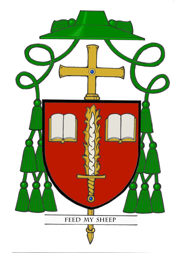
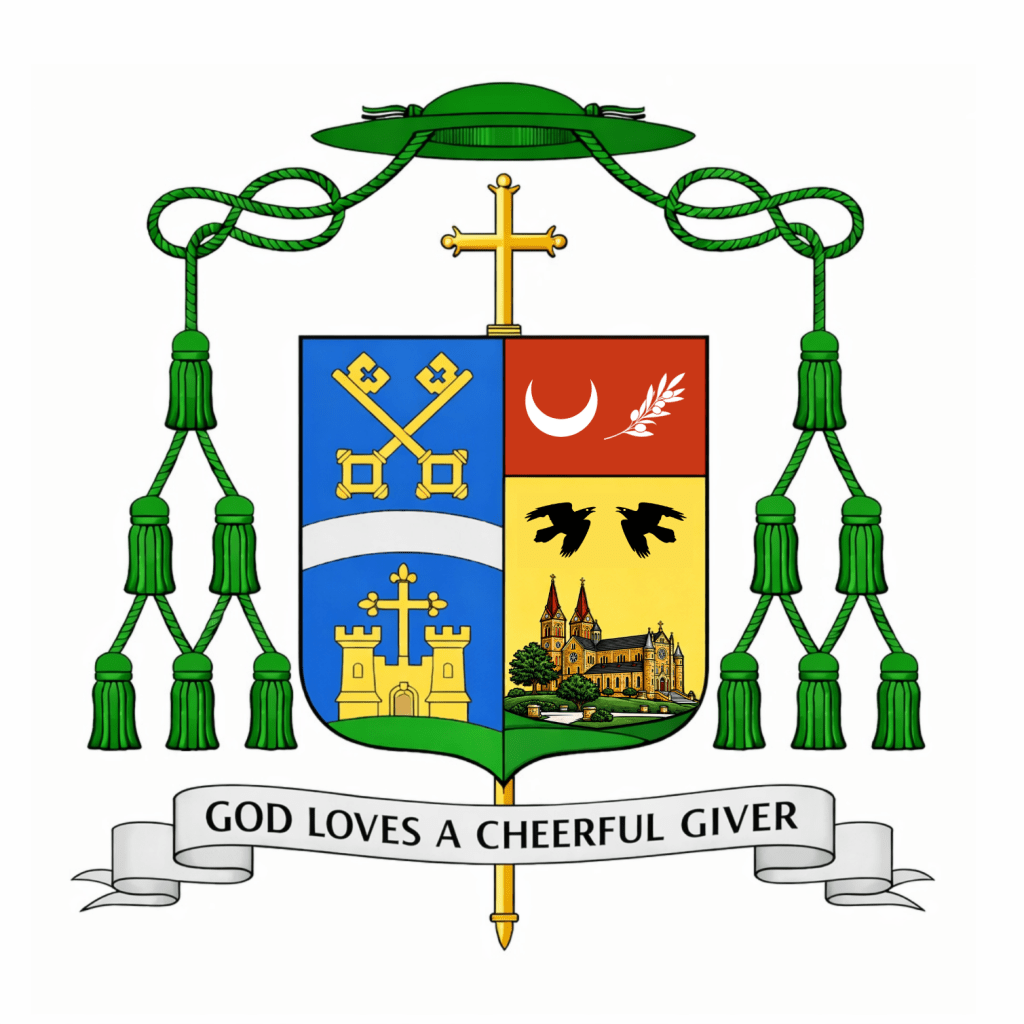
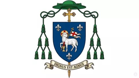
On May 1, the Most Reverend Godfrey Mullen, OSB (60) a Benedictine monk of St. Meinrad Archabbey in Indiana, as well as the Diocesan Administrator and former Vicar General of the Diocese of Belleville, Illinois, of which he is also a native son, was ordained a bishop and installed as the 10th Bishop of Belleville. The arms he assumed are pictured above.
For some time now, since his episcopal ordination and installation in May a number of people have asked for my comments on his coat of arms. I was privileged to design the armorial bearings of his immediate predecessor, Bishop Michael McGovern who is now the Archbishop of Omaha. I had wondered if, perhaps, Bishop Mullen would ask for my help with his coat of arms but he is certainly under no obligation to do so. In the end, I was disappointed he didn’t ask for my help when I saw what he ended up with. On the other hand, this also allows me to comment freely without being accused of “sour grapes”.
To use an expression that I haven’t had occasion to use since the ill-conceived and disastrous revamping of the coat of arms of the Archdiocese of Detroit (now happily abandoned) this coat of arms represents an EPIC FAIL.
I have no issue with the artwork, and I take no interest in critiquing the arms of the See of Belleville. My reaction is to the Bishop’s personal arms alone. Much of what he wanted to do is good and even correct. He kept the color scheme simple. He wanted an overall design that reflects his Benedictine background. He also managed to symbolize his family. The crescent and olive branch on the chief are from the arms associated with his family name and from the Jubilee Medal of St. Benedict, respectively. The olive branch also alludes to the city of Salem (which means “peace”) and the crescent is also an allusion to Our Lady. So, too, he does something very nice by having charges represent more than one thing keeping the arms from being too crowded. One thing that often goes overlooked in heraldic design, however, is the desirability of symmetry as well as the need to avoid asymmetry whenever possible. Perhaps the crescent flanked by two olive branches would have solved that better? As it is now the charges look as though they have just been randomly thrown onto the chief.
The two ravens also make good sense. Both St. Benedict (the founder of the Order) and St. Meinrad (the patron saint of the Archabbey) had ravens and the birds are generally seen as a symbol of both saints. In fact, the arms of the Archabbey contains ravens. So, perhaps, one would think, that would have been enough. Here is where we come to the biggest problem. Namely, the pictorial depiction of the Archabbey church.
To oversimplify the issue I’ll say plainly: coats of arms contain symbols, not pictures. What the bishop (or whoever advised him on this design) has done is simply to use the line drawing of the church that is the Archabbey’s current letterhead and colored it and slapped it onto his shield. This is the antithesis of heraldic design. The insipid line drawing is a nightmare to reproduce because of the abundance of detail, it’s inappropriate as a heraldic charge, and it makes for a coat of arms difficult to discern when seen in reduced format…as coats of arms so very frequently are. Using a symbol of St. Meinrad as he has already done is sufficient. Borrowing a charge or charges from the coat of arms of the Archabbey is a great idea with ample precedent in heraldic art and design. Even if the bishop strongly desired to use the Archabbey church as a symbol it would have been far better to depict one of the Archabbey’s distinctive towers or perhaps a rendition of its rose window. But, to simply reproduce in full a drawing of the Archabbey church used on letterhead—a drawing that was clearly made from a photograph as is evidenced by the inclusion of the trees, path and grounds surrounding it— is ridiculous and just plain WRONG!
It’s a shame really. This coat of arms had the potential to be a rather decent one and then the inclusion of that picture ruins the whole thing. How many times do I have to say that heraldry is both a science and an art form all its own, with its own rules, traditions, conventions and customs. You cannot simply have “whatever you want”, slap it onto a shield and call it heraldry. There are ways to design a good coat of arms. This coat of arms is not an example of those ways. At one point the description of the coat of arms says, “The cleft hill at the base continues from the hill of the diocesan crest. The bishop is a son of the diocese, but also a son of Saint Meinrad…”. Again, a clever idea to try and allude to both the diocese and the Archabbey, however, the design doesn’t “continue” from one side of the shield to the other. Impaled arms are a form of marshaling that dispalys two separate coats of arms on a single shield. The diocesan coat of arms doesn’t “become” part of the bishop’s coat of arms; it is displayed next to it.
Finally, to feed into another pet peeve of mine the episcopal cross in this achievement is also personalized…as though that’s an option. The explanation says, “The cross atop the shield is modeled on the cross depicted in the Benedictine Jubilee medal”. Isn’t that just so lovely? The problem is twofold. The cross isn’t “atop” the shield. It is standing behind it, as in, it is an external ornament. The second problem is that such a cross is a symbol of the episcopal office and as such is not subject to being depicted in a particular way according to the fancy of the armiger (or the designer). Let me be clear: any individual rendering of the Bishop’s coat of arms may, of course, depict the episcopal cross in a certain way, in this case in the manner of the cross of the Jubilee Medal. However, that is not obligatory. Other artists do not have to depict it that way and the blazon may not specify it. It isn’t an option to dictate the appearance of the external ornaments. The armiger has control over what goes ON the shield only; not what appears around it.
So, since people have been wondering what I thought of this heraldic achievement I have now said. I think it’s very disappointing because it had such potential. It could have been so much better. What is wrong with it betrays an amateurish style. One wonders if the bishop wouldn’t have been far better served by consulting with someone who knew something about how properly to design a coat of arms? A little more direction and this could have been salvaged.
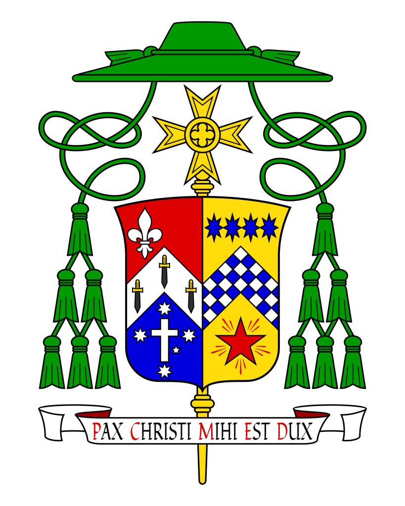
On July 3 Pope Leo XIV appointed Monsignor Stuart R. Hall (63) a priest of Melbourne, Australia and Dean of the cathedral in Melbourne, as well as a Navy Chaplain to be the next Bishop of the Military Ordinariate of Australia.
The arms he will assume, impaled with those of the Ordinariate, make allusion to academic institutions he has attended, as well as to the name Stuart.
The armorial bearings were designed by myself and Mr. Richard d’Apice and rendered very nicely by Mr. Sandy Turnbull.
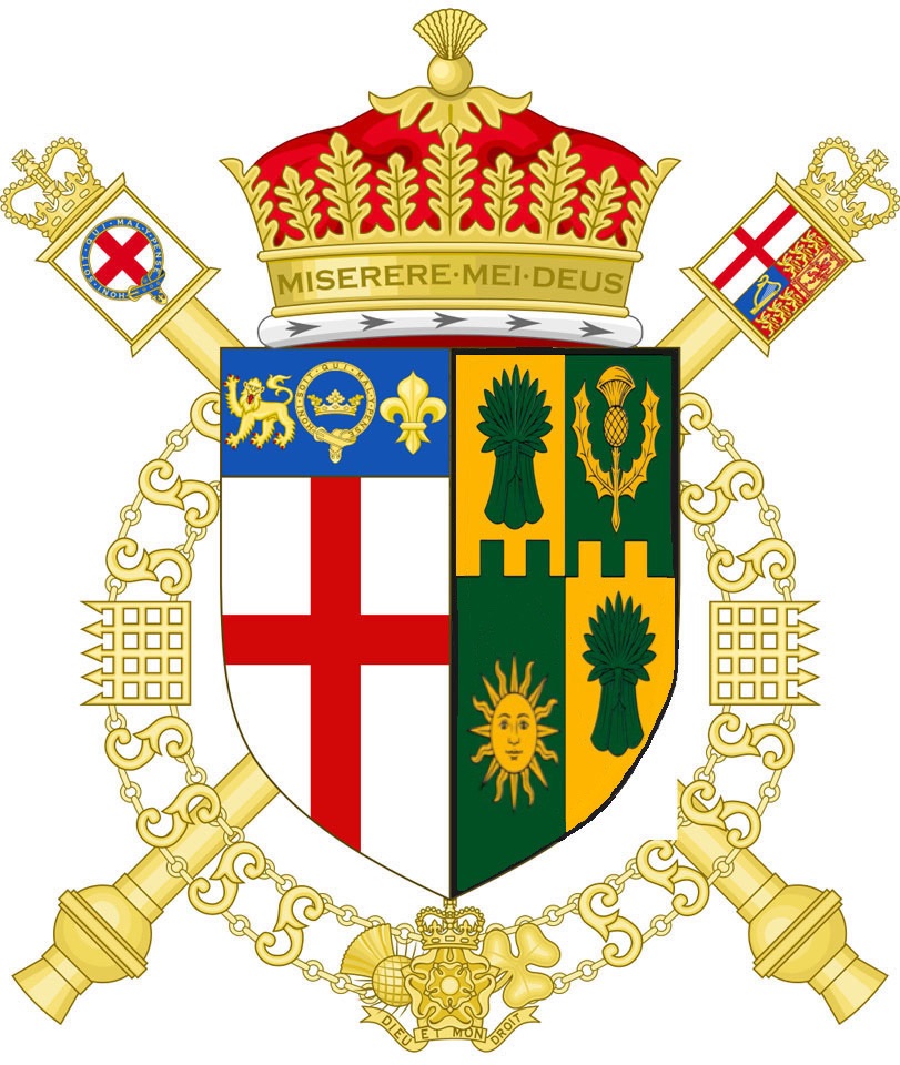
As a sort of post script to the post on the appointment of James Peill, formerly Richmond Herald and Bluemantle Pursuivant, as the next Garter Principal King of Arms of HM College of Arms I post his personal arms impaled with those of the office of Garter.
On July 7 the Most Rev. Gary Studniewski (68) a priest of the Archdiocese of Washington DC was ordained Titular Bishop of Jamestown and Auxiliary Bishop of Washington.
On the same day the Most Rev. Robert Boxie (45) a priest of the Archdiocese was ordained Titular Bishop of Cataquas and Auxiliary Bishop of Washington DC.
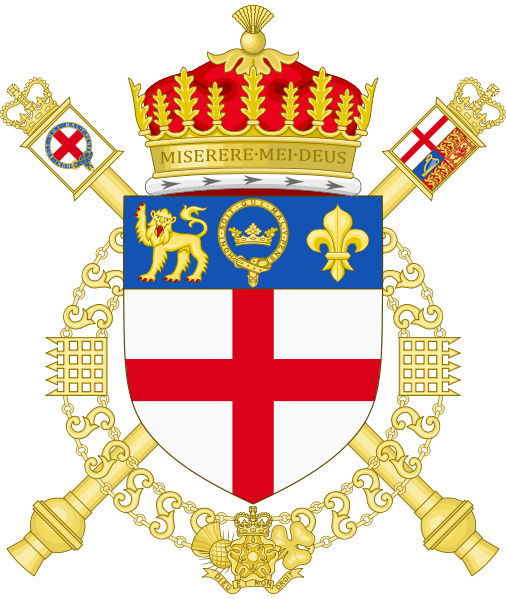
Today, HM King Charles III, appointed James van Someren Peill, Esq., until now Richmond Herald, (appointed last May) and formerly Bluemantle Pursuivant, (appointed in 2024) to the office of Garter Principal King of Arms, after the retirement of Sir David White, KCVO.
No, not the one in Italy; the one in Florida. On July 11, the Feast of St. Benedict, Patriarch of Western Monasticism, the Most Rev. Emilio Elpidio Biosca Agüero, OFM. Cap. (61) will be ordained a bishop and installed as the Third Bishop of Venice, Florida.
The coat of arms he will assume is:
My first response is to say, “Meh”. It’s not a bad coat of arms. The chief contains the symbol used throughout the Church by Franciscans of all types. The main field contains the hearts of Jesus, Mary and Joseph. Not “bad” per se, but rather unremarkable. Still, given the kind of ecclesiastical heraldry often being produced today it must be said that it could have been far worse.
I note that the Bishop chooses not to impale his personal arms with those of the diocese. In this he follows the custom set by his two predecessors who also bore only their own personal arms. This perhaps is because the complicated design of the arms of the See of Venice, Florida don’t lend themselves easily to being marshaled with other coats of arms. In my opinion, this is due to the fact that the diocesan arms were poorly designed in the first place.
I also note that the new bishop, who up until his appointment has been working in the Archdiocese of Washington, DC, must have received assistance from someone there in preparing his coat of arms. The episcopal cross and galero are the ones originally designed by the late A.C.W. Phelps of Cleveland and have been copied and used, and reused, in the Archdiocese of Washington since the time of Cardinal Hickey’s tenure.
On July 1 the Priestly Society of St. Pius X (SSPX) founded by the late Archbishop Marcel Lefebvre, will ordain four new bishops without Papal consent, an act which will incur automatic excommunication for those ordained and for the one who ordains them. That topic—the validity or not of this action is not for me to discuss here on this blog. However, a few days ago the Society also published the armorial bearings that will be assumed by these four men upon their ordination.
The coats of arms themselves are nicely designed, in accord with good heraldic practices and are alo very nicely rendered. However, my one and only question has to do with the style of these coats of arms. The Society of St. Pius X is well known for rejecting far more in the Church than simply the Novus Ordo Mass. Essentially, the rejected all of the reforms of the Second Vatican Council, as well as the teachings in all of the Council’s documents and the practices that grew out of those reforms. So, that moves me to ask: why don’t these coats of arms also contain the mitre and the crozier as external ornaments to the shield? After all, such a practice was not only common but normative prior to the reforms in ecclesiastical heraldry made by the Instructions of St. Paul VI in 1967, 1968 and 1969. It is only from that time that episcopal coats of arms have regularly omitted the mitre resting on the shiled and the crozier standing behind the shield alongside the episcopal cross.
So, to be consistent with their usual practices why don’t they depict these new coats of arms in that way, that is to say in the “traditional” way? They seem to have no problem complying with the reform made to Catholic ecclesiastical heraldry made during the pontificate of the same Pope who reformed the Mass and many other things in the life of the Church. Doesn’t it seem a bit hypocritical to go along with this one change when refusing to accept all the others?
The coat of arms of the United States of America which appears on the great seal of the U.S., familiar to many by its depiction on the one dollar bill, was adopted officially by Congress 244 years ago on June 20, 1782. It was designed over a period of time by three different Congressional committees but the final design is essentially the work of Charles Thompson, Congressional Secretary and William Barton. Both the coat of arms and the great seal it is depicted on were adopted by the Congress at the same time.
The resolution of Congress adopting the arms, still in force, legally blazoned the shield as:
“Paleways of 13 pieces, argent and gules; a chief, azure.”
The word “paly”, rather than “paleways”, should have been used and a more technically proper blazon would have been “argent, six pallets gules” (six red stripes on a white field).
The shield bears a resemblance to the United States flag, with two exceptions in particular:
The blue chief contains NO STARS (although certain derivative arms do, e.g. the chief of the arms of the United States Senate). The outermost stripes are white, not red, to avoid violation of the rule of tincture, as the chief is blue. The single supporter of the shield is a bald eagle with its wings displayed. From the eagle’s perspective, it holds a bundle of 13 arrows in its left talon, and an olive branch in its right talon. Although not specified by law, the olive branch is usually depicted with 13 leaves and 13 olives. In its beak, the eagle clutches a scroll with the motto “E pluribus unum” (Out of Many, One). Over its head there appears a glory with 13 stars on a blue field.
Each year the loose knit community of heraldic enthusiasts around the world observes International Heraldry Day. The holiday was established in 2013 at the initiative of the International Association of Amateur Heralds. The date of June 10 was chosen intentionally: on this day in 1128 in Rouen (France), Geoffrey V of Anjou was knighted by his future father-in-law, King Henry I of England. During the ceremony, Geoffrey received a shield bearing six golden lions on a blue background — one of the earliest known coats of arms in history.
So, this June 10 celebrate all things heraldic. If you are armigerous be sure to display your coat of arms!
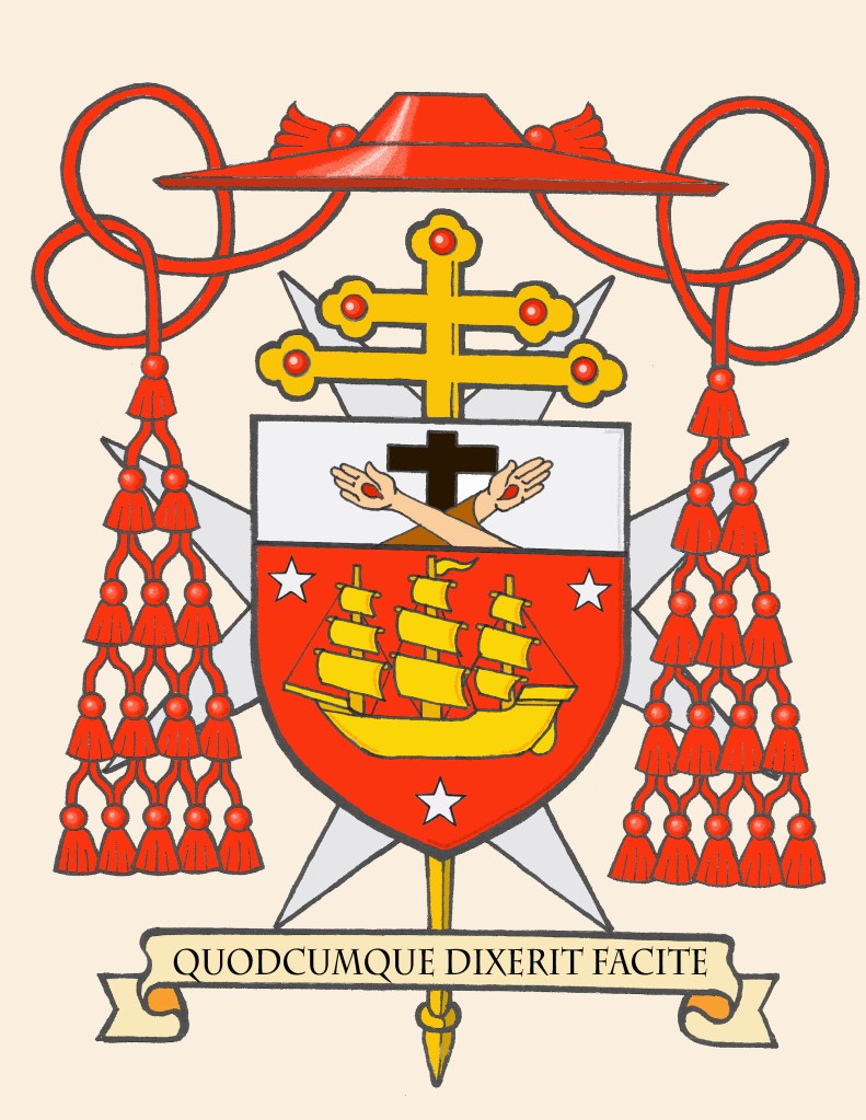
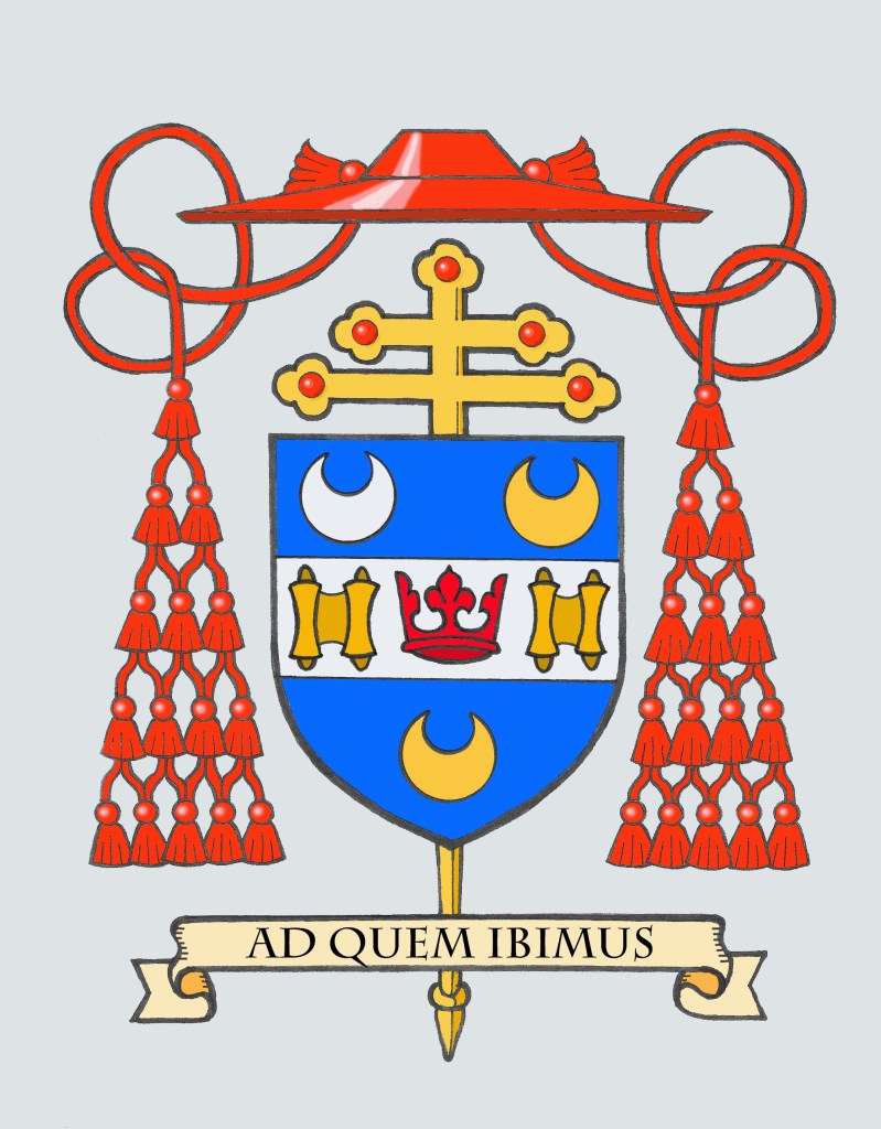
After I had been commissioned to provide the coat of arms for the present Archbishop of New York, Archbishop Hicks, I was asked a short time afterward if I would be willing to make the necessary modifications to the armorial bearings of His Eminence, Timothy Cardinal Dolan that would reflect that he is now the Archbishop-Emeritus. It was simply a matter of removing the impalement for the Archdiocese of New York from his armorial achievement.
BLAZON: Azure, upon a fess Argent an open crown Gules between two ancient scrolls Proper; in chief two crescents, to dexter Argent, to sinister Or; in base a crescent Or. The shield is ensigned with an archiepiscopal cross Or in pale behind the shield and surmounted by a cardinal’s galero with cords and fifteen tassels on either side in five rows of one, two, three, four and five all Gules. On a scroll below the shield is the motto: “Ad Quem Ibimus”.
EXPLANATION: The cardinal’s coat of arms, is composed of a shield upon which there are symbolic charges, a motto and the external ornaments of rank. The shield which is the most important feature of any heraldic device is blazoned (i.e. described) in heraldic language from the point of view of the bearer with the shield being held on his arm. Thus, where it applies, the term “dexter” (right) and “sinister” (left) are reversed as the device is viewed from the front.
By heraldic custom observed in North America, the arms of a diocesan bishop are “impaled” side by side on the same shield to the arms of his jurisdiction. This signifies that the diocesan bishop, in this case, the cardinal, is “married” to the See. The same method of impalement is employed in the coat of arms of two married people who are armigerous. During his tenure as the 13th Bishop and 10th Archbishop of New York, Cardinal Dolan impaled his personal arms with those of the See of New York. Upon reaching his retirement it is customary to modify the full achievement of his armorial bearings to remove the impalement for the See of New York to indicate that he no longer exercises Ordinary Jurisdiction over the archdiocese.
For his personal arms Cardinal Dolan uses the design he assumed in 2001 upon becoming Auxiliary Bishop of St. Louis, and which he also used as Archbishop of Milwaukee, reflecting his priestly ministry and interests.
The Cardinal’s design is composed of a blue field on which is seen a silver (white) fess, a bar across the center of the design which is about one-third of the area of the shield. At the center of the fess is a red crown, taken from the arms of the Archdiocese of St. Louis, the Cardinal’s home, and which he first served in episcopal ministry. The crown is placed between two scrolls, that are described as “Proper,” or “as they appear naturally.” These scrolls are to honor the cardinal’s baptismal patron, St. Timothy, who was the recipient of two of St. Paul’s Epistles.
Above the fess are two crescents; one silver (white) and one gold (yellow), and one below which is also gold. The silver crescent honors our Blessed Mother, in her title of the Immaculate Conception, Patroness of the United States, and the charge is taken from the arms of the Pontifical North American College, in Rome, where Cardinal Dolan studied for the priesthood and later served for seven years as rector. The other two crescents, of gold, are taken from the Dolan family arms and honor the cardinal’s parents.
For his motto, Cardinal Dolan has selected the phrase “AD QUEM IBIMUS”. By the use of these words taken from St. John’s Gospel (John 6:68), Cardinal Dolan takes the words of St. Peter as was said to Jesus, “LORD, TO WHOM SHALL WE GO,” for truly the Lord is the way to all and eternal happiness.
The external ornaments include a gold archiepiscopal cross with two horizontal bars (sometimes referred to as a patriarchal cross) placed vertically behind the shield decorated with red jewels. This is often mistaken for a processional cross like the one used in liturgical processions. However, like other heraldic ornaments the archiepiscopal cross has its origins in something which is no longer actually used. In the Middle Ages such a cross, without a corpus, was carried directly in front of all archbishops and Papal Legates as a symbol of their authority. Later, the cross was adopted for use by all bishops so archbishop’s added a second horizontal bar to their crosses to distinguish them from the episcopal cross of simple bishops. While no longer actually used it has remained a symbol of the archiepiscopal office in heraldry. It is not, as is sometimes supposed, a symbol of the office of Metropolitan because the archiepiscopal cross is used by all archbishops, even those who are not Metropolitan Archbishops.
In addition, above the shield is the red ecclesiastical hat called a “galero” with fifteen tassels pendant on either side. This is the singular heraldic emblem that distinguishes the coat of arms of a cardinal. This broad brimmed hat, once worn in cavalcades, is no longer used but remains as a heraldic emblem. The galero was first bestowed on the Cardinals of the Roman Church by Pope Innocent IV at the First Council of Lyon in 1245. It was the first hat to be distinguished by the use of a specific color (scarlet) and it was also to be adorned with tassels. However, originally the number of tassels was not fixed. There are various examples of cardinals’ coats of arms that show as few as two tassels suspended from the galero and as many as seventy-two! What marked these coats of arms as those belonging to cardinals was that the galero, cords and tassels were red and nothing else. No one else could use such a red hat except a cardinal regardless of how many tassels were suspended from it. The number eventually was fixed at thirty (usually depicted as fifteen suspended on either side of the shield in a pyramidal pattern) only in 1832. A system for distinguishing the ranks of other clergy based on the color of the hat, of the cords and the number of the tassels did not come into existence until the Instruction of Pope St. Pius X “Inter Multiplices” in 1905.
These external ornaments are those used for a prelate with the rank of cardinal who is also an archbishop.
It was my great pleasure and my privilege to assist His Eminence with this project.
You have, perhaps, heard the expression, “That’s not half bad” ? Well, sadly that can’t be said about the coat of arms that is the subject of this post. Unfortunately, the opposite is true; they are half bad.
Elected as the VIII Abbot of St. Norbert Abbey, DePere, Wisconsin on January 15, 2026, Rt. Rev. Bradley Vanden Branden, O.Praem. (38) received the abbatial blessing from Bishop David Ricken of Green Bay, WI on April 18, 2026. Abbot Bradley has assumed the following armorial bearings:
A few comments to begin with. Norbertine Abbots frequently choose the more Continental, and older, custom of ensigning the shield with the mitre and abbatial crozier rather than use the galero. It’s not my preference but I know that it is done and certainly has been the long-standing custom of the Abbots of St. Norbert Abbey. So, I won’t call it “incorrect”. Rather, I’ll simply repeat that it isn’t my preference in light of the Instruction of St. Paul VI no longer to use the mitre in heraldic achievements of prelates. I will add that I’m also not a fan of those Norbertine and Cistercian Abbots who do use the galero but insist on it being white to mirror the color of the habit they wear. The color of the galero indicates the rank of the bearer, NOT what they wear. Bishops use a green galero but do not wear that color. The color assigned to the galero for the rank of Abbot is black with 12 black tassels suspended by black cords. The innovation of a Norbertine or a Cistercian Abbot using a white galero is quaint, but it undermines the system devised for the appearance of the various galeri to indicate the rank held. In other words, using a white one because one’s habit is white is, in my opinion, too idiosyncratic.
The arms of the Abbey are of no concern to me here. They are long in use and very well designed in the early 20th C. by none other than Pierre Chaignon La Rose. (That’s the half that isn’t bad in this case). However, I’m commenting on the sinister impalement containing the Abbot’s personal arms. The various things he wished to symbolize: family, place of origin, ethnicity, personal interests are not poor choices at all. However, their arrangement and execution would be with what I take issue.
The chief represents the Fox River in DePere flanked by two riverbanks in colors taken from the Vanden Branden coat of arms. So, if there is a coat of arms used by his family it might have been better to base the entire design on that coat of arms. However, I will say that using the colors from that coat of arms as a way of giving a nod to those arms is an acceptable and even laudable thing. However, the river appears to be represented as if on a map. Heraldry is about symbolism; not realism. It would be far better to depict a river in the traditional heraldic manner by means of a barrulet or bar wavy.
The main part of the field has the flaming heart of St. Augustine because Norbertines follow the Rule of St. Augustine on a triangle to represent the Holy Trinity. That’s fine, but the triangle is orange as an allusion to the Dutch House of Orange. As the explanation given on the Abbey’s social media states: “Besides orange being a favorite color of Abbot Vanden Branden, it is also the national color of the Netherlands. Abbot Vanden Branden’s maternal side of the family is Dutch, with roots near Heeswijk – the same locale as Berne Abbey, the mother abbey of St. Norbert Abbey.”
His favorite color? How cute but that doesn’t matter when it comes to a coat of arms. Orange doesn’t exist in the palette allowed in heraldic art. Full stop. It is also interesting to note that the coat of arms of the House of Orange—the ruling royal house of the Netherlands—contains blue and gold, but no attempt at depicting the color orange!
The symbols below that allude to a love of music and the liturgy. Here my issue is with their arrangement. There are two vertical images with a non-vertical image shunted to one side. Just from the point of view of aesthetics, to say nothing of balance, it would look much better with the thurible in the middle between the paschal candle and organ pipes. I also find the use of the field Sable to be rather dark. Instead of using black, the House of Orange (and the Netherlands) could have been alluded to by using a blue field and having the heart of St. Augustine on a gold triangle to use the colors from the arms of the House of Orange.
I have taken the liberty of making a rough sketch illustrating what I am talking about:
Here the gold and black from the Vanden Branden coat of arms is retained and the Fox River is depicted symbolically as a bend wavy and using counterchanging to avoid a tincture violation. Then the heart of St. Augustine is placed on a gold triangle and the rest of the field is blue (colors from the arms of the House of Orange). Then the thurible takes a central balanced place between the two more vertical symbols associated with the liturgy: the paschal candle and the organ pipes. Is my proposal radically different? No, it isn’t. But, it has the benefit of a brighter, more balanced and heraldically correct design.
It should be said that because coats of arms may lawfully be assumed in the United States, and– except where there is an established and recognized Heraldic Authority– they may be lawfully assumed in the Church throughout the world, the Abbot was certainly free to assume the design he desired. But, the question remains: does that make it good? Well, that is a subjective question and, I suppose, I’m forced to admit that because in matters of taste there can be no dispute it really only matters if the armiger is pleased with the design. However, there is still the further question: is it good heraldry? In this instance I would put it to you that the answer is no, it’s not. All of the desired elements to be symbolized make sense but they are arranged poorly. In addition, there are rules, conventions, traditions and customs in heraldic design and heraldic art that should be observed. For example, one cannot simply use whatever color one wishes because it appeals to them. There is a fixed color palette in heraldry.
I see the problem as two-fold. First, there is the misconception that a coat of arms has to “tell a story” about the armiger. WRONG. It must simply identify him. Here I can turn to a quote from La Rose in a 1925 letter to none other than Abbot Bernard Pennings, O.Praem., the first Abbot of St. Norbert. LaRose says: “The modern notion, which dates from the rapid decline of the art in the 17th century and later: that a coat-of-arms should be in more or less symbolic terms, a moral portrait of its owner, or in the case of an ecclesiastical coat, should even declare its owner’s religious programme, etc, etc, is wholly erroneous.”
The second part of the problem is that far too many prelates, when looking to assume a new coat of arms, seek out the advice of someone they perceive to be proficient in drawing or painting. They see heraldry only as an art form, not as a science. So, they don’t look for the advice of someone well-versed in heraldry. Instead, they may find a friend, or an acquaintance (or in this case a confrere) who is good at drawing and then they simply have that person put together a variety of symbols arranged cleverly and placed on a shield. This is the type of coat of arms that leads to “creative” ideas like using the armiger’s favorite color…whether it is permitted in heraldic art or not!
In the case of Abbot Vanden Branden’s coat of arms a simple consultation with a competent heraldist could have resulted in some much-needed advice that could have vastly improved this design with a few simple tweaks.
Last March 19th the Right Reverend Alexandre Ineichen (59) was installed as the 40th Abbot of the Abbey of St. Maurice d’Augane in Switzerland. He had been confirmed in that position by Pope Leo XIV the previous October. The abbey is a community of Canons Regular and the Abbot is a Territorial Abbot, meaning that while he does not hold the rank of Bishop he nevertheless has the governing authority over the territory belonging to the Abbey as its Ordinary. Such a position used to be referred to as an Abbot Nullius but in more recent times is now called a Territorial Abbot. Many such abbacies had existed in former times with the Abbot exercising jurisdiction over not only the members of his community but of the diocesan clergy and lay faithful who lived within the territory of the abbacy. St. Paul VI began a process of phasing out such jurisdictions and today only a handful of them survive.
The distinguishing characteristic of the arms of a Territorial Abbot is that it makes use of the green galero, cords and tassels usually associated with the coat of arms of a bishop. However, since the armiger does not hold the rank of bishop there is no episcopal cross behind the shield but instead the usual veiled crozier of an abbot. Abbot Alexandre has also chosen to place the arms of the Abbey on an inescutchen overall rather than either quartering or impaling his arms with those of the Abbey, a good choice given the composition of his own personal arms.
On April 21, 2026 the Most Rev. Henry Mansell, Archbishop-Emeritus of Hartford, Connecticut entered into eternal life. He served as archbishop of the Archdiocese of Hartford in Connecticut from 2004 to 2013. Prior to that Archbishop Mansell served as bishop of the Diocese of Buffalo in New York from 1995 to 2003 and as an auxiliary bishop of the Archdiocese of New York from 1992 to 1995. may he Rest in Peace.
OK people! Learn this and stop screwing it up! In this year when the USA celebrates 250 years of its Independence there will be a ton of schmaltzy Americana stuff all over the place.
The coat of arms of the USA and the flag of the USA are NOT the same thing. The coat of arms (found on the Great Seal of the U.S.) does NOT have stars on the blue field above the red & white stripes on the shield. The blue part (called a “chief”) is entirely blue with nothing on it!!! The stars appear in the crest above the eagle’s head which is a constellation of 13 stars surrounded by a glory and clouds. The flag depicts 50 stars on the blue canton. The flag is not a heraldic banner of the shield from the coat of arms. The shield is not a “vertical depiction” of the flag.
Get this correct, and don’t buy any junk that depicts the coat of arms incorrectly.