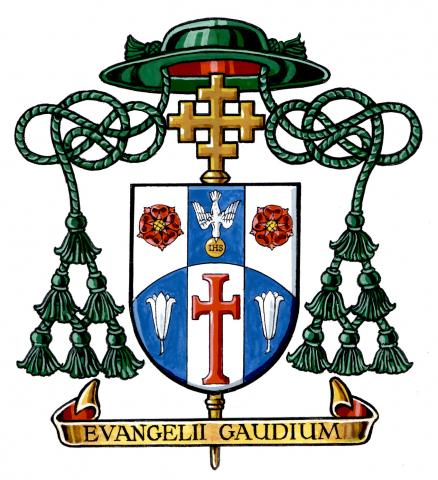
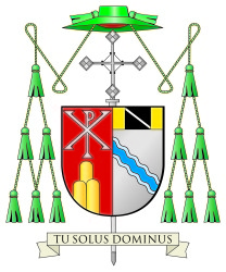
Earlier today the Most Rev. Myron Cotta was ordained as the Auxiliary Bishop of Sacramento, California. His newly assumed arms are below.
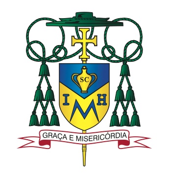
The field is divided by an inverted chevron alluding to a carpenter’s square for St. Joseph and the San Joaquin Valley. In chief there is an amphora charged with the letters “SC” for sacred chrism. The bishop’s given name, Myron, is the Greek word for the sacred oil.
In base there appears a monogram composed of the letters “I”, “M” and “H”. This stands for (if you can believe it) the Immaculate heart of Mary with the “M” taking the most prominent place. The bishop has a great devotion to Our Lady under this title.
The motto translates to “Grace and Mercy” and is in Portuguese to reflect the bishop’s ethnicity as being from the Azores.
Well, there is an overabundance of the use of letters in this achievement. Someone clearly never heard that the use of letters in heraldry is considered port design. The “SC” on the amphora is, in my opinion, unnecessary. The amphora alone is a sufficient symbol for sacred oil. Why not actually depict the Immaculate Heart of Mary instead of abbreviating it? The monogram is an example of extremely poor design. It’s weak and not self evident where the image of the Immaculate heart would have been. In addition, since most people don’t know that the name Myron means sacred oil they will naturally assume that the gigantic “M” in the coat of arms stands for Myron and not for Mary.
This was done by Paul Sullivan. Not one of his best efforts.