
June 10 is International Heraldry Day. Celebrate heraldry!
June 10 is International Heraldry Day. Celebrate heraldry!
By now so many people have seen the redesign of the archdiocesan coat of arms undertaken by the Archdiocese of Detroit and unveiled last Saturday (below, right).
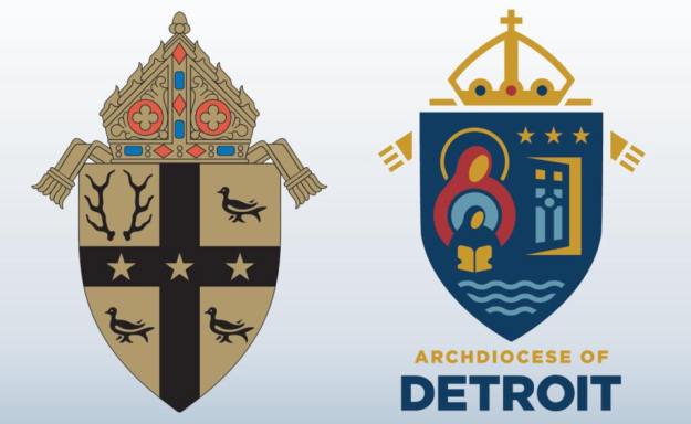
Where does one even begin? Perhaps a good place to start is by saying that this was done in conjunction with the release of Archbishop Vigneron’s post-synodal pastoral letter entitled, “Unleash the Gospel”. This letter addresses issues that arose during the archdiocesan synod and outlines the pastoral approaches to be implemented by the archdiocese as it faces the future. As a part of this entire effort someone had the idea that redesigning the coat of arms to reflect the current “realities” of the archdiocese and certain aspects of the archdiocese’s identity would be a good idea. I suppose the thinking was that with a new approach should come a new symbol. The archdiocese’s Moderator of the Curia, Msgr. Robert McClory, who was in charge of the redesign, said, “Initially, we thought about, ‘What is the identity of the archdiocese?’ When people think of the Archdiocese of Detroit, what do they think of, and what visuals are connected to that?”
So, it seems clear that this jettisoning of the former coat of arms and redesigning an entirely new one was done with all the very best of intentions. That seems abundantly clear and, I think, it’s worth pointing out and keeping in mind. There was no malicious iconoclasm motivating a desire to discard outmoded symbolism. Rather, there seems to have been a sincere effort to look to the future in a positive manner with a symbol for the local church that would be more evocative to both members of that local community and those outside of it as well. They were trying to do something good, and new, and fresh.
More is the pity. It is precisely all these good intentions that underscores the appalling ignorance with which this process, in the works for more than a year, proceeded. An article in the archdiocese’s publication, “The Michigan Catholic” indicates the following:
“Archbishop Vigneron consulted with a wide range of people, including laity and the archdiocesan Presbyteral Council, before deciding to go ahead with the changes, Msgr. McClory said. While the archdiocese enlisted the help of a Cleveland-based design firm for the project, the process also benefited from Archbishop Vigneron’s experience redesigning the coat of arms of the Diocese of Oakland, Calif., where he served as bishop from 2003-09.”
Apparently, the Archbishop’s previous experience left him feeling confident in doing a wide and varied consultation with just about everyone, except someone well versed in the customs, rules and traditions of good heraldic design. That really baffles me. In these days even a simple Google search will easily yield at least some possibilities of contacting a group or individual who has some knowledge or expertise in designing a coat of arms. Consulting such a person or group really wouldn’t be so difficult. I have to ask why it was deemed important to solicit the opinions of laity and the Presbyteral Council? What experience or learning do they possess that would enable them to determine a good heraldic design? I can appreciate the Archbishop’s desire to avoid making such a change by episcopal fiat and to seek the input of various people in his archdiocese. Nevertheless, the way to design or redesign a coat of arms is not by committee. I think the end result is clear evidence of that.
What they have come up with is, simply put, bad. The artwork is cartoonish and dated. The overall composition bears little to no resemblance to anything remotely like a coat of arms. The mitre on top has the appearance more of a royal crown than an episcopal mitre. The confusing miss-mash of charges float all over the place on the field. You cannot simply take a bunch of logo-like symbols, slap them onto a shield and call it “heraldry”!
Most of all, however, I think the epic fail has its origins in a basic misunderstanding of the nature and purpose of a coat of arms in the first place. Monsignor McClory goes on to say:
“A major difference between the old coat of arms and the new, Msgr. McClory said, is one’s ability to tell the story of faith using its symbols: Starting with the Old Testament in St. Anne and continuing through the revelation of the New Testament through her daughter, Mary, one comes to Christ through the waters of baptism and is invited through the open doors of the Church to bring others with them to their ultimate fulfillment with the Father, Son and Holy Spirit in heaven. I think you can really tell a story with this. You can’t do it with the old coat of arms.”
And there you have it. Once again, because something is connected to the Church it becomes about “telling a story”, or “tracing a history”. Not everything connected to the Church has to be a catechetical tool; not everything is a means of evangelization. Just as a personal coat of arms is not supposed to be one’s pictorial C.V. so, too, a corporate coat of arms is not supposed to be a visual mission statement or pictorial history.
Heraldry was developed as a means of creating a unique identifying mark. Full stop.
In addition, because even modern heraldry still hearkens back to the medieval period in which heraldry has its origins there is supposed to be both a timelessness and a sense of permanence to heraldry. It’s quite wrong to change a coat of arms simply because it was designed and adopted in a different time and because the thinking has changed about what should be on it. A coat of arms doesn’t have to “tell a story”; it doesn’t have to “reflect present realities”; it is supposed to be immutable. Since it becomes the identifying mark of the individual or corporate body that uses it the permanent character of it must be respected.
That is not to say that there are no instances of changes being made to a coat of arms. Even within the science of heraldry itself techniques such as marshaling (combining two or more coats of arms on the same shield), augmentation (adding a new element to an existing coat of arms to reflect an honor, event or accomplishment) and differencing (slightly changing an initial design to indicate its use by a relative, descendant, or protégé) exist to make changes within the accepted framework of heraldic custom and practice. But, simply throwing out the former coat of arms and redesigning the thing from scratch is foreign to the nature of heraldry. Let me be clear: it is sometimes done and whenever it is, it is always wrong.
Rather, the archdiocese has fallen victim to a not uncommon phenomenon present today. That is, equating heraldry with a logo. Corporate logos frequently change. Whether it’s to mark the takeover of the corporate body by another, or simply to refresh and renew the artwork, or to indicate the corporate body embarking on a new phase or vision the transitory nature of corporate logos almost necessitates their periodic updating or full-scale redesign. I note that the archdiocese consulted with a Cleveland based design firm. But, what does this firm know of heraldry? How much experience do they have designing a heraldic achievement? I would hazard a guess that its very little compared with their experience of coming up with a first time logo or doing a redesign for a group interested in “re-branding”. But, a coat of arms is neither a logo nor a brand.
The simplest solution to their present situation would have been to leave their diocesan coat of arms alone and design a logo which would be used not only for the roll out of this most recent pastoral letter and the ensuing archdiocesan efforts at implementing it but could have also become the favored symbol used by the archdiocese in place of the coat of arms. Things like letterhead, signage, etc. could easily have borne this newer logo and simply ignored the coat of arms. Its not the solution that those of us who prefer heraldry might like but it certainly is far from unprecedented. Numerous ecclesiastical institutions have desired a symbol that was considered more in keeping with the times. They have chosen to respect the existence of a previously adopted coat of arms and merely make minimal use of it in favor of the newer logo they have adopted as more fitting to their situation.
The Archdiocese of Detroit could have done the same. They could have tried, with the help of a competent heraldic designer, to truly re-design the present coat of arms. They could have, for example retained the gold field, the black cross and three gold stars on the cross and removed the antlers and martlets. Then in those now empty quadrants they could have placed charges symbolic of what they desired. They could have augmented the current coat of arms by means of placing a smaller shield at the center of the design bearing whatever symbols they wanted. They could have adopted a kind of heraldic badge (a symbol composed of heraldic charges but separate from a shield) and used that in conjunction with the archdiocesan coat of arms as well as had new artwork prepared for both. They could have decided to adopt an archdiocesan logo to be used instead of the coat of arms while leaving the former alone.
Instead, they chose the ill-advised path of completely throwing out the coat of arms first adopted 80 years ago and used regularly throughout the archdiocese in many ways and in many places, and coming up with an entirely new design, poorly executed, which bears little to no resemblance to the original and destroys any visual continuity with what had been used.
It has been announced that over time the former coat of arms will slowly but systematically be expunged and the Archbishop plans to have a new rendering of his own coat of arms impaled with this mess. I think that’s a very bad idea. Rather, if he wishes no longer to use the older archdiocesan arms the Archbishop should simply use his personal arms on the shield alone. That way, if his successor wishes to correct this error and revert to the former coat of arms he can do so easily.
I suppose that it shouldn’t really come as a surprise that this kind of thing happened considering what the archdiocese did to redesign what had been its beautiful cathedral of the Most Blessed Sacrament. Much of that renovation is quite nice (I’m thinking in particular of the floor of the sanctuary) but most of it doesn’t fit at all with the style of a neo-gothic structure. Once again in the interest of “updating” the archdiocese has an epic fail on its hands. What I find particularly sad is the failure isn’t because of a difference of opinion regarding taste. Rather, the fail occurred because of inexcusable ignorance of the subject at hand. They simply don’t get what a coat of arms is supposed to be. What they’ve ended up with is unheraldic and ugly.
On June 8 the Most Rev. John Patrick Dolan (55), a priest of the Diocese of San Diego, California will be ordained the Titular Bishop of Uchi Maius and the Auxiliary Bishop of San Diego. He contacted me shortly after his appointment and asked me to design a very simple coat of arms for him. The result is:

The blazon and description is as follows:
BLAZON: Or an image of the Sacred Heart Gules; on a chief Azure two crescents Or. The shield is ensigned with an episcopal cross Or in pale behind the shield and surmounted by a galero with cords and six tassels on either side in three rows of one, two and three all Vert. On a scroll below the shield is the motto: “Abide in My Love”.
EXPLANATION: The bishop’s coat of arms, is composed of a shield upon which there are symbolic charges, a motto and the external ornaments of rank. The shield which is the most important feature of any heraldic device is blazoned (i.e. described) in heraldic language from the point of view of the bearer with the shield being held on his arm. For his personal arms Bishop Dolan has adopted a design to reflect his religious devotion, priestly ministry and family. The arms are composed of a gold (yellow) field on which there is a single charge of the Sacred Heart of Jesus depicted wounded, surrounded by a crown of thorns and enflamed all colored red. This reflects the bishop’s devotion to the Sacred Heart which is also symbolic of the mercy of God which he tries to reflect in his priestly ministry. All priests are exhorted to conform themselves more closely to Christ and strive to be shepherds after His own heart. The gold field is borrowed from the coat of arms of the diocese of San Diego to recall the local church he has served as a priest and will continue to serve as a bishop. The chief (upper third of the shield) replicates the blue field and crescents traditionally associated with the arms of Dolan in Irish heraldry. Here the usually silver crescents have been colored gold (yellow) and reduced in number from three to two for differencing. These charges are merely borrowed to act as an allusion to the bishop’s family name.
For his motto, Bishop Dolan has selected the phrase “ABIDE IN MY LOVE”.
This past week it was announced from Buckingham Palace that HRH the Prince Philip, Duke of Edinburgh would be withdrawing from public engagements due to his advanced age. This led not a few of my friends, the the real kind and the Facebook kind, to write or comment on the Duke’s well-known coat of arms (below).

In addition, as seems to be the case all the time now, there ensued a discussion about how the coat of arms presently used by HRH, and used by him since 1949, was not the original design.
In 1947 the arms devised for him were these:
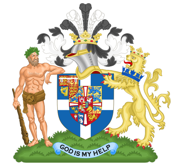
This coat of arms combined the coat of arms of the royal house of Greece, into which Prince Philip was born, those being Greece with an inescutcheon of the royal arms of Denmark because that family, Oldenburg-Glücksburg, was also the royal family of Greece. When the Greek monarchy was established they solicited a Danish prince to become King George I of the Hellenes rather than any Greek citizen. In addition to the Greek royal arms a small inescutcheon of the arms of Princess Alice, a granddaughter of Queen Victoria, was included in dexter chief.
This coat of arms was used by him at the time he married Princess Elizabeth of York and was created Duke of Edinburgh.
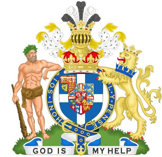
However, in 1949 the College of Arms revised the design of the Duke’s coat of arms as the earlier design was deemed too busy. They came up with the design currently in use which combines quarters for Denmark, Greece, Battenberg (because his mother, Princess Alice, was also a Battenberg, a name later changed to Mountbatten which is the family name used by Prince Philip and assumed by him when he became a naturalized British citizen and renounced any claim to his Greek and Danish titles) and the arms of the city of Edinburgh for his title.
However, just for fun, because this is how heraldists have fun, I drew up a rough little sketch and cut-and-pasted it together with a black and white drawing of the Duke’s original arms to depict something of what I might have proposed for the design of the arms of HRH in 1949 when it was decided to try and simplify the achievement.
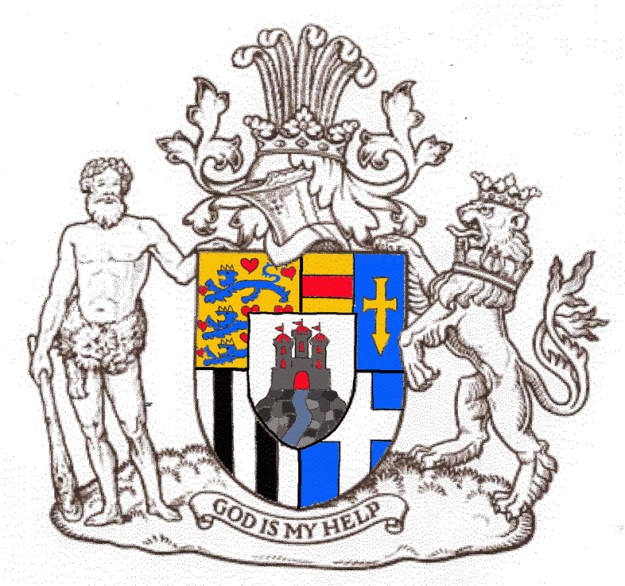
Here I have combined quarters for Denmark (1) and Greece (4) reflecting that he was born a Prince of Greece with Danish ancestry. There is also a quarter (2) depicting what is usually on the smallest inescutcheon of the Danish royal arms, namely, the dynastic arms of Oldenburg-Glücksburg, the cadet branch of Oldenburg which succeeded to the Danish throne and the paternal family of Prince Philip. I have included a quarter for Battenberg for his maternal family. Finally, the allusion to his title of Edinburgh is placed on an inescutcheon overall. It’s not as simple as the Duke’s current arms but it is still a simplification over the arms he originally bore and it displays connections to the countries of his origin as well as the family arms of both sides of his family while including a mention of his title. It was just a bit of fun.
The Rev. Kenneth Howell, 59, a priest of the Archdiocese of Brisbane has been appointed Titular Bishop of Thamugadi and Auxiliary Bishop of Brisbane by Pope Francis. He will be ordained on June 14.
His coat of arms (below), designed by me in collaboration with Mr. Richard d’Apice, AM, KCHS of the Australian Heraldry Society, employs a field borrowed from arms associated with “Howell” and also pick up on the theme of light and darkness in association with the cross of Christ. The escallop shell is a symbol of St. John the Baptist because the bishop-elect was ordained a priest on the eve of the Nativity of St. John.
The motto translates to, “Prepare the Way For Him”. The arms were rendered by Mr. Sandy Turnbull, also of the Australian Heraldry Society.

On May 3, the Feast of Ss. Philip & James, the Most Rev. Timothy Harris (54), a priest of the Archdiocese of Brisbane, was ordained a bishop in the Church and installed as the 6th Bishop of Townsville, Australia.
His personal arms, impaled with those of the diocese, make allusions to his family name (the crescent), his baptismal patron (the plates representing stones as a symbol of St. Timothy) and Pope Francis who appointed him a bishop and whose emphasis on mercy the bishop wishes to incorporate into his own ministry (the sprig of spikenard).
His arms were designed by me in close collaboration with Mr. Richard d’Apice, AM, KCHS and rendered by Mr. Sandy Turnbull, both members of the Australian Heraldry Society.

On February 22, the Feast of the Chair of St. Peter, the Most Rev. Gregory Homeming, of the Order of Discalced Carmelites (58) was ordained a bishop in the Church and installed as the 6th Bishop of Lismore, Australia.
His arms (below) reflect his membership in the Carmelite Order as also employ a symbol of St. Gregory the Great, a crane in its vigilance.
The bishop’s personal coat of arms were designed by me in collaboration with Mr. Richard d’Apice, AM, KCHS and rendered by Mr. Sandy Turnbull, both members of the Australian Heraldry Society.

On March 17 last The Most Rev. Jeffrey Haines and The Most Rev. James Schuerman were ordained to the episcopate to serve as Auxiliary Bishops of Milwaukee. Their newly assumed coats of arms (by Deacon Paul Sullivan) display, for a refreshing change, choices on the part of new bishops that result in clear, simple and distinctive coats of arms. Those of Bp. Schuerman appear to have been inspired by those of St. Francis de Sales but contain enough heraldic differencing to make them his own. These are both good examples of nice coats of arms.

Bishop Haines’ Coat of Arms
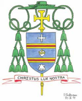
Bishop Schuerman’s Coat of Arms
On March 7 the Most Rev. Oscar A. Solis, formerly Auxiliary Bishop of Los Angeles, was installed as the 10th Bishop of Salt Lake City, Utah. The first Filipino-American to head a diocese is now the shepherd of a diocese covering the entire state of Utah, famous for being “Mormon country”. His handsome coat of arms which refers to both the Filipino flag and to his surname, Solis, meaning “of the sun”, is now in place over the cathedra in the very beautiful cathedral of the Madeleine. This has the distinction of being one of the loveliest cathedrals in the United States.

Here is the coat of arms of the Very Rev. Fr. Donald Richardson, BTh, STB, MA, KCHS who is presently the Dean of the Cathedral and Basilican Church of the Immaculate Mother of God, Help of Christians more commonly known as St. Mary’s Cathedral in Sydney, Australia. He has long been armigerous being a heraldry enthusiast himself and the cathedral church has made use of a corporate coat of arms different from that of the Archdiocese for a long time. When he was appointed Dean I told him I would prepare a nice emblazonment with his own arms impaled with the cathedral arms.
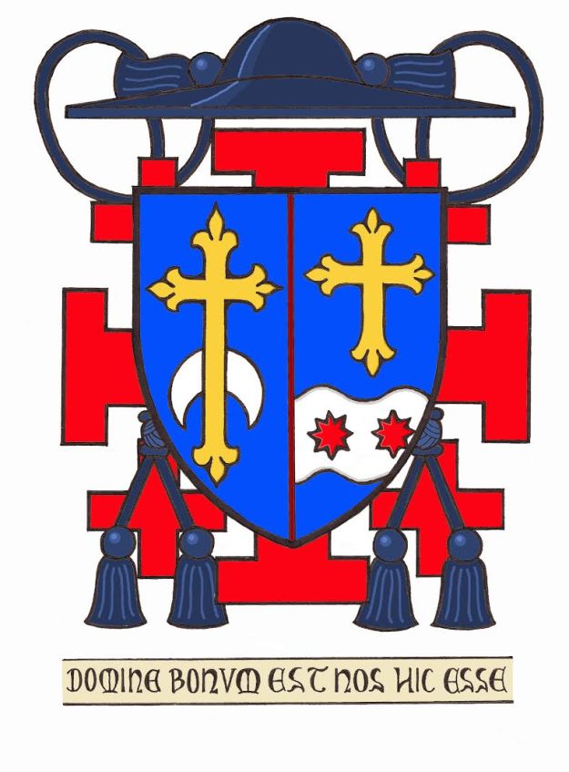
Because his personal arms are so similar to the arms of the cathedral I chose to use a line of separation in a color other than black since black wouldn’t provide a clear enough separation. There’s nothing wrong with this. many other artists and authors have advocated it as well. (See: Carl Alexander Vov Volborth’s works, Heraldry: Customs, Rules and Styles and The Art of Heraldry)
In addition, while Fr. Richardson does not possess a Roman Honor his arms are ensigned with the galero used for what is collectively known as “Minor Officials” which would include cathedral deans and/or rectors, rectors of shrine churches or seminaries, basilica rectors, Vicars Forane, Religious Superiors, etc. This galero has two tassels pendant on either side of the shield and they may be shown hanging one below the other or, as here, side by side from a median knot. Father will bear these arms “pro hac vice”, that is to say, during his tenure as Dean of the Cathedral only.
The cross of Jerusalem is included in the achievement to note that he is a Knight Commander in the Equestrian Order of the Holy Sepulchre. The motto means, “Lord, It Is Good For Us to Be Here” (Matt. 17:4)
In January several new Auxiliary Bishops have been ordained in the USA. Their choices regarding armorial bearings have been, shall we say, underwhelming. I am not commenting on the quality of the artwork, at least not for the moment. This post is concerned with the content and composition of these coats of arms from a heraldically correct viewpoint. Let’s have a look.
Most Rev. Timothy Freyer, Auxiliary of Orange, CA (ordained January 17)

Meh.
Most Rev. Mark Brennan, Auxiliary of Baltimore, MD (ordained January 19)

Busy.
Most Rev. Adam Parker, Auxiliary of Baltimore, MD (ordained January 19)

Gag. (and not entitled to the quarter of the Order of the Holy Sepulcher)
Most Rev. Gerard Battersby, Auxiliary of Detroit, MI (ordained January 25)

Yuck.
Most Rev. Robert Fisher, Auxiliary of Detroit, MI (ordained January 25)

Blech.
Uh-Oh!
Not quite, Trenton. On February 19 the church of St. Robert Bellarmine in Freehold, NJ was designated the Co-Cathedral of the venerable diocese of Trenton. The reasons for Bishop O’Connell requesting the designation of a co-cathedral, something usually reserved for diocese with a dual or twin seat of the bishop (such as Altoona-Johnstown, PA or Springfield-Cape Girardeau, MO) are of no concern here. The bishop desired it, his consulters concurred and the Holy See gave its permission.
However, during the ceremony elevating the 1,000 seat suburban parish church to co-cathedral one of the elements of the ritual, including the blessing of a new cathedra for the bishop, was the handing over of a new coat of arms for the co-cathedral (below).
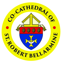
The design uses the arms of the See of Trenton which, as I have always said, is probably one of the nicest and most heraldically correct coats of arms of any diocese in the USA. The only addition was to add a chief with the pine cones taken directly from the arms of St. Robert Bellarmine himself.
Some might wonder why a church would need a coat of arms? Actually, it is quite common for churches, both parish churches and cathedral churches, to make use of corporate arms of their own. In fact, in many places the cathedral church incorrectly assumes that it has the right to employ the arms of the diocese as its own since it serves as the seat of the bishop of that diocese. Such an assumption is actually incorrect. The arms of the diocese cannot be used by the cathedral church, chapter or parish as also “theirs”. So, the idea of a separate coat of arms for the co-cathedral parish is a perfectly good one.
I note that the mother church of the diocese of Trenton, the cathedral of St. Mary of the Assumption, does not seem to make the mistake of employing the arms of the See of Trenton as their own. Indeed, it does not seem to make use of any coat of arms. So, this begs the question, “Why does the co-cathedral need its own coat of arms when the actual cathedral does not use one?”
I think the design of the new arms is a good one. It still maintains a sense of clarity and simplicity, clearly identifies with the diocese, and makes good use of charges from the armigerous patron saint of the place.
However, the problem is in the external ornament. The shield is surmounted by a mitre. Here, a similar mistake to a cathedral simply stealing the arms of the diocese has occurred. Someone involved in the design of this coat of arms just assumed that as a cathedral church the mitre is the most appropriate external ornament to adorn the shield. In heraldry the mitre is used, in some places still, to denote the arms of a bishop and in most places the arms of a diocese…not a cathedral. Just as a cathedral cannot simply make use of a diocesan coat of arms, similarly, a co-cathedral cannot usurp the ornaments proper to the corporate arms of a diocese. Quite unintentionally the person who designed this has created arms for a new diocese!
As is the case with the corporate arms of any church it should make use of the shield alone and, possibly, a motto if desired. There is no crest, no mitre, no crozier or cross, indeed, no external ornament to denote the arms of a cathedral or co-cathedral. Once again, rather than consulting with someone knowledgeable a person, or persons, just struck out on their own, extrapolated from what they had seen elsewhere…and got it WRONG!
I find this kind of ignorance annoying, appalling and fairly commonplace, especially when it comes to the Catholic Church in the United States.
The Right Reverend and Right Honorable Richard Chartres, KCVO, ChStJ, PC, FSA will be stepping down this month after twenty-two years as Bishop of London, the third most senior position in the hierarchy of the Church of England.
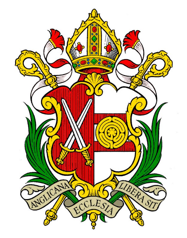
His coat of arms (above) depicts the arms of the See of London with its two crossed swords as an allusion to its patron, St. Paul impaled with his personal arms which depict a charge of a labyrinth. This, in my opinion, is a clever way to do a kind of canting arms the medieval labyrinth being a famous feature on the floor of Chartres cathedral.
Thanks to one of my regular correspondents for this fine image of the Bishop’s coat of arms.
Here is the version of the coat of arms of Bp. John O. Barres of Rockville Centre, NY published by the diocese.
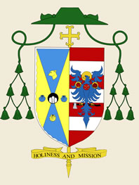
Hmmmmm…as one correspondent has already pointed out the blazon says that the bishop’s personal arms have a field that is “barry of six” yet seven are depicted here. In addition, the arms of the See are blazoned as having a bordure wavy but that is barely discernible.
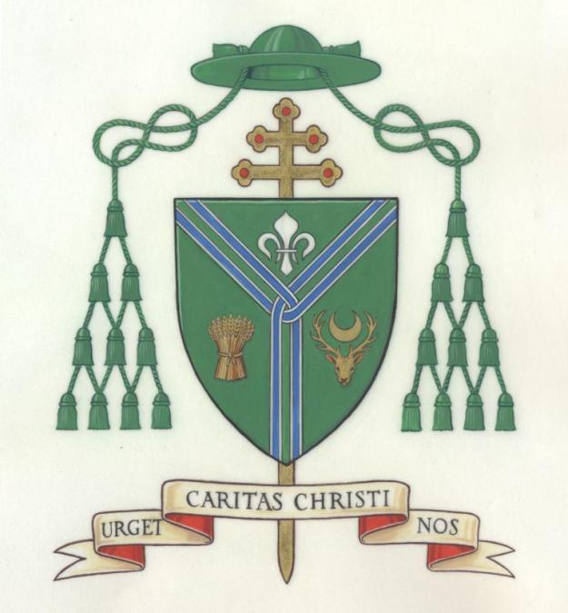
From the most recent College of Arms Newsletter: A grant of Arms was made by Letters Patent of Garter and Clarenceux Kings of Arms dated 14 October 2016 to George STACK, Archbishop of the Roman Catholic Archdiocese of Cardiff.
College reference: Grants 179/343. The blazon reads:
“Arms (illustrated below): Vert a Pall parted and fretted each piece Argent voided Azure between in chief a Fleur-de-lys Argent in the dexter a Garb and in the sinister a Stag’s Head caboshed a Crescent between the attires Or.”
On January 15 the Most Rev. James Johnston of Kansas City-St. Joseph, Missouri bestowed the abbatial blessing on the Rt. Rev. Benedict Neenan, OSB, the tenth abbot of Conception Abbey who was elected by the members of his community in November, 2016 to succeed Abbot Gregory Polan who had been elected as the Abbot Primate of the Benedictine Confederation.
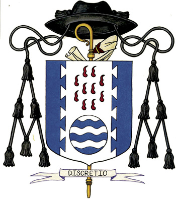
Abbot Benedict’s coat of arms, assumed upon election, are blazoned and explained as:
“Blazon: A field azure, a Canadian pale argent dovetailed, in chief ten goutte de sang (gules) (palewise two, three, three, two), in base a fountain (a roundle barry wavy argent and azure).”
The main charges of the shield (escutcheon) have particular significance for Abbot Benedict and his ministry to the monastic community. The circle with blue and white waves is called a fountain, and symbolizes the abbot’s hometown, Kansas City, the City of Fountains. The 10 blood droplets (goutte de sang) above it represent the self-sacrificial office of the abbot for the community. Ten droplets signify that he is the tenth abbot of Conception Abbey, which was founded in 1873. Abbot Benedict holds a doctorate in Church history and the two main charges —the fountain and the blood droplets — taken together evoke the Paschal Mystery that birthed the Church and which is the center of all human history, for “This is the one who came through water and blood, Jesus Christ, not by water alone, but by water and blood.” (1 John 5:6) Again, both the fountain and blood drops suggest baptism; the monastic life is often called a “second baptism” due to its deepening of the commitment to baptismal vows.
The white (argent or silver) division of the shield vertically is bordered in a dovetail pattern, calling to mind furniture joints. This alludes to the abbot’s training as a woodworker in Bavaria. The blue (azure) on either side of the central white composition represents the Blessed Virgin Mary. A traditional devotional image of the Virgin is the Madonna of Mercy, in which she spreads her mantle as protection over a group of the faithful. This symbolizes the patroness of the abbey’s protection over its monks.
-from the website of “The Catholic Key“.
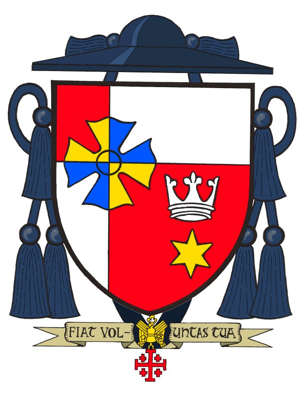
The arms (above) I recently devised for an American priest who lives and works in the USA but who, in addition to his pastoral responsibilities at home, was honored by being named an Honorary Canon of the Collegiate Chapter of the Basilica of St. Florian in Krakow.
The arms are:
Quarterly skewed to the dexter Gules and Argent; at the cross point a cross of St. Florian counterchanged Or and Azure; in sinister base above a mullet of six points Or an open crown Argent. Suspended below the shield is the badge of the Equestrian Order of the Holy Sepulcher. The shield is ensigned by the galero of a Canon Sable with cords and six tassels in two rows of one and two respectively Sable. On a scroll below the shield is the motto, “Fiat Voluntas Tua” (Let it Be Done According to Your Will).
The principal colors of the field are the Polish national colors and the division of the field alludes to the off-center cross found in the arms of St. John Paul II (who raised St. Florian Church, his own first priestly assignment, to the rank of a basilica). the cross associated with St. Florian himself is superimposed over the cross point and is colored in blue and gold counterchanged to avoid the tincture violations. These colors are also found in the arms of St. John Paul II.
In the lower right there is a six pointed star to symbolize Our Lady and it is crowned with an open crown alluding to Mary’s Queenship, the patroness of the armiger’s home diocese.
The black galero with black cords and six black tassels indicates the bearer is a cleric with the rank of Canon, in this case, a Collegiate Canon. Being a Knight of the Holy Sepulcher he also chose to display the badge of that Order pendant below the shield from a black ribbon.
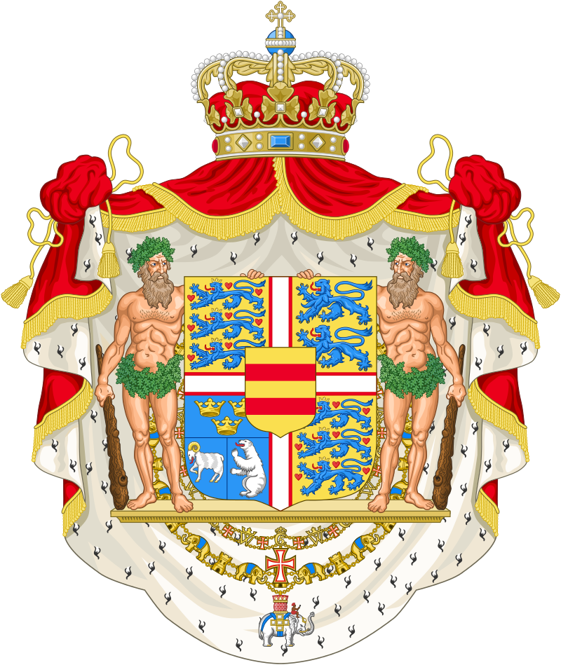
Best Wishes to Queen Margrethe II of Denmark on the 45th anniversary of her accession 1972 – 2017.
Fr. Guy Selvester's blog of Ecclesiastical Heraldry
Fr. Guy Selvester's blog of Ecclesiastical Heraldry
Fr. Guy Selvester's blog of Ecclesiastical Heraldry
Fr. Guy Selvester's blog of Ecclesiastical Heraldry
Fr. Guy Selvester's blog of Ecclesiastical Heraldry
Fr. Guy Selvester's blog of Ecclesiastical Heraldry
Fr. Guy Selvester's blog of Ecclesiastical Heraldry
Fr. Guy Selvester's blog of Ecclesiastical Heraldry
Fr. Guy Selvester's blog of Ecclesiastical Heraldry
Fr. Guy Selvester's blog of Ecclesiastical Heraldry
Fr. Guy Selvester's blog of Ecclesiastical Heraldry
Fr. Guy Selvester's blog of Ecclesiastical Heraldry

