Category Archives: Bad Heraldry

Detroit Coat of Arms Redesign: EPIC FAIL

By now so many people have seen the redesign of the archdiocesan coat of arms undertaken by the Archdiocese of Detroit and unveiled last Saturday (below, right).

Detroit

Where does one even begin? Perhaps a good place to start is by saying that this was done in conjunction with the release of Archbishop Vigneron’s post-synodal pastoral letter entitled, “Unleash the Gospel”. This letter addresses issues that arose during the archdiocesan synod and outlines the pastoral approaches to be implemented by the archdiocese as it faces the future. As a part of this entire effort someone had the idea that redesigning the coat of arms to reflect the current “realities” of the archdiocese and certain aspects of the archdiocese’s identity would be a good idea. I suppose the thinking was that with a new approach should come a new symbol. The archdiocese’s Moderator of the Curia, Msgr. Robert McClory, who was in charge of the redesign, said, “Initially, we thought about, ‘What is the identity of the archdiocese?’ When people think of the Archdiocese of Detroit, what do they think of, and what visuals are connected to that?”

So, it seems clear that this jettisoning of the former coat of arms and redesigning an entirely new one was done with all the very best of intentions. That seems abundantly clear and, I think, it’s worth pointing out and keeping in mind. There was no malicious iconoclasm motivating a desire to discard outmoded symbolism. Rather, there seems to have been a sincere effort to look to the future in a positive manner with a symbol for the local church that would be more evocative to both members of that local community and those outside of it as well. They were trying to do something good, and new, and fresh.

More is the pity. It is precisely all these good intentions that underscores the appalling ignorance with which this process, in the works for more than a year, proceeded. An article in the archdiocese’s publication, “The Michigan Catholic” indicates the following:

“Archbishop Vigneron consulted with a wide range of people, including laity and the archdiocesan Presbyteral Council, before deciding to go ahead with the changes, Msgr. McClory said. While the archdiocese enlisted the help of a Cleveland-based design firm for the project, the process also benefited from Archbishop Vigneron’s experience redesigning the coat of arms of the Diocese of Oakland, Calif., where he served as bishop from 2003-09.”

Apparently, the Archbishop’s previous experience left him feeling confident in doing a wide and varied consultation with just about everyone, except someone well versed in the customs, rules and traditions of good heraldic design. That really baffles me. In these days even a simple Google search will easily yield at least some possibilities of contacting a group or individual who has some knowledge or expertise in designing a coat of arms. Consulting such a person or group really wouldn’t be so difficult. I have to ask why it was deemed important to solicit the opinions of laity and the Presbyteral Council? What experience or learning do they possess that would enable them to determine a good heraldic design? I can appreciate the Archbishop’s desire to avoid making such a change by episcopal fiat and to seek the input of various people in his archdiocese. Nevertheless, the way to design or redesign a coat of arms is not by committee. I think the end result is clear evidence of that.

What they have come up with is, simply put, bad. The artwork is cartoonish and dated. The overall composition bears little to no resemblance to anything remotely like a coat of arms. The mitre on top has the appearance more of a royal crown than an episcopal mitre. The confusing miss-mash of charges float all over the place on the field. You cannot simply take a bunch of logo-like symbols, slap them onto a shield and call it “heraldry”!

Most of all, however, I think the epic fail has its origins in a basic misunderstanding of the nature and purpose of a coat of arms in the first place. Monsignor McClory goes on to say:

“A major difference between the old coat of arms and the new, Msgr. McClory said, is one’s ability to tell the story of faith using its symbols: Starting with the Old Testament in St. Anne and continuing through the revelation of the New Testament through her daughter, Mary, one comes to Christ through the waters of baptism and is invited through the open doors of the Church to bring others with them to their ultimate fulfillment with the Father, Son and Holy Spirit in heaven. I think you can really tell a story with this. You can’t do it with the old coat of arms.”

And there you have it. Once again, because something is connected to the Church it becomes about “telling a story”, or “tracing a history”. Not everything connected to the Church has to be a catechetical tool; not everything is a means of evangelization. Just as a personal coat of arms is not supposed to be one’s pictorial C.V.  so, too, a corporate coat of arms is not supposed to be a visual mission statement or pictorial history.

Heraldry was developed as a means of creating a unique identifying mark. Full stop.

In addition, because even modern heraldry still hearkens back to the medieval period in which heraldry has its origins there is supposed to be both a timelessness and a sense of permanence to heraldry. It’s quite wrong to change a coat of arms simply because it was designed and adopted in a different time and because the thinking has changed about what should be on it. A coat of arms doesn’t have to “tell a story”; it doesn’t have to “reflect present realities”; it is supposed to be immutable. Since it becomes the identifying mark of the individual or corporate body that uses it the permanent character of it must be respected.

That is not to say that there are no instances of changes being made to a coat of arms. Even within the science of heraldry itself techniques such as marshaling (combining two or more coats of arms on the same shield), augmentation (adding a new element to an existing coat of arms to reflect an honor, event or accomplishment) and differencing (slightly changing an initial design to indicate its use by a relative, descendant, or protégé) exist to make changes within the accepted framework of heraldic custom and practice. But, simply throwing out the former coat of arms and redesigning the thing from scratch is foreign to the nature of heraldry. Let me be clear: it is sometimes done and whenever it is, it is always wrong.

Rather, the archdiocese has fallen victim to a not uncommon phenomenon present today. That is, equating heraldry with a logo. Corporate logos frequently change. Whether it’s to mark the takeover of the corporate body by another, or simply to refresh and renew the artwork, or to indicate the corporate body embarking on a new phase or vision the transitory nature of corporate logos almost necessitates their periodic updating or full-scale redesign. I note that the archdiocese consulted with a Cleveland based design firm. But, what does this firm know of heraldry? How much experience do they have designing a heraldic achievement? I would hazard a guess that its very little compared with their experience of coming up with a first time logo or doing a redesign for a group interested in “re-branding”. But, a coat of arms is neither a logo nor a brand.

The simplest solution to their present situation would have been to leave their diocesan coat of arms alone and design a logo which would be used not only for the roll out of this most recent pastoral letter and the ensuing archdiocesan efforts at implementing it but could have also become the favored symbol used by the archdiocese in place of the coat of arms. Things like letterhead, signage, etc. could easily have borne this newer logo and simply ignored the coat of arms. Its not the solution that those of us who prefer heraldry might like but it certainly is far from unprecedented. Numerous ecclesiastical institutions have desired a symbol that was considered more in keeping with the times. They have chosen to respect the existence of a previously adopted coat of arms and merely make minimal use of it in favor of the newer logo they have adopted as more fitting to their situation.

The Archdiocese of Detroit could have done the same. They could have tried, with the help of a competent heraldic designer, to truly re-design the present coat of arms. They could have, for example retained the gold field, the black cross and three gold stars on the cross and removed the antlers and martlets. Then in those now empty quadrants they could have placed charges symbolic of what they desired. They could have augmented the current coat of arms by means of placing a smaller shield at the center of the design bearing whatever symbols they wanted. They could have adopted a kind of heraldic badge (a symbol composed of heraldic charges but separate from a shield) and used that in conjunction with the archdiocesan coat of arms as well as had new artwork prepared for both. They could have decided to adopt an archdiocesan logo to be used instead of the coat of arms while leaving the former alone.

Instead, they chose the ill-advised path of completely throwing out the coat of arms first adopted 80 years ago and used regularly throughout the archdiocese in many ways and in many places, and coming up with an entirely new design, poorly executed, which bears little to no resemblance to the original and destroys any visual continuity with what had been used.

It has been announced that over time the former coat of arms will slowly but systematically be expunged and the Archbishop plans to have a new rendering of his own coat of arms impaled with this mess. I think that’s a very bad idea. Rather, if he wishes no longer to use the older archdiocesan arms the Archbishop should simply use his personal arms on the shield alone. That way, if his successor wishes to correct this error and revert to the former coat of arms he can do so easily.

I suppose that it shouldn’t really come as a surprise that this kind of thing happened considering what the archdiocese did to redesign what had been its beautiful cathedral of the Most Blessed Sacrament. Much of that renovation is quite nice (I’m thinking in particular of the floor of the sanctuary) but most of it doesn’t fit at all with the style of a neo-gothic structure. Once again in the interest of “updating” the archdiocese has an epic fail on its hands. What I find particularly sad is the failure isn’t because of a difference of opinion regarding taste. Rather, the fail occurred because of inexcusable ignorance of the subject at hand. They simply don’t get what a coat of arms is supposed to be. What they’ve ended up with is unheraldic and ugly.

A Gallery of Banality

In January several new Auxiliary Bishops have been ordained in the USA. Their choices regarding armorial bearings have been, shall we say, underwhelming. I am not commenting on the quality of the artwork, at least not for the moment. This post is concerned with the content and composition of these coats of arms from a heraldically correct viewpoint. Let’s have a look.

Most Rev. Timothy Freyer, Auxiliary of Orange, CA (ordained January 17)

freyer

Meh.

Most Rev. Mark Brennan, Auxiliary of Baltimore, MD (ordained January 19)

Print

Busy.

Most Rev. Adam Parker, Auxiliary of Baltimore, MD (ordained January 19)

Print

Gag. (and not entitled to the quarter of the Order of the Holy Sepulcher)

Most Rev. Gerard Battersby, Auxiliary of Detroit, MI (ordained January 25)

battersby_coat_of_arms_thumbnail

Yuck.

Most Rev. Robert Fisher, Auxiliary of Detroit, MI (ordained January 25)

fisher_coat_of_arms_thumbnail

Blech.

Trenton Co-Cathedral

Uh-Oh!

Not quite, Trenton. On February 19 the church of St. Robert Bellarmine in Freehold, NJ was designated the Co-Cathedral of the venerable diocese of Trenton. The reasons for Bishop O’Connell requesting the designation of a co-cathedral, something usually reserved for diocese with a dual or twin seat of the bishop (such as Altoona-Johnstown, PA or Springfield-Cape Girardeau, MO) are of no concern here. The bishop desired it, his consulters concurred and the Holy See gave its permission.

However, during the ceremony elevating the 1,000 seat suburban parish church to co-cathedral one of the elements of the ritual, including the blessing of a new cathedra for the bishop, was the handing over of a new coat of arms for the co-cathedral (below).

Print

The design uses the arms of the See of Trenton which, as I have always said, is probably one of the nicest and most heraldically correct coats of arms of any diocese in the USA. The only addition was to add a chief with the pine cones taken directly from the arms of St. Robert Bellarmine himself.

Some might wonder why a church would need a coat of arms? Actually, it is quite common for churches, both parish churches and cathedral churches, to make use of corporate arms of their own. In fact, in many places the cathedral church incorrectly assumes that it has the right to employ the arms of the diocese as its own since it serves as the seat of the bishop of that diocese. Such an assumption is actually incorrect. The arms of the diocese cannot be used by the cathedral church, chapter or parish as also “theirs”. So, the idea of a separate coat of arms for the co-cathedral parish is a perfectly good one.

I note that the mother church of the diocese of Trenton, the cathedral of St. Mary of the Assumption, does not seem to make the mistake of employing the arms of the See of Trenton as their own. Indeed, it does not seem to make use of any coat of arms. So, this begs the question, “Why does the co-cathedral need its own coat of arms when the actual cathedral does not use one?”

I think the design of the new arms is a good one. It still maintains a sense of clarity and simplicity, clearly identifies with the diocese, and makes good use of charges from the armigerous patron saint of the place.

However, the problem is in the external ornament. The shield is surmounted by a mitre. Here, a similar mistake to a cathedral simply stealing the arms of the diocese has occurred. Someone involved in the design of this coat of arms just assumed that as a cathedral church the mitre is the most appropriate external ornament to adorn the shield. In heraldry the mitre is used, in some places still, to denote the arms of a bishop and in most places the arms of a diocese…not a cathedral. Just as a cathedral cannot simply make use of a diocesan coat of arms, similarly, a co-cathedral cannot usurp the ornaments proper to the corporate arms of a diocese. Quite unintentionally the person who designed this has created arms for a new diocese!

As is the case with the corporate arms of any church it should make use of the shield alone and, possibly, a motto if desired. There is no crest, no mitre, no crozier or cross, indeed, no external ornament to denote the arms of a cathedral or co-cathedral. Once again, rather than consulting with someone knowledgeable a person, or persons, just struck out on their own, extrapolated from what they had seen elsewhere…and got it WRONG!

I find this kind of ignorance annoying, appalling and fairly commonplace, especially when it comes to the Catholic Church in the United States.


Archbishop Etienne’s Mistake

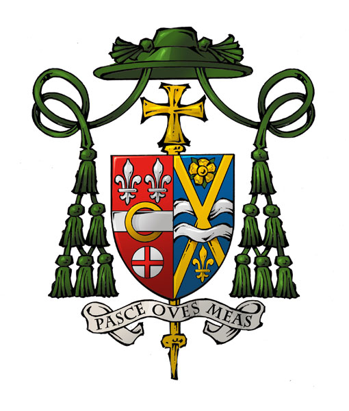
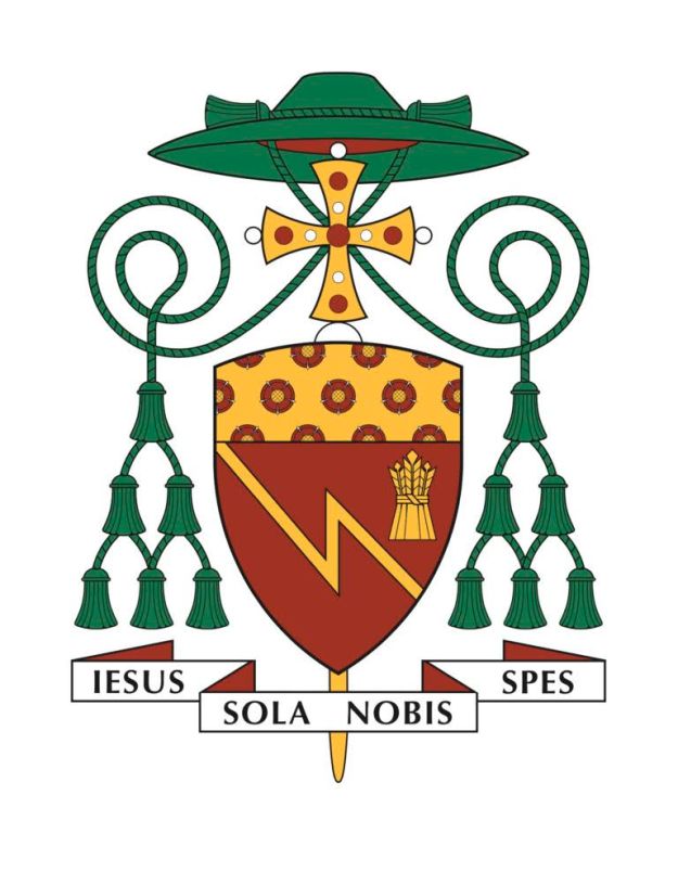
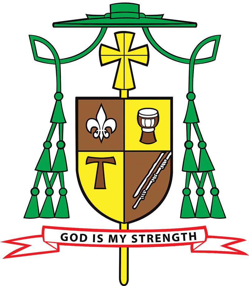
On November 9, 2016 the Most Reverend Paul D. Etienne was installed as the fourth Metropolitan Archbishop of Anchorage, Alaska. Since December of 2009, the 57-year-old Indiana native had been serving as the Bishop of Cheyenne, Wyoming. At the time of his election as a bishop he assumed a coat of arms which he bore during his tenure as Bishop of Cheyenne:

anc

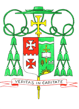
The design was, in my opinion, a bit crowded and fell victim to the usual problem with most of the heraldry of the American hierarchy. Namely, he tried to include too much. Time and time again I warn on this blog and elsewhere against the practice of trying to have a coat of arms be a “CV in pictures”. Sadly, that advice seems to frequently go unheeded.

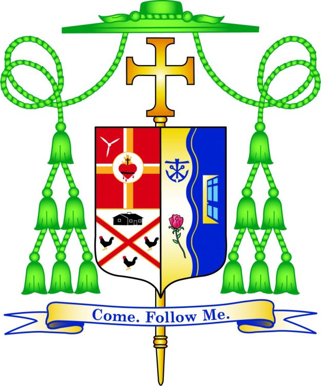
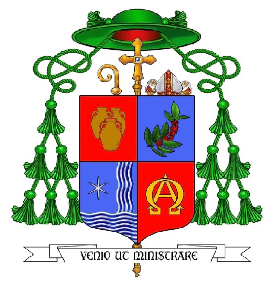
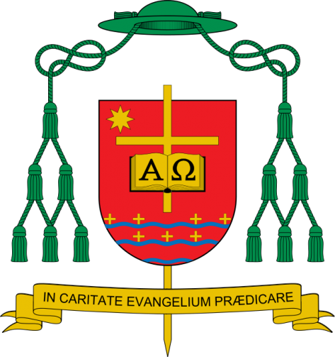
I noticed that when His Excellency was translated and promoted to Anchorage that he has assumed a new personal coat of arms:

anc2

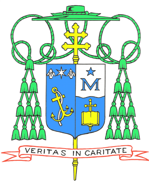
I must say that the overall design is surely more simple and more clear. In addition, it seems apparent that upon further reflection he realized that he had included too many charges and decided that there were, indeed, some he could live without. I think its unfortunate that he decided to discard the green field because just as it contrasted so nicely with the red-dominated arms of the See of Cheyenne, similarly, the contrast with the predominantly blue arms of the See of Anchorage would have been more striking.

The overall appearance of the coat of arms as it is now is most definitely better. However, the “mistake” I believe the archbishop has made is in entirely changing the original design. He has, in fact, assumed a second new coat of arms. Many prelates feel that when they change assignments that this is a perfectly acceptable practice. It’s as if “a new coat of arms for the new job” is their thought. In addition, after having assumed arms originally, often hastily because of the unfortunate expectation that a bishop in the USA will have his coat of arms prepared and ready to be displayed at the time of his ordination and/or installation, which is an unreasonable and unnecessary expectation, the armiger has had a chance for second thoughts and wishes to make modifications. But there is a problem.

You CANNOT.

That is to say, you really REALLY shouldn’t. A coat of arms isn’t a “logo” which companies often feel free to update, modify or even discard in favor of a new one. A coat of arms is a personal mark of identification and it becomes identified with the particular armiger to whom it belongs. In places like the USA where arms are not granted by a heraldic authority but are legally and quite appropriately assumed (i.e. adopted) great care must be taken to design a coat of arms with which the armiger is happy at the time they are assumed and made public.

In the case of a bishop the personal arms should not be designed to harmonize with the arms of the See with which they will be impaled for the simple reason that bishops sometimes move and re-designing the personal arms to “go better” with the arms of the See is ill-advised. (see the three different versions of the personal arms borne by Cardinal Cupich of Chicago or Bishop Libasci of Manchester, NH. Cardinal O’Brien, the Grandmaster of the Order of the Holy Sepulcher has changed his coat of arms no less than four times!). Part of the problem is the truncated timeline with which so many bishops have to contend when the design process begins. It is not unheard of for there to be as little as six weeks in between the announcement of his appointment and the ordination/installation. The poor heraldic designer must then contend with constant pressure from diocesan officials and committee members demanding the finished artwork for use on things like invitations, programs and in press packets.

But, designing a good coat of arms takes time. Frequently the designer and the armiger will go through three or four sketches (or more) before settling on a proper design. More frequently because of the time constraint (and occasionally because of a complete lack of interest in the subject on the part of the new bishop) something deemed to be “good enough” is cobbled together in a slap-dash manner and the result is, at best, a less-than-perfect design and, at worst, downright ugly and/or ridiculous!

When designing a coat of arms for someone who is not on a three week deadline I often encourage them to use what is jokingly referred to as “the refrigerator test”. That is, they are asked to take a sketch of the coat of arms and put it somewhere, like their refrigerator, where they will see it everyday. The idea is to live with it for a time and keep seeing it over and over to see if the initial ideas have staying power. In the case of Archbishop Etienne such a test might have enabled him to see that the original design was cluttered and that those things he wanted to represent in his coat of arms could have been done with a simpler design. Part of the solution here is to abandon the idea that a new bishop’s coat of arms must be available immediately, in a manner of weeks, and in time for his ordination/installation. I can assure you that in places where arms are granted by a heraldic authority such an authority feels no obligation to do their work with such a ridiculous deadline. There is absolutely nothing that requires a bishop’s coat of arms to be finished and ready by the day of his ordination/installation. A few more weeks to get it right won’t kill anybody.

Part of this problem could be solved by bishops seeking the advice of those competent and well-versed in the principles, customs and traditions of good heraldic practice. More often than not they don’t. They need to stop turning to the myriad of lawyers, engineers, seminarians and other enthusiasts who have read “a whole book” on heraldry and have declared themselves to be “expert” in heraldic design. In addition, the computer age has also led to the advent of a plethora of the heraldic equivalent of the singer/songwriter: those people who are competent artists but who don’t really know the first thing about heraldry or its rules. They can create really nice artistic renderings but should be collaborating with a competent designer instead of trying to do it all. Expertise in DESIGNING a coat of arms and in DEPICTING that design are two very different things.

Finally, it has to be said that, in the Church anyway, it is unfortunate that those who make the most use of heraldry, prelates, are frequently the ones who both know the least about it and also frequently have little interest in learning about its proper use and application. (You know, once they make you a bishop they take the bone out of your head that allows you to remember you can occasionally still be taught something). As mentioned above, a coat of arms can’t simply be changed after several years because one feels like it. Despite the fact that it belongs to the armiger and, in many cases, was devised by him as well as adopted by him he is not free capriciously to change the design on a whim especially not after having borne a particular coat of arms for years. It is akin to deciding to use an alias after years of being known as something else. While there is no “heraldry police” in the Church to stop you it is, nevertheless, wrong to change the design of a personal coat of arms even when such changes result in the general improvement of the design.

Rather, the task is to have a well-designed and pleasing coat of arms the first time around and to use that same coat of arms no matter how often a bishop might be transferred to a new diocese. It is important to remember that impaling the personal arms with the arms of the See is a custom, not a requirement, and not even a universal one at that. It predominates in N. America but it is far from the usual custom throughout the world. When impalement is employed bishops need to remember that the dexter impalement (the arms of the See) does not become part of their coat of arms. Instead, by impaling there are two distinct coats of arms being displayed on one shield. It is a form of marshaling two or more coats of arms and even at that it lasts only for their tenure in that office. A bishop-emeritus of a given diocese has no right whatsoever to continue impaling his personal arms with the arms of the See once he has resigned that See.

The best process to use is the same one which circumstance forces onto those bishops who first become Auxiliary Bishops. Namely, they design and assume a personal coat of arms alone which fills the entire shield. Later, if they are promoted to be a Diocesan Bishop then they may choose to impale their personal arms with the arms of their diocese. If, by chance, such an impalement makes for an aesthetically unpleasing combination then the solution is NOT to change their personal arms (or the diocesan one for that matter). The better option would be for the bishop in question simply to bear his personal arms alone and not impale them at all. It is important, however, for the armiger to maintain that coat of arms which he first assumed and which has become identified with him as much as his signature or the appearance of his face. As already stated above even when the temptation is strong to re-design the coat of arms for the purpose of improving the design after further reflection such an impulse must be stifled and ignored. Once the arms have been assumed it is, frankly, too late. That’s why its better to be sure of what is being assumed in the first place; it cannot, and should not be changed later.

I have written in these pages extensively about the idea of employing various versions of a coat of arms to suit the occasion and/or office held. Sometimes, coats of arms receive legitimate augmentations to reflect some event or change in status. Frequently, the external ornaments in a heraldic achievement, even of a bishop, change or are added to in order to reflect an honor received. All of these are legitimate modifications. However, for a bishop who has assumed a coat of arms and several years later is then moved to a different diocese or some other such position within the Church simply to say to himself, “You know, I’ve had second thoughts about including thus-and-such in my coat of arms. If I had to do it over again I’d use something different. Let me take advantage of this change and the fact that new artwork has to be prepared to redesign the whole thing” is egregiously wrong and is, realistically, a gigantic abuse of his authority. After all, in the Church what a bishop wants is rarely questioned and even more rarely denied.

Nevertheless, it is of utmost importance to get it right the first time, that is, at the time of assuming the coat of arms. Changing it later ISN’T an option and bishops who ignore that are making a mistake.

(The artwork for Archbishop Etienne’s coats of arms is by Deacon Paul Sullivan)


Auxiliaries of Boston

On August 24, 2016 two new Auxiliary Bishops to the Archbishop of Boston will be ordained. Their coat of arms are below for

The Most Rev. Robert Reed, Titular Bishop of Sufaritanus

reed

The Most Rev. Mark O’Connell, Titular Bishop of Gigthensis

o'connell

Hmmmm…interesting. Pretty. Busy. Good?

The designs, accompanied by very interesting descriptions, especially for lovers of fiction, are by J.C. Noonan and the artwork is by his usual collaborator Linda Nicholson.

Bishop J. Gregory Kelly

On February 11 the Most Rev. (John) Gregory Kelly was ordained as Auxiliary Bishop of Dallas. The description of the coat of arms (from the diocesan website):

“Bishop Kelly’s arms are based on the Kelly family design where the shield is silver (white) and the charges are black. For difference, and for his deep devotion to the Blessed Virgin Mary, the chevron is now blue. The chevron is reminiscent of the mountains of Colorado, so dear to His Excellency’s youth and the chevron is charged with two estoiles (special, six pointed stars) that are taken from the mantle of the image of Our Lady of Guadalupe to remind all of the profound Hispanic influence in Texas, the “Lone Star State“, represented by the single star below the chevron. Above the chevron are a fleur-de-lis and a trefoil (the heraldic representation of a shamrock) to honor the Bishop’s Irish and French-Canadian heritage.”

Once again we see here an example of the increasingly popular (and completely WRONG!) trend of personalizing one of the external ornaments, in this case, with the addition of the triquetra on the episcopal cross (erroneously referred to as a “processional” cross in the description) to represent the Holy Trinity because it was the name of the seminary the bishop attended.

It is necessary to repeat that the only thing subject to having charges particular to the bearer is the shield. The external ornaments may NOT be personalized in a heraldic achievement of this type and all those who advocate such a practice are both incorrect and foolish! The heraldic artist is completely free, in future, to depict this bishop’s coat of arms with an episcopal cross of any shape and manner he might wish. This is what happens when armigers turn to those who do not know what they are doing for the devisal of their coats of arms.

Kelly-COA

Artwork: P. Sullivan

Paris

All the world is praying for Paris and Parisians. Their shepherd will need our prayers as well as he tries to comfort the afflicted and the grieving as well as bring aid to the wounded and the frightened. Andre Cardinal Vingt-Trois’ coat of arms is really not a coat of arms (although at least he has SOMEthing…unlike so many of his brother bishops in France) but I point it out because he, a spiritual leader and guide, needs our support and prayers. The arms themselves, rather than a motto, remind us of an important thing, especially in the face of such bald hatred and aggression: “For God so loved the world…” (that He sent His only Son to be our Redeemer) John 3:16

fm vingt-trois013

Bishop Cheri

Bishop Cheri Coat of Arms

Today Bishop Fernand Cheri, OFM was ordained as the auxiliary bishop of New Orleans, Louisiana. His coat of arms has so many things about it that go against accepted heraldic practices, to say nothing of good taste, that I won’t even begin to comment on it.

Except to say no…just…no.

Bishop Garcia

On March 3, the Most Rev. Daniel Elias Garcia was ordained as Titular Bishop of Capsus and Auxiliary Bishop of Austin, Texas. His adopted coat of arms (below) depicts his devotion to Our Lady (the roses), baptism (the shell), the Colorado River and Christ who is the First and the Last.

Dividing the field into two colors (green and gold) by a blue line isn’t really the best design choice. It would have been better if the whole field were gold. In addition, the description of the arms from the ordination program describes the “processional cross” as being in the form of a Jerusalem cross for apparently no reason. First of all it is not a processional cross. The external ornament in a bishop’s coat of arms more than any other that marks it as the coat of arms of a bishop (even more than a mitre or a galero) is the episcopal cross that stands vertically behind the shield. This type of cross, which resembles a processional cross, used to be carried directly in front of a bishop. Like the galero, also no longer in use, such episcopal crosses are no longer used but are retained as not only one of but actually as THE ensign of the coat of arms of a bishop. The galero is optional; the cross isn’t.

Second, it is not permitted to mandate that an external ornament like the episcopal cross, be depicted in a certain shape or style. The blazon concerns itself only with what is on the shield. That may indeed be mandated to be depicted in a particular way. No other artist is bound to depict the episcopal cross of Bp. Garcia’s arms as a Jerusalem cross. It may be his preference but it is not one to which others must adhere.

BishopGarciaBlazon

Another Example of What NOT To Do

herb_bp._jana_piotrowskiego.svg_

Above is the coat of arms of Jan Piotrowski who will be installed on November 29 as the Bishop of Kielce, Poland. The bishop’s arms contain perfectly good charges and are arranged nicely with good composition with one exception. The episcopal cross (often mistakenly thought of as a processional cross) which is the one external ornament that indicates the arms belong to a bishop, since other prelates may use the green galero with 12 tassels, is depicted as passing in front of the shield and piercing it with the bottom of the cross protruding from behind the shield. It is as if the cross is depicted as both a charge on the field and an external ornament at the same time. This is most incorrect. Charges must never extend beyond the edges of the shield; external ornaments should not be placed in a position to obscure any of the shield; objects cannot be depicted as piercing the shield; external ornaments are to be just that: external to the shield. I’m sure the person who designed this and/or depicted it thought he was being very clever and innovative. Instead, it’s just wrong. EPIC FAIL.

Archbishop of Kuala Lumpur

unnamed

NO! HORRIBLE!

Cut and paste artwork (much of it STOLEN from someone else!), insipid charges, poor design. An example of the WORST kind of heraldry. It’s really not heraldry at all. Just a bunch of nonsense slapped onto a shield. This kind of heraldic device reveals an arrogance and conceit not befitting a bishop.

New Primate of Poland

The new Archbishop of Gniezno, Poland, the Most Rev. Wojciech Polak, will be installed on June 7. In 1948 it was decided that the Archbishops of Warsaw would also be the Archbishops of Gniezno and, thus, Primates of Poland. These two offices were joined “in persona episcopi”. However, later in March of 1992 it was decided once again to separate the two archdioceses with each having its own archbishop. Josef Cardinal Glemp who was Archbishop of Gniezno and warsaw at the time was permitted to retain the title of Primate of Poland until he stepped down in 2009. From 2009 onwards the title Primate of Poland once again rests solely with the Archbishop of Gniezno and not with the Archbishop of Warsaw.

The arms of Archbishop Polak (below) show a simple design. However, the galero is shown with 30 green tassels instead of 20 and those tassels also appear ro have a skein of gold interwoven in them. Such a hat is used in Roman Catholic heraldry by Patriarchs, not Primates. Frequently, it is erroneously asserted that Primates are entitled to the same external ornaments as Patriarchs. This is false and untrue! So, this new Archbishop-Primate begins his tenure by claiming additaments on his coat of arms to which he has no credible claim.

Heraldry: FAIL

herb_polak


St. James Parish, Jamesburg, NJ

Image

Above is the coat of arms recently designed for St. James Parish in Jamesburg, NJ. I’m not pleased with this design but much of it is the result of what the client requested. The sad reality is that frequently the heraldic designer and/or the heraldic artist must compromise their own tastes and even their knowledge of heraldry in order to accommodate the wishes of the client who has commissioned them. This one has been a little too ambitious in its use of color and has also overcharged the shield a bit. But, the client was happy with the design.

Archdiocese of Westminster

Image

The archdiocese of Westminster (UK) recently launched the use of a new rendering of the archdiocesan coat of arms. Previously, they had used the arms of the See (Gules a pall Proper) under the galero of an archbishop with the patriarchal (double-barred) cross. This was technically incorrect as the cross and galero imply the arms of an individual archbishop rather than a corporate body like a diocese. So, that has now been rectified with the use of this new rendering that more correctly indicates this is the coat of arms of the archdiocese, rather than of the Cardinal-Archbishop.

As for the artwork: isn’t it hideous?

Bishop Myron Cotta

Earlier today the Most Rev. Myron Cotta was ordained as the Auxiliary Bishop of Sacramento, California. His newly assumed arms are below.

Image

The field is divided by an inverted chevron alluding to a carpenter’s square for St. Joseph and the San Joaquin Valley. In chief there is an amphora charged with the letters “SC” for sacred chrism. The bishop’s given name, Myron, is the Greek word for the sacred oil.

In base there appears a monogram composed of the letters “I”, “M” and “H”. This stands for (if you can believe it) the Immaculate heart of Mary with the “M” taking the most prominent place. The bishop has a great devotion to Our Lady under this title.

The motto translates to “Grace and Mercy” and is in Portuguese to reflect the bishop’s ethnicity as being from the Azores.

Well, there is an overabundance of the use of letters in this achievement. Someone clearly never heard that the use of letters in heraldry is considered port design. The “SC” on the amphora is, in my opinion, unnecessary. The amphora alone is a sufficient symbol for sacred oil. Why not actually depict the Immaculate Heart of Mary instead of abbreviating it? The monogram is an example of extremely poor design. It’s weak and not self evident where the image of the Immaculate heart would have been. In addition, since most people don’t know that the name Myron means sacred oil they will naturally assume that the gigantic “M” in the coat of arms stands for Myron and not for Mary.

This was done by Paul Sullivan. Not one of his best efforts.