Category Archives: Work of Other Artists

Two New Auxiliaries for Sydney

On August 24 two new auxiliary bishops to the archbishop of Sydney will be ordained. I had a hand in designing both of their coats of arms along with Mr. Richard d’Apice and they were rendered by Mr. Sandy Turnbull. Both of these men are members of the Australian Heraldry Society. The two bishop are The Most Rev. Anthony Randazzo (49) a Sydneysider who is a priest of the Archdiocese of Brisbane. He will be Titular Bishop of Quiza. (arms below)

unnamed

And the Most Rev. Richard Umbers (45) born in New Zealand, a priest of the Personal Prelature Opus Dei who will be Titular Bishop of Thala. (arms below)

unnamed (1)

Yet More on Variations

Again, a continuation of this examination of different versions, as opposed to merely different renderings of the exact same version, of the coat of arms of one armiger used at various times, for certain occasions, for a specific place or group or to either add to or subtract from the elaboration of the display. We turn once again to the glorious Imperial arms of the Emperor of Austria and King of Hungary, later to be the Austro-Hungarian Emperor.

First we have the “small” arms of the House of Habsburg-Lorraine (displaying the arms of Habsburg, Babenberg and Lorraine impaled together on the shield.

13726824_10208089859297016_8059400258853156733_nThe second image shows the “medium” common coat of arms of Austria Hungary with the shields of (counterclockwise): Hungary, Galicia, Lower Austria, Salzburg, Styria, Tyrol, Carinthia & Carniola, Silesia & Moravia, Transylvania, Illyria and Bohemia. This was used from 1867-1915.

13606501_10208089859537022_3033927579067141710_n
Third, we see the “small” arms of Hungary.

13710420_10208089968619749_5719039436929223007_o
Fourth is the “medium” coat of arms of Hungary also displaying: Croatia, Slavonia, Dalmatia, Bosnia & Herzegovina, Transylvania, the city of Rijeka and the Kingdom of Hungary on the inescutcheon.

13697207_10208089968819754_3587770857485161403_n
Next, the fifth example is the “medium” coat of arms of Austria.

13769496_10208089975459920_3234770813832676932_n

The sixth is the small common coat of arms of the dual monarchy from 1915-1918.

13731503_10208089975859930_5668752617993343203_n


Finally, the seventh is the “medium” common arms used 1915-1918.

13669814_10208089976179938_672822033193628970_n
One Emperor: lots of versions of his coat of arms all of which are his.

More Variety

Another in this kind of series I’m doing on single armigers with various versions of their coats of arms. This time it is Elizabeth II, well, really the British Sovereign regardless of who it is. The first is a “small” version. You can see this one carved in stone on the facade of Buckingham Palace but it shows up most frequently on Letters Patent for a grant of arms.

13731753_10208071939049021_9136040104510128688_n

The second is a kind of “middle version” and it is versions like this frequently used by the government on documents and signage.

13718545_10208071939249026_3285921401622907273_n

The third is, of course, the “large” or full armorial achievement.

13731583_10208071939409030_4300182819525115676_n

Next is the Royal arms as used in Scotland (same sovereign but a different version of the arms).

13769478_10208071939529033_8866138776720469726_n

Fifth is the Royal arms OF Scotland as opposed to the Royal arms of the U.K. as used IN Scotland.

13707621_10208071939849041_2322311429308447620_n

Finally, one used by the sovereign for the Duchy of Lancaster. (By the way even though the Queen is a woman she is still the “Duke” of Lancaster).

13781656_10208071940009045_7676893031732967063_n

St. Benedict’s Abbey, Still River

StillRiver4

The monastic community of St. Benedict in Still River, Massachusetts decided recently to modify their existing coat of arms which was originally designed by the late, great, Dom Wilfrid Bayne, OSB of St. Anselm’s Abbey in Rhode Island. The coat of arms was designed some sixty plus years ago for the St. Benedict Center on Bow and Arrow streets in Cambridge, MA which was the origin of the community that eventually grew into St. Benedict’s Abbey today. There was originally no external ornament in the achievement. The community simply bore a shield with the coat of arms.

The decision was undertaken recently to add an abbatial crozier as an external ornament to bring the achievement into conformity with what is usual for a monastery with the rank of Abbey. While it is the usual custom to depict a sudarium, or veil, pendant from the crozier in the coat of arms of an abbot usually when depicting the arms of an abbey, a corporate body, the sudarium is omitted.

Archbishop Hebda

On May 14, Bernard Hebda, former bishop of Gaylord, Michigan and, most recently Coadjutor Archbishop of Newark (due to succeed in two more months on the resignation of Abp. Myers) was instead installed as the Archbishop of St. Paul-Minneapolis, Minnesota. His arms are:

Coat-of-Arms-Archbishop-Hebda-big

The blue, seven-pointed star at the top right of the shield signifies Mary and Archbishop Hebda’s placement of his pastoral ministry under her protection. The elderberry tree symbolizes Archbishop Hebda’s Polish ancestry. The tree is widely found in southeastern Poland, from where Archbishop Hebda’s paternal grandparents emigrated. The tree’s Polish name, “bez heb,” also serves as a visual pun of “Hebda.”

The tree also has a theological meaning; as one of the first plants to show signs of life after winter, it is also used to symbolize hope for a season of fertility and graces. According to an official document explaining the blazonry of Archbishop Hebda’s coat of arms, “Being strong and fruitful, the elderberry has also been identified with constancy and pastoral zeal, fundamental traits expected of any bishop.”

The seven green berries — reminiscent of rosary beads — at the top of the tree are a sign that he was named a bishop on Oct. 7, the feast of Our Lady of the Rosary. With the additional eight berries at the bottom of the tree, the total 15 berries symbolize Mary’s assumption, celebrated Aug. 15. The Norbertine monastery in Hebdów, Poland, was dedicated to the Assumption in the 12th century, and “Hebda” was a common name among those who lived and worked on the monastery’s lands. The four clusters of fruit on the elderberry tree are a sign of the cardinal virtues — prudence, justice, fortitude and temperance — which “sustain the pastoral activity of the bishop.” [NOTE: all of the previous paragraph and the symbolism it describes is really a bit of a stretch, heraldically.]

The checked pattern on the fess is adopted from the coat of arms of the Diocese of Pittsburgh, where Archbishop Hebda grew up and was ordained a priest July 1, 1989. According to the blazonry explanation, the placement of the tree on the chequy fess “recalls that Bishop Hebda has roots in the Diocese of Pittsburgh and has drawn his strength from that local Church.”

Bishop James Checchio of Metuchen, NJ

image


On Tuesday, May 3, 2016 the Most Reverend James F. Checchio, a priest of the diocese of Camden, NJ and most recently until February of this year the Rector of the Pontifical North American College in Rome, will be ordained a bishop in the Church and installed as the fifth bishop of the diocese of Metuchen, NJ, the diocese in which I serve.

His newly adopted coat of arms is depicted, as is the usual custom in the United States for diocesan bishops, impaled with the arms of the diocese. The diocesan arms were designed in 1981 when the diocese was established and modified in 1998. The four quadrants, depicted in silver and gold, the colors of the flag of the Vatican City-State, represent the four counties of the diocese: Middlesex, Somerset, Hunterdon and Warren. The moline cross overall is taken from the arms of Trenton from which the diocese was separated in 1981. In the Trenton arms the cross is gold on a blue field. Originally, it was depicted in the Metuchen arms as black but that was changed in 1998. The red tongue of fire in the upper left alludes to both the Holy Spirit and to the name “Metuchen” which is a Lenne Lanape word meaning “land of firewood”. The crowned letter “M” in the lower right is a reference to St. John Paul II who, as pope, founded the diocese and whose arms depicted a letter “M” in the lower right corner. With the crown it is also a symbol of the Queenship of Mary, the patroness of the diocese. Originally the “M” was also black but when the late Bishop Vincent Breen asked me to undertake a redesign of the diocesan arms in 1998 the “M” was changed to blue along with the cross.

Bishop Checchio commissioned the Italian artist Renato Poletti to work with him on his personal arms and emblazon them marshaled to those of the diocese. The gold escallop shell is a reference to his baptismal patron, St. James the Greater and the silver crescent represents Our Lady under the titles of the Immaculate Conception the patroness of the cathedral of his native diocese of Camden, as well as of the Pontifical North American College and the United States of America. The chevron represents a roof beam and, as such, symbolizes protecting the flock which is the task of a bishop. The sheep and crook are an allusion to his work as rector of a seminary preparing men to be shepherds in priestly ministry.

The motto reads, “Let Us Be Reconciled to God” a fitting message for a bishop appointed during the Jubilee Year of Mercy.

Ad Multos Annos, Bishop Checchio!


Coat of Arms of a Priest

ananias

Above is the coat of arms for an American Benedictine monk and priest. Disappointed that there was not any external ornament in Catholic heraldry that would specifically and immediately identify a coat of arms as belonging to a Benedictine as, for example, the cross fleury behind the shield used by Dominicans, and cognizant that it was inappropriate simply to marshal his own arms to those of his Order (as far too many Religious mistakenly do) I was asked by him to come up with a design that reflected his membership in the Order of St. Benedict.

The principal charge, a raven, is a symbol of St. Benedict and the heart it holds in its beak is a reflection of both a personal devotion to the Sacred Heart of Jesus on the part of the armiger as well as an allusion to the motto which means “Bend my Heart” or “Incline my Heart” which is also inspired by a line in the Holy Rule of St. Benedict.

The background is a variation of the blue and silver fusils in bend that can be found in the arms of Bavaria. The monastery to which he belongs is one of several in the U.S. founded by Bavarian monks who came to the U.S. as missionaries in the mid 19th C. and it also forms part of the monastery’s own coat of arms. Here the fusils are placed in a straight vertical position rather than in bend and the field draws in close to create a single fusil in the center as the background for the raven.

This coat of arms was designed by me in 2014 and most recently and very beautifully rendered by the Italian heraldic artist, Marco Foppoli.

Abbess of Regina Laudis

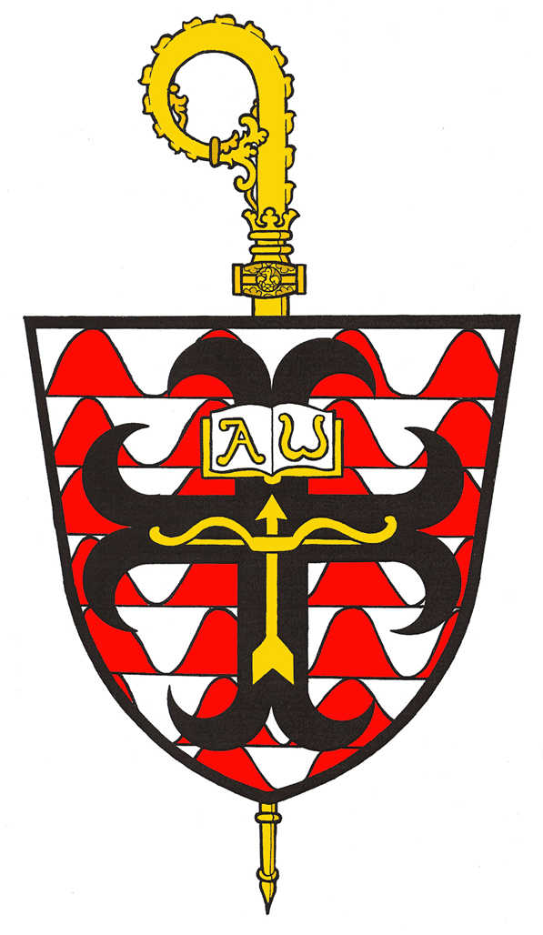
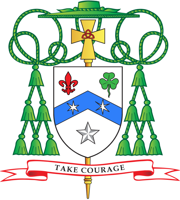
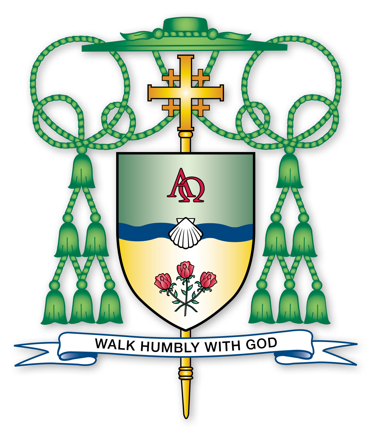
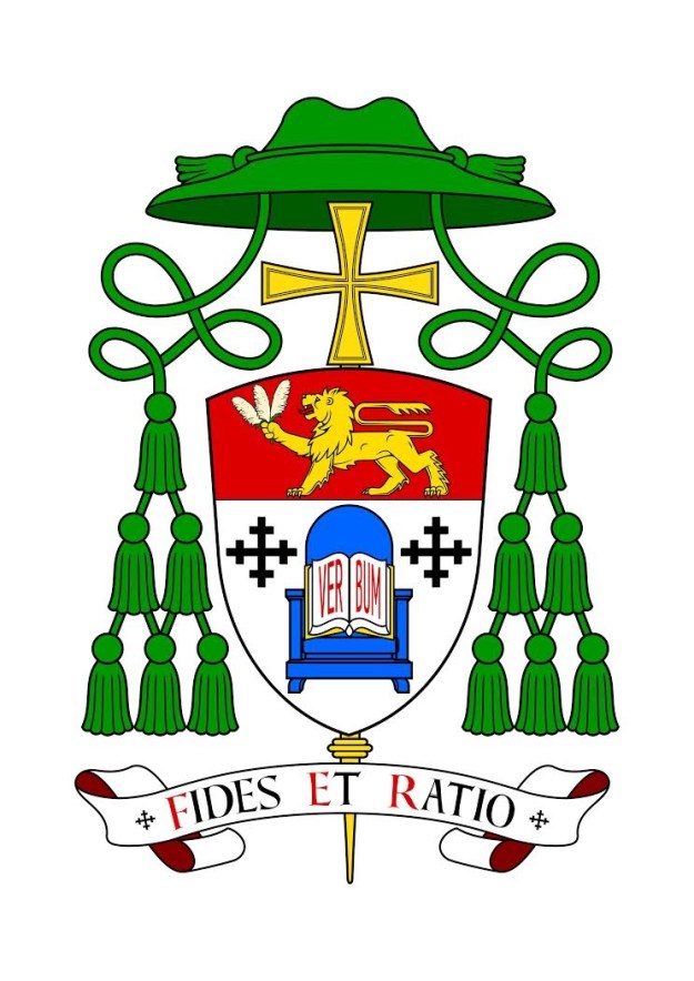
The coat of arms used by the Third Abbess of the Abbey of Regina Laudis in Connecticut, Rev. Mother Lucia Kuppens, OSB. She was elected February 1 of 2015 and received the abbatial blessing on the following May 10th from the Archbishop of Hartford.

AbbesLucia

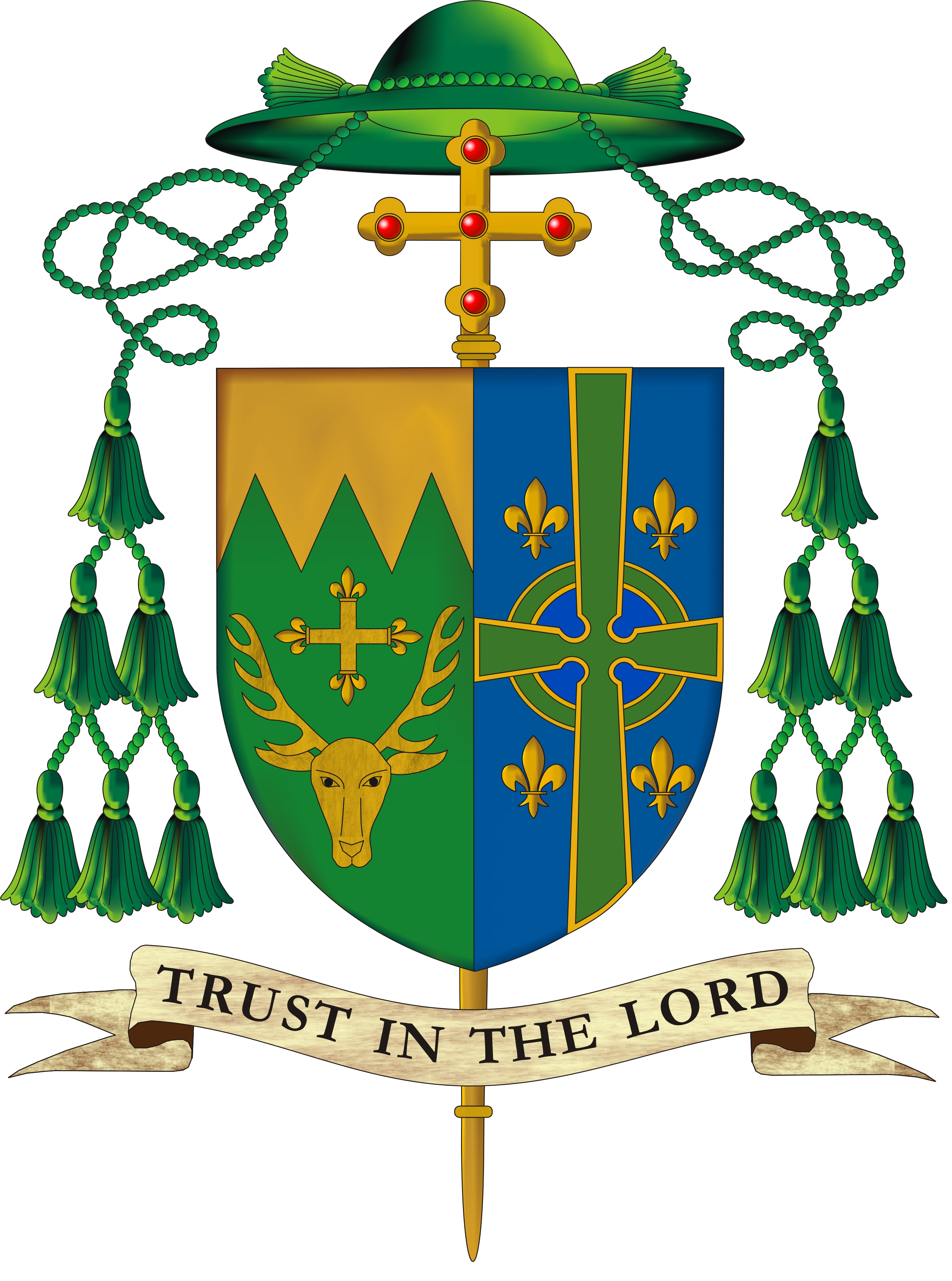
The Abbess describes the design (executed by Mother Alma Egger, OSB) as follows:

The book symbolizes my maternal ancestry, one hundred percent Irish, from Galway in the west of Ireland. A strong Celtic influence permeated my home. From these roots I received my love of the word, of poetry, of learning, education, culture, and music. The book could be interpreted to represent Scripture, or The Rule, literature itself or the works of Shakespeare, the particular focus of my doctoral dissertation. On a practical level, the book refers to much of my work in the Abbey, which includes supporting others in their studies, hosting student groups, directing the Monastic Internship Program, and when called for, writing about the Abbey. My Clothing and Profession ceremonies were both on the Advent feast of “O Sapientia” in celebration of Wisdom. The book is open, conveying the imagination and intellect open to the Wisdom of the Holy Spirit.

The roof truss at the top of the shield symbolizes my paternal ancestry. The dominant national identity in my father’s family was Alsatian, from northeastern France, just a stone’s throw from the German border. They were a people who suffered and survived much in war, as their borders continually changed. From my father’s family comes a rootedness in the earth, an appreciation of manual work, a respect for practical solutions and love for what is essential in life. From him comes my attraction to the other main area of my monastic service, the Cellarer’s Office. Until fairly recently my father worked all over the Abbey helping repair and build things. Through my involvement with a Lay Oblate Community (The Closed Community) prior to entering the Abbey, I had many experiences of participating in building on the Abbey land, notably the Chapter House on the Hill. Since 2009 I have been working with others to renovate the original monastic buildings and envision this being a major work for the whole community for the next ten years.

Continuity with Lady Abbess and Abbess David is represented by the wavy line in the center that marks the pine hill, which was on both of their shields as well. The hill is the central feature of our land. It is where our church was built and it represents the spiritual center and heart of the monastery. The three stars, which also appeared on Abbess David’s shield represent the continued commitment to build the triadic nature of our authority structure composed of Abbess, Prioress, and Subprioress.

The consecration lamp is an ancient and rich symbol of consecrated virginity and therefore seemed an apt symbol for representing the light of St. Lucy, Virgin and Martyr. Each nun receives such a lamp, made by our potter, at the time of her Consecration, when the church bestows its blessing and affirmation on the fruitfulness of her vows. The burning oil lamp symbolizes the gift of self, consumed in the fire of love. Two flames rise from this lamp symbolizing for me that the gift of one’s love to Christ is never solitary, but is given in relationship to others. The consecration lamp unifies the whole shield, mediating between the speculative and practical polarities of my genealogy and bringing our attention to the meaning of the motto, which is taken from the Office of St. Scholastica, sister of St. Benedict and a consecrated virgin. As told in the Dialogues of St. Gregory the Great, one night she prevailed on her brother to disobey his Rule and instead of returning to his monastery, stay with her talking and praying. Though she did not tell him why, she knew her death was near. He refused her, but her tears of supplication to God caused a sudden storm that prevented St. Benedict from leaving. Thus in that moment, she prevailed over him and St. Gregory says of her, ‘Plus potuit quia plus amavit,’ which is translated: ‘She was able to do more because she loved more.’ The banner of the motto embraces the whole shield and all the symbols on it, signifying that all we do is possible only through love and the grace of God.

Why the decision to use a simple oval shield alone without the external ornament of the veiled crozier pale wise behind the shield is a mystery. It is the only heraldic ornament that would mark this as the coat of arms of an abbess. Without it, these are simply the arms of a woman and a motto. Similarly, the previous abbess’ coat of arms used no crozier but employed supporters! It causes one to wonder if there is a lack of proper heraldic knowledge amongst the nuns. It is a shame they have not been advised better.

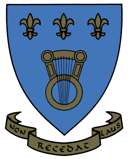
The abbey itself has a fine coat of arms designed and emblazoned by the late great practitioner of the science and art of heraldry, Dom Wilfrid Bayne, OSB, a monk of Portsmouth Abbey in R.I.
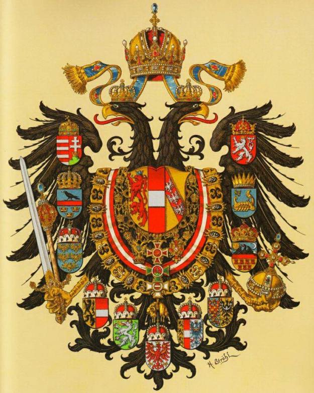
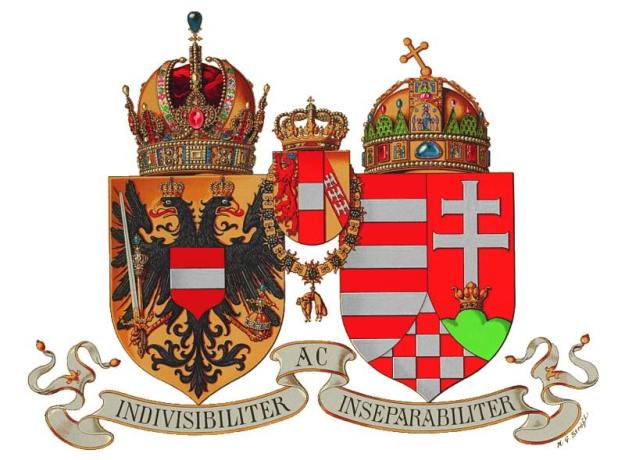
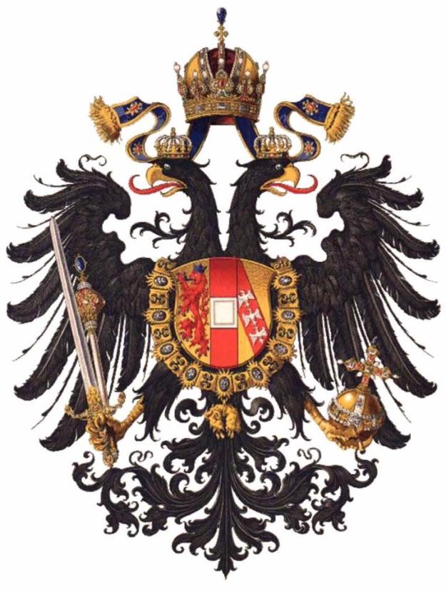
crestTrans

Bishop J. Gregory Kelly

On February 11 the Most Rev. (John) Gregory Kelly was ordained as Auxiliary Bishop of Dallas. The description of the coat of arms (from the diocesan website):

“Bishop Kelly’s arms are based on the Kelly family design where the shield is silver (white) and the charges are black. For difference, and for his deep devotion to the Blessed Virgin Mary, the chevron is now blue. The chevron is reminiscent of the mountains of Colorado, so dear to His Excellency’s youth and the chevron is charged with two estoiles (special, six pointed stars) that are taken from the mantle of the image of Our Lady of Guadalupe to remind all of the profound Hispanic influence in Texas, the “Lone Star State“, represented by the single star below the chevron. Above the chevron are a fleur-de-lis and a trefoil (the heraldic representation of a shamrock) to honor the Bishop’s Irish and French-Canadian heritage.”

Once again we see here an example of the increasingly popular (and completely WRONG!) trend of personalizing one of the external ornaments, in this case, with the addition of the triquetra on the episcopal cross (erroneously referred to as a “processional” cross in the description) to represent the Holy Trinity because it was the name of the seminary the bishop attended.

It is necessary to repeat that the only thing subject to having charges particular to the bearer is the shield. The external ornaments may NOT be personalized in a heraldic achievement of this type and all those who advocate such a practice are both incorrect and foolish! The heraldic artist is completely free, in future, to depict this bishop’s coat of arms with an episcopal cross of any shape and manner he might wish. This is what happens when armigers turn to those who do not know what they are doing for the devisal of their coats of arms.

Kelly-COA

Artwork: P. Sullivan

New Bishop of Cremona

On January 30 the Most Rev. Antonio Napolioni will be ordained as the new Bishop of Cremona. His newly-adopted coat of arms (below) combines symbols of two popes he admires (the sun from the arms of Pope Francis and the fleur-de-lis from the arms of Bl. Paul VI), the rivers of Cremona and the mountains as a symbol of the journey of faith and, in particular, the Transfiguration. The motto, “Serve the Lord With Gladness” is from Psalm 99.

Stemma-vescovo-Antonio-Napolioni

Bishop Malesic of Greensburg, PA

On July 13 the Most Rev. Edward Malesic, a priest of the Harrisburg, PA diocese will be ordained and installed as the fifth bishop of Greensburg, Pennsylvania at Blessed Sacrament Cathedral in Greensburg.

his newly assumed coat of arms is:

image

The explanation of the arms (provided by the diocese) is:

“The color of the field is BLUE (azure), the color of the sky, which symbolizes the direction of the soul’s ascent toward God and away from worldly values, therefore, the color represents the path set by the spiritual virtues, raising a person from the things of the earth toward the incorruptibility of heaven.

The CHEVRON is a heraldic device best described as an inverted “V” and is one of the most ancient figures in heraldry. Frequently, in Roman Catholic Church heraldry, it signifies the rafter which supports the roof of the church as a source of protection for the community of faith gathered under it. The THREE SHAMROCKS represent the Cathedral in Harrisburg, dedicated to St. Patrick, where Bishop Malesic was ordained to the priesthood by the imposition of the hands of Cardinal William H. Keeler, at that time Bishop of Harrisburg. The CHEVRON is in SILVER (argent), the color of transparency, also of truth and justice, fundamental requirements of the Bishop’s pastoral service.

The CROWN above the chevron is the symbol of Bishop Malesic’s given name, after St. Edward “The Confessor” (d.1066), King of England who gave witness to his Catholic faith through his life. The crown also recalls Mary, Queen of the Apostles, upon whose intercession Bishop Malesic relies.

The LINDEN TREE below the chevron expresses the Slovenian heritage of Bishop Malesic’s father. The linden tree is considered the national tree of Slovenia and is also a symbol of joy and safety. The community often gathered under the shade of the linden tree for fellowship and community discussions.”

The bishops of Greensburg have a pretty good tradition of having simple, well-designed coats of arms. Bishop Malesic is no exception. While he has still given in slightly to the “coat of arms as pictorial CV” school of heraldry it isn’t too bad and he’s far from the only American bishop to do so. I think that overall the design is clear, well done and blends well with the arms of the diocese. My only criticism, and it is a small one, is that the two crosses in chief in the arms of the diocese are incorrect. They should be patteé formeé, that is to say they should look like two round gold balls formed into crosses. This is because they are taken from the two identical crosses in the arms of the see of Pittsburgh, from which Greensburg was separated, where, in turn, they were derived from the gold bezants in the arms of William Pitt but turned into crosses to difference them. These crosses do not in any way resemble gold balls.

The personal arms of of Bishop Malesic were designed and rendered impaled with those of the diocese by Renato Poletti.

Archbishop Wester of Santa Fe

On Thursday, June 4, the Most Rev. John C. Wester, formerly Bishop of Salt Lake City, Utah and prior to that Auxiliary Bishop of San Francisco, will be installed as the Twelfth Archbishop of Santa Fe, New Mexico. His personal arms, assumed at the time of his episcopal ordination in San Francisco, are now marshaled to those of the venerable Archdiocese of Santa Fe the arms of which allude to both Spain and to the titular patron of its cathedral church: St. Francis of Assisi.

The artwork for the coat of arms (below) is by Deacon Paul Sullivan.

wester_santa fe arms

Bishop Garcia

On March 3, the Most Rev. Daniel Elias Garcia was ordained as Titular Bishop of Capsus and Auxiliary Bishop of Austin, Texas. His adopted coat of arms (below) depicts his devotion to Our Lady (the roses), baptism (the shell), the Colorado River and Christ who is the First and the Last.

Dividing the field into two colors (green and gold) by a blue line isn’t really the best design choice. It would have been better if the whole field were gold. In addition, the description of the arms from the ordination program describes the “processional cross” as being in the form of a Jerusalem cross for apparently no reason. First of all it is not a processional cross. The external ornament in a bishop’s coat of arms more than any other that marks it as the coat of arms of a bishop (even more than a mitre or a galero) is the episcopal cross that stands vertically behind the shield. This type of cross, which resembles a processional cross, used to be carried directly in front of a bishop. Like the galero, also no longer in use, such episcopal crosses are no longer used but are retained as not only one of but actually as THE ensign of the coat of arms of a bishop. The galero is optional; the cross isn’t.

Second, it is not permitted to mandate that an external ornament like the episcopal cross, be depicted in a certain shape or style. The blazon concerns itself only with what is on the shield. That may indeed be mandated to be depicted in a particular way. No other artist is bound to depict the episcopal cross of Bp. Garcia’s arms as a Jerusalem cross. It may be his preference but it is not one to which others must adhere.

BishopGarciaBlazon

Bishop Christopher Coyne of Burlington, Vermont

Coat-of-Arms

On January 29 Bishop Christopher Coyne, until now Auxiliary Bishop of Indianapolis and before that a priest of the Archdiocese of Boston, will be installed as the 10th Bishop of Burlington, Vermont.

The dexter side of the shield (to the viewer’s left), represents the coat of arms of the Diocese of Burlington and is composed of a green field, which meets a gold chief (upper one-third of the design) at a jagged line, called “dancetty,” to give the impression of green mountain peaks, thus honoring the Green Mountain State of Vermont. Below the mountain is a golden stag’s head that is taken from the arms of Lord Cavendish, Earl of Burlington, for whom the See City is named. Between the stag’s antlers, as seen in the arms of the Archdiocese of Boston, is a golden cross fleuretty. This cross, honoring the French missionaries who first brought The Faith to the region, signifies that the first priest to be stationed in the service of the people of Vermont, Father Jeremiah O’Callaghan, was sent by Boston Bishop Benedict Fenwick.

The sinister side (to the viewers right) ‘s occupied by the personal heraldry of Bishop Coyne; upon a blue (azure) field is Bishop Coyne’s coat of arms which blends images representing his love for God, family genealogy and ministry history in the Archdiocese of Boston.

Bishop Coyne’s grandfathers were Irish and his grandmothers were French. The coat of arms reflects those two heritages with the Celtic cross and the fleur de lis. The Celtic cross also calls to mind the centrality of the cross in the history of salvation and the sacrifice of Jesus which brings redemption. The fleur de lis also represent Mary, the Mother of our Savior, and Saint Joseph, her most chaste spouse. Finally, the blue (azure) field also calls to mind Mary, the Immaculate Conception, under whose patronage the Diocese of Burlington has been placed.

Not Louisiana, Paris, France, New York or Rome! But Gary, Indiana, Gary, Indiana, Gary, Indiana; My Home Sweet Home.

123014

On January 6, 2015 the Most Rev. Donald J. Hying, a priest of the Archdiocese of Milwaukee, former Rector of the seminary there and, since 2011, Auxiliary Bishop of Milwaukee will be installed as the IV Bishop of the diocese of Gary, Indiana.

The Bishop’s coat of arms (above) depicting the arms of the See (dexter) which allude to the titular patron of the cathedral of the Holy Angels and his personal arms (sinister) which allude, in part, to the arms of the See of Milwaukee.

The motto translates to “Love never fails”. (1 Cor: 13)

(artwork by Paul Sullivan)