Category Archives: Corporate Bodies

Very Rev. Steven A. Peay, PhD

One year ago today the Very Rev. Steven A. Peay, PhD, an Episcopal priest of the Diocese of Albany and Honorary Canon Theologian for Evangelism at Christ Church Cathedral in Eau Claire, WI became the 20th Dean and President of Nashotah House Seminary in Nashotah, WI.

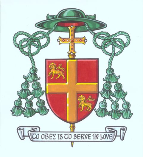
His coat of arms is pictured below. The blazon is:

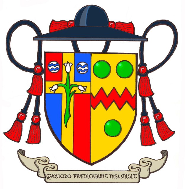
Arms impaled; to dexter, quarterly Gules and Azure, overall on a Latin cross Or between two fountains in chief a triple blossom lily Proper; to sinister Or between three pommes a fess dancetty Gules. The shield is ensigned with the ecclesiastical hat of an Honorary Canon according to the Earl Marshal’s Warrant for the coats of arms of clergy in the Anglican Communion of 1976. Below the shield is a scroll with the motto, “Quomodo Prædicabunt Nisi Misit” (Romans 10:15)

In the arms of the seminary the lily represents both the Holy Trinity and the Blessed Virgin Mary, to whom the main chapel is dedicated. The two fountains allude to the seminary location between Upper and Lower Nashotah Lakes.

In the personal coat of arms of Fr. Peay the gold field and fess dancetty are taken from the coat of arms of Bl. John Henry Cardinal Newman. The bearer has long been an admirer of Newman’s work and writings. There is some irony in choosing this as Newman famously converted from the Church of England to Roman Catholicism and Fr. Peay, conversely, had been a Roman Catholic and was received into The Episcopal Church. Whereas Newman had three hearts surrounding the fess in his arms here, for difference, they have been changed to three pommes. In heraldry this term describes a green roundel. In this case they are chosen to resemble peas as an allusion to the bearer’s surname “Peay”.

The motto is a favorite scriptural quote that reflects the bearers long time teaching of historical theology and preaching to seminarians.

Peay2c

St. Joseph Parish, Washington, NJ

sc00016f9d

The newly assumed coat of arms of St. Joseph Catholic Church (above) incorporates elements alluding to the location of the parish and the parish’s titular patron saint. The blazon is: Gules, two bars Argent and in chief three fleur-de-lis Argent. That is: on a red background there are two horizontal silver (white) stripes and above that three fleur-de-lis also silver (white).
The new coat of arms is based closely on the coat of arms of George Washington (pictured below) The blazon of that coat of arms is: Argent, two bars Gules and in chief three mullets of five points also Gules. The Borough of Washington and Washington Township in Warren County in Northwest New Jersey is named for Washington.

Wash-mid
In the arms of the parish the colors have been reversed for difference and the three mullets or stars have been replaced with three fleur-de-lis, a symbol in heraldry used most often to represent Our Lady but one which is also used to allude to St. Joseph, her husband. For some time now the parish already employed the fleur-de-lis as a kind of logo or parish symbol.
The new coat of arms was designed and rendered by me as I am serving as the Administrator of the parish.

Pontifical Colleges and Schools

Pontifical College Josephinum (USA)

Image 4


Pontifical Catholic University of Sāo Paolo (Brazil)

PUC-logo

Pontifical Catholic University of Rio de Janeiro (Brazil)

Brasaov

Pontifical Lateran University (Rome)

sensi

Pontifical University of St. Thomas Aquinas (Rome)

Pontifical_University_of_Saint_Thomas_Aquinas_logo

Pontifical Gregorian University (Rome)

Estemma_UniGreg

Pontifical Scots College (Rome)

pontificio

Venerable English College (Rome)

coat_of_arms

Pontifical North American College (Rome)

nac-logo

Pontifical Athenaeum of Saint Anselm (Rome)

ateneo1


Very Nice Diocesan Arms

On Sept. 24th Edgar da Cunha will be installed as the new bishop of Fall River, MA. The diocese possesses a very nicely designed coat of arms that even includes a nice “can’t” or heraldic pun based on the name of the See. The wavy line that crosses the shield from the upper left to the lower right depicts a river that falls as one looks at it from left to right. Thus, it “says” the name of the diocese. In addition, the overall design is simple and uncluttered. The cross is a sign of the faith and the grace of God and the star is a symbol of the titular of the cathedral: St. Mary. The arms were designed by Pierre Chaignon la Rose.

640px-Roman_Catholic_Diocese_of_Fall_River.svg

St. James Parish, Jamesburg, NJ

Image

Above is the coat of arms recently designed for St. James Parish in Jamesburg, NJ. I’m not pleased with this design but much of it is the result of what the client requested. The sad reality is that frequently the heraldic designer and/or the heraldic artist must compromise their own tastes and even their knowledge of heraldry in order to accommodate the wishes of the client who has commissioned them. This one has been a little too ambitious in its use of color and has also overcharged the shield a bit. But, the client was happy with the design.

Heraldic Vestments (Part II)

Back in February I posted about a nice set of vestments decorated with coats of arms worn by the Archbishop of Newark. Generally speaking I don’t think this is usually pulled off very well. But, every now and again you come across an example where the use of heraldry as a decoration on vesture actually works rather nicely. I recently came across another example. At the Archabbey of St. Vincent in Latrobe, Pennsylvania there is a very nice set of festive vestments which had been a gift to the Archabbey from the Abbey of Montserrat in Spain. That community had been the beneficiary of some financial aid from the monks at St. Vincent after the Spanish Civil War when they were in great need. In gratitude, the Spanish monks presented the community with some of their handiwork in the form of beautifully embroidered vestments with the coat of arms of St. Vincent on the front of the chasuble. What you can’t see is the beautifully embroidered portrait of St. Benedict that is on the back of the chasuble. Nevertheless, the embroidered coat of arms on the front is very nicely done. Unfortunately, because the Archabbot insists on wearing his pectoral cross on the outside of the chasuble, incorrectly I might add, he obscures part of the shield from view. The chasuble has recently been slightly reconstructed because the base material began to fall apart but the front of the vestment with all the embroidery has remained intact despite being 70+ years old.

Image

Image

Archdiocese of Westminster

Image

The archdiocese of Westminster (UK) recently launched the use of a new rendering of the archdiocesan coat of arms. Previously, they had used the arms of the See (Gules a pall Proper) under the galero of an archbishop with the patriarchal (double-barred) cross. This was technically incorrect as the cross and galero imply the arms of an individual archbishop rather than a corporate body like a diocese. So, that has now been rectified with the use of this new rendering that more correctly indicates this is the coat of arms of the archdiocese, rather than of the Cardinal-Archbishop.

As for the artwork: isn’t it hideous?

Parish of St. Catherine Labouré in Harrisburg, PA

Image

The arms naturally incorporate images found on the Miraculous Medal, which had been first entrusted to Catherine Labouré by the Blessed Virgin Mary.  The shield incorporates four images found on the Medal, the Marian monogram, the stars from Sacred Scripture (as ascribed to Mary in the Apocalypse: 12-13), and the Sacred Heart of Jesus and the Immaculate Heart of Mary side by side.  The shield is worked in blue and in gold.  On this gold field is found the Marian cipher, a letter “M” surmounted by a Christian Cross, an image presented to Saint Catherine by the Virgin Mary herself.  It is blue, as it represents the Blessed Mother specifically.

The blue field above represents the Blessed Virgin, of course, but more so in Her title of Our Lady of Grace.  Upon this field appear the Sacred Heart of Jesus and the Immaculate Heart of Mary, linked theologically as Mary always stood beside her Son.  These two images associated with the Miraculous Medal are surrounded by the twelve stars that surround Mary’s head as a halo in many Marian images, most definitely those associated with Her as Our Lady of the Miraculous Medal as seen on the reverse side of the medal itself.  Both hearts suffer and bleed for the world.

Saint Catherine supports the shield in her historic and colorful habit of a Daughter of Charity of Saint Vincent de Paul as it was worn at the time of her life on earth.  Saint Catherine stands on a compartment upon a green river bank above the blue waters of the Susquehanna River that runs through the state capital city to which the parish is near.  The shield rests upon a stone, specifically a keystone, the emblem of the Commonwealth of Pennsylvania.  Next to the keystone is found a floral spray composed of shamrocks honoring the patron saint of the Diocese of Harrisburg, Saint Patrick of Ireland; and mountain laurel, the official flower of the Commonwealth of Pennsylvania.

Design: J. Noonan  Art: L. Nicholson

Constantinian Order Reconciliation

Image

It was announced yesterday that the Duke of Noto (Spanish branch) and the Duke of Castro (Neapolitan branch) of the royal house of the Two Sicilies signed an accord which, while it does not completely solve the issue of the headship of the royal house more closely ties the two heads of the royal orders together in closer cooperation as co-grand masters with equal footing of the Sacred Military and Constantinian Order of St. George. This is a positive step toward healing a very long-standing rift.

(artwork by Carlos Navarro)

Archbishop Gagnon of Winnipeg, Canada

Image

On January 3 Archbishop Richard Gagnon, formerly bishop of Victoria was installed as Archbishop of Winnipeg. The arms (above) which he assumed upon becoming a bishop are retained. The shield is partly inspired by the emblem of Bishop Gagnon’s predecessor, Modeste Demers (1809-1871), the first Bishop of Vancouver Island. Bishop Demers and Bishop Gagnon are closely related via a collateral branch of the Demers family. Bishop Demers’ emblem was red and gold and featured a gold Latin cross set on a mount with two figures praying at the base of the cross. These tinctures have been kept, as has the cross. Since Bishop Gagnon was ordained on June 24th, the feast day of St. John the Baptist, the two charges are gold Agnus Dei emblems, traditionally associated with St. John the Baptist. This is also a reference to Bishop Gagnon’s ancestral roots in Quebec.

He may impale these arms with those of the archdiocese (below). In addition, the episcopal cross behind the shield will become an archiepiscopal cross with two horizontal bars and another row of green tassels will be added to the galero.

Image


UPDATE: The only image I was able to obtain so far of the Archbishop’s arms impaled is in black and white. As one commenter on this post has already pointed out there have been slight changes made to the arms of the archdiocese.

Gagnon


Basilica of Regina Pacis, Brooklyn, NY

Image

Arrrrrgh! This is horrible, Horrible, HORRIBLE!!! This coat of arms devised for the newly-designated Basilica Church of Regina Pacis in the Diocese of Brooklyn, NY is an excellent example of everything heraldry should NOT be. Do the “designers” (and I use the term loosely) of this monstrosity think that you simply take whatever images you want in whatever style you want and tack it to a shield and that’s called heraldry?

The only correct thing about this coat of arms is that basilica churches do, in fact, have the use of the ombrellino or pavilion and keys as external ornaments. Literally, everything else about it is horribly incorrect and completely lacking in imagination, creativity or even a passing knowledge of heraldic design.

The motto should not cross the shield but be depicted below it. Why is there a second scroll above the shield bearing only the name of the church? Is a coat of arms not identifying enough? The inclusion of the arms of the See of Brooklyn in its entirety is questionable but since it was done it would be good if part of it weren’t cut off! The pictorial images of Our Lady and of the church itself are wholly inappropriate and the whole is clearly a mish-mash of images cut and pasted together that don’t even match in style!

This is the worst kind of slap-dash, indifferent, ignorant heraldry that it sadly in use in far too many parts of the United States. IT STINKS!