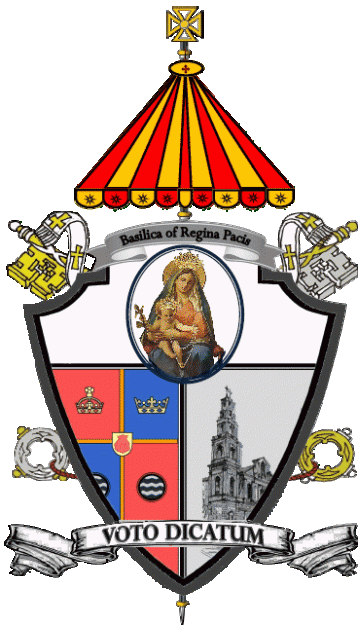
Arrrrrgh! This is horrible, Horrible, HORRIBLE!!! This coat of arms devised for the newly-designated Basilica Church of Regina Pacis in the Diocese of Brooklyn, NY is an excellent example of everything heraldry should NOT be. Do the “designers” (and I use the term loosely) of this monstrosity think that you simply take whatever images you want in whatever style you want and tack it to a shield and that’s called heraldry?
The only correct thing about this coat of arms is that basilica churches do, in fact, have the use of the ombrellino or pavilion and keys as external ornaments. Literally, everything else about it is horribly incorrect and completely lacking in imagination, creativity or even a passing knowledge of heraldic design.
The motto should not cross the shield but be depicted below it. Why is there a second scroll above the shield bearing only the name of the church? Is a coat of arms not identifying enough? The inclusion of the arms of the See of Brooklyn in its entirety is questionable but since it was done it would be good if part of it weren’t cut off! The pictorial images of Our Lady and of the church itself are wholly inappropriate and the whole is clearly a mish-mash of images cut and pasted together that don’t even match in style!
This is the worst kind of slap-dash, indifferent, ignorant heraldry that it sadly in use in far too many parts of the United States. IT STINKS!

Investigate the civic heraldry of Latin America, where you will see this same type of trash in great abundance. It really seems that Americans who really know heraldry are so few in number that they could all fit inside a city bus.
Yes its horrible beyound spitting ones tea across my dahlias. They should be spoke to and have it corrected.
This will continue until the Holy See establishes an actual armorial authority with competent members.
Reblogged this on Araldika Malta and commented:
An interesting article from the United States on what is bad heraldry.
Even from a standpoint entirely ignorant of heraldry, this is awful. It’s slapdash and messy. From an elementary design perspective it is horrendous, and the execution is even worse. It looks to have been done in Microsoft paint with some stolen Internet images.
It hurts to look at this.
A lot of Latin American civic heraldry is like this: take a shield and stuff it with as many symbols as you can manage, exactly in the manner of a pizza with every type of topping. Fruit, vegetation, mountains, stars, draped flags and monuments are particularly popular ingredients.
“And a partridge in a pear tree!”
Guy, if the new Secretary of State hasn’t got round to inviting you (too much on his plate), you owe it to us to volunteer.