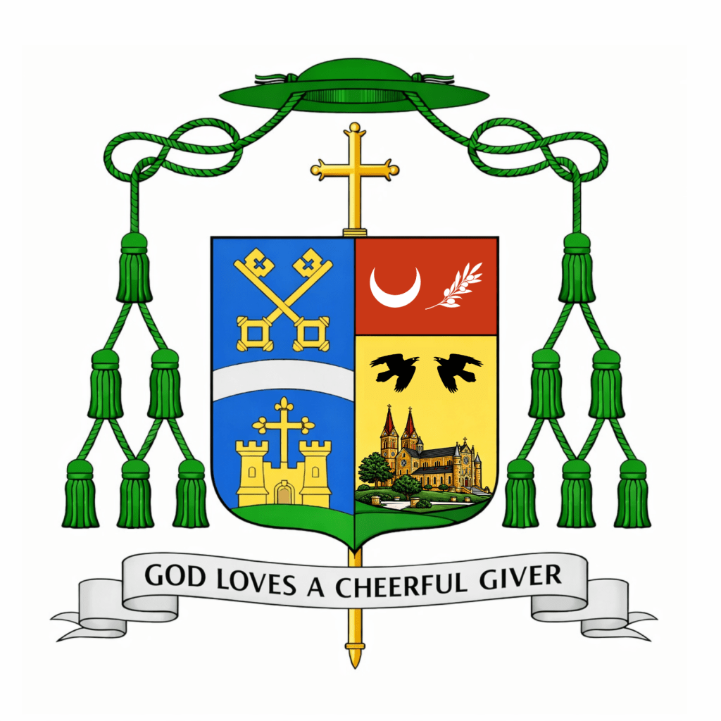
On May 1, the Most Reverend Godfrey Mullen, OSB (60) a Benedictine monk of St. Meinrad Archabbey in Indiana, as well as the Diocesan Administrator and former Vicar General of the Diocese of Belleville, Illinois, of which he is also a native son, was ordained a bishop and installed as the 10th Bishop of Belleville. The arms he assumed are pictured above.
For some time now, since his episcopal ordination and installation in May a number of people have asked for my comments on his coat of arms. I was privileged to design the armorial bearings of his immediate predecessor, Bishop Michael McGovern who is now the Archbishop of Omaha. I had wondered if, perhaps, Bishop Mullen would ask for my help with his coat of arms but he is certainly under no obligation to do so. In the end, I was disappointed he didn’t ask for my help when I saw what he ended up with. On the other hand, this also allows me to comment freely without being accused of “sour grapes”.
To use an expression that I haven’t had occasion to use since the ill-conceived and disastrous revamping of the coat of arms of the Archdiocese of Detroit (now happily abandoned) this coat of arms represents an EPIC FAIL.
I have no issue with the artwork, and I take no interest in critiquing the arms of the See of Belleville. My reaction is to the Bishop’s personal arms alone. Much of what he wanted to do is good and even correct. He kept the color scheme simple. He wanted an overall design that reflects his Benedictine background. He also managed to symbolize his family. The crescent and olive branch on the chief are from the arms associated with his family name and from the Jubilee Medal of St. Benedict, respectively. The olive branch also alludes to the city of Salem (which means “peace”) and the crescent is also an allusion to Our Lady. So, too, he does something very nice by having charges represent more than one thing keeping the arms from being too crowded. One thing that often goes overlooked in heraldic design, however, is the desirability of symmetry as well as the need to avoid asymmetry whenever possible. Perhaps the crescent flanked by two olive branches would have solved that better? As it is now the charges look as though they have just been randomly thrown onto the chief.
The two ravens also make good sense. Both St. Benedict (the founder of the Order) and St. Meinrad (the patron saint of the Archabbey) had ravens and the birds are generally seen as a symbol of both saints. In fact, the arms of the Archabbey contains ravens. So, perhaps, one would think, that would have been enough. Here is where we come to the biggest problem. Namely, the pictorial depiction of the Archabbey church.
To oversimplify the issue I’ll say plainly: coats of arms contain symbols, not pictures. What the bishop (or whoever advised him on this design) has done is simply to use the line drawing of the church that is the Archabbey’s current letterhead and colored it and slapped it onto his shield. This is the antithesis of heraldic design. The insipid line drawing is a nightmare to reproduce because of the abundance of detail, it’s inappropriate as a heraldic charge, and it makes for a coat of arms difficult to discern when seen in reduced format…as coats of arms so very frequently are. Using a symbol of St. Meinrad as he has already done is sufficient. Borrowing a charge or charges from the coat of arms of the Archabbey is a great idea with ample precedent in heraldic art and design. Even if the bishop strongly desired to use the Archabbey church as a symbol it would have been far better to depict one of the Archabbey’s distinctive towers or perhaps a rendition of its rose window. But, to simply reproduce in full a drawing of the Archabbey church used on letterhead—a drawing that was clearly made from a photograph as is evidenced by the inclusion of the trees, path and grounds surrounding it— is ridiculous and just plain WRONG!
It’s a shame really. This coat of arms had the potential to be a rather decent one and then the inclusion of that picture ruins the whole thing. How many times do I have to say that heraldry is both a science and an art form all its own, with its own rules, traditions, conventions and customs. You cannot simply have “whatever you want”, slap it onto a shield and call it heraldry. There are ways to design a good coat of arms. This coat of arms is not an example of those ways. At one point the description of the coat of arms says, “The cleft hill at the base continues from the hill of the diocesan crest. The bishop is a son of the diocese, but also a son of Saint Meinrad…”. Again, a clever idea to try and allude to both the diocese and the Archabbey, however, the design doesn’t “continue” from one side of the shield to the other. Impaled arms are a form of marshaling that dispalys two separate coats of arms on a single shield. The diocesan coat of arms doesn’t “become” part of the bishop’s coat of arms; it is displayed next to it.
Finally, to feed into another pet peeve of mine the episcopal cross in this achievement is also personalized…as though that’s an option. The explanation says, “The cross atop the shield is modeled on the cross depicted in the Benedictine Jubilee medal”. Isn’t that just so lovely? The problem is twofold. The cross isn’t “atop” the shield. It is standing behind it, as in, it is an external ornament. The second problem is that such a cross is a symbol of the episcopal office and as such is not subject to being depicted in a particular way according to the fancy of the armiger (or the designer). Let me be clear: any individual rendering of the Bishop’s coat of arms may, of course, depict the episcopal cross in a certain way, in this case in the manner of the cross of the Jubilee Medal. However, that is not obligatory. Other artists do not have to depict it that way and the blazon may not specify it. It isn’t an option to dictate the appearance of the external ornaments. The armiger has control over what goes ON the shield only; not what appears around it.
So, since people have been wondering what I thought of this heraldic achievement I have now said. I think it’s very disappointing because it had such potential. It could have been so much better. What is wrong with it betrays an amateurish style. One wonders if the bishop wouldn’t have been far better served by consulting with someone who knew something about how properly to design a coat of arms? A little more direction and this could have been salvaged.


Thank you for your thoughts. I too was disappointed when I first saw the design. I know Bishop Mullen, OSB personally. He was a beloved professor and friend. I share his love for all things Benedictine and for Saint Meinrad Archabbey. But I couldn’t help myself “yelling” at the computer screen saying “No! No! No!” And “Eww.” I wish I could say that the design has “grown” on me. Maybe if I squint? LOL. Anyway, I appreciate your love for heraldry and I learn a lot.