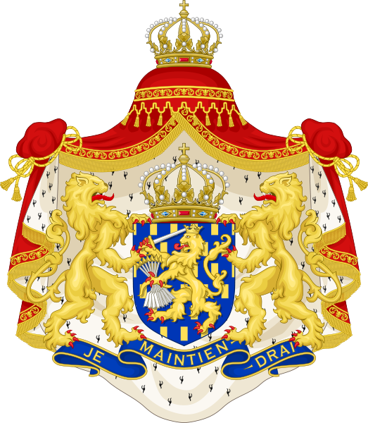
The Greater Coat of Arms of the Republic of Venice. A little busy but all their jurisdictions are in there! The patron saint of Venice is St. Mark (feast day: April 25).

The Greater Coat of Arms of the Republic of Venice. A little busy but all their jurisdictions are in there! The patron saint of Venice is St. Mark (feast day: April 25).

Coat of Arms of the Republic of Venice, topped by the Doge’s cap. The patron saint of Venice is St. Mark (feast day: April 25).
One of the lesser known and, indeed, lesser used external ornaments in ecclesiastical heraldry is the Prior’s Staff, sometimes called the Cantor’s Staff. Like the crozier of bishops and abbots it has its origin in the staff used by pilgrims as a walking stick. As it evolved it came to be depicted as a simple staff usually of metal which terminated at the top in a small ball, or an apple, a fleur-de-lis or even the small representation of a house or chapel.
It is most often used in ecclesiastical heraldry for monastics but can also be seen in those places that still have cathedral chapters. Those officials of the chapter who do not enjoy the right to pontifical insignia, such as Priors, Provosts, Precentors or Cantors make use of it as a sign of their office. At one time Precentors or First Cantors were in charge of music for the chapter and cathedral and actually used this long staff to conduct the choir. It’s easy to see how from there it became a symbol of their office. This type of staff was also used to direct ceremonies.
Using the Prior’s Staff as a heraldic emblem was for those officials who actually used one in real life. As its use became less frequent it then evolved into an emblem for those who held the office that used to employ such staves. It is seen very little in heraldry these days.
(The example above is the coat of arms of the Collegiate Chapter of Canons of St. Vittore of Arcisate rendered beautifully by Marco Foppoli)
The word “sudarium” means “veil” in Latin. This veil makes an appearance in ecclesiastical heraldry in the coats of arms for abbots (see the arms of Abbot Gregory Duerr, OSB of Mt. Angel Abbey above). Since 1969 and the Papal Instruction, “Ut Sive” the use of the mitre and crozier in the coats of arms of Cardinals, Archbishops and Bishops has been discontinued. However, the mitre is still used in corporate arms for abbeys and dioceses. Similarly, the crozier is frequently used as an ornament to ensign the shield of an abbey. In some countries the mitre is still erroneously used by bishops to ensign their arms alone. While that was commonplace in the Middle Ages it is really incorrect (mind you not “unallowed” but merely “incorrect”) in modern heraldry.
While Pope Paul’s Instruction asked that the mitre and crozier be omitted from the arms of Cardinals, Archbishops and Bishops as unnecessary due to the fact that the galero with its colors and tassels and the (arch)episcopal cross are sufficient emblems for those prelates the crozier has been maintained as the external emblem particular to the arms of abbots, along with the sudarium, and of abbesses. However, to mark the crozier as the emblem of a monastic prelate it must have the sudarium attached to it.
The reason for the sudarium started out as a practical one and has, like so many other heraldic emblems, evolved into something merely symbolic. At the time when abbots were conceded the privilege of using pontifical insignia (i.e. mitre, crozier, ring) they were not originally allowed to wear pontifical gloves. The veil was attached to the crozier in order to protect the staff of the crozier from dirt and perspiration on the hands of the one holding it. Later, pontifical gloves were also conceded to abbots (and abbesses) so the sudarium became more symbolic than practical. It is also possible to find frequent examples of abbatial arms that have a crozier without the sudarium or, even, to omit the crozier entirely. This is quite incorrect.
The external ornaments proper to an prelate with the rank of abbot are the black galero with twelve tassels and the crozier placed behind the shield with the sudarium attached. Occasionally, it is possible to find the sudarium still actually used by some abbots, such as those at Heiligenkreuz in Austria. (below)
The coat of arms of His Eminence, Francis Cardinal Spellman, Archbishop of New York from 1939-1967. The blazon is: Arms impaled; in the dexter Argent on a saltire Gules between four Greek crosses Gules the sails of a windmill in saltire Argent (New York Archdiocese). In sinister Sable, on a fess Argent four ermine spots Sable; overall a bend Or goutee de sang; a chief of the Religion (Spellman).
The arms of the archdiocese employ a red X-shaped cross of St. Patrick, the patron of the archdiocese. On this is superimposed the sails of a windmill to recall the Dutch who first settled the city of New Amsterdam, later called New York. The four red crosses represent the four Gospels. Spellman’s own arms were not the first that he adopted when he was made a bishop. His original coat of arms depicted the Santa Maria, flagship of Christopher Columbus, under full sail. He used these when he was Auxiliary Bishop of Boston. After he was translated to New York Spellman adopted the arms we see here. Unfortunately, I do not know the meaning behind the ermine spots or the gold bend. I know the drops of blood were an allusion to the Precious Blood of Christ. As a Bailiff of the Order of Malta he includes both the chief of that order (Gules a cross throughout Argent) and places the shield on the cross of the order.
The external ornaments include the galero and the mitre as well as the archiepiscopal cross and the crozier. These arms were designed long before the 1969 Instruction of Pope Paul VI forbidding the use of mitre and crozier in the arms of bishops, archbishops and cardinals.
I have always like this particular coat of arms. It is an exmaple of good heraldry which is a rare find among the coats of arms of American prelates…of any era!
The external ornament used in heraldry that distinguishes the coat of arms of a Churchman from those of a layman more than any other is the galero. This broad-brimmed and low-crowned hat was originally a pilgrim’s hat and worn primarily when traveling in a cavalcade to shade one’s head from the sun. In heraldry it was seen as a fitting substitute for helm, mantling and crest which were considered too martial for non-combattants like clergy.
A hat originally used only in Roman heraldry and not really catching on in the rest of Europe eventually the galero came to replace the mitre in the arms of prelates since the former was seen as the more “Roman” option. The galero was first bestowed on the Cardinals of the Roman Church by Pope Innocent IV at the First Council of Lyon in 1245. It was the first hat to be distinguished by the use of a specific color (scarlet) and it was also to be adorned with tassels. However, originally the number of tassels was not fixed. There are various examples of cardinals’ coats of arms that show as few as two tassels suspended from the galero (see the arms of St. John Fisher in color below) and as many as seventy-two! (the arms in black and white above are those of Cardinal Ximenes) What marked these coats of arms as those belonging to cardinals was that the galero, cords and tassels were red and nothing else. No one else could use such a red hat except a cardinal regardless of how many tassels were suspended from it.
The number eventually was fixed at thirty (usually depicted as fifteen suspended on either side of the shield in a pyramidal pattern) only in 1832. A system for distinguishing the ranks of other clergy based on the color of the hat, of the cords and the number of the tassels did not come into existence until the Instruction of Pope St. Pius X “Inter Multiplices” in 1905.
So, all these different colored hats, cords and tassels are really a relatively recent innovation in Catholic heraldry.
There are numerous organizations throughout the world for those interested in heraldry. Many specialize in the heraldry of a particular country and some are simply societies for the furtherance of the appreciation and knowledge of heraldry. Some of them are private organizations (membership by invitation). Many are open for anyone to apply for membership. Here are some of my favorites. (in the interest of full disclosure I am a member of those marked with an * and also an officer in those marked with a #)
The Heraldry Society (England) *
The Heraldry Society of Scotland
The Royal Heraldry Society of Canada *
The Heraldry Society of New Zealand
The Australian Heraldry Society
The American College of Heraldry * #
The American Heraldry Society * #
The International Association of Amateur Heralds *
The Fellowship of the White Shield *
The White Lion Society (England)
The Westphalian Heraldry Society
There is an interesting article on the Vatican’s website about the use of the Papal Ferula (or bacculus pastoralis, (i.e. pastoral staff or “crozier”) by popes in recent decades for solemn liturgies. All those who found the return of the ultra-modern staff commissioned by Pope Paul VI (including myself who refers to it as the dental pick crozier) will find this article interesting. Apparently Pope Francis intends to alternate use between this crucifix-staff of Paul VI and the one used by Benedict XVI.
You may read the article HERE.
Having seen a Facebook post I wrote about this some time ago my friend and heraldic enthusiast and artist Xavi Garcia who writes the excellent blog Dibujo Heráldico posted recently about the coat of arms of the Prefect of the Pontifical Household (and former secretary to Pope Benedict XVI) Archbishop Georg Gänswein. It is the custom of the Prefect of the Pontifical Household to impale (combine on the same shield) his personal arms with those of the reigning pope. When Archbishop Gänswein was named an archbishop earlier this year he adopted personal arms that reflect St. George, his baptismal patron (the dragon being slain with a spear) and his devotion to Our Lady (the star). These were impaled with the arms of Pope Benedict (above). Now that Pope Francis has been elected and Archbishop Gänswein remains as Prefect of the Pontifical Household (at least for now) his arms are changed to be impaled with those of Pope Francis (below). Now there is a great deal of blue on one shield but that was not something that could have been forseen. Xavi has depicted the two coats of arms himself in his own style and I am happy to share them with you here. Check out his blog while you’re at it too!
(artwork: Xavi Garcia)
Anyone interested seriously in the art of heraldry should, indeed must, become familiar with the work of artist Paul Boesch. He had a distinctive style drawing such that his pieces looked like wood cuts. The illustration above is a beautiful rendering Boesch did of the coat of arms of Pope Pius XI (1922-1939).
Arguably one of the best coats of arms designed and emblazoned by the late Archbishop Bruno Heim was that of Pope John Paul I who reigned as pope for just 33 days from August to September of 1978. The coat of arms was slightly modified from the one he had borne before becoming pope. Upon his election Albino Cardinal Luciani chose the unique double name of John Paul combining the papal names of his two immediate predecessors. The coat of arms was put together to reflect this double name. In chief we see the lion of St. Mark that makes up the arms of the See of Venice. Cardinal Luciani served as Patriarch of Venice before being elected to the papacy. In addition, two of his predecessors as pope, St. Pius X and Bl. John XXIII also were Patriarchs of Venice before their respective elections as pope and both retained the chief of St. Mark in their coats of arms as pope. In the arms of John Paul I the chief of St. Mark not only recalls his own time in Venice but evokes the memory of Pope John XXIII. The collee, or stylized mountains or hillocks in base are from the coat of arms of Pope Paul VI whose family name, Montini, means “little mountains”. In between the mountains and the chief there are three stars. Paul VI had three fleur-de-lis in the same position in his arms and Cardinal Luciani’s original arms had three stars but the stars had only four points each. Here they have been modified to five-pointed stars which are a heraldic symbol of Our Lady, specifically of the Assumption. Despite the fact that Pope John Paul I adamantly refused to be crowned as pope the papal tiara nevertheless appears in its usual spot ensigning the shield along with the keys of St. Peter. Truly, this is one of Heim’s best designs. Sadly, it was not seen by many because of the brevity of the pontificate of the “smiling pope”.
Several people have asked me to illustrate further just what the practice of combining two coats of arms together on one shield via the antiquated method of dimidiation looks like. This form of marshaling was used extensively in the Middle Ages but fell out in favor of impaling. With dimidiation, as the name implies each of the two coats of arms is split down the middle and only one half of each is depicted in the two halves of one shield. An excellent example of this are the arms of Dolní Lomná, a village in the Czech republic. The arms depict an eagle on one half and a tree on the other. Dimidiation obscures part of each of the coats of arms and also sometimes creates somewhat unusual looking creatures like this demi-eagle/demi-tree or even more amusingly the famous arms of the Lord Warden of the Cinque Ports who seems to bear lions that are also half boat!
Bishop Michael Jackels of Wichita has been named as the new archbishop of Dubuque, Iowa by Pope Francis (it was really decided by Pope Benedict XVI but not announced until after Francis was elected). The current coat of arms of the good bishop will present some interesting problems when he goes to Dubuque. The arms as they currently are depict two distinct impalements. They both comprise the bishop’s personal arms. Neither is the impalement of the arms of the See of Wichita. In North America it has become customary, although far from mandatory, for bishops to depict their own personal arms side by side on the same shield with the coat of arms of their diocese. This does not make the arms of the diocese part of their own coat of arms. Rather, it is a method called impalement used to depict to separate coats of arms on the same shield together in the same achievement. This is done to illustrate that the bishop is “married” to his diocese. Indeed, impalement was first employed in heraldry as a means of depicting the coats of arms of two armigerous people who were married to each other. The impalement of the husband is depicted in the dexter side of the shield (which appears on the left-hand side as we view the shield) and those of the wife in the sinister side (right-hand side as we view it). In the coats of arms of (arch)bishops we therefore would see the arms of the diocese in the position of the husband’s arms and the arms of the individual incumbent bishop in the place of the wife’s arms. It is worth noting that this is only while he is in office as the diocesan bishop. Auxiliary bishops are not entitled to do this as they do not enjoy jurisdiction over the diocese and, similarly, retired bishops must relinquish impaling their arms with those of the diocese as they no longer have jurisdiction over it. As I said before, the arms of the See do not become part of the bishop’s coat of arms. Rather, two distinct coats of arms are being depicted on the shield side by side to denote the “marriage” of the two.
Impalement is far from the only method of marshaling arms together to illustrate jurisdiction. A bishop may quarter his arms with those of the See. An older, and really antiquated, system of marshaling called dimidiation can also be used. In that method the two coats of arms are divided in half and the dexter half of the arms of the see appear in the dexter half of the shield while the sinister half of the bishop’s arms appear in the sinister half of the shield. This method is hardly ever used for the obvious reason that parts of both coats of arms are obscured from view. It is worth repeating that a bishop is under no obligation, as is often erroneously thought, to marshal his personal coat of arms with those of his See. He may simply bear his own personal arms alone. Indeed, if he chooses he may opt not to adopt a coat of arms at all and simply use the diocesan coat of arms during his tenure as his own emblem.
Bishop Jackels has chosen, during his time as Bishop of Wichita, to use his personal arms alone. (illustrated above) This was probably a wise decision since his personal arms are already impaled and impaling them with the arms of the See would have been disastrous. Of course he could have quartered the arms and repeated the arms of the See in the 1st and 4th quarters (upper left & lower right respectively) while depicting the two impalements in the 2nd and 3rd quarters. Which leads us to the question: why does he have impaled arms in the first place?
I think it is a design flaw borne, most likely, out of ignorance as to what the meaning of impalement is, heraldically speaking. At first glance his personal arms look like the unicorn in the sinister impalement combined with the arms of a See that consist solely of a depiction of St. Michael the Archangel. Or, to see these impaled arms in their historically original context, it looks like a “Mr. St.-Michael” married a “Miss Unicorn”. The bishop would have been far better off if he had adopted arms that were divided per fess (horizontally in a straight line) that then depicted St. Michael in chief and the unicorn in base, or vice versa. Better yet, the unicorn could have been depicted and a symbol for St. Michael (like a cross botonee, or a flaming sword, or angels’ wings, etc.) placed on a chief (a separated upper third section of the shield). All this, then could be marshalled to the arms of his See.
As it is now it seems that the very handsome arms of the See of Dubuque will, once again, have to be left out of the achievement of Archbishop-elect Jackels’ coat of arms. That’s not the end of the world but it is a shame. In addition, it really is poor heraldic design to impale what appear to be two separate coats of arms and call it one unified coat of arms. There is no way to avoid the appearance of two marshaled coats which is why this design falls short. Simply put, there are other and better ways of doing it.
The coat of arms of the late Baroness Thatcher. This version was done when she was made a Dame of the Garter. While the arms of women are usually depicted on an oval or lozenge shaped shield these are done on the heater shaped shield usually used by men. The inescutcheon (small plain shield in the center) is placed there to indicate these are not her husband’s arms or inherited from an armigerous ancestor but are, in fact, her own granted coat of arms.
UPDATE: Her husband’s arms which are completely different appear below.
Fr. Guy Selvester's blog of Ecclesiastical Heraldry