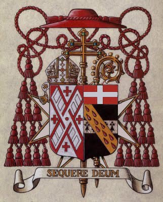
The coat of arms of His Eminence, Francis Cardinal Spellman, Archbishop of New York from 1939-1967. The blazon is: Arms impaled; in the dexter Argent on a saltire Gules between four Greek crosses Gules the sails of a windmill in saltire Argent (New York Archdiocese). In sinister Sable, on a fess Argent four ermine spots Sable; overall a bend Or goutee de sang; a chief of the Religion (Spellman).
The arms of the archdiocese employ a red X-shaped cross of St. Patrick, the patron of the archdiocese. On this is superimposed the sails of a windmill to recall the Dutch who first settled the city of New Amsterdam, later called New York. The four red crosses represent the four Gospels. Spellman’s own arms were not the first that he adopted when he was made a bishop. His original coat of arms depicted the Santa Maria, flagship of Christopher Columbus, under full sail. He used these when he was Auxiliary Bishop of Boston. After he was translated to New York Spellman adopted the arms we see here. Unfortunately, I do not know the meaning behind the ermine spots or the gold bend. I know the drops of blood were an allusion to the Precious Blood of Christ. As a Bailiff of the Order of Malta he includes both the chief of that order (Gules a cross throughout Argent) and places the shield on the cross of the order.
The external ornaments include the galero and the mitre as well as the archiepiscopal cross and the crozier. These arms were designed long before the 1969 Instruction of Pope Paul VI forbidding the use of mitre and crozier in the arms of bishops, archbishops and cardinals.
I have always like this particular coat of arms. It is an exmaple of good heraldry which is a rare find among the coats of arms of American prelates…of any era!

Not everyone was of that opinion father, I do not know if you know the book “Heraldry for the designer” by William Metzig but Metzig redesigned these beautiful arms because they were, as he said, to busy. It was a strange redesign as he placed the cross from behind the shield on the shieldand placed the the arms of the diocese and chief of the order in small cantons in the chief of the shield with a white dove in between.
I know the book but don’t own a copy. Based on your comments I doubt I’ll trouble myself to purchase one because, clearly, Mr. Metzig has no idea what he is talking about! The cross of the order of Malta and the chief of the order have their places dictated by the heraldic regulations of that order. Why would anyone place an external ornament, like the cross of the order, ON the shield? That’s ridiculous. These aren’t matters of design that are free to be changed. Similarly, the arms of the archdiocese are impaled with the personal arms as a form of marshaling. It is not an option to incorporate the arms of the See INTO the personal arms. He found the arms too busy but managed to ADD a charge by including a dove? This Metzig sounds like an idiot!