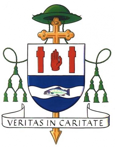
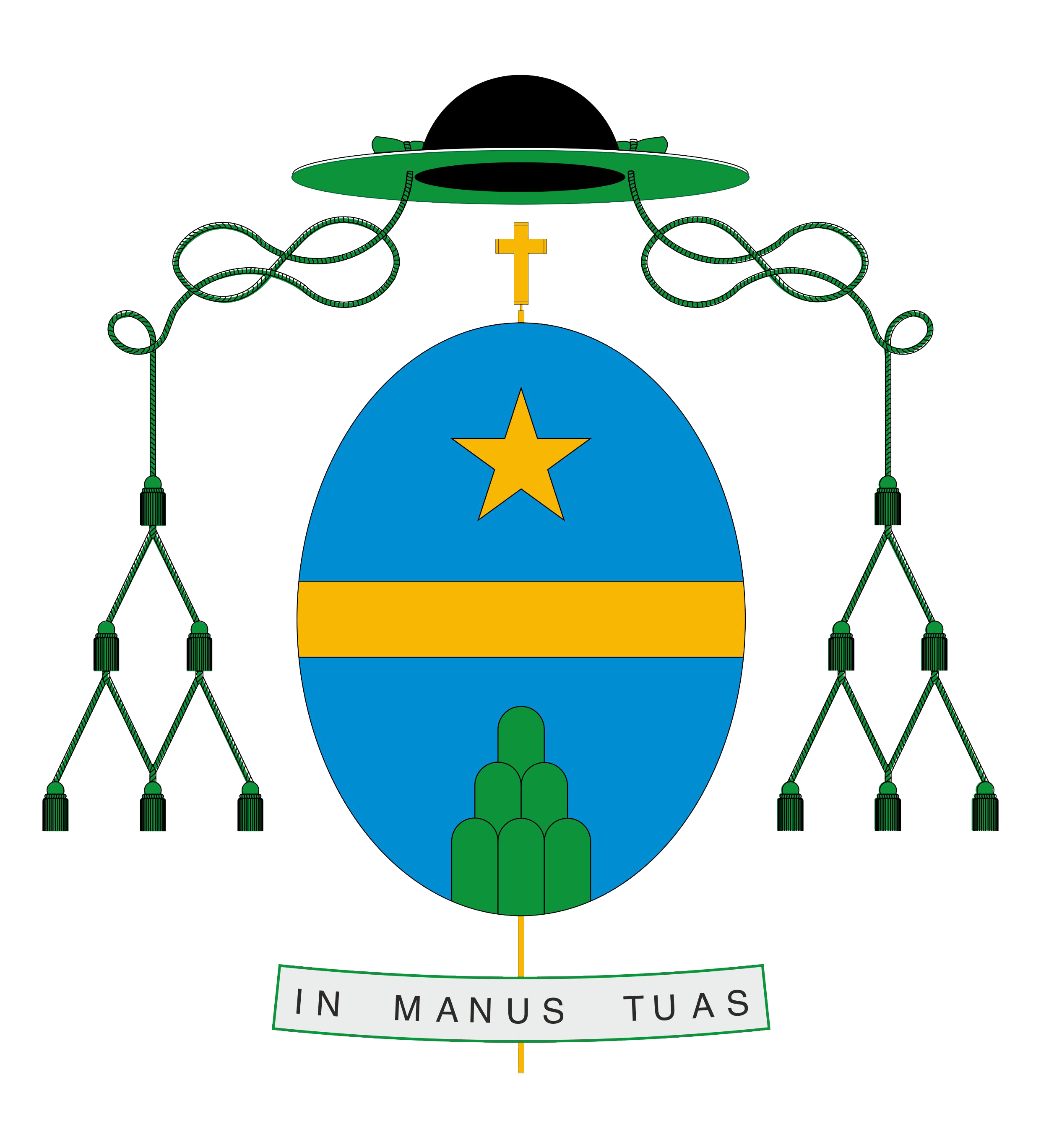
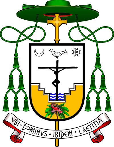
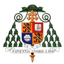
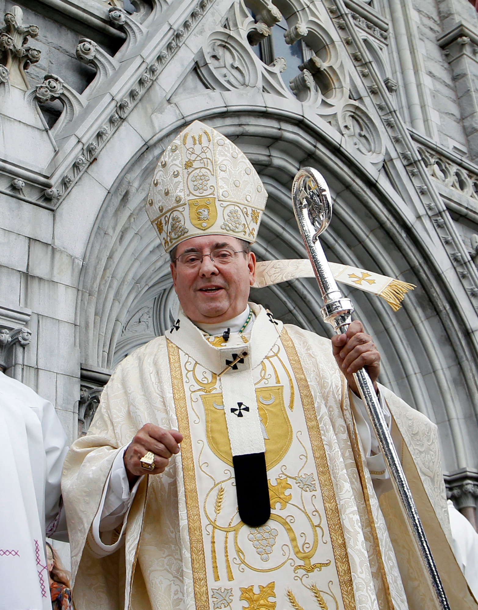
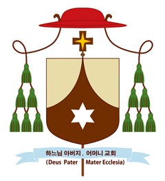
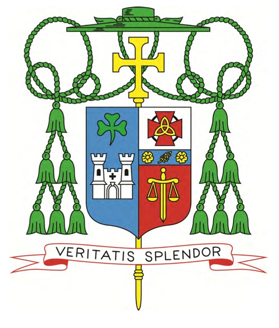
Below is an image from “The Florida Catholic” of the coat of arms of the newly ordained Auxiliary Bishop of Miami, the Most Rev. Peter Baldacchino. I am disappointed that the bishop chose to make no allusion to his baptismal patron, St. Peter, in the coat of arms. Similarly, I am disappointed that he passed up the obvious choice to have canting arms by depicting a baldacchino, or canopy, over an altar. In fact, it might have been interesting to depict the famous Bernini baldacchino of St. Peter’s Basilica as a way to combine the two. Instead, he has chosen a cluttered design filled with far too many charges in an attempt to create a “C.V. in pictures” which is precisely what a coat of arms is NOT.
The description of the symbolism in the design is also from “The Florida Catholic”:
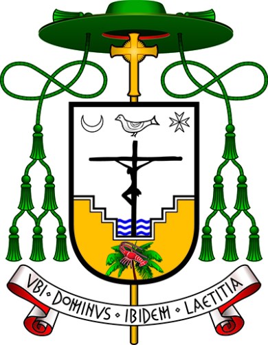
Dominating the coat of arms is Christ crucified. The Cross emerges as a sign of victory over death, represented by the waters of the baptismal font, the source of Christian life which communicates to every Christian the victory of Christ. The baptismal font is a reference also to his own rediscovery of baptism through the Neocatechumenal Way and to the work of evangelization: bringing people to live their baptism so that they may receive divine life.
Beneath the Cross and baptismal font is found an image of a palm tree upon which a lobster rests, a well-known symbol of the early Church, representing the mystery of salvation through baptism: a sea creature, accustomed to live in the waters of sin, through the work of the Holy Spirit, can leave behind its natural environment and live upon a palm tree, symbol of eternity and paradise.
Above the Cross hovers a dove, symbol of the Holy Spirit, who is the life of the Church, and without whom nothing can be done. In the upper part are found the moon, representing the Blessed Virgin Mary: “And a great sign was seen in heaven; a woman arrayed with the sun, and the moon under her feet, and upon her head a crown of twelve stars” (Rev 12:1); and the Cross of Malta, but also the star which leads the way to Christ. The palm tree is also a reference to the Archdiocese of Miami, and the lobster to the Turks and Caicos Islands, where Bishop Baldacchino ministered for 15 years. The coat of arms is completed by the three waves of the baptismal font representing the three rivers of the Archdiocese of Newark, where Bishop Baldacchino was ordained in 1996.
The motto translates to: “Where God is, there is joy”.