Category Archives: Work of Other Artists

Monk & Priest

Fr. Pachomius Meade, OSB a monk and priest of Conception Abbey in Missouri is an artist by avocation. He is very interested in heraldry as well and has had occasion to design some very nice coats of arms. But, up until now, he had not adopted armorial bearings for himself. With my encouragement he eventually set about doing so and, in my opinion, took the right path which was to take his time and go through many draft ideas. He has finally settled on a design which I also told him was a striking and good one.

The explanation of the charges chosen for this design are in his own words:

The top third of the shield (chief) is made up of two charges (one repeated). It depicts a royal crown between two birds’ claws erased. The talons are designed so as to be obviously those of falcons. Heraldry often places leather straps (jess) and bells on falcon legs. I took the artistic license to show the feathers around the talon in a diagonal conical form, as several species of falcons display around their legs. The talons plus the crown together are a rebus for my religious name Pachomius, which in the Coptic language means “king’s falcon.” These charges on a chief make them, therefore, canting arms, which is to say the arms “speak” the name of the armiger. Additionally, the base of the chief – which is usually a straight line – is enarched, a very simple variation on the line. I liked the idea of an elegant variant such as this.  Other than the stylistic choice, on a personal level I like that it is Romanesque, which is the style of my abbey’s basilica and is a subtle nod to the structure of a church.  

The lower two thirds of the shield depict smaller white shields (escutcheons) on a green field. The repeated charge spread evenly on a field in heraldry is called semy or semé, meaning “seeded.” This is a feature of heraldry that I particularly love and what was lacking in some of my original ideas for a coat of arms. The charge of a white shield without a charge of its own is a traditional symbol for a painter or heraldist. Probably my most obvious talent since I was a child has been art and it seemed like a no-brainer to have this charge. Again, there’s nothing more to it than that, but my own theological reflection on this part of the shield can also be that monastic life is called a white martyrdom – to distinguish from red martyrdom – and the spiritual combat of this charism. My surname is Meade, which is a meadow, and a green field makes sense (although, I believe my last name is really an Anglicized Gaelic word that had a completely unrelated definition).”  

I think he has come up with a clear bold design. The symbolism of the charges makes sense. He kept the overall design somewhat simple. The choice of tinctures is not only good from the point of view of symbolism they are aesthetically pleasing. The priest’s galero above the shield symbolizes his priesthood while the chaplet (rosary) encircling the shield is the accepted heraldic external ornament indicative of the armiger being a Consecrated Religious, in this case, a professed monk.

I say, “Well done!”. Incidentally, the artwork is by Fr. Pachomius as well.

DO NOT FOLLOW THIS EXAMPLE!

Recently, while taking a short trip for some post-Easter R&R I went to visit friends in western Pennsylvania. I found myself in the town of Loretto, PA where I had attended college at St. Francis University (but in my day it was still just St. Francis College). In that town is the fine parish church of St. Michael, built entirely at the expense of Charles M. Schwab, the US Steel president whose summer residence was located in Loretto. His former mansion is now the motherhouse of the TOR Franciscans who run the university. Schwab generously built the fine romanesque revival structure and donated it to the parish. Andrew Carnegie donated the church’s pipe organ. Some time ago the church was designated a minor basilica. It’s churchyard is the resting place of its founder, Father (Prince) Demetrius Gallitzin.

While looking around the lovely structure which has been spruced up since the the days when I occasionally saw it as a student some 37 years ago I noted in a side chapel a large display of the basilica’s coat of arms…and almost vomited.

What a poor coat of arms for the purpose intended. In fact, it is simply the Altoona-Johnstown diocesan coat of arms with the base changed to have the arms of St. John Paul II (who bestowed the dignity of basilica on the church) shoved in as well. The motto is the one used by the bishop at the time the church was raised to basilican rank.

The fess with three plates is borrowed from the arms of William Penn. The two charges in chief represent the cathedral of the Blessed Sacrament in Altoona and the co-cathedral of St. John Gualbert in Johnstown. The cross in base is borrowed from the coat of arms of the aforementioned Demetrius Gallitzin. Of course the ombrellino and crossed keys are typical external ornaments of a minor basilica.

But what a complete lack of creativity this design displays. Instead of alluding to the diocese or to the pope who bestowed the honor it is the arms of the diocese and the arms of that pope shoved together. There is absolutely nothing in there to identify the basilica as being dedicated to St. Michael the Archangel, or being located in Loretto, or to the Franciscan heritage of that place. The slender line dividing the silver Gallitzin cross from the arms of John Paul II is also heraldically unsupportable. From beginning to end this thing is junk.

It was so horribly disappointing to see this is what was used. The raising of the church to the rank of a basilica occurred only in 1996. By that time the internet was an easy place to find the right person or the right guidance on the design and creation of a fitting coat of arms. There is no excuse for the horrible result they ended up with, except the laziness or arrogance of those in charge of that decision.

This basilica coat of arms is useful for one thing and one thing only: to serve as an example of what not to do!

Bishop of the Virgin Islands

On April 17, 2021 the Most Rev. Jerome Feudjio (65) a priest of the Diocese of St. Thomas, American Virgin Islands was ordained a bishop and installed as the sixth Bishop of St. Thomas. The bishop is a native of Cameroon. The armorial bearings he has assumed are:

These are placed here for your information with no further comment. (I’m feeling charitable today)

Another Presbyteral Coat of Arms

Sometimes, fate interrupts the desire for armorial bearings. This armiger was having a coat of arms designed for him. Sadly, the heraldist working on it for him passed away. With much of the work done but not yet finalized he came to me requesting my help. The original design was very busy with many charges included and a bit too liberal a use of various tinctures. (Keeping a coat of arms to fewer tinctures is always a good idea).

I didn’t feel as though the whole thing could be scrapped to start over. Rather, I tried instead to clean up the design a bit while still maintaining the original ideas. I also made a few suggestions about tinctures. Working with the armiger we were able to come up with something with which he was pleased and also with which I was, at least, satisfied. It’s not the achievement I would have designed had I had the opportunity to start from scratch. Nevertheless, it is a decent, if crowded, design and there aren’t any egregious violations of tincture rules.

I must admit it was odd working on a project that had been started and brought rather far along by someone else. It was also an odd feeling to make changes to something that another heraldist had done and, being deceased, couldn’t defend or explain his choices. Still, it was a privilege to help this particular armiger out and, I think, we ended up with a rather nice coat of arms for him. (…if I do say so myself)

Bishop Kulick of Greensburg, PA

On February 11, 2021 the Most Rev. Larry James Kulick (55) a priest of the Greensburg, Pennsylvania diocese will be ordained a bishop and installed as the 6th Bishop of Greensburg.

The arms he is assuming are:

The Bishop’s family is of Slovak origin hence the clear resemblance of his personal arms to those of Slovakia with the addition of two garbs of wheat, traditionally used in Catholic heraldry as an allusion to the Eucharist. Really, he has simply taken the arms of Slovakia in their entirety to use as his own coat of arms. It can be argued that the inclusion of the two garbs differences his personal arms from those of Slovakia. That would not be entirely untrue. However, it isn’t, in my opinion, a sufficient enough difference. Some thought could have been given to a change of tincture as well.

It is noteworthy that the double-barred cross which is the principal charge in the Slovak arms is also repeated in the arms of the See. In the arms of the Diocese of Greensburg the double-barred, or patriarchal, cross is taken from the arms traditionally associated with the Order of St. Benedict and are included as an allusion to the Benedictine monks of St. Vincent Archabbey who have been present in that part of Pennsylvania since 1846 and have ministered to Catholics there since before the foundation of the diocese in 1951. In fact, the Benedictines founded the cathedral parish before it even was a cathedral and graciously gave it back once it had been designated as the cathedral church. In addition, the monks run a major seminary which is the seminary the new bishop attended. So that particular charge can have multiple significance for the armiger.

The explanation included in the worship program for the event says among other things that the colors have significance for the armiger. One sentence says, “The darker red at the top of the shield represents the blood of martyrs, and the lighter red below it represents fire; together they symbolize the martyrdom of St. Lawrence, Bishop Kulick’s patron saint.” To that I can only add that there are no shades of difference in heraldic colors and no set meanings to the what a particular color means. Another section of the explanation says this (somewhat unbelievably), “The blue shadow on top of the hills symbolizes how Christ illuminates the world, and blue is the color of the Blessed Virgin Mary, the diocesan patroness as Our Lady of the Assumption. The shadows and highlights at the top of the mountains where the red and blue come together also represent St. Joseph.”

Really? Shadows and highlights represent St. Joseph? How? And how, specifically, is a highlight blazoned? So, while I don’t doubt that all these meanings are significant to the armiger, or that at least he thinks they are, but this isn’t heraldry. Such subtleties may be present in the mind of a graphic artist but not in the science of heraldry. This is all a bit too “over the top” and focuses on the wrong things.

The coat of arms was done by Sig. Poletti of Italy who also did the coat of arms of Bishop Kulick’s predecessor, Bishop Malesic, now of Cleveland.

Bishop Bonnar of Youngstown

On January 12th, the Most Rev. David Bonnar (58) a priest of Pittsburgh will be ordained a bishop and installed as the 6th Bishop of Youngstown, Ohio. The coat of arms he is assuming is:

As per the diocesan website the explanation of his personal arms, impaled with those of the See are: “The chequy blue and silver fess appears in the Diocese of Pittsburgh’s coat of arms representing his diocese of origin.  The seven point blue star recalls the Blessed Virgin Mary, whom Bishop Bonnar entrusts his new pastoral ministry.  The pomegranate represents the motto of the Bishop that all the grains of this fruit are united in an only body, the mystical body of the Church.  The field of gold, the first among the noble metals, symbolizes the first of the virtues – the faith – which makes all believe in the salvation given by the Lord.”

The combinations of tinctures are pleasing. The overall design is simple: a complex ordinary with something above and something below, rather like the arms of the See as well. The charges are relatively clear even when reduced.

Bishop Byrne of Springfield, MA

On December 14 the Most Rev. William Draper Byrne (56) a priest of the Archdiocese of Washington, DC will be ordained a bishop and installed as the Tenth Bishop of Springfield, Massachusetts. His personal coat of arms impaled with those of the See of Springfield (below) depicts a paschal candle, a symbol of the Light of Christ to the world and also of sacrifice (the candle is consumed as it burns, which also makes a slight pun on the Bishop’s name). The crescent is taken from the arms of the See of Washington, DC and also from those of his seminary, the Pontifical North American College in Rome.

The bishop designed his own arms in consultation with another priest of Washington, DC and had them depicted by an artist who copied the style of the late Anthony W.C. Phelps of Cleveland, Ohio. That style became popular in Washington when it was used by Cardinal Hickey (who had previously been Bishop of Cleveland) and has been copied since by a number of bishops who have come from the Archdiocese of Washington. Mr. Phelps died in 2005.

Latin Patriarch of Jerusalem

On October 24 it was announced that the Apostolic Administrator of the Latin Patriarchate of Jerusalem for the last four years, Archbishop Pierbattista Pizzaballa, OFM, the former Custos of the Holy Land had been named by the Pope as the Patriarch of Jerusalem for the Latins. Accordingly, His Beatitude’s armorial bearings were updated to include another row of green tassels for a total of thirty tassels suspended from the galero. This rendering, as also the original rendering, was done by Marco Foppoli.

Bishop Lewandowski, C.Ss.R.

The coat of arms assumed by the Most Rev. Bruce Lewandowski, CSsR who will be ordained the Titular Bishop of Croae and Auxiliary Bishop of Baltimore on August 18th:

While many reactions leap to mind such as: incorrect, poorly-designed, clashing styles (the dove’s wing going right up off the shield is particularly ridiculous) among others there is really only one word to describe this:

HIDEOUS!

Found in Translation

The Most Rev. Edward Malesic (59) who, since 2015 has served as the fifth Bishop of Greensburg, Pennsylvania is now to be translated to the See of Cleveland, Ohio becoming its twelfth Bishop. The announcement was made in Rome this morning. Very well liked and respected in Greensburg, Bishop Malesic, originally a priest of Harrisburg, PA, will be greatly missed. He brings to Cleveland his gifts and talents and hopefully he will have a fruitful ministry there. His coat of arms, assumed in 2015, will impale well with those of the Diocese of Cleveland.

Archabbot Martin Bartel, OSB of St. Vincent Archabbey

On June 23 the Rt. Rev. Martin de Porres Bartel, OSB (65) was elected by the monks of St. Vincent Archabbey in Latrobe, PA as their 12th Archabbot. On July 10th at Mass he received the abbatial blessing from the Most Rev. Edward Malesic, the Bishop of Greensburg, PA which is the diocese in which the Archabbey, America’s oldest Benedictine Monastery and currently the largest Benedictine Abbey in the world, is located. I studied for my Master of Divinity at St. Vincent Seminary and I used to be a monk in the Community there.

The new Archabbot has assumed a coat of arms:

I’m a bit conflicted in my assessment of this coat of arms. I know the Archabbot and I also know the monk who designed it and executed the artwork. I have a great deal of respect for Archabbot Martin as a priest and a monk and I don’t wish to be too harsh in my critique. I think the best I can say is that it isn’t “horrible”. Another way to say it would be, “It could have been worse” but that is, admittedly, damning with faint praise.

I will not say a word about the artwork because that is not usually the subject of any of my criticism on this blog. Different artist’s draw differently. The style is strongly reminiscent of that of the late Wilfred Bayne, OSB a monk of Portsmouth Abbey in Rhode Island who was an eminent heraldist in his day.

My first, and principal, criticism is that, as has happened in many instances before, the veiled crozier that is the primary heraldic symbol of the coat of arms belonging to an abbot is missing. When St. Paul VI (pope from 1963-1978) decided to remove both the mitre and crozier from the coats of arms of bishops and leave only the episcopal cross in their heraldic achievements many took this to affect the arms of abbots as well. In former times abbatial achievements contained the mitre and the crozier. However, Paul VI’s directive was truly addressing the arms of bishops and cardinals only. The coat of arms of an abbot is still supposed to have a crozier placed behind the shield with a veil (sudarium) attached. It’s origin comes from a time when abbots made use of the crozier (in fact abbots have used the crozier longer than bishops have done) but did not enjoy the privilege of pontifical gloves. The veil served the function of protecting the crozier from dirt and oil that can be present on the hand. It is not usually used practically anymore but it has remained as a heraldic symbol and – I repeat – the heraldic symbol of the coat of arms of an abbot. Other clergy are entitled to the black galero with twelve tassels. Such a galero may be used in the armorial bearings of Vicars General, Vicars Episcopal, Provosts, Major Religious Superiors and, on occasion, some others holding a particular office. Alone, it does not indicate the coat of arms of an abbot.

The arms adopted by the Archabbey in the early 20th Century are very nicely designed and combine well when impaled with the personal arms of the Archabbot.

As for Archabbot Martin’s personal arms: the cross quartered Sable and Argent is a reference to both the Dominican Sisters who educated him as a boy and the order to which his patron, St. Martin de Porres, belonged. Over these is a basket containing bread and a broom. These are, apparently, symbols associated with St. Martin de Porres and the bread is also an allusion to the Holy Eucharist.

There is no problem with the black in the cross up against the red of the field. The so-called “rule” of tincture (i.e. that a color should not be placed on a color nor a metal on a metal) does not come into play with complex fields or charges. Because the cross is both black (Sable) and white (Argent) it may be placed on a field of a single tincture. (For example: the complex field Azure & Argent of the arms of the Archabbey may have an entirely Sable inverted chevron on it without violating this “rule” because of the complex appearance of the field). However, I think it would have looked better if a lighter shade of red had been used giving the arms a brighter appearance.

I find that the basket of bread is ill-placed as is the broom. In addition, there seems to be no good justification for the basket to be blue. Introducing multiple tinctures into a coat of arms without good reason is unsupportable, heraldically. The broom I suppose to be considered gold (Or). I have not seen an actual blazon of these arms, if one exists. If it is not intended to be gold but brown, of any shade, then it should be noted that brown is not used in heraldry. If it were blazoned as “Proper“, a term which means a particular charge is shown as it appears in nature, I don’t see this as being justifiable either since there is no naturally occurring broom and, therefore, no color which would be considered its “proper” color. Some more attention should have been paid to both the placement and the tinctures of the basket and broom.

So, I return to where I started. This design isn’t “bad” per se. But, having said that, it could have been considerably better. With some further consultation on the design the armiger might have been better served. Of the twelve Archabbots of St. Vincent nine of them have borne unique coats of arms. (The first four used the same coat of arms). Of those nine coats of arms, with 1 being the best and 9 being the worst, I would say that Archabbot Martin’s ranks 8th. The final word I can say is that I have seen abbatial coats of arms that are absolutely horrible and ugly. This is most definitely NOT one of those. But, it is merely…OK.

Rozanski to St. Louis

Today Pope Francis appointed the Most Rev. Mitchell T. Rozanski (61), since 2014 the Bishop of Springfield, Massachusetts, and prior to that a priest and Auxiliary Bishop of Baltimore, Maryland, as the 11th Bishop and 10th Archbishop of St. Louis, Missori.

The coat of arms which he assumed on becoming a bishop in 2004 which reflect his Maryland roots will impale nicely with those of the venerable See of St. Louis.

Ad multos annos!

Archbishop of Atlanta

The Most Rev. Gregory Hartmayer, OFM.Conv., (68) Bishop of Savannah, Georgia since 2011, was installed as the 8th Archbishop of Atlanta on May 6. The arms he assumed when he became Bishop of Savannah he has retained and impaled with those of the See of Atlanta.

OK. This isn’t a bad coat of arms. It also isn’t the very best I’ve ever seen. I have no comment on the arms of the See of Atlanta. The archbishop’s personal arms employ a very complex field and then sort of ruin that effect by pasting several charges onto it. I have no issue with the idea of a dividing line of a color other than black between two impaled coats of arms but for reasons passing understanding this seems to be more than just an artistic decision because it is included in the blazon.

I do have a problem with the fact that there are two different shades of blue used in the same achievement but both are blazoned simply as “Azure”. The archiepiscopal cross (which is quite wrongly described as a “processional” cross…which it is not) with the roundel containing silhouette of the San Damiano cross (a particularly Franciscan symbol) is heraldically unsupportable. I have written on this blog numerous times that the external ornaments should not be personalized by unique additions. Finally, while it has certainly become something that is done frequently I do not approve of the inclusion of the pallium in the achievement of a metropolitan archbishop. I agree with Bruno Heim’s assessment that the pallium as a heraldic charge is best depicted on the shield and not included as as external ornament.

Many will say, “Oh! But as an archbishop he’s entitled to it!” Well, first of all the extra row of tassels on the galero and the two horizontal bars on the archiepiscopal cross clearly indicate the armiger is an archbishop. Second, to those who raise the objection that those are also ornaments used by archbishops who are not also metropolitans and the pallium is the only symbol of being a metropolitan, I say, “Tough”. That’s not a good enough reason to destroy the aesthetics of a good heraldic achievement by trying to stuff yet another ornament into it. There are other external ornaments used by bishops no longer included in their coats of arms, like mitres and croziers. The coat of arms does not have to include every single thing a prelate is entitled to wear or use.

As I have said, this is a debatable point and many favor the use of the pallium in the achievement of a metropolitan archbishop. I do not. Neither did Heim. I trust his opinion more than the opinions of 100 other people. So, I think the inclusion of the pallium here detracts from the rest of the coat of arms especially as, placed where it is, it looks more like an afterthought.

The archbishop’s arms were first prepared when he became a bishop by an old friend and former student of his. The same person worked on this project for his arms as Archbishop of Atlanta.

The blazon is: “Impaled fimbriated gules, (????) at dexter (for Atlanta), Bary wavy of seven Argent and Azure; at the centre point overall an open crown Or and at the honour point a rose of the first with a center of the last, and at sinister (for Archbishop Hartmayer), per pale argent and azure a chief wavy of one crest depressed in the center of one point and issuant in base throughout a pile reversed enarched all counterchanged, overall an eagle or and in chief at dexter a triquetra interlaced with circle of the last and at sinister a tau cross sable.

The explanation (from the archdiocesan website) is: “The personal Coat of Arms of Bishop Hartmayer is intended to symbolically represent the Bishop’s heritage and vocation as a Conventual Franciscan Friar. The background of wavy blue and white is a heraldic symbol for water. The Bishop is a native of Buffalo, NY – the Queen City of the Great Lakes. Water is also the key symbol of Baptism – the first Sacrament of Initiation as a Christian. This helps recall the Bishop’s ministry as the primary sacramental minister of his diocese. The eagle serves as a two-fold symbol of both the Bishop’s German heritage and of St. John the Evangelist. The Bishop’s father was named John and this is the Bishop’s middle name. The Celtic Knot, known as a Triquetra, represents the Bishop’s Irish heritage on his maternal side. And finally, the Tau is a reference to Bishop Hartmayer’s vocation as a Conventual Franciscan Friar. St. Francis would sign his writing with a Tau, often painted it on the walls and doors of places and he stayed, and would remind his friars that their habit was in the shape of a Tau cross illustrating to them that they must go into the world wearing this cross like an incarnation of Christ.

Three New Ones That Don’t Quite Hit the Mark

Recently, there have been several new bishops ordained and/or installed in the U.S. and in each case their new coats of arms are very disappointing. One of the most valuable sections of the famous book on ecclesiastical heraldry by the late (great) Bruno B. Heim entitled, Heraldry in the Catholic Church concerns the design and adoption of new coats of arms by clergy. In that section, among other pieces of advice, Heim cautions that the new armiger should seek out the advice of someone competent in heraldry and, in particular, ecclesiastical heraldry if they can. That person to be consulted may not be the one who actually does the artwork but they can advise on what is and, more importantly, isn’t appropriate in a coat of arms.

Sadly, none of these new bishops seems to have done that.

I would also add a piece of advice which I have found myself repeating so often over the years to clergy who wish to adopt a coat of arms that it has become, perhaps, the most important piece of advice I can offer. Your coat of arms is not your CV in pictures! A coat of arms is a unique mark of identification. It isn’t a pictorial mission statement, a review of every aspect of your life, a personal history in symbols, a catalogue of all your likes and dislikes or a statement on your ideas of ecclesiology and ministry.

Too many clergy, especially new bishops, don’t seem to understand this. As a result they do too much or they include things that are inappropriate. Let’s take a look.

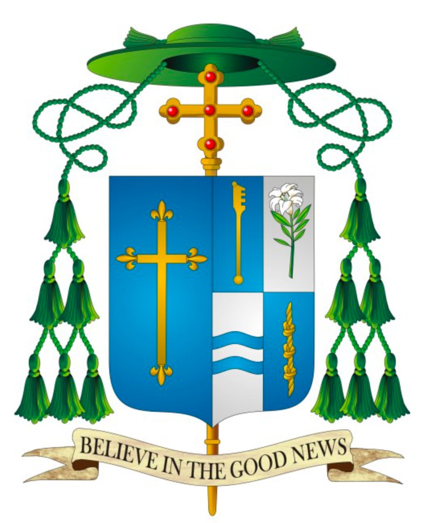
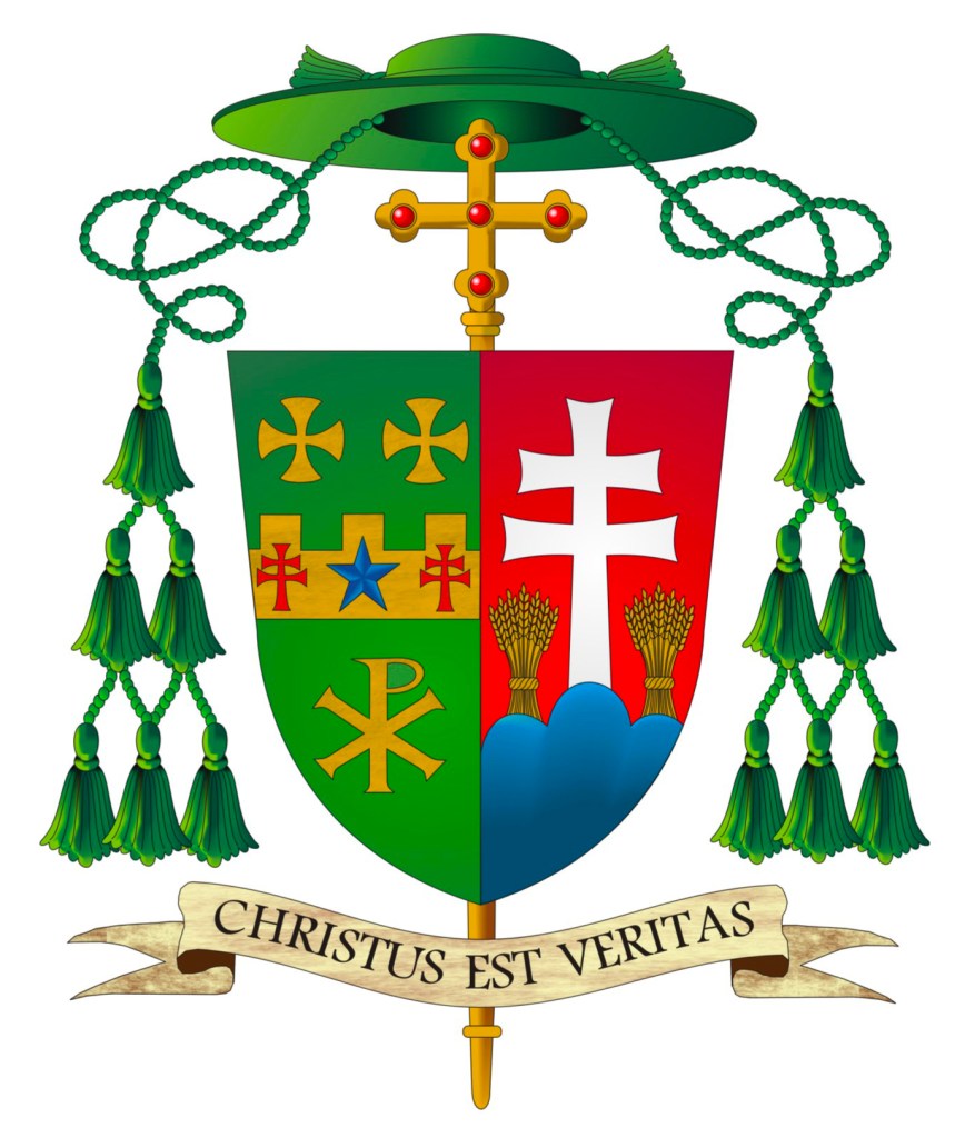
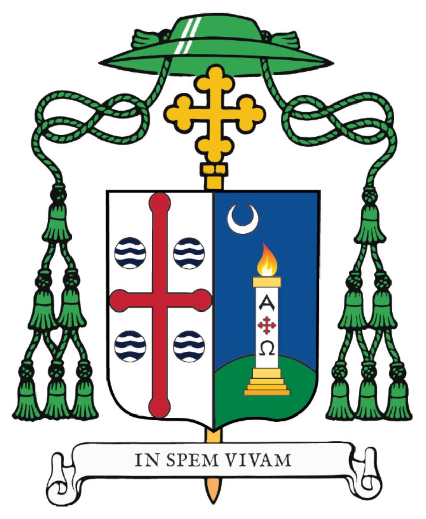
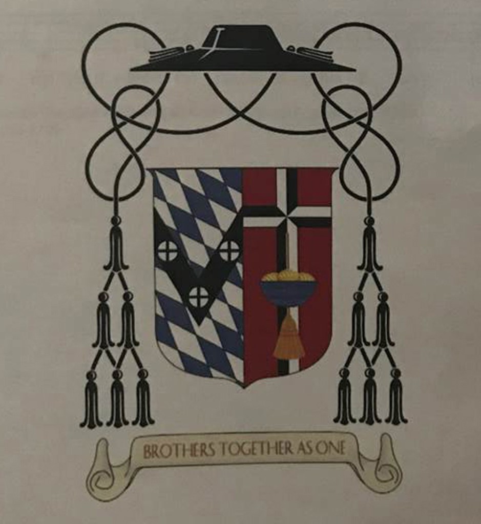
First, is the armorial bearings of Bishop Francis I. Malone (69) who was ordained and installed as the Third Bishop of Shreveport, Louisiana on January 28. The arms of the See of Shreveport are in the dexter impalement and they are not of any interest. However, the personal arms…oh boy! The chalice overall at the center is inappropriately placed and is also an almost photographic depiction of the bishop’s own personal chalice. Heraldry makes use of symbols, not portraits or photographs. An appropriate charge would be “a chalice” not a particular chalice.

The bishop has also quartered the field in such a way that he has marshaled arms that do not belong to him and appropriated them as his own. In the upper left and right of his arms he has, whole and entire, depicted the arms of the See of Philadelphia and the arms of the See of Little Rock; one because he was born there and the other because he served there as a priest. However, by including them entirely in his own arms it appears he is claiming jurisdiction over both! The better way to handle this would have been to borrow a single charge from each and incorporate them into the design of his own coat of arms rather than illicitly stealing the arms of two dioceses.

The charge on the lower left, the fleur-de-lis is fine and on the lower right the cross and crown is a logo used by his former parish which in and of itself is fine and even makes a nice heraldic charge but the overall arrangement is sloppy, and an attempt at a heraldic CV against which I warn people all the time.

Finally, the smaller Celtic cross superimposed over the episcopal cross which is an external ornament behind the shield is heraldically unsupportable. Whoever designed this coat of arms had the clear (and quite good intention) of including as many things from the bishop’s life and ministry as possible but arranged them in a way that suggests he really wasn’t that well versed in heraldic design to pull it off. Everything included in the coat of arms could have been correctly included in a more aesthetically pleasing manner if only someone who knew about heraldic design had been involved.

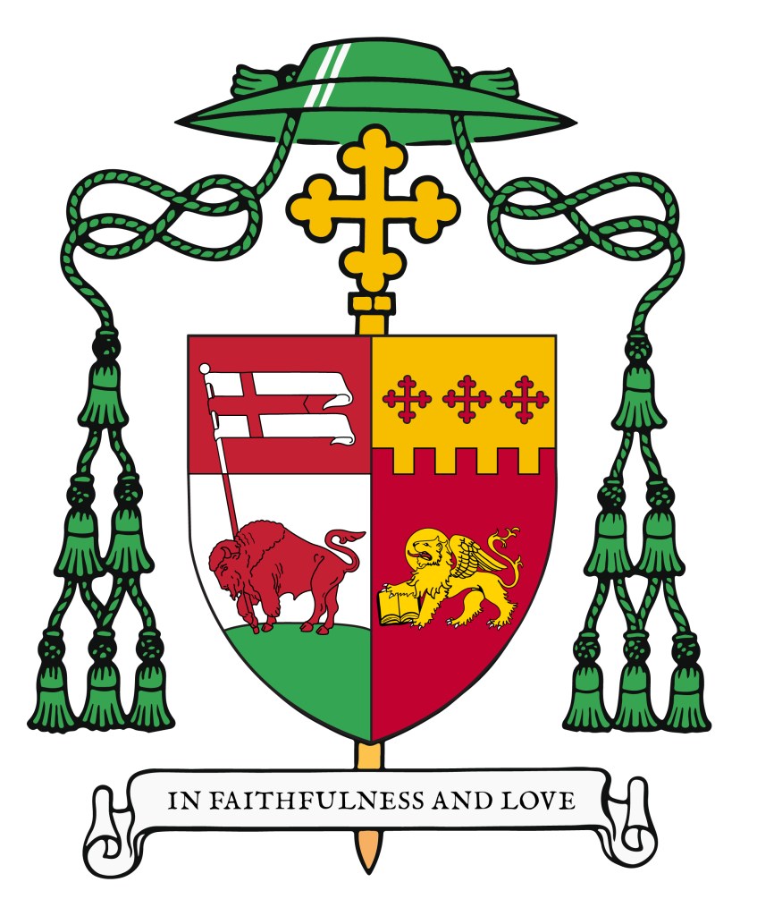
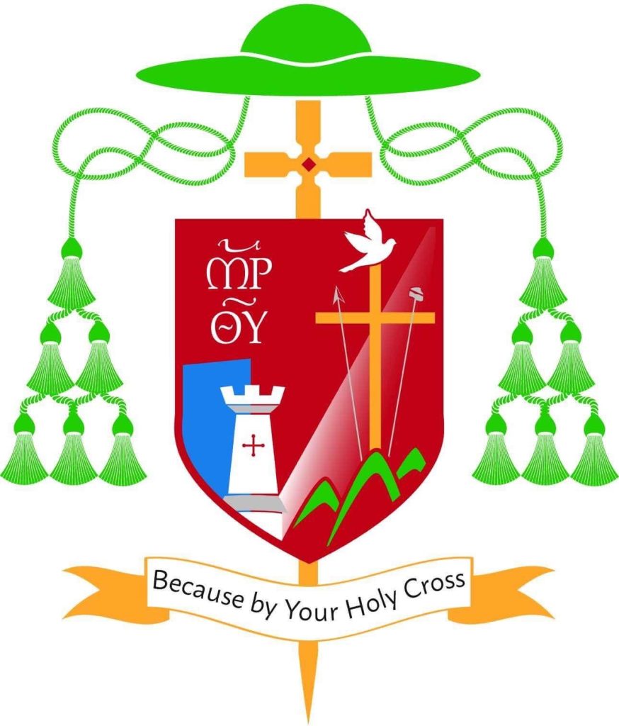
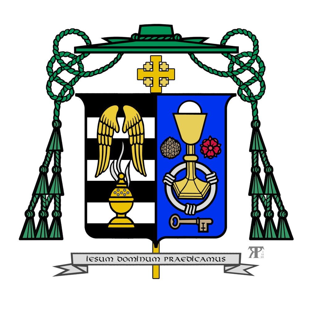
Second, is Bishop John McClory (56) a Detroit priest who was ordained and installed as the Fifth Bishop of Gary, Indiana on February 11. Again, the arms of the See are of no concern and, actually, are one of the better diocesan coat of arms in use in the USA with a nice reference to the Guardian Angels (titular patrons of the cathedral church).

This coat of arms is really rather nice. There is a good choice of the symbols to be used as charges. There are no tincture violations or indiscretions and, I would say the overall appearance of the coat of arms is aesthetically pleasing and harmonizes well with the arms of the See.

My criticism concerns the arrangement of the charges on the field which is rather like what has come to be known as the “lucky charms” style of heraldry. Namely, a bunch of charges scattered on the field and slapped onto a shield and called heraldry. In addition, trying to “personalize” the episcopal cross which is an external ornament which indicates the rank of the bearer and not a charge on the field which communicate the identity of the bearer is a mistake. It is in the form of a Jerusalem cross to indicate membership in the Equestrian Order of the Holy Sepulchre. This is not the way to depict such membership. Either a charge on the field would have been appropriate, or placing the Jerusalem cross near but outside the shield is also acceptable. In addition, the actual insignia of the Order can be depicted suspended below the shield by a black ribbon or, as a bishop, he could have placed the shield on the Jerusalem cross. But, shaping the episcopal cross to a personal preference is not an option.

Nevertheless, this is the best of the three.

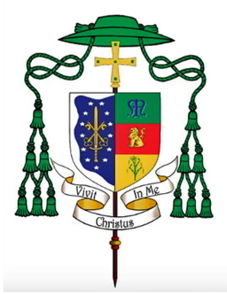
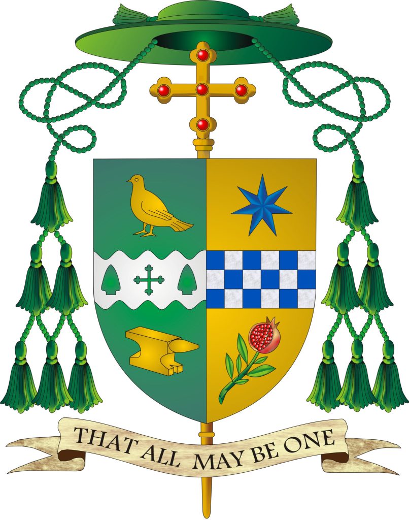
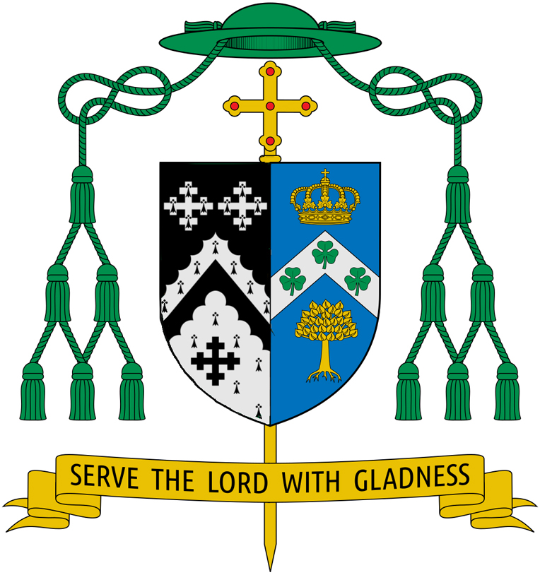
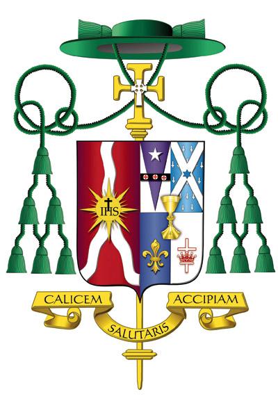
Finally, we have the armorial bearings of Bishop Donald DeGrood (54) a priest of St. Paul-Minneapolis who is being ordained a bishop and installed as the Ninth Bishop of Sioux Falls, South Dakota today, in fact, even as I write this post.

Ugh!

For the third time I take no issue with the arms of the See and also think it is one of the better designed diocesan coats of arms in the USA.

As for the personal arms he has, once again, tried to do too much. The tincture combinations are unfortunate and, actually, rather sad looking. The purple priest’s stole on a green field violates the so-called tincture “rule” which dictates that a metal on a metal and a color on another color should be avoided. The sheaf of wheat looks rather anemic (but, in fairness, that may simply be an issue involving this particular depiction of the arms). The charge of the gold letter “M” in the upper right is borrowed from the arms of St. John Paul II. There’s nothing wrong with that, per se. Many warn against using letters as charges but it is well known that John Paul II argued with Bruno Heim for maintaining the “M” in his arms which he has used as a bishop and cardinal. Certainly, that charge became widely known as John Paul’s coat of arms was used extensively during his historic 27-year-long pontificate.

However, in the official version of John Paul’s arms, painted by Bruno Heim himself, the letter “M” was depicted, correctly, as filling the whole space of the field on which it was depicted. So, the charge followed the contours of the shield shape upon which it appeared. This explains why one side of the “M” is longer than the other. However, depicting it this way, floating in the middle of the field, it is completely unnecessary, and also quite ridiculous to depict the “M” with one side shorter than the other. The “M” was not blazoned to be depicted that way, Rather, that was merely an artistic convention. There seems to be the erroneous and utterly stupid notion floating around out there that the “M” must be unevenly drawn to make it the “John Paul II M“. WRONG!

The black cross on a field that is blue and green is a bad choice of tinctures. Once again, it appears as though the new bishop consulted someone who was not very well acquainted with proper heraldic design.

These three represent a situation that is all too common in the Church in general and in the United States in particular. With all the competent assistance available, especially since the advent of the internet, it’s really rather sad that such amateurish and, in some cases, frankly ugly coats of arms continue to be created.

UPDATE on the coat of arms of Archbishop Perez

Archbishop elect Nelson Perez will be installed as the 16th Archbishop of Philadelphia on February 18. His coat of arms will appear as below. He has not really changed his arms but rather has decided to have the star in chief on his personal arms depicted differently that the five pointed star in the arms of the archdiocese. Originally, he had a five pointed star, borrowed from the arms of the See of Philadelphia, to commemorate his time as a priest there. Now that he will be serving as the archbishop there, the need for that is lessened. So, his arms remain the same with a slight tweak in the style of the star in chief.