Tomorrow, October 22, the feast of St. John Paul II, the Most Rev. Michael A. Saporito (64), a priest of the Archdiocese of Newark and, since 2020, Titular Bishop of Luperciana and Auxiliary Bishop of Newark, will take canonical possession of the Diocese of Metuchen, New Jersey–a neighboring diocese–and take up his ministry as its sixth Bishop since 1981 when the diocese was erected by St. John Paul II separating the four northernmost counties from the Diocese of Trenton.
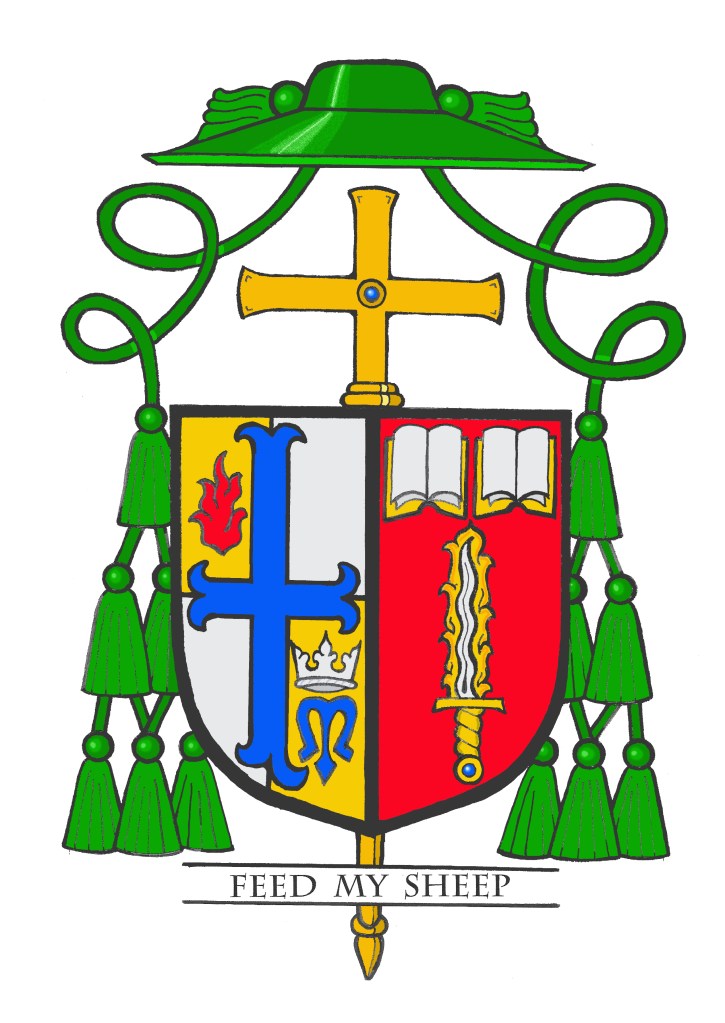
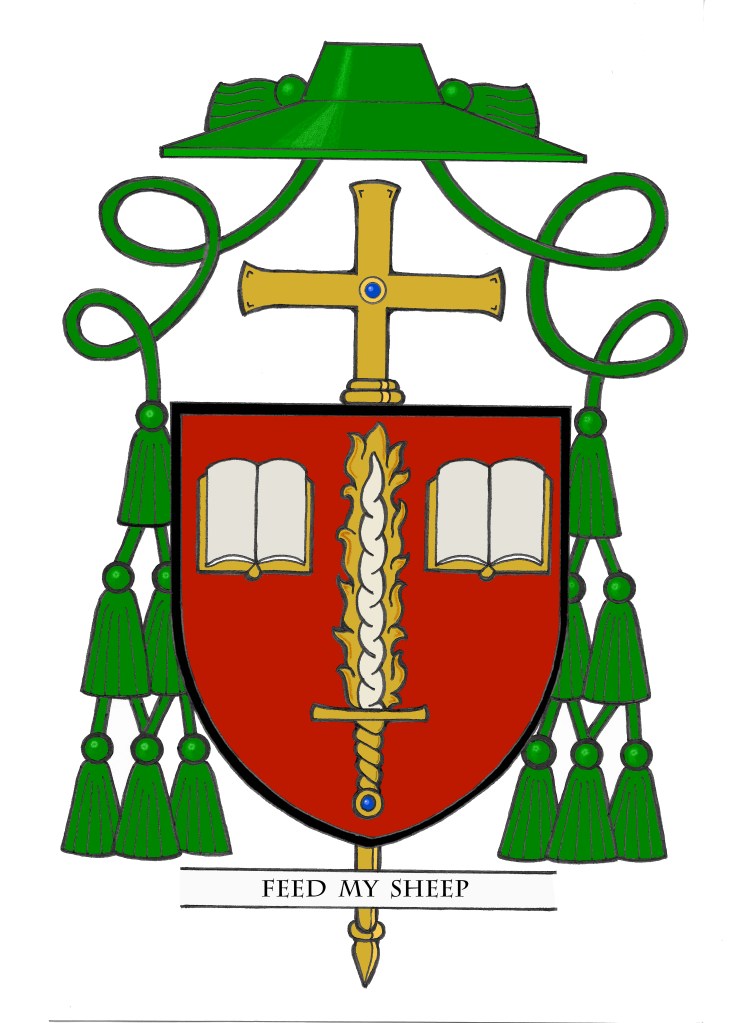
It was my privilege six years ago to design and execute the coat of arms of Bishop Saporito when he was first made a bishop. I was also very happy that he asked me once again to assist him in the project of marshaling his personal arms to those of the See of Metuchen, especially as now he becomes my own bishop in the diocese in which I serve as a priest. I did make one very tiny modification to his original arms (see below) in that with the narrower space of only one side of the shield to work with I found it was better to place the two books side by side and the sword below them. Previously, the books had flanked the sword. My concern was for the fact that since most episcopal coats of arms (at least in the U.S.) are seen primarily in greatly reduced formats–as on letterhead, or notecards, or on websites and social media–that squeezing the two books to fit them on either side of the sword would render them difficult to distinguish when the coat of arms was reduced in size. I wanted them to remain clearly discernible as books rather than two blobs of color either side of the sword. Archbishop Heim, in his now famous book, writes about how the heraldic designer and/or the heraldic artist (because those two are NOT the same thing) have the task of how best to arrange and depict a coat of arms. This is especially true in the case of marshaling two, or more, coats of arms together on the same shield. Ecclesiastical heraldry is not bounded by the sometimes complex rules of marshaling that one would find in English, or Scottish heraldry, for example. It’s more than simply a matter of taking existing arms and squeezing them into a smaller area on the shield. On occasion, a bit more creativity may be called for.
The Bishop approved this slight change which has more to do with the artistic rendering (emblazonment) of the arms rather than the actual design (blazon) of the arms. In fairness, however, I point out that the blazon was, in fact, changed to reflect this modification.
BLAZON: Arms impaled. In the dexter: Quarterly Or and Argent; a cross moline throughout Azure; in dexter chief a flame gules; in sinister base a crown Argent over a letter “M” Azure. (See of Metuchen) In the sinister: Gules, a flaming sword palewise, point in chief, the blade Argent, enflamed Or, the hilt and pommel Or with a pommel stone Azure, below, in chief to dexter and sinister, two open books Argent, bound Or. (Saporito) Shield ensigned with an episcopal cross Or behind the shield and a bishop’s galero Vert cords and twelve tassels disposed in three rows of one, two and three all Vert. On a scroll below the shield the motto: “Feed My Sheep”.
EXPLANATION: The coat of arms of the Diocese of Metuchen is based on both the arms of the Diocese of Trenton, from which it was separated as well as those of St. John Paul II who erected the diocese on November 19,1981.
The shield is divided into four quadrants representing the four counties of Middlesex, Somerset, Hunterdon and Warren that comprise the diocesan territory. The gold (yellow) and silver (white) colors are those used on the flag of the Vatican City State.
The cross moline is taken from the arms of the Diocese of Trenton. This shape of the cross is often associated with the Order of St. Benedict in heraldry. Its blue color here is the reverse of the Trenton arms (which depict a gold cross on a blue field). In the upper left of the shield there is a red tongue of fire. The word “Metuchen” is derived from the Lenne Lenape Indian word “metachen”, which means, “firewood”. In addition this symbol is associated with the descent of the Holy Spirit on the apostles at Pentecost.
In the lower right we see a blue letter “M” surmounted by a silver crown. This is the monogram for Mary, Our Queen. The diocese is under the patronage of the Queenship of Mary. The “M” also appeared in the arms of His Holiness, Pope John Paul II.
For his personal arms Bishop Saporito chose symbols reflecting his priestly life and ministry when he assumed a coat of arms upon becoming a bishop in 2020. The red background is borrowed from the coat of arms of the Archdiocese of Newark where the upper third of that shield (called a chief) is colored red. The bishop’s whole life, priesthood and, episcopate up until now had been spent in the service of that Archdiocese.
The central symbol, or charge, is the flaming sword that is used as a symbol of his baptismal patron, St. Michael the Archangel. Michael, reckoned as the commander of the heavenly hosts wields the sword that symbolizes righteousness and God’s justice.
The sword, with a silver blade surrounded by golden flames and gold handle has two open books side by side just above it. The pages of the books are blank and silver (white) while the books are bound in gold (yellow). These symbolize the Sacred Scriptures in both Testaments and are a reminder of the need for and the work of evangelization in the Church. The Bishop has devoted a part of his priestly ministry to the New Evangelization.
The motto below the shield is “Feed My Sheep” (John 21:17)
The shield is also ensigned with those external ornaments that indicate the bearer is a bishop. The gold (yellow) episcopal cross, not to be confused with a processional cross, is placed vertically behind and extending above and below the shield. In former times archbishops, and later all bishops, had a cross mounted on a staff carried immediately in front of them while in procession or on solemn occasions. This cross was a symbol of their rank as bishop. While such an episcopal cross is no longer used practically it has been retained heraldically. In fact, there are other clerics who make use of the ecclesiastical hat with its many tassels but the one true heraldic emblem of a bishop, and the only essential one, is the episcopal cross placed behind the shield. In Catholic liturgical practice a processional cross is usually a crucifix, with the corpus of Christ upon it. An episcopal cross never contains a corpus.
Above the shield is the ecclesiastical hat, called a galero which, in heraldry, replaces the martial helmet, mantling and crest. “The hat with six pendant tassels (green, purple or black) on each side is universally considered in heraldry as the sign of prelacy. It, therefore, pertains to all who are actually prelates.” (Heim, Bruno B., Heraldry in the Catholic Church 1978, page 114) The galero is green with green cords pendant from it and twelve green tassels arranged in a pyramid shape on either side of the shield. At one time in history bishops and archbishops wore green before adopting the more Roman purple we see today. In heraldry the green hat and tassels was retained for prelates with the rank of bishop according to the Instruction of the Secretariat of State, “Ut Sive” of March, 1969.
This was, for obvious reasons, a project on which I was very happy and proud to work. Of the six Bishops of Metuchen I have served as a priest under four of them. Of those four this is the third coat of arms I have had the privilege of designing and emblazoning in addition to working on the current emblazonment of the diocesan coat of arms. All of us in the Diocese wish Bishop Saporito: AD MULTOS ANNOS!

