The recently approved joint cypher of King Charles & Queen Camilla which represents them both.
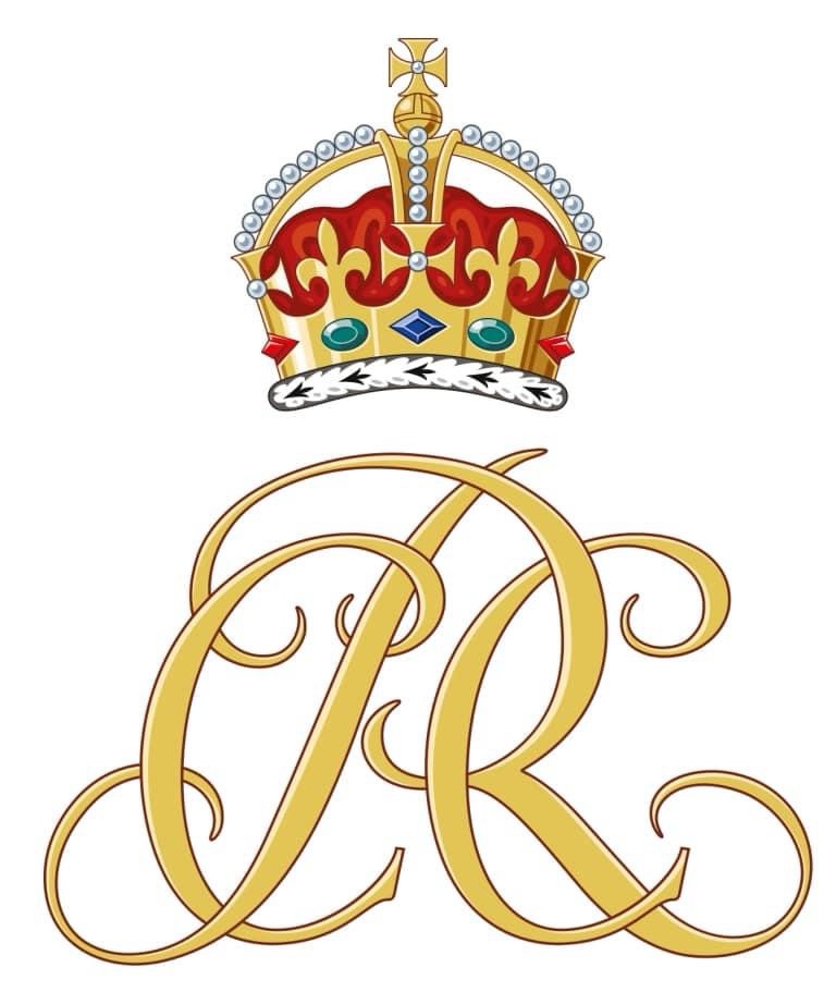
The recently approved joint cypher of King Charles & Queen Camilla which represents them both.
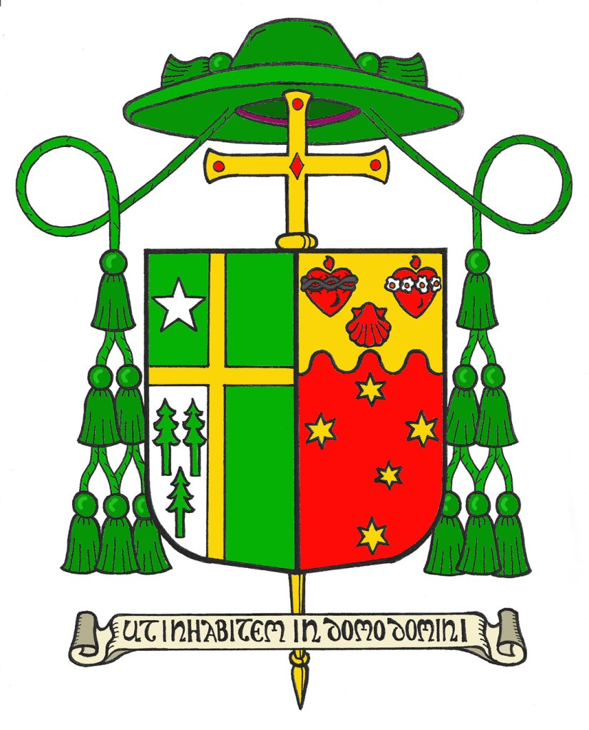
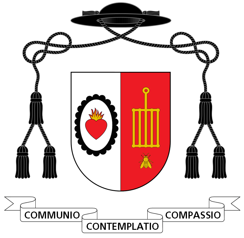
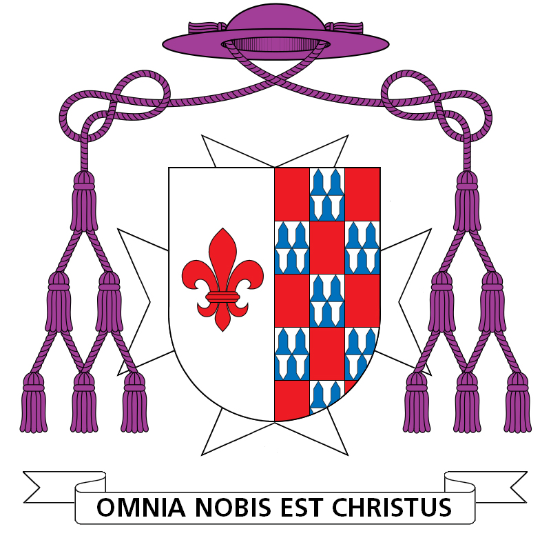
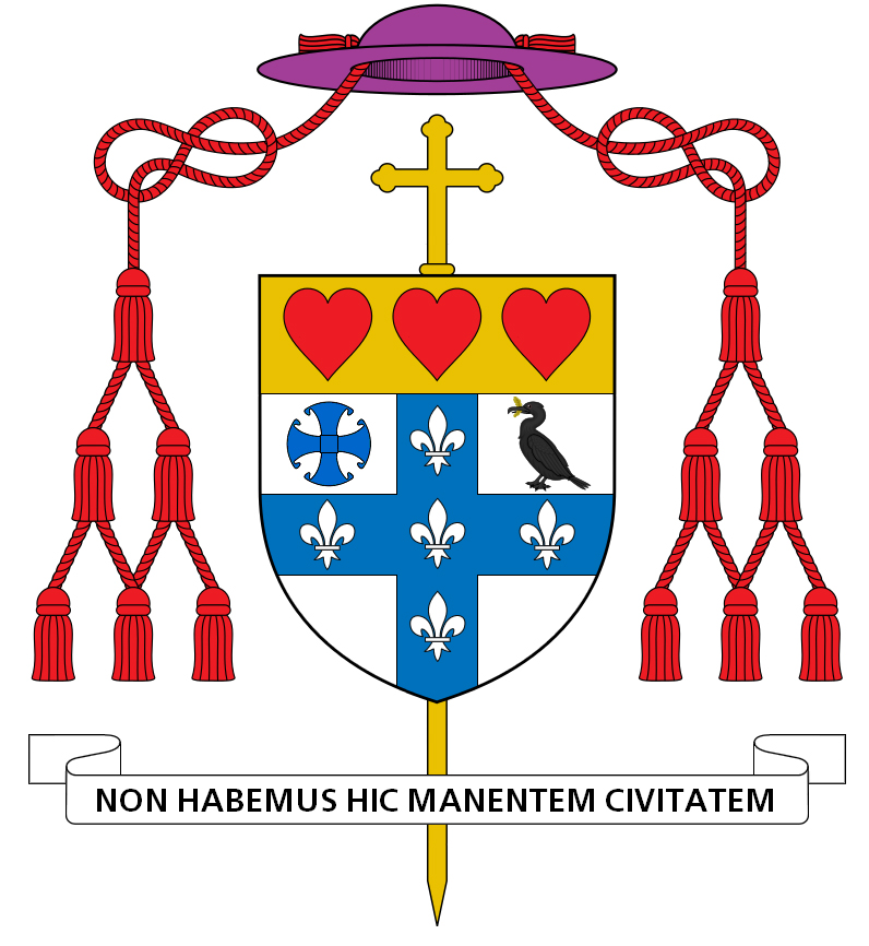
The Most Rev. Joseph E. Strickland (65), originally a priest of Dallas, Texas, later incarnated to Tyler, Texas and since 2012 Bishop of Tyler was removed from that office on November 11, 2023 by the Roman Pontiff.
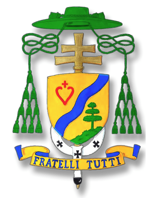
Back in 2012 when he was appointed as Fourth Bishop of Tyler I had the happy task of designing his coat of arms. Now that he has ceased to be the Bishop of Tyler his coat of arms will be modified to reflect that reality. He remains a bishop in the Church and, as such, retains the use of his armorial bearings. His coat of arms at the time of his ordination and installation was:
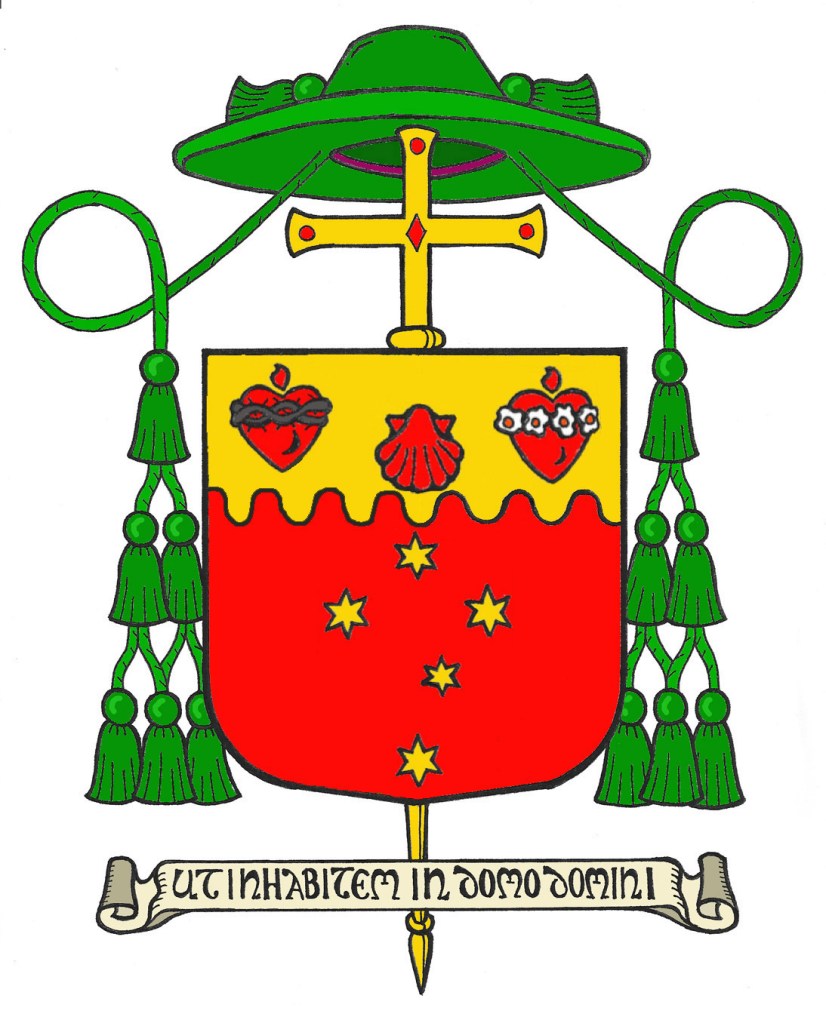
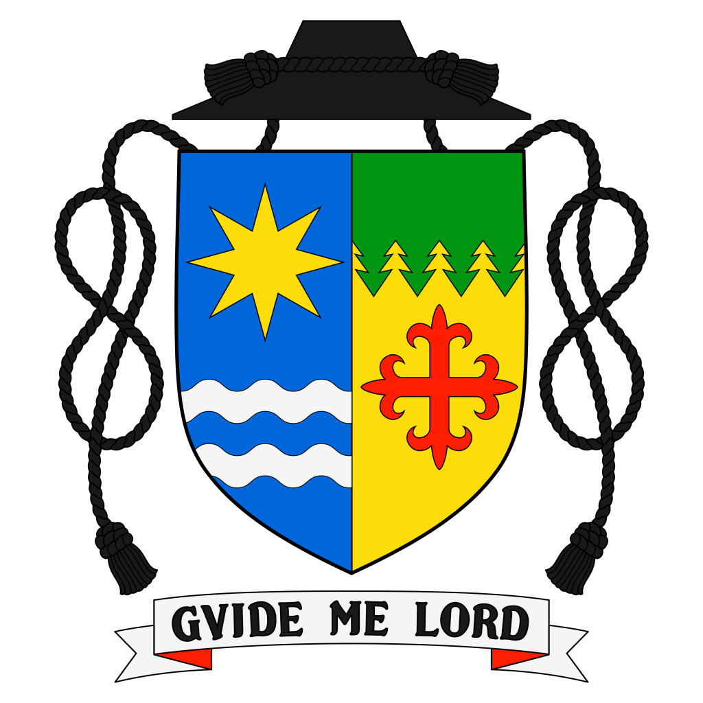
Now that he has been removed as Ordinary of Tyler, his armorial bearings will appear as this:
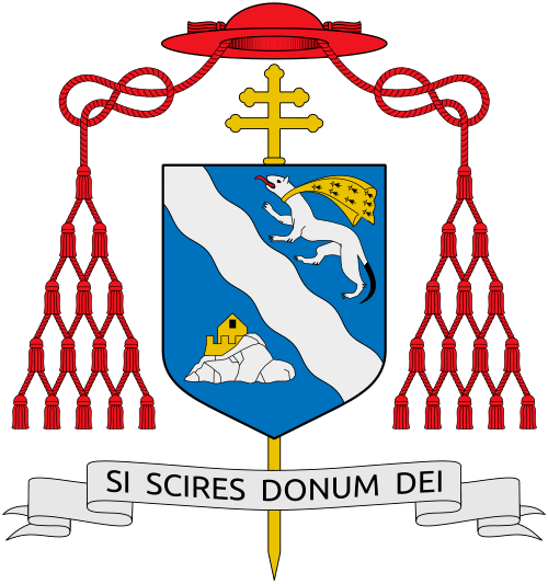
On September 30 Pope Francis held a Consistory in order to create new cardinals of the Holy Roman Church. Among those was the Frenchman from the Archdiocese of Rennes, Christophe Cardinal Pierre (77), who since 2016 has served as Apostolic Nuncio to the United States of America. He was named Cardinal Deacon of San Benedetto fuori Porta San Paolo. The arms he assumed on becoming a bishop in 1995 are now ensigned with the scarlet galero of a cardinal.
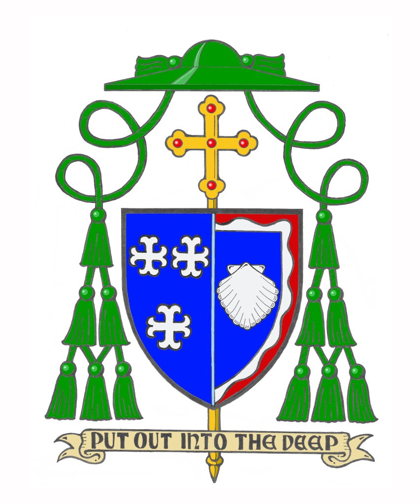
On October 12, the Most Rev. Stephen Maekawa, OP (55) a priest of the Order of Preachers (i.e. the Dominicans) living and working in Alaska was ordained a bishop and installed as the 10th Bishop of Fairbanks, Alaska.
His coat of arms is:
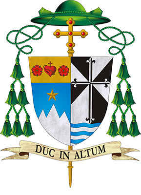
According to the diocesan website:
“In the right side of the shield (to the observer’s left), we find represented the coat of arms of the Diocese of Fairbanks. At the base, the North Star is suspended on a blue field over the mountains of Alaska, which appear in white. In the upper section, between two red roses on a field of gold, is the Sacred Heart of Jesus, titular symbol of the Cathedral of the diocese. The roses, representing St. Therese of Lisieux, patroness of the Alaska Missions, recall her promise, “After my death I will let fall a shower of roses.
In the left side of the shield (to the observer’s right) is the personal coat of arms of Bishop Maekawa. The black and white cross is the from the coat of arms of the Order of Preachers founded by St. Dominic in 1216. The waves represent the waters of baptism and the family name Maekawa which means “before the river.” The episcopal motto “Duc in Altum” is Jesus’ command to the Apostle Peter, “Put out into the Deep” which reminds us to trust in the Lord Jesus believing that all creation belongs to God: “The earth is the Lord’s and all it holds, the world and those who dwell in it.” (Ps 24:1)“
I think, unsurprisingly, the bishop has chosen a simple coat of arms reflecting his Religious community. It harmonizes well with the diocesan arms with which it is impaled. A nice design that doesn’t try to do too much–perhaps the single biggest error made by most new American bishops.
I heard the sad news today of the sudden and unexpected passing of the Most Rev. Kevin Birmingham, Titular Bishop of Dolia and Auxiliary Bishop of Chicago. He passed from this life on October 1, 2023. he was 51. May he rest in peace.
I was privileged to design the bishop’s coat of arms when he became a bishop in 2020.
On September 26, in an unprecedented liturgy, the Archdiocese of Los Angeles received four new Auxiliary Bishops at the same time. While it is unusual for any diocese to receive so many new bishops at once it seems almost fitting for the U.S.’s largest archdiocese of well over 4 million Catholics to receive the needed assistance in episcopal ministry in order to serve the people of southern California adequately. Bishops Albert Bahhuth (66), Matthew Elshoff, OFM. Cap.(68), Brian Nunes (58) and Slawomir Szkredka (49) were all ordained to the episcopate by the Most Rev. José Gomez, Archbishop of Los Angeles.
Their armorial bearings were all designed by James-Charles Noonan. As he usually does he makes a great deal about the shape of the episcopal cross in each achievement as well as the “significance” of the shape and color of the gemstone in each one. None of that is heraldically supportable. It may be his favorite idea but, as I have written about extensively in the past, the external ornaments in a coat of arms are not personalized not do they contain unique and special symbols particular to the armiger. That would require they be blazoned as such and would then have to be copied by any artist rendering the coat of arms. Only the charges on the shield are unique to the armiger.
Even there, Mr. Noonan has placed his own stamp on these four coats of arms. Acknowledging the unusual nature of four bishops being ordained at once he has included a similar chief in all four coats of arms as a means of tying them all together by the use of this similar charge. The idea in and of itself has some merit. The occasion was unique; something unique to mark it is a nice idea.
However, the coats of arms of auxiliary bishops do not contain charges that represent the jurisdiction in which they will serve as auxiliary bishop. A heraldic representation of possessing jurisdiction over a diocese belongs to the Ordinary of the diocese alone. In addition, a reference to the diocese (by borrowing a charge from the diocesan coat of arms) is quite common in heraldry. But, that isn’t what has occurred here. Instead of each coat of arms borrowing some charge from the arms of Los Angeles the four new bishop’s arms all bear an almost identical chief–an ordinary charge–in a manner not unlike those used to signify membership in a Religious Order or an Order of Chivalry.
Don’t misunderstand me: my criticism is not of the idea of heraldically marking the unusual circumstance of four bishops being ordained all at the same time. Rather, it is of the use of a near-identical charge, and one that sort of implies a kind of jurisdiction, that I am criticizing. It’s a clever devise. But, perhaps a bit “too clever” for its own good. In addition, one has to consider that all four of these bishops may not–indeed very likely will not–remain as auxiliaries of Los Angeles permanently. Once one of them is translated to another diocese the whole unifying symbolism uniting all four coats of arms begins to fall apart. Perhaps the use of a single similar charge employed differently in each of the coats of arms would have been a better solution?
The design of each of the rest of the four coats of arms is quite correct and very nice. As usual, Mr. Noonan’s regular collaborator in producing the artwork has shown herself capable of creating very fine work.
The following are the coats of arms of Bishops Bahhuth, Elshoff, Nunes and Szkredka:

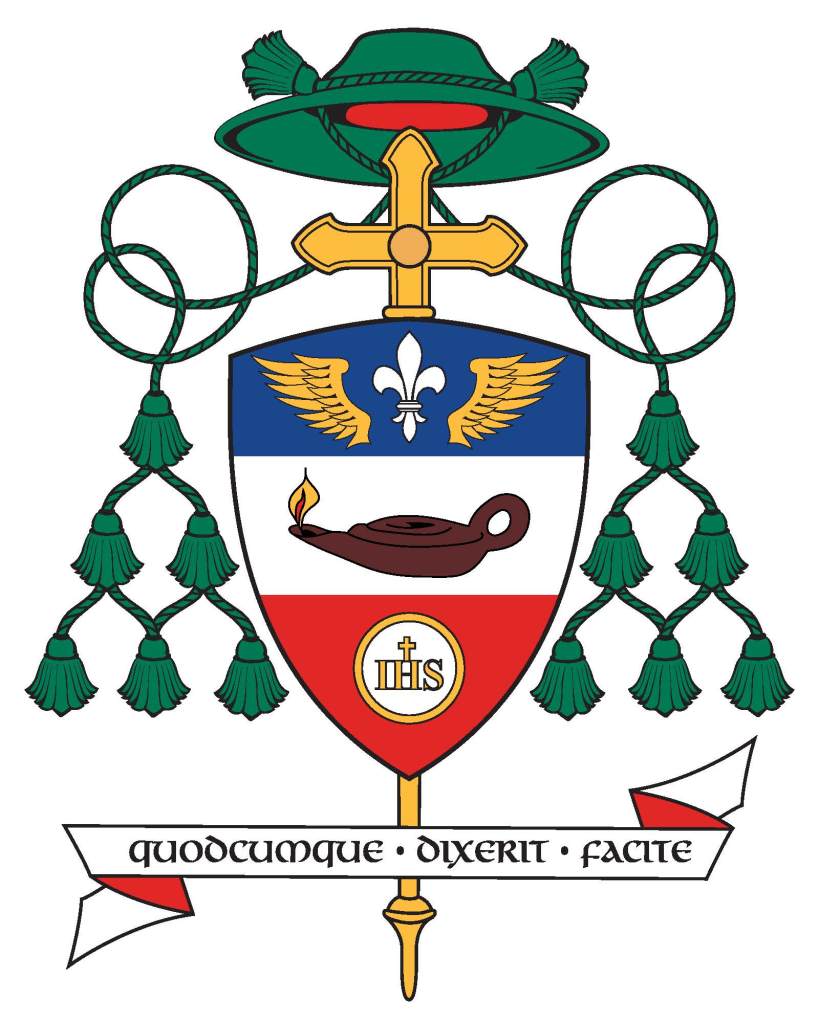
On September 28 of this year the Most Rev. Michael Pham (56), a priest of the Diocese of San Diego, CA will be ordained a bishop and will serve as Titular Bishop of Cercina and Auxiliary Bishop of San Diego. On the same day, the Most Rev. Felipe Pulido (53), a priest of the Diocese of Yakima, WA will be ordained the Titular Bishop of Buffada and also serve as Auxiliary Bishop of San Diego.
I was happy to assist both of these new bishops with the creation of their respective coats of arms. The armorial bearings of Bishop Pham are:
The shield is divided horizontally to depict a silver (white) sky above a blue wavy ocean. The ocean is criss-crossed by diagonal lines in order to create a pattern suggestive of a fisherman’s net. This has more than one meaning. First, it represents that after 1975 while still living in Vietnam the bishop’s father became a fisherman to provide for his family. In addition, the net indicates not only the task of an apostle (or a successor to an apostle) of being a “fisher of men” but it also alludes to the New Evangelization where we are exhorted to put out into the deep (Duc in Altum). This symbolizes both the bishop’s priestly and episcopal ministry.
In the upper part of the shield the main charge is a boat on the waves under full sail. The boat also alludes to the work of a fisherman. In addition, a boat, in heraldry, is often used as a symbol of the Church itself, often referred to as the barque of Peter, who was a fisherman himself. On the sail of the boat in the center is a red beehive surrounded by two green palm branches. The beehive is a symbol of St. John Chrysostom, the bishop’s baptismal patron saint. Chrysostom was the archbishop of Constantinople and renowned for his inspiring preaching. So, he was known as a “honey-tongued” preacher, hence the beehive as his symbol. The palm branches are an ancient symbol of martyrdom. The bishop’s family comes from the first diocese in the north of Vietnam where his ancestors were among the first martyrs for the faith in that part of the world.
On either side of the boat are eight red tongues of fire which also have more than one meaning. First, they are symbols of the Holy Spirit which, the Sacred Scriptures remind us, descended on the Apostles as tongues of fire at Pentecost. This was the beginning of their ministry to go out into the world to preach the Gospel so it is another symbol of Evangelization. Throughout his priestly ministry the bishop has worked with various groups of different ethnic and cultural backgrounds. Many flames represent a diversity of communities. Bishop Pham strengthened the cultural communities found in the diocese and shared them with the larger Catholic community. He has served as Episcopal Vicar of the Office of Ethnic & Intercultural Communities. Six years ago, he launched the first-ever Pentecost Mass for All Peoples, which has come to attract more than 2,000 faithful annually. So, symbols of the Holy Spirit were seen to appropriately reflect this ministry. It also reflects how, on Pentecost, when the Holy Spirit descended, people from many different and various places, languages and cultures heard the Apostles speaking in their own languages. The red of the boat, the beehive and the tongues of fire is a further allusion to the blood of the martyrs.
The motto below the shield is, “Hiệp Nhất trong Chúa Kitô” which means “One in Christ” or “United in Christ” in Vietnamese. This motto reflects the work the bishop has done throughout his priesthood to help various communities and to work towards the unity of diverse cultures and groups within the People of God.
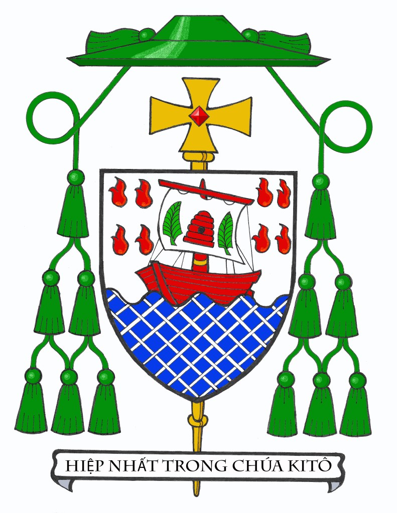
The armorial bearings of Bishop Pulido are:
The shield is divided into four quarters with wavy horizontal lines from top to bottom. In the first and fourth quarters the lines alternate blue and silver (white) while in the other two quarters they alternate red and gold (yellow).
The blue and white lines represent the Blessed Virgin Mary. In addition, they suggest water which also alludes to Jesus washing the feet of His disciples. In addition, they can be seen as referring to the waters of Baptism. The red and gold (yellow) lines represent the Holy Spirit and fire. In addition, the colors can be seen as referring to the Blood (as well as water) that poured from the side of the Lord at His crucifixion. They are also seen as referring to bread (gold/yellow) and wine (red) as a reference to the Eucharist. In this way these lines also refer back to the foot washing because Jesus was showing His disciples the kind of self-sacrificing service they were called to which was about to be played out in His sacrifice on the cross and would be experienced for them in the future whenever they came together to share the Eucharist.
At the center of the shield is a silver (white) roundel called a plate. On this plate is a simple symbolic representation of the Mandatum (washing of the feet). The outer edge of this roundel, or plate is a line composed of small humps. Such a line is called “invected” in heraldry. It is borrowed from the coat of arms of the Diocese of Yakima, WA where Bishop Pulido served as a priest before being named a bishop.
The motto below the shield is, “Building Communio” which is what the bishop sees as the purpose and goal of his episcopal ministry.
On September 3 the new Archbishop of Mechelen-Brussel (Malines-Bruxelles) was ordained a bishop and was installed as the 23rd Archbishop. The Most Reverend Luc Terlinden (54) is of the noble family of the viscounts and barons Terlinden. This makes him the first archbishop who is from the nobility since Mgr. de Méan (who was the last Prince-Bishop of Liège and died as Archbishop in 1830). There have been other nobles named as bishops in Belgium, however. It is disappointing that the archbishop chose to create and assume new arms (below) that only slightly refer to his noble family’s coat of arms (above, left). I’m sure many fine heraldist and genealogists are disappointed at that. The arms he has assumed aren’t bad, per se. Rather, it is that his ancestral arms are far better.
Throughout the course of my priesthood, after my time as a Parochial Vicar concluded and I began to be placed in charge of my assignments I also began the practice of 1) devising armorial bearings for the different places in which I have served and 2) marshaling those newly-devised coats of arms with my own. Having jurisdiction over the church or parish was then illustrated heraldically.
In the image above the first coat of arms (upper left) is my personal coat of arms assumed at ordination in 1997. The next image (upper right) shows my arms impaled with those of the Shrine of the Blessed Sacrament in Raritan, NJ where I served as the Sixth Rector (hence the four tassels instead of only two) from 2009-2015. The image at lower left shows my arms impaled with those of St. Joseph Church in Washington, NJ where I served as Administrator and then as the Twenty-Second Pastor from 2015-2023. During the last part of that time I was also Dean of the Morris Canal Deanery. The final image (lower right) shows my coat of arms impaled to the newly-devised parish coat of arms of St. Mary, Star of the Sea in South Amboy, NJ where I will serve as the Ninth Pastor from 2023 onwards.
(Artwork: Xavier Garcia)

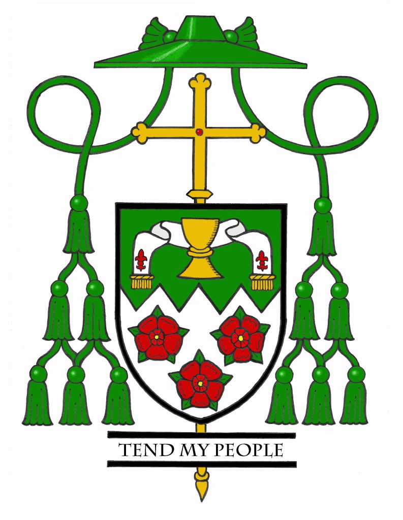
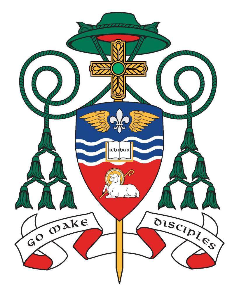
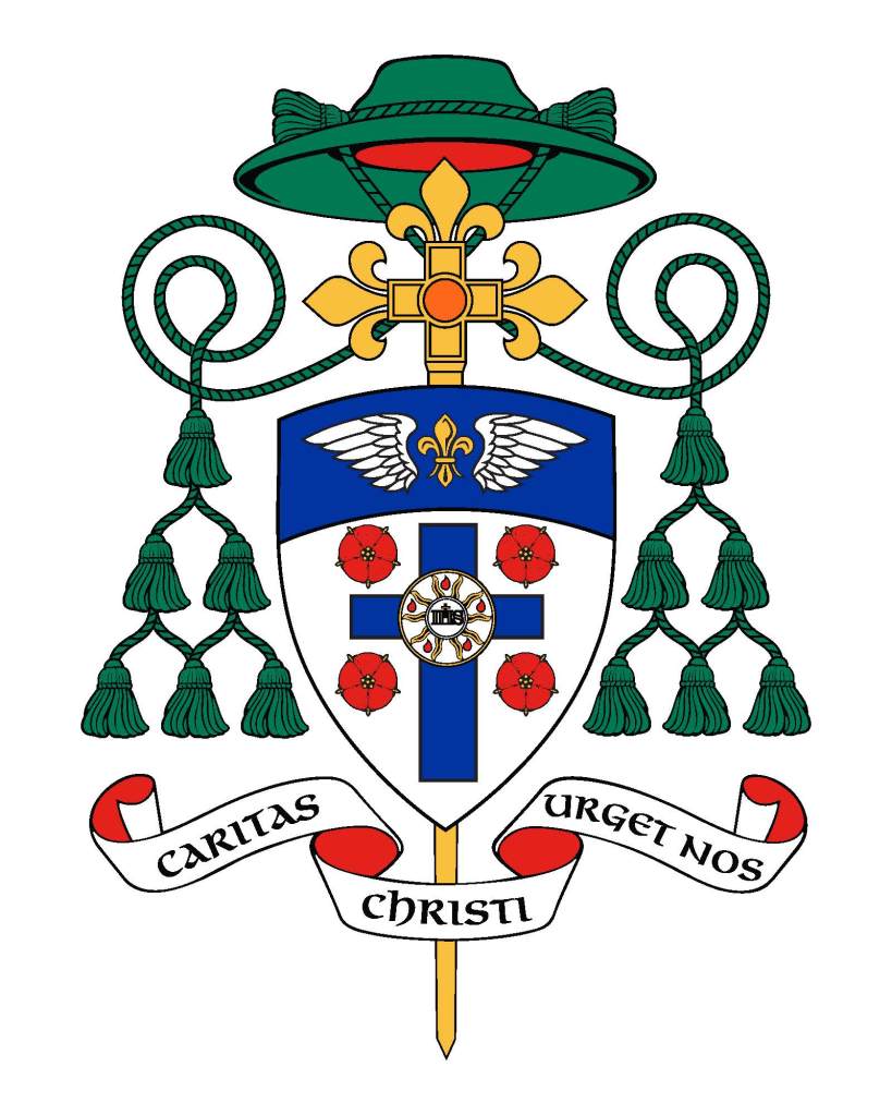
One of my readers, Jorge Hernández Sánchez, from Seville who is also a heraldist has completed some 100 coats of arms specifically for ecclesiastical clients. He sent me quite a few of his creations. Many of them are wonderful examples of the coats of arms of prelates of various types below the rank of bishop. We see a preponderance of episcopal and archiepiscopal heraldry. It’s nice to see the armorial bearings of other ranks in the Church. The following are just a sampling of Jorge’s work…
Last November, my Bishop appointed me to serve as the Dean of the Deanery in which my parish is located. That meant there was going to be a modification of my coat of arms. The addition of a second tassel to the galero in my armorial bearings was for the duration of the office of Dean only.
Just yesterday, my Bishop announced the appointment of three new Deans. Two of them are appointed to fill vacancies created by the retirement of two priests. The third is in my own Deanery where a vacancy is about to occur when I am transferred to a new assignment later this month. Since the extra tassel was only “pro hac vice” I must now reliquish it and revert to using the galero of a simple priest, with one tassel pendant on either side of the shield.

As it turns out, I served as a Dean for only nine months. At the time of my appointment last November, my bishop and I had no way of knowing that I would be transferred only the following summer.

On July 25, the Feast of St. James, Rev. Mons. Edward M. Lohse (61) a priest of the Diocese of Erie, PA since 1989 (and a man who was two years ahead of me at St. Vincent Seminary) is being ordained and installed as the Fifth Bishop of Kalamazoo, Michigan.
The cross in chief is from the attributed arms of St. Edward the Confessor. The division line wavy is from the arms of the See of Erie and it represents the lakeshore where Erie lies. On the fess are symbols of the Jesuit Order and the Benedictine Order both of which profoundly influenced the bishop’s formation and spirituality. The base uses the blue and silver fusils from the arms of Wittelsbach and, by extension, of Bavaria to symbolize his family and faith, both of which have their origins in Bavaria.
The arms are simple, clear and contrast nicely with the somewhat unfortunate arms of the See of Kalamazoo. I think a better composition of the arms would have been to place the Bavarian fusils in chief with the wavy division line beneath them and then have blue field with the cross throughout and the two symbols of the orders in the first and fourth quarters. That’s merely an opinion, mind you, and in matters of taste there can be no real dispute. However, the pattern of fusils in bend looks better at the top of the shield where the eye is first naturally drawn. A solid chief with a patterned base makes a weak composition, in my opinion, because it looks top-heavy.
In addition, the essentially silver (white) backgrounds of both of the roundels placed on a silver fess looks washed out and weak. They would have contrasted better being on a blue field and “popped” a bit more. Also, the cross and lettering on the medal of St. Benedict should be black, rather than blue. I suppose the same could be asserted for the letters on the Jesuit symbol as well.
Overall, it is still a good design and Bishop Lohse certainly has a coat of arms that is better than many other US bishops. That’s not saying much, however, given the appallingly bad heraldry employed by most US bishops. Nevertheless, I think this is a decent coat of arms. My criticism is intended to convey only that it could have been a little better without changing any of the symbolism, but just arranging it better.
In 2018, the Most Rev. Richard Henning, a native and a priest of Long Island’s Diocese of Rockville Centre, NY (and a high school classmate of mine) became Auxiliary Bishop of that diocese. I was pleased and honored to assist him with the design of his personal coat of arms to be adopted upon ordination to the episcopate.
Last year, the Holy Father appointed him to be the Coadjutor Bishop of Providence, Rhode Island, just across Long Island Sound from his former diocese. A coadjutor bishop is appointed to share in the authority of the diocesan bishop in running the diocese and has the right of automatic succession to the See when the previous bishop dies or retires. (NOTE: there used to be such a thing as coadjutor without the right of succession, but such appointments are no longer made). Bishop Henning succeeded to the See of Providence on the first of May of this year upon the retirement of Bishop Thomas Tobin becoming the IX Bishop of Providence. So his armorial bearings have been altered to impale his personal arms with those of the See:
The arms of the Diocese of Providence are composed of a blue field on which are placed three silver (white) crosses with arms that appear to terminate in anchors. These crosses, heraldically known as “moline crosses,” are used to suggest an anchor. By employing the symbol of the State of Rhode Island this signifies that the Diocese of Providence encompasses all of the state it was established to serve. The crosses, three in number to signify The Trinity, are rendered in the traditional colors of water, blue and silver (white), because of the importance that water plays in the life of “The Ocean State.” These colors are also the traditional colors for the representation of the Blessed Virgin Mary, who, in her title of Our Lady of Providence, is Patroness of the Diocese and of the See City.
Bishop Henning’s personal coat of arms is composed of a design depicted in red (Gules), white (Argent) and blue (Azure) which are the national colors of the United States.
Both the blue background and the single escallop shell allude to the sea as evoking the Bishop’s own background and the shell is also borrowed from the coat of arms of the See of Rockville Centre, the diocese in which he was born and raised and which he served as a priest and auxiliary bishop. The shell image also recalls the Bishop’s heritage in the Diocese of Brooklyn, dedicated to its patron, St. James. The episcopal ordination of Bishop Henning took place on the eve of the Feast of St. James. In concert with the Bishop’s motto, the shell is a traditional symbol of baptism and pilgrimage. It is in the depths of these waters that Christians find their salvation in Jesus Christ.
The white wavy line surrounding the blue field is similarly taken from the arms of Rockville Centre and it alludes to the diocese’s location on Long Island, NY. Furthermore, it indicates the sea as the place where the barque of St. Peter, an image used to evoke the Church, is located.
The blue background also evokes the Bishop’s devotion to the Blessed Virgin Mary and his years of service as a Professor and Rector at the Seminary of the Immaculate Conception in Huntington, NY. The red wavy portion of the border evokes the Bishop’s devotion to the Most Sacred Heart of Jesus and his former service as the Director of the Sacred Heart Institute for the Ongoing Formation of the Catholic Clergy.
This situation was one of those times that chance presented a challenge. The bishop wanted to impale his arms with those of the See as is customary in N. America. In addition, he had no good reason to change the diocesan arms and no desire–correctly–to change his personal arms. Impaling them side-by-side presented an aesthetic challenge because they both employ blue fields. In addition, it is customary not to continue a bordure all the way around the field when the arms are impaled. Rather, there is a kind of dimidiation employed whereby the bordure is discontinued along the impalement line. In order to make the division between the two coats of arms more visible, and slightly less confusing a division line of very light blue (blue celeste, if you will) was employed for aesthetic reasons. This is really more of an artistic style choice rather than a heraldic one. Once again, it was my pleasure to assist him with this project.
The Right Reverend Dom Cuthbert Brogan, OSB who first became Prior-Administrator of St. Michael’s Abbey at Farnborough in England in 1996 and was elected as its Abbot in 2006 has–at long last–finally become armigerous! Four years ago he was elected Abbot Visitor of the English-speaking Province of the Subiaco Congregation, to which his monastery belongs. At that time he finally decided to begin the process of applying for a grant of arms from HM College of Arms in London.
This is neither a quick (nor, I must admit an inexpensive) proposition. Nevertheless, those who live in countries where there is an official heraldic authority, such as the College of Arms, are subject to its jurisdiction and are not simply free to assume a coat of arms like those who live in places without a heraldic authority, like the USA for example. Here in the US an abbot may simply assume arms. In those places where there is a state-sponsored heraldic authority it may be illegal to do so, depending on the country.
Last week, Dom Cuthbert received his grant of arms and it is magnificent!
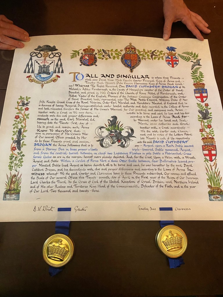
As is usually the custom (though not a necessity) a beautiful custom-made, illuminated document for the Letters Patent of the grant was produced. This one bears the royal arms at the top using the “Tudor style” crown preferred by His Majesty between the arms of the Earl marshal, the Duke of Norfolk and the College itself. The margins are decorated with the arms of office of Garter Principal King-of-Arms as well as Clarenceux King-of-Arms who also signed the Letters Patent. The margins also contain bullrushes and otters. The otters are symbolic of St. Cuthbert, the Abbot’s patron. He was born on the feast of St. Cuthbert. Otters warmed the saint’s feet with their breath when he emerged from the North Sea after a night of singing psalms. The bullrushes are for Rushmoor Borough, in which Farnborough Abbey is located. In addition, the raven is a symbol of St. Benedict, the roses are for England and the ducks are another animal alluding to St. Cuthbert.
The College of Arms is in the habit of also providing a crest even for their ecclesiastical clients despite the fact that the galero replaces helm, mantling and crest in the achievement of a cleric. Here the crest is also composed of a demi-otter and ferns and bullrushes (already explained). While it is not used in the achievement, the Abbot is free to use his crest as a stand alone symbol, or even adapt it and use it as a heraldic badge.
It is a nice touch, too, that the grant was dated March 21, 2022 which is the feast day commemorating the Death of St. Benedict.
The arms themselves are explained by Abbot Cuthbert thusly: “The fortress is the monastic life – the house built on rock of the gospels. This keeps in certain values and excludes others. The island represents a number of islands – England, Lindisfarne, Mont St Michel, and Caldey – all associated with me or our monastery. The island also represented the fuga mundi – separation from the world which marks the monastic life. The patriarchal cross is from the arms of the Subiaco Cassinese Congregation. The stormy sea expresses how the monastery stands unchanging amongst the vicissitudes of church and world. The two bolts of lightning recall assaults on my monastery from two sources in the past. But the house stood firm“.
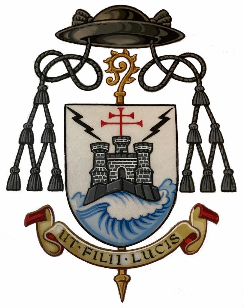
The motto below the shield translates as “The Children of Light”.
I am very pleased to say that I was one of the people encouraging Abbot Cuthbert over the years to apply for a grant of arms. It pleases me to no end that after quite a few years he did, indeed, follow my advice. I think the final result was worth the wait. The design is good; clear and simple. In addition, rather than falling prey to the temptation into which so many prelates fall by making their coat of arms a CV in pictures, this coat of arms is filled with significance while using simple imagery. The Abbot chose to symbolize concepts and events of significance to his life rather than his name, or his family name, or the many jobs and/or accomplishments or associations he has had. That’s where so many prelates fail. They insist on symbols of everything and everyone with whom they have been associated throughout theirs lives no matter how slight the association has been.
Abbot Cuthbert has avoided that pitfall and ended up with a bold, clear and very good coat of arms. His abbey also makes use of a fine coat of arms for the abbey itself (see below). Now I’ll have to start needling him to have a rendering done of his arms impaled with those of his abbey!
The Most Rev. Timothy C. Senior (63) a priest of Philadelphia who has served as Auxiliary Bishop there since 2009 was installed as the 12th Bishop of Harrisburg, Pennsylvania. His arms, assumed in 2009, are now impaled with those of his See. The black and white bordure in his personal arms are an interesting allusion to his love of playing the piano.
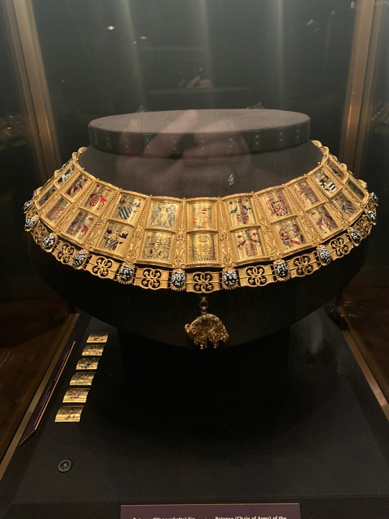
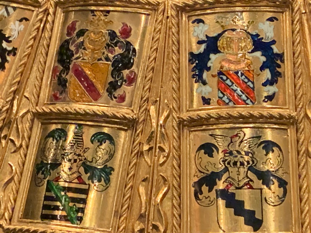
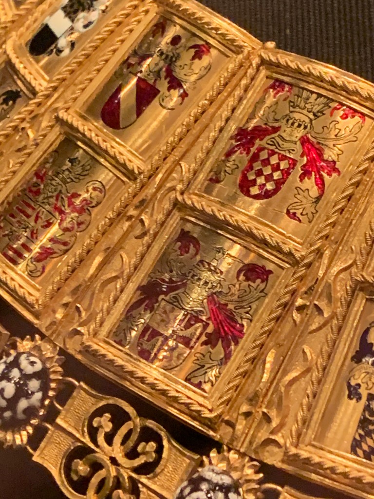
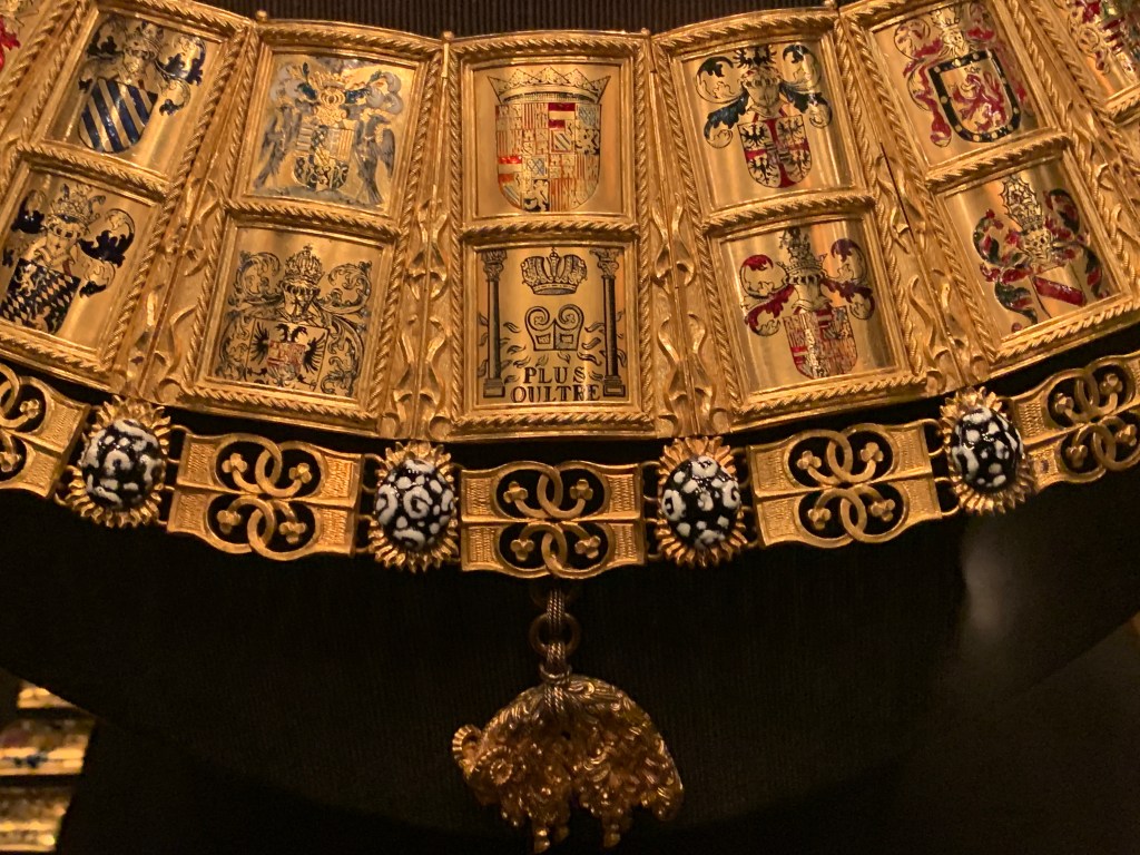
On a recent visit to the Schatzkammer (treasury) of the Hofburg Palace in Vienna I had the chance to reacquaint myself with a real treasure: the heraldic collar, called a potence, of the King-of-Arms of the Distinguished Order of the Golden Fleece. It’s truly amazing and covered in the armorial bearings of the knights of the Order. A feast for the eyes…but it must have been awfully hard on the collar bone and shoulders!
Fr. Guy Selvester's blog of Ecclesiastical Heraldry
Fr. Guy Selvester's blog of Ecclesiastical Heraldry
Fr. Guy Selvester's blog of Ecclesiastical Heraldry
Fr. Guy Selvester's blog of Ecclesiastical Heraldry
Fr. Guy Selvester's blog of Ecclesiastical Heraldry
Fr. Guy Selvester's blog of Ecclesiastical Heraldry
Fr. Guy Selvester's blog of Ecclesiastical Heraldry
Fr. Guy Selvester's blog of Ecclesiastical Heraldry
Fr. Guy Selvester's blog of Ecclesiastical Heraldry
Fr. Guy Selvester's blog of Ecclesiastical Heraldry
Fr. Guy Selvester's blog of Ecclesiastical Heraldry
Fr. Guy Selvester's blog of Ecclesiastical Heraldry
