Duchess of Sussex Coat of Arms

Despite my speculation in a previous post the newly-created coat of arms for the Duchess of Sussex was released today!

33340391_10101362446434169_8122416638642356224_o

According to the website of the Royal Family:

A Coat of Arms has been created for The Duchess of Sussex. The design of the Arms was agreed and approved by Her Majesty The Queen and Mr. Thomas Woodcock (Garter King of Arms and Senior Herald in England), who is based at the College of Arms in London.

Her Royal Highness worked closely with the College of Arms throughout the design process to create a Coat of Arms that was both personal and representative.

The blue background of the shield represents the Pacific Ocean off the California coast, while the two golden rays across the shield are symbolic of the sunshine of The Duchess’s home state. The three quills represent communication and the power of words.

Beneath the shield on the grass sits a collection of golden poppies, California’s state flower, and wintersweet, which grows at Kensington Palace.
It is customary for Supporters of the shield to be assigned to Members of the Royal Family, and for wives of Members of the Royal Family to have one of their husband’s Supporters and one relating to themselves. The Supporter relating to The Duchess of Sussex is a songbird with wings elevated as if flying and an open beak, which with the quill represents the power of communication.

A Coronet has also been assigned to The Duchess of Sussex. It is the Coronet laid down by a Royal Warrant of 1917 for the sons and daughters of the Heir Apparent. It is composed of two crosses patée, four fleurs-de-lys and two strawberry leaves.

The arms of a married woman are shown with those of her husband and the technical term is that they are impaled, meaning placed side by side in the same shield.

Mr. Thomas Woodcock, Garter King of Arms said: “The Duchess of Sussex took a great interest in the design. Good heraldic design is nearly always simple and the Arms of The Duchess of Sussex stand well beside the historic beauty of the quartered British Royal Arms. Heraldry as a means of identification has flourished in Europe for almost nine hundred years and is associated with both individual people and great corporate bodies such as Cities, Universities and for instance the Livery Companies in the City of London. ”

The Duchess of Sussex

The coat of arms which will eventually be used by the new Duchess of Sussex may very well use a similar arrangement as the arms of the current Duchess of Gloucester (pictured). That is to say that rather than her father’s arms impaled on the same shield with her husband’s arms a coat of arms granted to her in her own right will be placed on a smaller escutcheon placed over her husband’s coat of arms.
32978817_10213956089309100_3390081192119238656_n
 
It was reported in “The Daily Mail” that the reason a coat of arms devised for her father to be used by her as well did not appear in the days before the royal wedding is that the Queen decided the process for justifying such a grant was “too complicated” and that it would be better to do what had been done in the case of the Danish-born Duchess of Gloucester. At the time of her marriage in 1972 her husband, Richard, was the previous Duke’s second son. His older brother, William, was killed 6 weeks after their July, 1972 wedding making Richard the heir to the Dukedom (which he inherited on the death of his father in 1974).
 
Birgitte, the current Duchess, with no ancestors of British origin, was granted a coat of arms of her own by Royal Warrant in July, 1973, about a year after she married Richard.
 
So, it is not hard to imagine that Meghan, the Duchess of Sussex will, similarly, be given a coat of arms of her own in due course and that it might very well be displayed on a smaller shield placed over her husband’s coat of arms. The precedent has been set for such action.
 
The story in “The Daily Mail” said, “Mr Markle will not have his own coat of arms,’ confirms a senior source at the College of Arms, which acts on behalf of the Crown in all matters of heraldry.
 
‘We were told it would be too ‘complicated’.
 
‘The Palace has instructed us to use the example of the Duchess of Gloucester and give Meghan Markle her own coat of arms instead.”
 
It will be interesting to see how this eventually works out but I’ll bet they do something similar for the Duchess of Sussex as was done for the Duchess of Gloucester who was also a non-armigerous foreigner who married into the Royal Family.

New Prince & Grand Master of the Order of Malta

prince-and-grand-master-matthew-festing_orig

His Most Eminent Highness Fra’ Giacomo Dalla Torre del Tempio di Sanguinetto (73) a native Roman and former Grand Prior of Rome who, in the past, served as Lieutenant of the Order ad interim after the death of the 78th Grand Master, Fra’ Andrew Bertie, and who, last year, was elected to serve for one year as Lieutenant of the Grand Master during a year of reform and reflection was, on May 2, 2018, elected as the 80th Prince and Grand Master of the Sovereign Military Order of the Hospital of St. John of Jerusalem, Rhodes and Malta. He succeeds Fra’ Matthew Festing, the 79th Grand Master who resigned in 2017 after an internal struggle within the Order and the intervention of the Holy See.

April-30-2017-01

Almost Identical

Sometimes, especially in the world of ecclesiastical heraldry, prelates aren’t always so creative and frequently they adopt arms that are very similar to each other’s. On occasion this may indicate a kind of patronage of one prelate over another. For example, St. John XXIII’s longtime secretary, Loris Capovilla, was later made an Archbishop and eventually a Cardinal. At the time of his episcopal ordination he adopted John XXIII’s coat of arms entirely with one tiny exception; he removed one of the fleur-de-lis in order to “difference” his arms from his patron.

Differencing is an old custom in heraldry and often misunderstood. Two different coats of arms might seem identical at first glance. Yet, as long as one element is changed, or “differenced” it makes for a sufficient differentiation between the two in order to avoid two armigers bearing identical coats of arms. Sometimes this could be the changing of a particular charge, the addition of a label or a mark of cadence or even simply changing the tinctures.

Here we see an interesting pair. Both Angelo Giuseppe Roncalli, Patriarch of Venice (later Pope St. John XXIII) and Carlos Maria Della Torre, Archbishop of Quito & Primate of Ecuador were created Cardinals by Pope Pius XII in 1953. The arms they each bore were almost identical showing a tower flanked by two fleur-de-lis on a red and white field.

J23  Torre

However, Roncalli’s arms showed a field “Gules, a fess Argent” and Della Torre’s showed a field, “Barry of four Argent and Gules”. These arms allude to his name, “Of the Tower”. In addition, Roncalli added the chief of Venice (depicting the gold lion of St. Mark on a silver (white) field) at the time he was promoted to Patriarch there as is usually the custom for the incumbents in that position. That provided a great visual difference between their arms. However, after Roncalli’s election as Pope in 1958 Della Torre once again made their arms very similar by adopting a chief with the gold lion of St. Mark on a red field; differenced from the Pope’s but only slightly. I suppose given the relative similarity of their coats of arms in the first place he wished to honor his “classmate” as a Cardinal who was also now his Pope.

What is more it is interesting to note that both men bore the same motto despite there being no particular relationship between the two.

These arms seem almost identical, but note quite.

Artwork: The late Michael McCarthy

Bishop Konzen

The Most Rev. Joel Matthias Konzen, S.M. (67) a priest of the Society of Mary (Marists) was ordained as the Titular Bishop of Leavenworth and Auxiliary to the Archbishop of Atlanta on April 3, 2018. His coat of arms is explained by its designer and artist, Deacon Paul Sullivan.

bjk_coat-of-arms

The episcopal heraldic achievement, or bishop’s coat of arms, is composed of a shield, that is the central and most important part of the design and tells to whom the design belongs, the external ornamentation, that tells the owner’s position or rank, and a motto, placed upon a scroll.

For Bishop Konzen the shield is silver (white) with a blue pile (an “A” shaped device) upon which is displayed the conjoined “A” and “M,” known an “the monogram of Mary,” in silver (white) that is the emblem of the Society of Mary, known as the Marists, that is the Bishop’s religious community. The pile resembles an inlet of water, such as a bay or harbor, and this pile is charged with a gold (yellow) oak leaf to signify Oak Harbor, Ohio, where Bishop Konzen was born and raised.

Above the pile are an open book (gold [yellow] with red edges) and a red cross of The Faith to signify that Bishop Konzen has spent most of his life in education, in a Catholic environment, including his last position, before coming to the fullness of Christ’s Most Holy Priesthood, as a Bishop, as President of the Marist School in Atlanta.

For his motto, His Excellency, Bishop Konzen has adopted the Latin phrase “MISERERE GAUDENS,” that is taken from the 8th verse of the 12th chapter of Saint Paul’s Letter to the Romans. This passage can be paraphrased as “Be merciful, and with a cheerful heart.”

The achievement is completed with the external ornaments that are a gold (yellow) episcopal cross, that extends above and below the shield and a pontifical hat, called a galero, with its six tassels, in three rows, on either side of the shield, all in green. These are the heraldic insignia of a prelate of the rank of bishop by instruction of the Holy See, of March 1969.

+Rt. Rev. Giles Hayes, OSB R.I.P.

GILES5

The Right Reverend Giles Hayes, OSB (79) the Tenth Abbot of St. Mary’s Abbey in Morristown, New Jersey (founded in 1884 as St. Mary’s Abbey in Newark, a daughter house of St. Vincent Archabbey in Pennsylvania and later moved to Morristown) passed away on March 7, 2018.

He was elected Abbot in 2006 at which time he commissioned me to design and execute his abbatial coat of arms. He led the community until 2014.

The arms of the Abbey (in the first and fourth quarters above) are clearly based on those of the community’s motherhouse.

May he Rest in Peace.

Archabbots of St. Vincent

St. Vincent Archabbey in Latrobe, Pennsylvania, the oldest monastery in the United States, was founded in 1846 by monks from St. Michael’s Abbey in Metten, Bavaria under the leadership of Fr. Boniface Wimmer. They came to Pennsylvania funded by the Ludwigs-Missionverein, an organization started by the King Ludwig I of Bavaria to minister to German immigrants throughout the world.

When the community had grown large enough to be elevated to the status of an independent abbey in 1855 it was decided to designate it an archabbey and Father Boniface was named Archabbot for life by Bl. Pius IX. His coat of arms (below) looks to be based in a quartering of the arms of the royal family of Bavaria, the House of Wittelsbach. The lion holding the banner of Christ was used not only by Archabbot Boniface as his coat of arms but also by the community as the heraldic symbol of the archabbey. It seems as though Wimmer’s first three successors, Archabbot Andrew Hintenach (1888-1892), Archabbot Leander Schnerr (1892-1918) and Archabbot Aurelius Stehle (1918-1930) also used this coat of arms. I have not been able to locate any other coats of arms for them.

Coat_of_Arms_of_Archabbot_Boniface_Wimmer2a

In 1930 with the election of St. Vincent’s fifth Archabbot, Alfred Koch (1930-1949), things changed. At that time the community decided to adopt a corporate coat of arms, which borrowed the blue and white fusils in bend from another Wittelsbach quartering and took the three plates on a black fess from the arms of William Penn, turned the fess into an inverted chevron (to create the letter “V” for “Vincent”) and charged the three plates with Benedictine crosses. Archabbot Alfred impaled this with a personal coat of arms. Thereafter, his successors did likewise.

Image 26

Archabbot Dennis Strittmatter (1949-1963)

Image 33

Coadjutor Archabbot Rembert Weakland (1963-1967) later Abbot-Primate and Archbishop of Milwaukee

Image 31

Archabbot Egbert Donavan (1967-1979)

Image 29

Archabbot Leopold Krul (1979-1983)

Image 37

Archabbot Paul Maher (1983-1990)

Image 35

Archabbot Douglas Nowicki (1991-present)

Image 5

During the tenure of Archabbot Egbert Bl. Paul VI changed the customary rules governing the external ornaments of prelates indicating that the mitre was no longer to be used in coats of arms. In addition, he called for the discontinuation of the crozier in arms of bishops. The crozier used to be included in the achievements of bishops in addition to the episcopal cross. Paul VI indicated in was the cross alone that would continue to be used in the arms of bishops and that the crozier should be excluded. This was interpreted by some, wrongly, to mean the crozier should no longer be used in the arms of abbots as well. However, it is the veiled crozier, not the galero, which indicates the rank of abbot in heraldry. Archabbots Leopold and Paul were advised incorrectly to leave the crozier out of their achievements. It was, however, restored to use in the coat of arms of Archabbot Douglas which was designed by me.

Abbot of Averbode

The Right Reverend Marc Fierens O.Praem. will be blessed and installed as the 53rd Abbot of Averbode, Belgium on March 11. This design was devised by the Abbot in consultation with with someone very well versed in heraldry. The drawing is by Prisca Van Dessel.

Averbode

It has long been customary for the Abbots of Religious Orders that wear a white or mostly white habit to use an abbatial galero that corresponds to the color of their habit. Since the Praemonstratensians wear a habit which is entirely white their abbots have traditionally used a white galero.

Personally, I have never agreed with this tradition. The color of the galero does not have to correspond with what is actually worn. Rather, in heraldry, color as well as number of tassels is an indication of rank. For example, bishops and archbishops use a green galero. This has its origin in the belief that the original color worn by bishops was green. However, when Roman purple was later adopted by bishops for their manner of dress the galero, which is after all symbolic, remained green for bishops and archbishops in heraldry.

Indeed, abbots do not, nor have they ever, wear a galero! It’s use in their heraldic achievements is purely symbolic. This is a further reason that it need not correspond to the color of their habit. The black galero with 12 tassels indicates the bearer is a Religious Superior, in this case an abbot, regardless of what we wears. The galero need not indicate the Order to which he belongs, just his rank. In abbatial heraldry it is the veiled crozier which indicates the arms are those of an abbot because the black galero with 12 tassels may be used by any Major Religious Superior of any Order, Institute or Congregation, as well as by secular Vicars General and Vicars Episcopal. Similarly, the galero that indicates the armiger is a priest is black with 2 black tassels regardless of whether the bearer is a secular clergyman or a member of a Religious Community. Franciscan priests do not use a brown galero, Sylvestrine priests do not use a blue galero,  Dominican priests do not use a white galero, etc. Nevertheless, among the Canons Regular of Premontré the canons, like their abbots, do indeed make use of a white galero.

I may not be in favor of it but it is, regardless of my personal opinion, a long-standing tradition in heraldry and done on a regular basis. The length of time this custom has been observed has made it into the commonly accepted practice. My contrary opinion is but wishful thinking on my part. I wish it otherwise and I have good reasons to support that opinion. Alas, it is not and I have to live with disappointment.

Bishop Aviles

The Most Rev. Mario Aviles, C.O. (48) former Procurator General of the Confederation of Oratorians of St. Philip Neri, was ordained Titular Bishop of Cataquas and will serve as the first Auxiliary Bishop of Brownsville, Texas on February 22, 2018.

Aviles

The Armorial Bearings of Roman Catholic Deacons

I’ve have once again come across several images of the coats of arms of Deacons in the Roman Catholic Church on the internet which moves me to write, yet again, that:

THERE IS NO OFFICIALLY SANCTIONED EXTERNAL HERALDIC ORNAMENT TO ENSIGN THE ARMORIAL BEARINGS OF DEACONS IN THE LATIN RITE ROMAN CATHOLIC CHURCH.

One simply does NOT exist. None, nada, zilch, zip, bupkus. Anyone who asserts otherwise is a liar and should be horse whipped (with a horse whip).

In the Roman Catholic Church there are two types of Deacons. Transitional Deacons are ordained to that lowest rank in Holy Orders as a final step prior to their Presbyteral ordination. There are also those who are called to enter into ordained ministry as Deacons with the intent of remaining so permanently. For neither type is there an external heraldic ornament sanctioned by the Holy See, which is the only authority within the Catholic Church capable of making such a determination and assigning such an ornament.

Some of you are perhaps saying to yourselves, “No, hang on, Father, that’s not so. Deacons use a black galero that has no tassels on it.” Now, I want you to read the next sentence carefully.

NO, THEY DON’T.

In the Christian churches of the West, especially among those with a sacramental/liturgical style of worship such a heraldic ornament does exist in the Church of England. An entire system of hats for the use of the clergy of the Church of England was devised and adopted by the English College of Arms by an Earl Marshal’s Warrant of 1976. By extension, what is done in the Church of England is frequently, though not universally, done throughout the Anglican Communion. So, a black galero with no tassels is used heraldically by Deacons in the Anglican Tradition.

That has no effect on Roman Catholic Church heraldry.

Again, there is NO approved external ornament for Deacons in the Roman Catholic Church. Those who adopt the galero with no tassels are incorrect because it is an Anglican custom. Those who simply decide to make up out of whole cloth some other external ornament to function as a “Deacon’s crest” or to add a special augmentation to the shield of the arms of a Deacon like a chief indicating diaconal ministry are also quite wrong to do so. Those who claim such things are sanctioned by the Holy See are lying. Full stop.

So, what option is there for a Deacon? Well, for Transitional Deacons (a state which usually last no more than 12 months) they should wait until they are ordained Priest and ensign their arms with a Priest’s galero. For Permanent Deacons they have the option of using arms ensigned with helm, mantle and crest as laymen do (which is appropriate if they have descendants who will inherit the arms some day) or they may bear arms consisting of the shield and motto alone without any other ornament.

A coat of arms is a mark of identification not a perk to indicate your job or function. The Church has said very little on heraldry for clergy below the rank of Bishop and most of what we have by way of “rules” for the lower clergy comes from immemorial custom. Because the Permanent Diaconate was dormant for several centuries, including those centuries when heraldry developed, there are no customs for the arms of Permanent Deacons. It is hoped that the Holy See will address this at some point but until it does

DEACONS HAVE NO EXTERNAL ORNAMENT PROPER TO THEM IN ROMAN CATHOLIC HERALDRY!!!!

New Ordinaries in USA

The Most Rev. J. Mark Spalding (53) was ordained a bishop and installed as twelfth Bishop of Nashville on February 2, 2018.

Print

The Most Rev. William Shawn McKnight (49) was ordained a bishop and installed on February 6, 2018 as the fourth Bishop of Jefferson City, Missouri.

1200px-Coat_of_arms_of_Shawn_McKnight.svg

Well…at least it IS uncomplicated and clear.

Bishop Knestout

Knestout

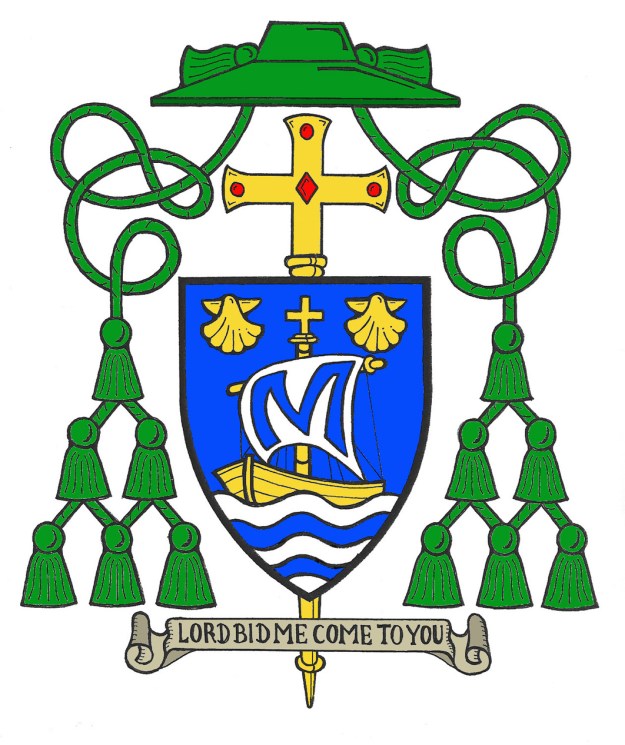
The coat of arms (above) of the Most Rev. Barry C. Knestout, since 2008 Titular Bishop of Leavenworth and Auxiliary Bishop of Washington, D.C., his native diocese, appointed as the 13th Bishop of Richmond, Virginia last December. He will be installed in Richmond on January 12.

His coat of arms, expertly rendered by Marco Foppoli, impale the arms of the See of Richmond with the personal arms of the bishop assumed finally, after two other previous iterations, shortly after he was ordained a bishop.

While Bishop Knestout was always rather clear on what charges (individual elements) he wished to employ on his coat of arms the composition of the design went through various changes until he finally settled on the arms he bears today. He always intended to pay homage to the Ordinary he would serve under as Auxiliary Bishop, HE Donald Cardinal Wuerl, by using the single charge in the cardinal’s own arms; a tower. In addition, Bishop Knestout wanted very much to honor the previous Archbishops of Washington whom he served for many years as private secretary, HE James Cardinal Hickey, and HE Theodore Cardinal McCarrick. From their respective arms he borrowed a lion. In addition, the bishop wished to include symbols alluding to his ancestry and his native state of Maryland. This was accomplished with the other charges and the choice of tinctures and metals to be employed.

At first the arms were to look like this:

Snapshot 2008-11-24 17-20-52

However, on further reflection it was decided to try and incorporate the charges symbolic of the Archbishops together on the field and to bring greater uniformity to the other charges and keep them separated on the chief. In addition, he decided to render the motto in english rather than latin. The design then looked like this:

scan0002_2

In fairness, it was probably not in the bishop’s mind that he would be made a diocesan bishop himself one day so he probably wasn’t thinking along the lines of how his coat of arms would look if impaled with the arms of a diocese. If he had he might have stopped here because this design would, indeed, have more easily impaled with another coat of arms and not suffered too much from being squeezed into one half of a shield. Finally, another decision was made to surround the field with a bordure (border) rather than use a chief and we arrived at the arms Bp. Knestout has used for almost ten years:

KnestoutCoat copy

While it is not mandatory but merely customary for in North America for bishops to impale their arms with those of their See (i.e. depict their own personal coat of arms marshaled together side by side with the arms of their diocese on the same shield in the manner of two coats of arms of people married to each other) the decision to do just that has been made. It is the usual custom in the USA but it presents a problem.

The usual practice in heraldry when arms with a bordure are impaled is not to continue the bordure all the way around the field. Rather, along the line of impalement the bordure is not depicted. This is known as dimidiation. It applies not only to bordures but also to any kind of orle or tressure. If it were a plain bordure this wouldn’t matter so much. But, in the case of Bishop Knestout’s arms the bordure contains charges. Dimidiating the bordure leaves those charges out and/or cuts them in half.

Dimidiation would be most correct not only for the bordure around the field of the bishop’s personal arms but also the red tressure on the arms of the See of Richmond. As you can see in the coat of arms of the last bishop, the late Francis X. DiLorenzo:

Coat_of_arms_of_Francis_Xavier_DiLorenzo.svg

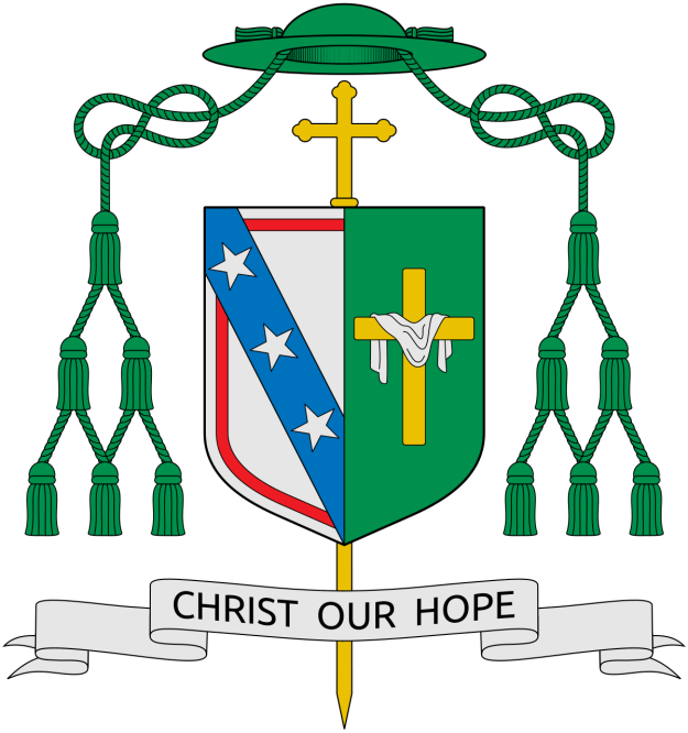
Plainly one can see that the red orle, or tressure, that surrounds the silver field is not entirely depicted. This has been the custom for previous bishops of Richmond as well. However, as I have already noted, this doesn’t have as big an impact as the dimidiation of the bordure in Bishop Knestout’s personal arms which would, of necessity, require one of the fish to be omitted and two of the crosses to be cut in half.

In addition, the space required to (incorrectly) depict the entire bordure forces the lion to be shown as “spilling over” the field and onto the bordure as well in order to be clearly seen and not reduced to the point of being difficult to discern. Again, this is problematic. I will simply quote the great Bruno Heim, “In heraldry the charges should never overlap.” The bordure is an ordinary charge that should entirely surround the field and contain those charges depicted thereon.

These criticisms I offer hesitantly because of the well deserved reputation of Marco Foppoli, the artist who depicted this rendering of the bishop’s impaled arms. Marco is an internationally known and respected heraldic artist of the highest calibre. However, he did not design the armorial bearings of Bishop Knestout or of the See of Richmond. Perhaps he was simply complying with the wish of his client to have his arms both impaled with the See of Richmond and depicted fully without the dimidiation?

So, what is the better, more “heraldically correct” solution to the problem? There are two options. The first is to respect the usual conventions of heraldic marshaling and dimidiate both the bordure in the bishop’s personal arms as well as the orle in the arms of the See. It is sometimes the case when two or more coats of arms are marshaled together on the same shield that such circumstances occur. Again, I will remind the reader that an individual does not assume a coat of arms by designing them to harmonize well with some yet unforeseen coat of arms with which they may be impaled or quartered. Anyone who does that would be, to put it mildly, slightly presumptuous! The second solution is the easier, albeit less conventional. Namely, in this instance the bishop could have chosen simply to bear his own arms and not impale them with the See of Richmond. As I indicated above impaling the arms is customary not mandatory. In addition, it just so happens there is adequate precedent for such a course of action in the history of the Diocese of Richmond. Bishop Knestout’s predecessor, Bishop DiLorenzo was himself preceded by Bishop Walter Sullivan who served from 1974-2003 and was also an Auxiliary Bishop of Washington prior to that from 1970-1974. Bishop Sullivan for all of his twenty-nine years as Bishop of Richmond bore his personal arms alone, the arms he assumed on becoming a bishop, and did not impale them with the arms of the See of Richmond.

My compliments to Marco Foppoli for another very nice artistic rendering. However, to whomever made the decision to impale the arms without the necessary dimidiations I would suggest that was an ill-conceived idea that flies in the face of accepted heraldic practices and was, furthermore, completely unnecessary given the precedents.

Heraldry has rules and you can’t just do whatever you wish!


Cardinal Law R.I.P.

Bernard Francis Cardinal Law (1931-2017), Cardinal Priest of Santa Susanna, former Archpriest of St. Mary Major (2004-2011), former Archbishop of Boston (1984-2002), former Bishop of Springfield-Cape Girardeau (1973-1984) has died in Rome where he went to live two years after resigning his post in Boston.

His coat of arms as Archbishop of Boston (above)

Bishop Weisenburger of Tucson

On November 29 the Most Rev. Edward Weisenburger (56), since 2012 the Bishop of Salina, Kansas, was installed as the Eighth Bishop of Tuscon, Arizona. When he was ordained a bishop in 2012 he assumed a coat of arms that was designed by J.C. Noonan and marshaled to the See of Salina. Once again Mr. Noonan has worked on Bishop Weisenburger’s current coat of arms:

coat-of-arms-for-web

Overall, a very pleasing design and nicely rendered by the artist who is Mr. Noonan’s regular collaborator.

However, the bishop, whether on his own or advised by Mr. Noonan has made the classic mistake of thinking that he is free simply to change the design of his arms on a whim simply because he is taking up a new position. Worse, the changes in the design are justified as harmonizing better with the arms of the See. That is a very poor justification for large scale changes to the design of personal arms, especially when one considers that while it is a long standing custom in the Church in the United States for diocesan bishops to impale their personal arms with those of the See it is not, by any means, a requirement. A good heraldic designer would know that if a man’s personal arms do not harmonize well with the arms of a See then it is, perhaps, a better design decision and a better heraldic decision for the bishop to refrain from marshaling his own arms with the diocesan arms.

As I said in my previous post about the arms of Bishop Siegel of Evansville, this is why it is important to settle on a good design at the time arms are assumed. You CANNOT change them later on a whim! Your coat of arms identifies you. Moving to a new assignment doesn’t change your identity.

The coat of arms originally assumed by Bishop Weisenburger was:

weisenburger_arms_color_400

The charge of the Lamb of God is still prominent but has been moved from the main charge to being in a secondary position on the chief. For some reason the garbs have been eliminated. In the description provided of the arms in 2012 it said they represented the Eucharist and also, “Kansas wheat”. I suppose the thinking was to eliminate them since he no longer would be living in Kansas. But, as symbols of the Eucharist they are still justified in the design. Not to mention that as a part of his coat of arms for five years already they are part of his personal identifying mark.

Now the arrowhead has become the main charge and a star has been introduced. This effectively makes this an entirely new coat of arms.

The new description justifies all this in the following manner:

“The base of the bishop’s personal shield is worked entirely in gold—the color in Catholic heraldry representing the purity of the Triune God, Divinity and truth.  Upon this gold field appears a large stone arrowhead, depicted here as those that may be found in archeological dig sites within the Tucson diocese’s borders. An arrowhead presented in the downward position is a heraldic sign of peace. Moreover, the arrowhead is worked in red, borrowing this color from the Tucson diocesan arms as a particular tribute to his new see. Red also represents the blood of the pierced heart of Saint Augustine, an homage to the patron saint of Tucson’s Cathedral.  The arrowhead serves as a secondary homage to Oklahoma, the bishop’s home state and home archdiocese. Upon the arrowhead sits the six-pointed star of the Blessed Virgin Mary in her title of Our Lady of Perpetual Help, a secondary homage to the Diocese of Salina, which honors the Blessed Mother as their patron saint under this particular title.”

Now, all that sounds very nice and is probably appealing to many people. The problem is that it expresses very well everything that is wrong with this bishop’s new coat of arms. It falls right into the trap of thinking that his arms is his pictorial CV with it’s introduction of a new charge as an homage to his former diocese and the references to tincture changes to allude to the diocese of Tucson. Instead, the bishop’s original arms (with the blue field) “says” Edward Weisenburger. That gets “married” to Tucson since he is its new bishop and the arms are impaled to represent that “marriage”. That’s it; full stop. There is nothing more to be said, or done or, worse yet, re-done.

It is genuinely a shame that, with all of the best of intentions as well as what is, I’m sure, a real desire to create something unique, so many bishops get it so very, very WRONG!