Category Archives: Heraldic Mistakes

Do The Work

I’m very gratified whenever someone tells me that they regularly take a look at this blog. Sometimes they will mention that they have learned a thing or two in what they’ve read here and sometimes they also, jokingly or occasionally chidingly, tell me that they are surprised at the sharpness of my criticisms. With increasing frequency, however, I’m also hearing often in both direct contact with me or in other places on the internet where heraldic enthusiasts congregate that those of us who seem to know more about heraldry should do more to educate those who wish to learn more.

First, let me say that the “those who wish to learn more” frequently fall into two categories. There are those who, for whatever reason, have an interest in learning as much as they can about heraldry for their own enrichment. They understand that a study of heraldry means delving into a world of history, genealogy, symbolism and, lastly, art. Heraldry is a science as well as an art. It isn’t just about pretty pictures or “cool” images of dragons and basilisks. It’s not the domain of medieval fantasists (although many of them do enjoy it) or social-climbing faux nobles. It is a perfectly good hobby, so to speak; a wonderful subject to which one can devote a lifetime of study and learning. In addition, a few also become intimately involved in it as a profession or as an avocation and create new coats of arms for the deserving and the desirous. Whether someone becomes a practitioner of heraldic design and art or simply remains a great enthusiast it is a topic about which you can never stop learning more.

But then there is the other type who, again for whatever reason, have an interest in heraldry but don’t really care all that much about learning the “why and wherefore” of heraldic history or design. They have no interest whatsoever in the many ways the development of heraldry differs from country to country or during different centuries. They have, perhaps, read one or two books on heraldry (or maybe even as many as three!) and have now decided that they’ve “got this”. They are now as expert on the topic as the Garter King of Arms. Therefore, the time has come for them to hang out a shingle and begin creating coats of arms themselves…as a “herald”.

Ironically, despite being convinced of their own expertise, it is this second category who seem to complain the most and the loudest that those individuals and organizations online who offer criticism of heraldic designs owe it to everyone else to educate them more.

Well, first of all, reading someone’s criticism of a design should actually help the less educated to learn more in itself. Although, having said that, I must admit that when I come across really appalling examples I often don’t go into a detailed analytical criticism of the coat of arms but just express my great displeasure by means of some exclamation like, “Awful!”. I’ll grant you that someone is hardly likely to learn much from that other than that I didn’t like it.

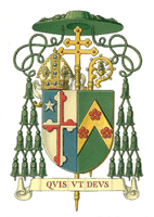
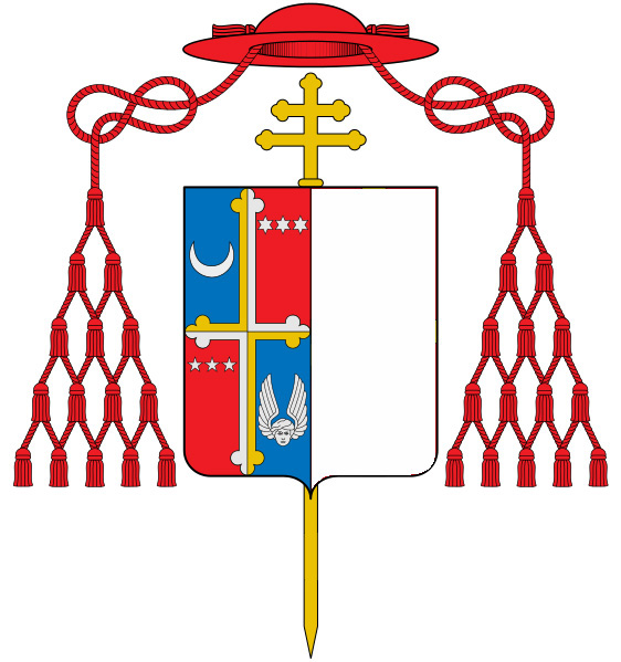
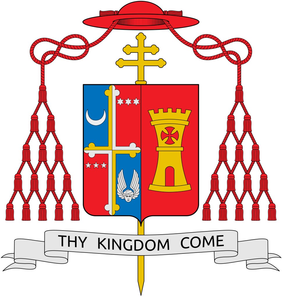
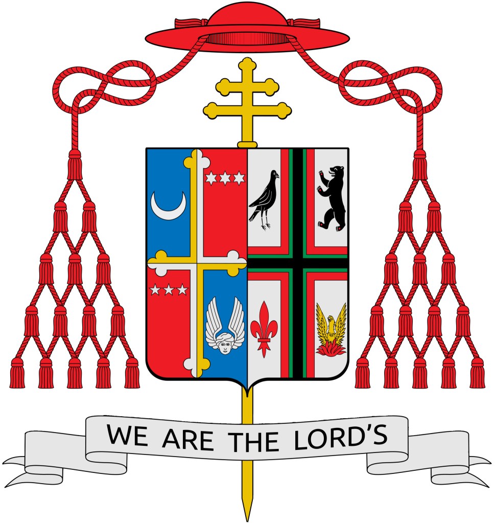
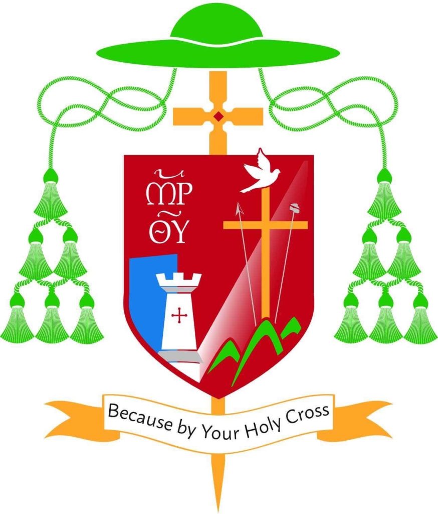
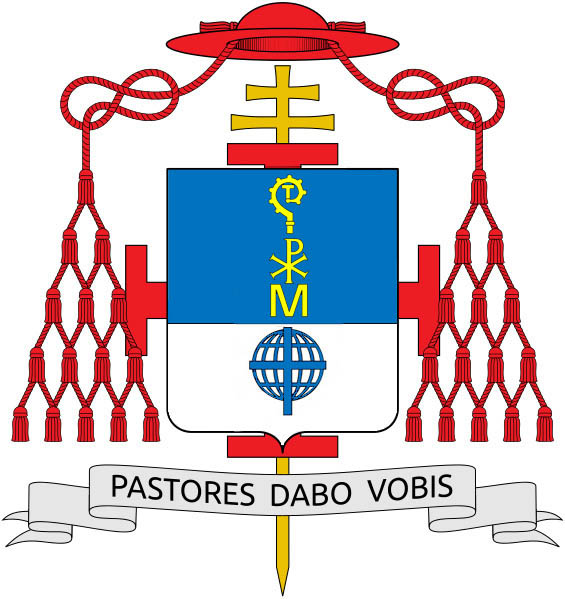
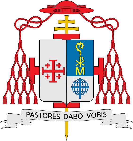
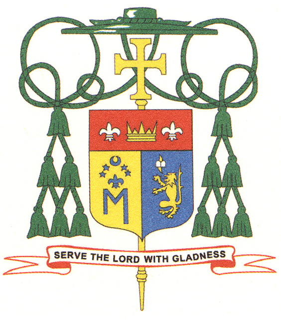
My area of particular interest is, obviously, ecclesiastical heraldry. This is an interesting sub-set of heraldry that crosses over time and boundaries and has many rules, customs and traditions of its own despite the fact that there is no umbrella heraldic authority over the entire Church. In places where a heraldic authority does exist the coats of arms of clerics are just as subject to that local authority as the armorial bearings of anyone else. The Church makes no claim to having some kind of supra-national jurisdiction over the regulation of heraldry worldwide. Famously, St. John XXIII (himself a heraldic enthusiast) wanted to establish a Pontifical Office of Heraldry. His former secretary and good friend, Abp. Bruno Heim, talked him out of it. Heim said that one couldn’t legislate in matters of taste. He also had a healthy respect for the different ways heraldry developed in different countries and a real love of heraldic creativity. He knew such a Pontifical Office would tend to standardize Church heraldry and stifle creativity.

So, that’s one of the reasons there isn’t now, nor is there likely to be, an office to regulate the armorial bearings of clergy, prelates and institutions in the Church.

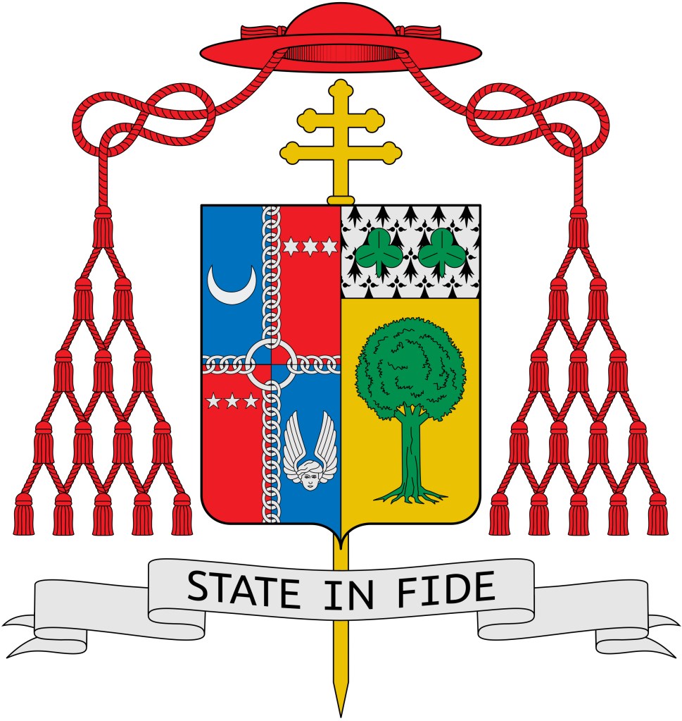
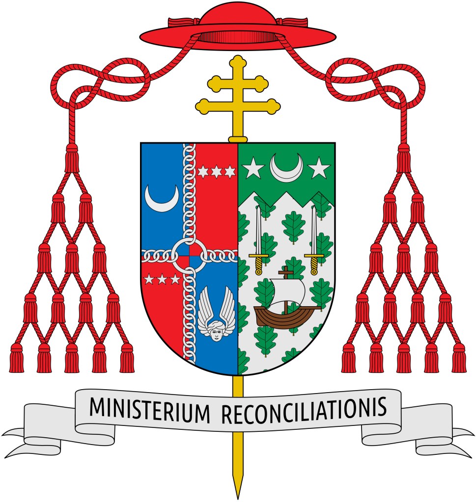
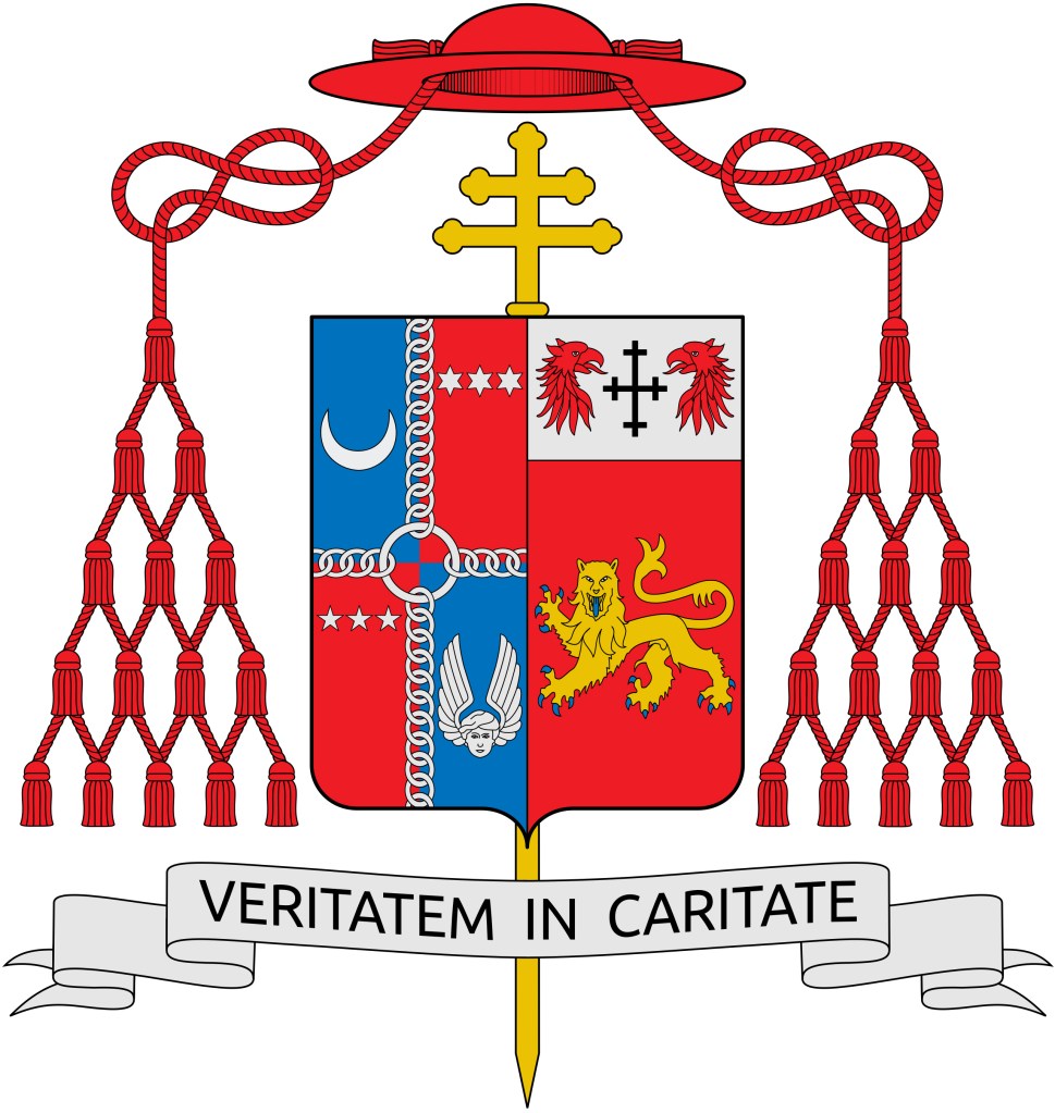
Throughout history the Church has primarily concerned itself with the external ornaments of heraldry. That is, those things that are placed around the shield rather than on it which indicate the rank and/or function of the armiger in question. What actually goes onto the shield is a matter of individual taste or family history or inheritance or anything else that would make for a unique mark of identification for the bearer of the coat of arms. The Church has no great desire to get into that. Those are precisely the kinds of things some heraldic authorities do get into. I know someone who had applied for a grant from the College of Arms in England and the individual wanted the shield divided per bend. He was told to modify that request because, in England, they preferred not to divide the field that way. I know of another case where a bishop wished to receive a grant from the Court of Lord Lyon. His arms were designed by a very competent expert in heraldry but they contained a field chequy and Lord Lyon didn’t allow such a field so the design had to be changed. The Holy See has neither the time, the resources to devote, or the desire to get into that kind of heraldic regulation. Rather, it tends to concern itself with things like the appropriate color of the tassels on a galero to indicate a Prothonotary Apostolic, etc.

So claiming that it is the job of the Holy See to provide guidance in this area isn’t the answer especially as they already do to some extent. Similarly, it isn’t the job of the various heraldic societies that exist to make sure everyone knows every and any rule of the heraldic science. For the most part those societies exist for people who already know and appreciate heraldry somewhat and wish to share their love of the subject with other enthusiasts. There is an educational element to that but it comes primarily from mutual enrichment rather than mere instruction. There are the many heraldic artists in the world, many of whom now have a website to display their work and solicit business. But they are not necessarily experts in heraldry. Rather, many of them are happy to provide heraldic artwork, itself a speciality that not every competent artist can undertake, but it is not necessarily their task to educate. Finally, there are the heraldic enthusiasts like myself who have a website or blog and who, sometimes a bit flippantly, offer exposure and criticism in an effort promote good heraldic practices and, perhaps, help some people to avoid bad ones. But, I put it to you that while having such a blog may help others to learn that does not make it incumbent upon me to attempt to provide an exhaustive course of study in the particulars of ecclesiastical heraldry. After all, this is something I do for fun!

No, the problem in the world today, especially since the advent of the internet and social media, is that, as usual, people want something for nothing. They want some quick and easy way to skip over the hard stuff and be provided with all the answers they need at the click of a mouse. To put it another way, they don’t want to do the work.

Occasionally, someone is kind enough to describe me as an “expert” in ecclesiastical heraldry, especially Catholic heraldry. That’s very kind. To the extent that it may be true it is so for one reason and for one reason only. It’s because I undertook to begin a serious study of heraldry when I was a young man and have stayed with it for over 35 years. I started doing this before there was an internet (or one to speak of) and it was difficult to communicate with others who shared my enthusiasm. But, I was willing to delve, to do research, to read extensively, to slowly build up a personal heraldic library, to seek the advice of experts and then eventually to come under the tutelage of a person who could critique my own ideas and help me to learn by making mistakes. I did the work!

There are a lot of resources available…if you’re willing to roll up your sleeves and do some good, old-fashioned research. You can’t learn about heraldry by reading an book, or two, or even three. You definitely can’t learn about ecclesiastical heraldry by looking at pictures of other bishop’s coats of arms alone. For example, if you look in the back of a really good book on Church heraldry like Bruno Heim’s Heraldry in the Catholic Church you’ll find not only a bibliography but several appendixes quoting papal documents. How many people have undertaken to look up and obtain full texts of those documents and then have them translated into their own language if they don’t have a good command of Latin?

I did.

How many people who claim to really love Church heraldry look at the books in Heim’s bibliography and then set out to obtain as many of them as possible for your own library, or at least track copies of them down in a lending library?

I did.

How many heraldic enthusiasts who can draw reasonably well have said no to undertaking heraldic commissions because they realize they don’t really know enough about heraldry to create a coat of arms for someone else so they wait several years in order to learn more and become more competent in the field before daring to be so bold as to design a coat of arms for someone else?

I did.

To become really good at this -not the world’s greatest, but just really good- takes a lot of effort, a lot of time and a lot of work. Sadly, there are too many people involved with the creation of heraldry who simply don’t want to make the effort, put in the time or do the work. THAT’S why there is so much bad heraldry floating around the Church. It’s because too many people who have no business whatsoever creating coats of arms are doing so. For a bishop to go to a friend, or relative, or seminarian and say, “You draw well. Why don’t you do my coat of arms?” is like me going to a friend and saying, “You know how to sew on a button so why don’t you make me a chasuble?” It’s preposterous! But, it happens all the time. Ignorant dilettantes who don’t have the sense to seek out the advice of someone with greater expertise, let alone refer their “client” to someone with greater expertise, are getting involved in droves in the design and creation of coats of arms in the Church. Not only are the resulting designs really bad but then they have the audacity to say that someone else: the Holy See, a heraldic society, or even a blogger should provide more guidance and instruction to them so that they can avoid mistakes.

Well, I don’t agree. I’m living proof that the resources and material are out there and can be found with a little effort. What is required is having the humility to start out as a student and not jump immediately into attempting to do something about which you know very little as though anyone can do it. It requires the ability genuinely to learn from criticism instead of simply becoming defensive in the face of it. Most importantly, instead of expecting someone else to provide you with ready-made answers at your fingertips so that you can reap all the benefit of the years of effort someone else has made to increase their knowledge and expertise while at the same time barely lifting a finger yourself you need to…

DO. THE. WORK!

Bishop Lewandowski, C.Ss.R.

The coat of arms assumed by the Most Rev. Bruce Lewandowski, CSsR who will be ordained the Titular Bishop of Croae and Auxiliary Bishop of Baltimore on August 18th:

While many reactions leap to mind such as: incorrect, poorly-designed, clashing styles (the dove’s wing going right up off the shield is particularly ridiculous) among others there is really only one word to describe this:

HIDEOUS!

Archabbot Martin Bartel, OSB of St. Vincent Archabbey

On June 23 the Rt. Rev. Martin de Porres Bartel, OSB (65) was elected by the monks of St. Vincent Archabbey in Latrobe, PA as their 12th Archabbot. On July 10th at Mass he received the abbatial blessing from the Most Rev. Edward Malesic, the Bishop of Greensburg, PA which is the diocese in which the Archabbey, America’s oldest Benedictine Monastery and currently the largest Benedictine Abbey in the world, is located. I studied for my Master of Divinity at St. Vincent Seminary and I used to be a monk in the Community there.

The new Archabbot has assumed a coat of arms:

I’m a bit conflicted in my assessment of this coat of arms. I know the Archabbot and I also know the monk who designed it and executed the artwork. I have a great deal of respect for Archabbot Martin as a priest and a monk and I don’t wish to be too harsh in my critique. I think the best I can say is that it isn’t “horrible”. Another way to say it would be, “It could have been worse” but that is, admittedly, damning with faint praise.

I will not say a word about the artwork because that is not usually the subject of any of my criticism on this blog. Different artist’s draw differently. The style is strongly reminiscent of that of the late Wilfred Bayne, OSB a monk of Portsmouth Abbey in Rhode Island who was an eminent heraldist in his day.

My first, and principal, criticism is that, as has happened in many instances before, the veiled crozier that is the primary heraldic symbol of the coat of arms belonging to an abbot is missing. When St. Paul VI (pope from 1963-1978) decided to remove both the mitre and crozier from the coats of arms of bishops and leave only the episcopal cross in their heraldic achievements many took this to affect the arms of abbots as well. In former times abbatial achievements contained the mitre and the crozier. However, Paul VI’s directive was truly addressing the arms of bishops and cardinals only. The coat of arms of an abbot is still supposed to have a crozier placed behind the shield with a veil (sudarium) attached. It’s origin comes from a time when abbots made use of the crozier (in fact abbots have used the crozier longer than bishops have done) but did not enjoy the privilege of pontifical gloves. The veil served the function of protecting the crozier from dirt and oil that can be present on the hand. It is not usually used practically anymore but it has remained as a heraldic symbol and – I repeat – the heraldic symbol of the coat of arms of an abbot. Other clergy are entitled to the black galero with twelve tassels. Such a galero may be used in the armorial bearings of Vicars General, Vicars Episcopal, Provosts, Major Religious Superiors and, on occasion, some others holding a particular office. Alone, it does not indicate the coat of arms of an abbot.

The arms adopted by the Archabbey in the early 20th Century are very nicely designed and combine well when impaled with the personal arms of the Archabbot.

As for Archabbot Martin’s personal arms: the cross quartered Sable and Argent is a reference to both the Dominican Sisters who educated him as a boy and the order to which his patron, St. Martin de Porres, belonged. Over these is a basket containing bread and a broom. These are, apparently, symbols associated with St. Martin de Porres and the bread is also an allusion to the Holy Eucharist.

There is no problem with the black in the cross up against the red of the field. The so-called “rule” of tincture (i.e. that a color should not be placed on a color nor a metal on a metal) does not come into play with complex fields or charges. Because the cross is both black (Sable) and white (Argent) it may be placed on a field of a single tincture. (For example: the complex field Azure & Argent of the arms of the Archabbey may have an entirely Sable inverted chevron on it without violating this “rule” because of the complex appearance of the field). However, I think it would have looked better if a lighter shade of red had been used giving the arms a brighter appearance.

I find that the basket of bread is ill-placed as is the broom. In addition, there seems to be no good justification for the basket to be blue. Introducing multiple tinctures into a coat of arms without good reason is unsupportable, heraldically. The broom I suppose to be considered gold (Or). I have not seen an actual blazon of these arms, if one exists. If it is not intended to be gold but brown, of any shade, then it should be noted that brown is not used in heraldry. If it were blazoned as “Proper“, a term which means a particular charge is shown as it appears in nature, I don’t see this as being justifiable either since there is no naturally occurring broom and, therefore, no color which would be considered its “proper” color. Some more attention should have been paid to both the placement and the tinctures of the basket and broom.

So, I return to where I started. This design isn’t “bad” per se. But, having said that, it could have been considerably better. With some further consultation on the design the armiger might have been better served. Of the twelve Archabbots of St. Vincent nine of them have borne unique coats of arms. (The first four used the same coat of arms). Of those nine coats of arms, with 1 being the best and 9 being the worst, I would say that Archabbot Martin’s ranks 8th. The final word I can say is that I have seen abbatial coats of arms that are absolutely horrible and ugly. This is most definitely NOT one of those. But, it is merely…OK.

Archbishop of Atlanta

The Most Rev. Gregory Hartmayer, OFM.Conv., (68) Bishop of Savannah, Georgia since 2011, was installed as the 8th Archbishop of Atlanta on May 6. The arms he assumed when he became Bishop of Savannah he has retained and impaled with those of the See of Atlanta.

OK. This isn’t a bad coat of arms. It also isn’t the very best I’ve ever seen. I have no comment on the arms of the See of Atlanta. The archbishop’s personal arms employ a very complex field and then sort of ruin that effect by pasting several charges onto it. I have no issue with the idea of a dividing line of a color other than black between two impaled coats of arms but for reasons passing understanding this seems to be more than just an artistic decision because it is included in the blazon.

I do have a problem with the fact that there are two different shades of blue used in the same achievement but both are blazoned simply as “Azure”. The archiepiscopal cross (which is quite wrongly described as a “processional” cross…which it is not) with the roundel containing silhouette of the San Damiano cross (a particularly Franciscan symbol) is heraldically unsupportable. I have written on this blog numerous times that the external ornaments should not be personalized by unique additions. Finally, while it has certainly become something that is done frequently I do not approve of the inclusion of the pallium in the achievement of a metropolitan archbishop. I agree with Bruno Heim’s assessment that the pallium as a heraldic charge is best depicted on the shield and not included as as external ornament.

Many will say, “Oh! But as an archbishop he’s entitled to it!” Well, first of all the extra row of tassels on the galero and the two horizontal bars on the archiepiscopal cross clearly indicate the armiger is an archbishop. Second, to those who raise the objection that those are also ornaments used by archbishops who are not also metropolitans and the pallium is the only symbol of being a metropolitan, I say, “Tough”. That’s not a good enough reason to destroy the aesthetics of a good heraldic achievement by trying to stuff yet another ornament into it. There are other external ornaments used by bishops no longer included in their coats of arms, like mitres and croziers. The coat of arms does not have to include every single thing a prelate is entitled to wear or use.

As I have said, this is a debatable point and many favor the use of the pallium in the achievement of a metropolitan archbishop. I do not. Neither did Heim. I trust his opinion more than the opinions of 100 other people. So, I think the inclusion of the pallium here detracts from the rest of the coat of arms especially as, placed where it is, it looks more like an afterthought.

The archbishop’s arms were first prepared when he became a bishop by an old friend and former student of his. The same person worked on this project for his arms as Archbishop of Atlanta.

The blazon is: “Impaled fimbriated gules, (????) at dexter (for Atlanta), Bary wavy of seven Argent and Azure; at the centre point overall an open crown Or and at the honour point a rose of the first with a center of the last, and at sinister (for Archbishop Hartmayer), per pale argent and azure a chief wavy of one crest depressed in the center of one point and issuant in base throughout a pile reversed enarched all counterchanged, overall an eagle or and in chief at dexter a triquetra interlaced with circle of the last and at sinister a tau cross sable.

The explanation (from the archdiocesan website) is: “The personal Coat of Arms of Bishop Hartmayer is intended to symbolically represent the Bishop’s heritage and vocation as a Conventual Franciscan Friar. The background of wavy blue and white is a heraldic symbol for water. The Bishop is a native of Buffalo, NY – the Queen City of the Great Lakes. Water is also the key symbol of Baptism – the first Sacrament of Initiation as a Christian. This helps recall the Bishop’s ministry as the primary sacramental minister of his diocese. The eagle serves as a two-fold symbol of both the Bishop’s German heritage and of St. John the Evangelist. The Bishop’s father was named John and this is the Bishop’s middle name. The Celtic Knot, known as a Triquetra, represents the Bishop’s Irish heritage on his maternal side. And finally, the Tau is a reference to Bishop Hartmayer’s vocation as a Conventual Franciscan Friar. St. Francis would sign his writing with a Tau, often painted it on the walls and doors of places and he stayed, and would remind his friars that their habit was in the shape of a Tau cross illustrating to them that they must go into the world wearing this cross like an incarnation of Christ.

Three New Ones That Don’t Quite Hit the Mark

Recently, there have been several new bishops ordained and/or installed in the U.S. and in each case their new coats of arms are very disappointing. One of the most valuable sections of the famous book on ecclesiastical heraldry by the late (great) Bruno B. Heim entitled, Heraldry in the Catholic Church concerns the design and adoption of new coats of arms by clergy. In that section, among other pieces of advice, Heim cautions that the new armiger should seek out the advice of someone competent in heraldry and, in particular, ecclesiastical heraldry if they can. That person to be consulted may not be the one who actually does the artwork but they can advise on what is and, more importantly, isn’t appropriate in a coat of arms.

Sadly, none of these new bishops seems to have done that.

I would also add a piece of advice which I have found myself repeating so often over the years to clergy who wish to adopt a coat of arms that it has become, perhaps, the most important piece of advice I can offer. Your coat of arms is not your CV in pictures! A coat of arms is a unique mark of identification. It isn’t a pictorial mission statement, a review of every aspect of your life, a personal history in symbols, a catalogue of all your likes and dislikes or a statement on your ideas of ecclesiology and ministry.

Too many clergy, especially new bishops, don’t seem to understand this. As a result they do too much or they include things that are inappropriate. Let’s take a look.

First, is the armorial bearings of Bishop Francis I. Malone (69) who was ordained and installed as the Third Bishop of Shreveport, Louisiana on January 28. The arms of the See of Shreveport are in the dexter impalement and they are not of any interest. However, the personal arms…oh boy! The chalice overall at the center is inappropriately placed and is also an almost photographic depiction of the bishop’s own personal chalice. Heraldry makes use of symbols, not portraits or photographs. An appropriate charge would be “a chalice” not a particular chalice.

The bishop has also quartered the field in such a way that he has marshaled arms that do not belong to him and appropriated them as his own. In the upper left and right of his arms he has, whole and entire, depicted the arms of the See of Philadelphia and the arms of the See of Little Rock; one because he was born there and the other because he served there as a priest. However, by including them entirely in his own arms it appears he is claiming jurisdiction over both! The better way to handle this would have been to borrow a single charge from each and incorporate them into the design of his own coat of arms rather than illicitly stealing the arms of two dioceses.

The charge on the lower left, the fleur-de-lis is fine and on the lower right the cross and crown is a logo used by his former parish which in and of itself is fine and even makes a nice heraldic charge but the overall arrangement is sloppy, and an attempt at a heraldic CV against which I warn people all the time.

Finally, the smaller Celtic cross superimposed over the episcopal cross which is an external ornament behind the shield is heraldically unsupportable. Whoever designed this coat of arms had the clear (and quite good intention) of including as many things from the bishop’s life and ministry as possible but arranged them in a way that suggests he really wasn’t that well versed in heraldic design to pull it off. Everything included in the coat of arms could have been correctly included in a more aesthetically pleasing manner if only someone who knew about heraldic design had been involved.

Second, is Bishop John McClory (56) a Detroit priest who was ordained and installed as the Fifth Bishop of Gary, Indiana on February 11. Again, the arms of the See are of no concern and, actually, are one of the better diocesan coat of arms in use in the USA with a nice reference to the Guardian Angels (titular patrons of the cathedral church).

This coat of arms is really rather nice. There is a good choice of the symbols to be used as charges. There are no tincture violations or indiscretions and, I would say the overall appearance of the coat of arms is aesthetically pleasing and harmonizes well with the arms of the See.

My criticism concerns the arrangement of the charges on the field which is rather like what has come to be known as the “lucky charms” style of heraldry. Namely, a bunch of charges scattered on the field and slapped onto a shield and called heraldry. In addition, trying to “personalize” the episcopal cross which is an external ornament which indicates the rank of the bearer and not a charge on the field which communicate the identity of the bearer is a mistake. It is in the form of a Jerusalem cross to indicate membership in the Equestrian Order of the Holy Sepulchre. This is not the way to depict such membership. Either a charge on the field would have been appropriate, or placing the Jerusalem cross near but outside the shield is also acceptable. In addition, the actual insignia of the Order can be depicted suspended below the shield by a black ribbon or, as a bishop, he could have placed the shield on the Jerusalem cross. But, shaping the episcopal cross to a personal preference is not an option.

Nevertheless, this is the best of the three.

Finally, we have the armorial bearings of Bishop Donald DeGrood (54) a priest of St. Paul-Minneapolis who is being ordained a bishop and installed as the Ninth Bishop of Sioux Falls, South Dakota today, in fact, even as I write this post.

Ugh!

For the third time I take no issue with the arms of the See and also think it is one of the better designed diocesan coats of arms in the USA.

As for the personal arms he has, once again, tried to do too much. The tincture combinations are unfortunate and, actually, rather sad looking. The purple priest’s stole on a green field violates the so-called tincture “rule” which dictates that a metal on a metal and a color on another color should be avoided. The sheaf of wheat looks rather anemic (but, in fairness, that may simply be an issue involving this particular depiction of the arms). The charge of the gold letter “M” in the upper right is borrowed from the arms of St. John Paul II. There’s nothing wrong with that, per se. Many warn against using letters as charges but it is well known that John Paul II argued with Bruno Heim for maintaining the “M” in his arms which he has used as a bishop and cardinal. Certainly, that charge became widely known as John Paul’s coat of arms was used extensively during his historic 27-year-long pontificate.

However, in the official version of John Paul’s arms, painted by Bruno Heim himself, the letter “M” was depicted, correctly, as filling the whole space of the field on which it was depicted. So, the charge followed the contours of the shield shape upon which it appeared. This explains why one side of the “M” is longer than the other. However, depicting it this way, floating in the middle of the field, it is completely unnecessary, and also quite ridiculous to depict the “M” with one side shorter than the other. The “M” was not blazoned to be depicted that way, Rather, that was merely an artistic convention. There seems to be the erroneous and utterly stupid notion floating around out there that the “M” must be unevenly drawn to make it the “John Paul II M“. WRONG!

The black cross on a field that is blue and green is a bad choice of tinctures. Once again, it appears as though the new bishop consulted someone who was not very well acquainted with proper heraldic design.

These three represent a situation that is all too common in the Church in general and in the United States in particular. With all the competent assistance available, especially since the advent of the internet, it’s really rather sad that such amateurish and, in some cases, frankly ugly coats of arms continue to be created.

O’Brien: Grand Master Emeritus (UPDATED)

On December 8, 2019 His Holiness Pope Francis appointed Fernando Cardinal Filoni as the VIII Grand Master of the Equestrian Order of the Holy Sepulchre of Jerusalem. With that his predecessor, Edwin Cardinal O’Brien became Grand Master Emeritus of the Order.

Heraldic use in the EOHS is somewhat unclear. There are various sources all claiming to be definitive accounts of the heraldic privileges of the Order but, in fact, since most only exist online none can truly be said to be definitive.

Since 1949 when Cardinals of the Holy Roman Church have been appointed by the Pope as Grand Masters they have observed the heraldic convention, like other orders, of marshaling their personal arms to those of the Order by means of quartering them. No one has disputed their right to do so or that this has been the usual manner. There remains a question, however, of whether or not to marshal the armorial bearings of Grand Masters Emeriti in the same way, or, as the usual heraldic custom would suggest, to have them revert to using their personal arms alone.

Cardinal O’Brien’s coat of arms is of particular interest in this question because of his unfortunate and erroneous habit of retaining armorial elements from his previous postings in his coat of arms each time he has been assigned to undertake a new position. So, the arms he assumed when first ordained Auxiliary Bishop of New York have long ago been abandoned. After he concluded his tenure as Archbishop of of the Military Archdiocese, USA he kept the open globe from the archdiocesan achievement of the US Military and incorporated it as a base into his personal arms when he moved to Baltimore. In an even worse move, when he left Baltimore as its archbishop to go to Rome as Pro-Grand Master and later Grand Master of the EOHS he kept his coat of arms entirely as they had been in Baltimore, impaled with the arms of the See of Baltimore, for which he had absolutely no right whatsoever as he was no longer the Ordinary of that archdiocese. It is important to remember that the custom of bishops impaling their personal arms with those of their See does not mean that the arms of the jurisdiction becomes a part of their own coat of arms. Rather, it is a means of marshaling, that is to say, depicting two separate coats of arms on the same shield to illustrate a relationship between the two, in the case of bishops to indicate that they are “married” to their diocese and exercise jurisdiction over it. If they should leave that diocese they no longer enjoy that right.

So, we see that the arms of the See of Baltimore never should have been included in Cardinal O’Brien’s arms as Grand Master of the EOHS. In the case of the globe from the arms of the US Military Archdiocese at least it can be said that rather than marshaling his arms to those of the Military Archdiocese what O’Brien did was to borrow a charge and incorporate it into his own personal arms which is arguably a better practice and, thus, acceptable.

There are probably those who assume it is acceptable for the cardinal simply to continue using the same achievement he used as Grand Master. They would be wrong. No one in an emeritus position is entitled to heraldically represent jurisdiction they no longer exercise. I have seen some sources that would claim a Grand Master Emeritus, indeed any cleric, may quarter his personal arms with those of the Order. I believe this is false. The convention has always been that quartering the personal arms with those of the Order is the prerogative of the Grand Master alone. I have seen no definitive official source that allows for any cleric to quarter their arms with the arms of the Order.

Accordingly, and logically, the only other recourse would be for Cardinal O’Brien to bear his personal arms alone like other members of the College of Cardinals who have retired; to exclude the arms of the See of Baltimore over which he ceased to have any jurisdiction long ago; to retain the globe from the arms of the See of the US Military as it is now a charge incorporated into his personal arms; to indicate his continued membership in the EOHS by means of placing the cross of the Order (the Jerusalem cross) behind the shield. This, unfortunately, leaves him with a rather unfortunate personal armorial achievement. (below)

There is a good argument to be made for one other possibility. Certain officials of the Order and members of a particular rank within the Order, namely Knights & Dames of the Collar; Lieutenants; Members of the Grand Magistry and Grand Priors, impale their arms with the arms of the Order. It can be argued that the Grand Master Emeritus is both a Knight of the Collar and, honorarily at least, still considered a Member of the Grand Magistry. By that logic a Grand Master Emeritus might impale his personal arms with those of the Order rather than quarter them and this would leave Cardinal O’Brien with an achievement that looks a bit less empty. (below)

Bishop Austin Vetter of Helena

On Wednesday, November 20, the Most Rev. Austin Vetter (52), a priest of the Diocese of Bismarck, North Dakota, was ordained a bishop and installed as the 12th Bishop of Helena, Montana. He was formerly a Spiritual Director at the Pontifical North American College in Rome, the seminary which he himself attended. Like so many other American bishops coming from that source he decided to have his coat of arms designed and emblazoned by an amateur heraldist, a man with another profession, who has begun to work extensively in the field of ecclesiastical heraldry due to his many contacts in Rome. The results are usually somewhat disappointing – not bad; not incorrect; not poorly rendered – but just drab, unimaginative and a ceaseless repetition of the same things over and over again plugged into a basic template making all of them appear, essentially, the same.

From the program prepared for the Ordination we read the following description prepared by the person who designed the coat of arms: “Bishop Vetter’s personal coat of arms blends images representing his origins: the crescent moon is for the Blessed Mother, the Immaculate Conception, patroness of the United States, the Diocese of Bismarck, and the Pontifical North American College (Bishop Vetter’s alma mater where he also later served on faculty); the sheaves of wheat which combine the concept of the Eucharistic symbol and the principle product of the farm where Bishop Vetter grew up; a “wavy barrulet,” the water representing “the spring of water welling up to eternal life” (John 4:14) and the Missouri River which begins in Montana and flows through Bismarck, North Dakota; and a “gemel in chevronwise,” one of them recalling the rafter holding the roof of the church which is set upon the foundation of the apostles with Christ Jesus as the cornerstone (meaning protection) and the second representing the Rocky Mountains of Montana.

The color blue (Azure) symbolizes the separation from the worldly values and the ascent of the soul toward God, therefore the run of the Celestial Virtues which raise themselves from the things of the earth toward the sk y. It als o represents the Blessed Mother and the “Big Sky” of Montana. The silver (Argent) of the crescent symbolizes the transparency and the purity of the Virgin Mary. The garb, sheaves of wheat, is in gold (Or), the first among the noble metals, then the symbol of the first of the Virtues , the Faith which enables us to believe in the Eucharistic Host, fruit of wheat, real body of Christ.”

Yeah…blah.

The second paragraph which goes on and on about the symbolism of the colors betrays an error that many amateur heraldist make. Namely, assuming that there are definite meanings assigned to different colors in heraldry. There aren’t. Perhaps, the armiger has chosen to assign meanings to certain colors for himself personally but if that is the case the explanation should stipulate that, as in, “The bishop feels that the color blue means XYZ to him because…” Otherwise, it’s simply made up out of whole cloth.

Another interesting thing in the explanation which goes to my point about the repetition in this person’s designs is the explanation of the use of the “gemel”. In heraldry the word gemel means “twin”. It is a term taken from Scottish heraldry primarily and does not describe a particular charge or object. Rather, it is an adjective that describes certain ordinaries or subordinaries as being depicted twinned, or in a pair. So, it’s not an object, a gemel “chevron wise” (i.e. arranged in the shape of a chevron). Instead, it should be blazoned “Two chevronels gemel”, that is, two thinner chevrons paired.

What is also interesting is this explanation of the coat of arms of a bishop this same artist did several years ago, “The chevron is an heraldic device, best described as an inverted “V”; it signifies the rafter, which holds the roof of the church, and symbolizes the concept of protection.” Does that sound familiar? Perhaps it is supposed that every bishop must have a chevron of some kind in his coat of arms as a symbol of a church? Are there no other symbols of a church, or of the Church, or of protection?

This bishop’s last name – Vetter – comes from the German for “cousin” and yet there was no attempt to try and symbolize that. His first name, Austin, is derived from the name Augustine and yet none of the symbols associated with that saint were used. Why do I point this out? Because a coat of arms is first and foremost a mark of personal identification. As I have written here numerous times, it is not a CV in pictures! It’s not supposed to be about where you are from, where you lived, where you went to school, etc. It is, instead, supposed to identify you, personally. So, using charges that in some way alluded to his name or family name, while far from a necessity in any coat of arms, might have proven a better starting point and certainly would have made for a mark of identity that was more personal.

Instead, there is another cookie-cutter coat of arms. And yet the question persists of “Why are so many bishops’ coats of arms so poorly done?” It is, I believe, because too many bishops are content to copy what they have seen before for the sake of “getting it done” instead of consulting with someone who is well versed in heraldic science as well as someone who can provide real heraldic art instead of something using a computer generated template. This coat of arms, like others is not, as I wrote above, bad, incorrect or poorly rendered. But, it is rather disappointing.

Most Rev. John M. Smith, RIP


bishopsmith_emeritus_crest

On Jan. 22, 2019 of the Most Rev. John Mortimer Smith, Bishop Emeritus (2010-2019) and Ninth Bishop of the Diocese of Trenton (1997-2010), former Coadjutor Bishop of Trenton (1995-1997), former Bishop of the Diocese of Pensacola-Tallahassee in Florida (1991-1995) and former Auxiliary Bishop of the Archdiocese of Newark (1988-1991) passed into eternal life.  Bishop Smith died in Morris Hall Meadows, Lawrenceville, after a long illness. He was 83 years old.

His coat of arms (above) was assumed at the time he was ordained an Auxiliary Bishop in 1988. It is, in my opinion, a little too “busy” insofar as he tried to do too much. All those various charges represent different events/aspects of his priestly life and ministry, a kind of pictorial CV, which is precisely the type of thing I encourage new armigers to avoid all the time. It was particularly problematic and a little bit unattractive when it was marshaled to the arms of a See, such as Trenton, because all this was then squeezed into a narrow impalement (below). Perhaps, it would have been better to marshal the arms differently or to have simply borne his personal arms alone (something of which most American bishops cannot conceive because they think it isn’t permitted!)

sc003412d4

Aside from his less-than-wonderful coat of arms I met Bishop Smith on several occasions and found him to be a warm, outgoing and very kind man. He was very down-to-earth and easy to talk with. In the days when he was bishop of Trenton I hosted a 30-minute weekly radio program for my diocese and he told me on more than once occasion how he enjoyed listening to it in the car while driving to some event at which he was to preside. He was one of our biggest fans. May he rest in peace and receive the reward of his labors in the Lord’s vineyard.

(Artwork for both images by Deacon Paul Sullivan)

Bishop Knestout

Knestout

The coat of arms (above) of the Most Rev. Barry C. Knestout, since 2008 Titular Bishop of Leavenworth and Auxiliary Bishop of Washington, D.C., his native diocese, appointed as the 13th Bishop of Richmond, Virginia last December. He will be installed in Richmond on January 12.

His coat of arms, expertly rendered by Marco Foppoli, impale the arms of the See of Richmond with the personal arms of the bishop assumed finally, after two other previous iterations, shortly after he was ordained a bishop.

While Bishop Knestout was always rather clear on what charges (individual elements) he wished to employ on his coat of arms the composition of the design went through various changes until he finally settled on the arms he bears today. He always intended to pay homage to the Ordinary he would serve under as Auxiliary Bishop, HE Donald Cardinal Wuerl, by using the single charge in the cardinal’s own arms; a tower. In addition, Bishop Knestout wanted very much to honor the previous Archbishops of Washington whom he served for many years as private secretary, HE James Cardinal Hickey, and HE Theodore Cardinal McCarrick. From their respective arms he borrowed a lion. In addition, the bishop wished to include symbols alluding to his ancestry and his native state of Maryland. This was accomplished with the other charges and the choice of tinctures and metals to be employed.

At first the arms were to look like this:

Snapshot 2008-11-24 17-20-52

However, on further reflection it was decided to try and incorporate the charges symbolic of the Archbishops together on the field and to bring greater uniformity to the other charges and keep them separated on the chief. In addition, he decided to render the motto in english rather than latin. The design then looked like this:

scan0002_2

In fairness, it was probably not in the bishop’s mind that he would be made a diocesan bishop himself one day so he probably wasn’t thinking along the lines of how his coat of arms would look if impaled with the arms of a diocese. If he had he might have stopped here because this design would, indeed, have more easily impaled with another coat of arms and not suffered too much from being squeezed into one half of a shield. Finally, another decision was made to surround the field with a bordure (border) rather than use a chief and we arrived at the arms Bp. Knestout has used for almost ten years:

KnestoutCoat copy

While it is not mandatory but merely customary for in North America for bishops to impale their arms with those of their See (i.e. depict their own personal coat of arms marshaled together side by side with the arms of their diocese on the same shield in the manner of two coats of arms of people married to each other) the decision to do just that has been made. It is the usual custom in the USA but it presents a problem.

The usual practice in heraldry when arms with a bordure are impaled is not to continue the bordure all the way around the field. Rather, along the line of impalement the bordure is not depicted. This is known as dimidiation. It applies not only to bordures but also to any kind of orle or tressure. If it were a plain bordure this wouldn’t matter so much. But, in the case of Bishop Knestout’s arms the bordure contains charges. Dimidiating the bordure leaves those charges out and/or cuts them in half.

Dimidiation would be most correct not only for the bordure around the field of the bishop’s personal arms but also the red tressure on the arms of the See of Richmond. As you can see in the coat of arms of the last bishop, the late Francis X. DiLorenzo:

Coat_of_arms_of_Francis_Xavier_DiLorenzo.svg

Plainly one can see that the red orle, or tressure, that surrounds the silver field is not entirely depicted. This has been the custom for previous bishops of Richmond as well. However, as I have already noted, this doesn’t have as big an impact as the dimidiation of the bordure in Bishop Knestout’s personal arms which would, of necessity, require one of the fish to be omitted and two of the crosses to be cut in half.

In addition, the space required to (incorrectly) depict the entire bordure forces the lion to be shown as “spilling over” the field and onto the bordure as well in order to be clearly seen and not reduced to the point of being difficult to discern. Again, this is problematic. I will simply quote the great Bruno Heim, “In heraldry the charges should never overlap.” The bordure is an ordinary charge that should entirely surround the field and contain those charges depicted thereon.

These criticisms I offer hesitantly because of the well deserved reputation of Marco Foppoli, the artist who depicted this rendering of the bishop’s impaled arms. Marco is an internationally known and respected heraldic artist of the highest calibre. However, he did not design the armorial bearings of Bishop Knestout or of the See of Richmond. Perhaps he was simply complying with the wish of his client to have his arms both impaled with the See of Richmond and depicted fully without the dimidiation?

So, what is the better, more “heraldically correct” solution to the problem? There are two options. The first is to respect the usual conventions of heraldic marshaling and dimidiate both the bordure in the bishop’s personal arms as well as the orle in the arms of the See. It is sometimes the case when two or more coats of arms are marshaled together on the same shield that such circumstances occur. Again, I will remind the reader that an individual does not assume a coat of arms by designing them to harmonize well with some yet unforeseen coat of arms with which they may be impaled or quartered. Anyone who does that would be, to put it mildly, slightly presumptuous! The second solution is the easier, albeit less conventional. Namely, in this instance the bishop could have chosen simply to bear his own arms and not impale them with the See of Richmond. As I indicated above impaling the arms is customary not mandatory. In addition, it just so happens there is adequate precedent for such a course of action in the history of the Diocese of Richmond. Bishop Knestout’s predecessor, Bishop DiLorenzo was himself preceded by Bishop Walter Sullivan who served from 1974-2003 and was also an Auxiliary Bishop of Washington prior to that from 1970-1974. Bishop Sullivan for all of his twenty-nine years as Bishop of Richmond bore his personal arms alone, the arms he assumed on becoming a bishop, and did not impale them with the arms of the See of Richmond.

My compliments to Marco Foppoli for another very nice artistic rendering. However, to whomever made the decision to impale the arms without the necessary dimidiations I would suggest that was an ill-conceived idea that flies in the face of accepted heraldic practices and was, furthermore, completely unnecessary given the precedents.

Heraldry has rules and you can’t just do whatever you wish!


Bishop Weisenburger of Tucson

On November 29 the Most Rev. Edward Weisenburger (56), since 2012 the Bishop of Salina, Kansas, was installed as the Eighth Bishop of Tuscon, Arizona. When he was ordained a bishop in 2012 he assumed a coat of arms that was designed by J.C. Noonan and marshaled to the See of Salina. Once again Mr. Noonan has worked on Bishop Weisenburger’s current coat of arms:

coat-of-arms-for-web

Overall, a very pleasing design and nicely rendered by the artist who is Mr. Noonan’s regular collaborator.

However, the bishop, whether on his own or advised by Mr. Noonan has made the classic mistake of thinking that he is free simply to change the design of his arms on a whim simply because he is taking up a new position. Worse, the changes in the design are justified as harmonizing better with the arms of the See. That is a very poor justification for large scale changes to the design of personal arms, especially when one considers that while it is a long standing custom in the Church in the United States for diocesan bishops to impale their personal arms with those of the See it is not, by any means, a requirement. A good heraldic designer would know that if a man’s personal arms do not harmonize well with the arms of a See then it is, perhaps, a better design decision and a better heraldic decision for the bishop to refrain from marshaling his own arms with the diocesan arms.

As I said in my previous post about the arms of Bishop Siegel of Evansville, this is why it is important to settle on a good design at the time arms are assumed. You CANNOT change them later on a whim! Your coat of arms identifies you. Moving to a new assignment doesn’t change your identity.

The coat of arms originally assumed by Bishop Weisenburger was:

weisenburger_arms_color_400

The charge of the Lamb of God is still prominent but has been moved from the main charge to being in a secondary position on the chief. For some reason the garbs have been eliminated. In the description provided of the arms in 2012 it said they represented the Eucharist and also, “Kansas wheat”. I suppose the thinking was to eliminate them since he no longer would be living in Kansas. But, as symbols of the Eucharist they are still justified in the design. Not to mention that as a part of his coat of arms for five years already they are part of his personal identifying mark.

Now the arrowhead has become the main charge and a star has been introduced. This effectively makes this an entirely new coat of arms.

The new description justifies all this in the following manner:

“The base of the bishop’s personal shield is worked entirely in gold—the color in Catholic heraldry representing the purity of the Triune God, Divinity and truth.  Upon this gold field appears a large stone arrowhead, depicted here as those that may be found in archeological dig sites within the Tucson diocese’s borders. An arrowhead presented in the downward position is a heraldic sign of peace. Moreover, the arrowhead is worked in red, borrowing this color from the Tucson diocesan arms as a particular tribute to his new see. Red also represents the blood of the pierced heart of Saint Augustine, an homage to the patron saint of Tucson’s Cathedral.  The arrowhead serves as a secondary homage to Oklahoma, the bishop’s home state and home archdiocese. Upon the arrowhead sits the six-pointed star of the Blessed Virgin Mary in her title of Our Lady of Perpetual Help, a secondary homage to the Diocese of Salina, which honors the Blessed Mother as their patron saint under this particular title.”

Now, all that sounds very nice and is probably appealing to many people. The problem is that it expresses very well everything that is wrong with this bishop’s new coat of arms. It falls right into the trap of thinking that his arms is his pictorial CV with it’s introduction of a new charge as an homage to his former diocese and the references to tincture changes to allude to the diocese of Tucson. Instead, the bishop’s original arms (with the blue field) “says” Edward Weisenburger. That gets “married” to Tucson since he is its new bishop and the arms are impaled to represent that “marriage”. That’s it; full stop. There is nothing more to be said, or done or, worse yet, re-done.

It is genuinely a shame that, with all of the best of intentions as well as what is, I’m sure, a real desire to create something unique, so many bishops get it so very, very WRONG!

Bishop Thanh Thai Nguyen

On December 19 the Most Rev. Thanh Thai Nguyen, 64, a priest of the Diocese of St. Augustine, Florida will be ordained the Titular Bishop of Acalissus and Auxiliary Bishop of Orange, California.

His coat of arms, designed by J.C. Noonan is:

Coat-of-Arms-Color-and-trans-background-768x1077

This is a pretty typical design from what we have come to see from Mr. Noonan. As usual, he insists on personalizing the external ornaments by added symbols to the episcopal cross which, strictly speaking, should not and may not be done. The blazon of a coat of arms (its written description which describes the elements unique to that coat of arms and so, contains the essence of that particular coat of arms) concerns only that which appears on the shield. The external ornaments are enumerated in Roman Catholic heraldic custom but they are generic, not specific. In addition, for some reason the ribbon for the neck badge of the Equestrian Order of the Holy Sepulchre has been depicted here as brown. It should be black.

The wavy lines, lambs and lily in chief are a reference to the importance of waters in the bishop-elect’s personal journey, the 23rd Psalm and St. Joseph. The pelican in her piety is symbolic of the Eucharist and the arch of stars a reference to Our Lady under the title of Our Lady of La Vang.


+Rt. Rev. Paul Maher, OSB: RIP

SVAA006

Archabbot Paul R. Maher, O.S.B., the tenth Archabbot of Saint Vincent Archabbey, Latrobe, Pennsylvania died Thursday, June 29, 2017, the Solemnity of Ss. Peter & Paul. He was 91 years old. A native of Latrobe, Pennsylvania, he served as Archabbot from 1983 until 1990.

Archabbot Paul received his early schooling in Latrobe, where he attended Holy Family School and was an altar server in Holy Family Parish. Having completed elementary school, he went to Saint Vincent Preparatory School for his secondary education. He graduated from Saint Vincent Prep in 1943, in the middle of the Second World War. Just turned 18 years old, he joined the U.S. Army Air Corps. For the next two years he served in the European Theater as tail gunner on a B-24 bomber. He flew 21 combat missions over southern Germany and Austria and was honorably discharged at the end of the war.

The influence of his older brother William, who had become a diocesan priest, and his older sister Rita, who became a Religious Sister of Mercy nun, helped him reach the decision to study for the Benedictine priesthood. In 1945 he returned to Saint Vincent and began his studies at Saint Vincent College as a candidate for the Benedictine Order. In 1947 he was admitted to the Order as a novice and made his simple profession of monastic vows on July 2, 1948. He professed solemn vows three years later, on July 11, 1951.

Archabbot Paul received his A.B. Degree from Saint Vincent College in 1950 and immediately began his studies of theology in Saint Vincent Seminary. In 1951 Archabbot Denis Strittmatter, O.S.B. sent the young Benedictine brother to Rome to complete his theological studies at the Pontifical Atheneum of Sant’ Anselmo. Two years later, he was ordained to the priesthood by Bishop Placido Nicolini, O.S.B., at the Basilica of Saint Francis in Assisi on June 21, 1953. After ordination, he continued graduate studies at Sant’ Anselmo for another four years, earning a Ph.D. in philosophy in 1957.

Upon completion of his doctorate, Father Paul returned to Saint Vincent, where he taught philosophy in the College and Seminary from 1957 to 1966, serving as chairman of the College’s Department of Philosophy from 1961 to 1966. During his years of teaching at Saint Vincent, he also served as moderator of one of the College’s residence halls (1958 to 1960), socius (superior) of the monastery’s junior monks (1960 to 1963), and vice rector of Saint Vincent Seminary (1963 to 1966).

In 1966, Archabbot Paul was named prior (superior) of Saint Vincent’s mission to China and a member of the faculty of Fu Jen Catholic University, Taiwan. He remained in Taiwan as monastic superior and university professor for seventeen years.

He was elected Archabbot on June 7, 1983, and on June 30, 1983, received the abbatial blessing in the Archabbey Basilica from Bishop William G. Connare of Greensburg, Pennsylvania. Among those present at his blessing were Archbishop Rembert Weakland of Milwaukee; Bishop Norbert Gaughan, auxiliary bishop of Greensburg; Bishop Rene Gracida of Corpus Christi, Texas; and the two retired Archabbots of Saint Vincent, Archabbot Egbert Donovan and Archabbot Leopold Krul.

Mark W. McGinnis, author of the book The Wisdom of the Benedictine Elders, described Archabbot Paul as a “very intelligent, highly experienced abbot who has the demeanor, gentleness, and openness of an ideal priest.” His brother monks would agree with this and add that he was an ideal monk: humble, generous, thoughtful of others, and devoted to the Benedictine life of prayer and work.

Following his retirement in 1990, Archabbot Paul became a parish assistant at Saint Benedict Church, Carrolltown, Pennsylvania, where he resided until 1996. He returned to the Archabbey that year to serve as guestmaster and archivist until 2009. Archabbot Paul was the son of the late William A. Maher and Edna G. (Hunt) Maher. He was one of twelve children, two of whom are currently residing in Latrobe.

He was a very humble man eschewing the use of pontificalia as he was entitled by his office. He only grudgingly agreed to have a coat of arms at the behest of the archivist of the community, the late Fr. Omer U. Kline, OSB. His coat of arms was designed in consultation with the late Br. Nathan Cochran, OSB of St. Vincent and alludes to the traditional Irish arms associated with the name Maher; his baptismal and monastic patron, St. Paul (the sword) and his missionary work via the double-barred Scheyern cross being used at St. Vincent as the “mission cross” given to those monks sent out into the mission fields. From a lack of correct heraldic custom the crozier (veiled or otherwise) was omitted from the achievement and the extra knots and loop of cords below the galero was a bit of license by the artist who wished to fill the space left by the lack of a crozier. The motto, “Resonare Christum” (Echo Christ) was also used by the late John Cardinal Wright of Pittsburgh.

May he rest in peace.


Detroit Coat of Arms Redesign: EPIC FAIL

By now so many people have seen the redesign of the archdiocesan coat of arms undertaken by the Archdiocese of Detroit and unveiled last Saturday (below, right).

Detroit

Where does one even begin? Perhaps a good place to start is by saying that this was done in conjunction with the release of Archbishop Vigneron’s post-synodal pastoral letter entitled, “Unleash the Gospel”. This letter addresses issues that arose during the archdiocesan synod and outlines the pastoral approaches to be implemented by the archdiocese as it faces the future. As a part of this entire effort someone had the idea that redesigning the coat of arms to reflect the current “realities” of the archdiocese and certain aspects of the archdiocese’s identity would be a good idea. I suppose the thinking was that with a new approach should come a new symbol. The archdiocese’s Moderator of the Curia, Msgr. Robert McClory, who was in charge of the redesign, said, “Initially, we thought about, ‘What is the identity of the archdiocese?’ When people think of the Archdiocese of Detroit, what do they think of, and what visuals are connected to that?”

So, it seems clear that this jettisoning of the former coat of arms and redesigning an entirely new one was done with all the very best of intentions. That seems abundantly clear and, I think, it’s worth pointing out and keeping in mind. There was no malicious iconoclasm motivating a desire to discard outmoded symbolism. Rather, there seems to have been a sincere effort to look to the future in a positive manner with a symbol for the local church that would be more evocative to both members of that local community and those outside of it as well. They were trying to do something good, and new, and fresh.

More is the pity. It is precisely all these good intentions that underscores the appalling ignorance with which this process, in the works for more than a year, proceeded. An article in the archdiocese’s publication, “The Michigan Catholic” indicates the following:

“Archbishop Vigneron consulted with a wide range of people, including laity and the archdiocesan Presbyteral Council, before deciding to go ahead with the changes, Msgr. McClory said. While the archdiocese enlisted the help of a Cleveland-based design firm for the project, the process also benefited from Archbishop Vigneron’s experience redesigning the coat of arms of the Diocese of Oakland, Calif., where he served as bishop from 2003-09.”

Apparently, the Archbishop’s previous experience left him feeling confident in doing a wide and varied consultation with just about everyone, except someone well versed in the customs, rules and traditions of good heraldic design. That really baffles me. In these days even a simple Google search will easily yield at least some possibilities of contacting a group or individual who has some knowledge or expertise in designing a coat of arms. Consulting such a person or group really wouldn’t be so difficult. I have to ask why it was deemed important to solicit the opinions of laity and the Presbyteral Council? What experience or learning do they possess that would enable them to determine a good heraldic design? I can appreciate the Archbishop’s desire to avoid making such a change by episcopal fiat and to seek the input of various people in his archdiocese. Nevertheless, the way to design or redesign a coat of arms is not by committee. I think the end result is clear evidence of that.

What they have come up with is, simply put, bad. The artwork is cartoonish and dated. The overall composition bears little to no resemblance to anything remotely like a coat of arms. The mitre on top has the appearance more of a royal crown than an episcopal mitre. The confusing miss-mash of charges float all over the place on the field. You cannot simply take a bunch of logo-like symbols, slap them onto a shield and call it “heraldry”!

Most of all, however, I think the epic fail has its origins in a basic misunderstanding of the nature and purpose of a coat of arms in the first place. Monsignor McClory goes on to say:

“A major difference between the old coat of arms and the new, Msgr. McClory said, is one’s ability to tell the story of faith using its symbols: Starting with the Old Testament in St. Anne and continuing through the revelation of the New Testament through her daughter, Mary, one comes to Christ through the waters of baptism and is invited through the open doors of the Church to bring others with them to their ultimate fulfillment with the Father, Son and Holy Spirit in heaven. I think you can really tell a story with this. You can’t do it with the old coat of arms.”

And there you have it. Once again, because something is connected to the Church it becomes about “telling a story”, or “tracing a history”. Not everything connected to the Church has to be a catechetical tool; not everything is a means of evangelization. Just as a personal coat of arms is not supposed to be one’s pictorial C.V.  so, too, a corporate coat of arms is not supposed to be a visual mission statement or pictorial history.

Heraldry was developed as a means of creating a unique identifying mark. Full stop.

In addition, because even modern heraldry still hearkens back to the medieval period in which heraldry has its origins there is supposed to be both a timelessness and a sense of permanence to heraldry. It’s quite wrong to change a coat of arms simply because it was designed and adopted in a different time and because the thinking has changed about what should be on it. A coat of arms doesn’t have to “tell a story”; it doesn’t have to “reflect present realities”; it is supposed to be immutable. Since it becomes the identifying mark of the individual or corporate body that uses it the permanent character of it must be respected.

That is not to say that there are no instances of changes being made to a coat of arms. Even within the science of heraldry itself techniques such as marshaling (combining two or more coats of arms on the same shield), augmentation (adding a new element to an existing coat of arms to reflect an honor, event or accomplishment) and differencing (slightly changing an initial design to indicate its use by a relative, descendant, or protégé) exist to make changes within the accepted framework of heraldic custom and practice. But, simply throwing out the former coat of arms and redesigning the thing from scratch is foreign to the nature of heraldry. Let me be clear: it is sometimes done and whenever it is, it is always wrong.

Rather, the archdiocese has fallen victim to a not uncommon phenomenon present today. That is, equating heraldry with a logo. Corporate logos frequently change. Whether it’s to mark the takeover of the corporate body by another, or simply to refresh and renew the artwork, or to indicate the corporate body embarking on a new phase or vision the transitory nature of corporate logos almost necessitates their periodic updating or full-scale redesign. I note that the archdiocese consulted with a Cleveland based design firm. But, what does this firm know of heraldry? How much experience do they have designing a heraldic achievement? I would hazard a guess that its very little compared with their experience of coming up with a first time logo or doing a redesign for a group interested in “re-branding”. But, a coat of arms is neither a logo nor a brand.

The simplest solution to their present situation would have been to leave their diocesan coat of arms alone and design a logo which would be used not only for the roll out of this most recent pastoral letter and the ensuing archdiocesan efforts at implementing it but could have also become the favored symbol used by the archdiocese in place of the coat of arms. Things like letterhead, signage, etc. could easily have borne this newer logo and simply ignored the coat of arms. Its not the solution that those of us who prefer heraldry might like but it certainly is far from unprecedented. Numerous ecclesiastical institutions have desired a symbol that was considered more in keeping with the times. They have chosen to respect the existence of a previously adopted coat of arms and merely make minimal use of it in favor of the newer logo they have adopted as more fitting to their situation.

The Archdiocese of Detroit could have done the same. They could have tried, with the help of a competent heraldic designer, to truly re-design the present coat of arms. They could have, for example retained the gold field, the black cross and three gold stars on the cross and removed the antlers and martlets. Then in those now empty quadrants they could have placed charges symbolic of what they desired. They could have augmented the current coat of arms by means of placing a smaller shield at the center of the design bearing whatever symbols they wanted. They could have adopted a kind of heraldic badge (a symbol composed of heraldic charges but separate from a shield) and used that in conjunction with the archdiocesan coat of arms as well as had new artwork prepared for both. They could have decided to adopt an archdiocesan logo to be used instead of the coat of arms while leaving the former alone.

Instead, they chose the ill-advised path of completely throwing out the coat of arms first adopted 80 years ago and used regularly throughout the archdiocese in many ways and in many places, and coming up with an entirely new design, poorly executed, which bears little to no resemblance to the original and destroys any visual continuity with what had been used.

It has been announced that over time the former coat of arms will slowly but systematically be expunged and the Archbishop plans to have a new rendering of his own coat of arms impaled with this mess. I think that’s a very bad idea. Rather, if he wishes no longer to use the older archdiocesan arms the Archbishop should simply use his personal arms on the shield alone. That way, if his successor wishes to correct this error and revert to the former coat of arms he can do so easily.

I suppose that it shouldn’t really come as a surprise that this kind of thing happened considering what the archdiocese did to redesign what had been its beautiful cathedral of the Most Blessed Sacrament. Much of that renovation is quite nice (I’m thinking in particular of the floor of the sanctuary) but most of it doesn’t fit at all with the style of a neo-gothic structure. Once again in the interest of “updating” the archdiocese has an epic fail on its hands. What I find particularly sad is the failure isn’t because of a difference of opinion regarding taste. Rather, the fail occurred because of inexcusable ignorance of the subject at hand. They simply don’t get what a coat of arms is supposed to be. What they’ve ended up with is unheraldic and ugly.

Trenton Co-Cathedral

Uh-Oh!

Not quite, Trenton. On February 19 the church of St. Robert Bellarmine in Freehold, NJ was designated the Co-Cathedral of the venerable diocese of Trenton. The reasons for Bishop O’Connell requesting the designation of a co-cathedral, something usually reserved for diocese with a dual or twin seat of the bishop (such as Altoona-Johnstown, PA or Springfield-Cape Girardeau, MO) are of no concern here. The bishop desired it, his consulters concurred and the Holy See gave its permission.

However, during the ceremony elevating the 1,000 seat suburban parish church to co-cathedral one of the elements of the ritual, including the blessing of a new cathedra for the bishop, was the handing over of a new coat of arms for the co-cathedral (below).

Print

The design uses the arms of the See of Trenton which, as I have always said, is probably one of the nicest and most heraldically correct coats of arms of any diocese in the USA. The only addition was to add a chief with the pine cones taken directly from the arms of St. Robert Bellarmine himself.

Some might wonder why a church would need a coat of arms? Actually, it is quite common for churches, both parish churches and cathedral churches, to make use of corporate arms of their own. In fact, in many places the cathedral church incorrectly assumes that it has the right to employ the arms of the diocese as its own since it serves as the seat of the bishop of that diocese. Such an assumption is actually incorrect. The arms of the diocese cannot be used by the cathedral church, chapter or parish as also “theirs”. So, the idea of a separate coat of arms for the co-cathedral parish is a perfectly good one.

I note that the mother church of the diocese of Trenton, the cathedral of St. Mary of the Assumption, does not seem to make the mistake of employing the arms of the See of Trenton as their own. Indeed, it does not seem to make use of any coat of arms. So, this begs the question, “Why does the co-cathedral need its own coat of arms when the actual cathedral does not use one?”

I think the design of the new arms is a good one. It still maintains a sense of clarity and simplicity, clearly identifies with the diocese, and makes good use of charges from the armigerous patron saint of the place.

However, the problem is in the external ornament. The shield is surmounted by a mitre. Here, a similar mistake to a cathedral simply stealing the arms of the diocese has occurred. Someone involved in the design of this coat of arms just assumed that as a cathedral church the mitre is the most appropriate external ornament to adorn the shield. In heraldry the mitre is used, in some places still, to denote the arms of a bishop and in most places the arms of a diocese…not a cathedral. Just as a cathedral cannot simply make use of a diocesan coat of arms, similarly, a co-cathedral cannot usurp the ornaments proper to the corporate arms of a diocese. Quite unintentionally the person who designed this has created arms for a new diocese!

As is the case with the corporate arms of any church it should make use of the shield alone and, possibly, a motto if desired. There is no crest, no mitre, no crozier or cross, indeed, no external ornament to denote the arms of a cathedral or co-cathedral. Once again, rather than consulting with someone knowledgeable a person, or persons, just struck out on their own, extrapolated from what they had seen elsewhere…and got it WRONG!

I find this kind of ignorance annoying, appalling and fairly commonplace, especially when it comes to the Catholic Church in the United States.


Bishop Barres

Here is the version of the coat of arms of Bp. John O. Barres of Rockville Centre, NY published by the diocese.

coatofarms-barres

Hmmmmm…as one correspondent has already pointed out the blazon says that the bishop’s personal arms have a field that is “barry of six” yet seven are depicted here. In addition, the arms of the See are blazoned as having a bordure wavy but that is barely discernible.

Bishop Parkes of St. Petersburg

On Wednesday, January 4, 2017 the Most Rev. Gregory Parkes a 52-year-old Long Island native who has, since 2012 served as Bishop of Pensacola-Tallahassee, Florida will be installed as the fifth bishop of St. Petersburg, Florida.

At the time he was ordained a bishop and installed as the fifth bishop of Pensacola-Tallahassee he assumed a coat of arms (below) designed for him by the well-known Italian heraldic artist, Marco Foppoli:

344

Since the arms of the See of Pensacola-Tallahassee, a dual diocese with co-cathedrals, is divided per fess with each of the See’s two cities occupying, as it were, a quartering of the shield the bishop assumed personal arms that were similarly divided per fess so that when impaled on the same shield the overall effect suggests a quartered shield with a rather pleasing effect.

Upon his translation to the See of St. Petersburg the bishop had his arms rendered by a different artist and, according to the usual North American custom, impaled his arms with those of the very nicely designed and handsome arms of the See:

parkes2

However, we can now see that the bishop has decided to change his personal arms. Firstly, he has decided to add the charge of the Sacred Heart of Jesus in base as an allusion to the coat of arms of his former diocese, Pensacola-Tallahassee. This is not wholly a horrible idea. Rather, it serves almost as a kind of augmentation. However, having said that it also feeds into a very bad habit also present among many of the American bishops today who end up serving in more than one diocese over the course of their episcopal ministry. That is, deciding to add a charge from each place where they have served as though collecting charms for a charm bracelet throughout their lives. This, too, also gets back to the poor idea of having one’s coat of arms serve as a pictorial CV…which it decidedly is not.

I don’t know for certain but the desire to include the Sacred Heart charge which is usually emblazoned as “Proper” (shown in its natural color of red) could perhaps explain the otherwise inexplicable decision to change the tinctures of the section of the bishop’s personal arms in base from “Gules a chi-rho Or” to “Or a chi-rho Gules and the Sacred Heart Proper in bend“.

I think the bishop would have ended up with something better if he had augmented his arms by placing the Sacred Heart on an escutcheon or a bezant or plate imposed over the crossing of the chi-rho or possibly by simply placing it on a canton as a genuine augmentation. In that way he could have left the original tinctures intact and avoided what he essentially has now: an entirely new coat of arms!

Again, the translation to a new diocese is not sufficient justification for redesigning and changing a coat of arms in use for four years.

It’s sad that the age of the internet has created all sorts of new opportunities for the heraldic enthusiast as well as contributed to the proliferation of newly proclaimed heraldic “experts” and yet has, ironically and somewhat paradoxically, also led to the degradation of the quality of heraldic knowledge that is prevalent among those assisting with the preparation of coats of arms, in particular in ecclesiastical circles.