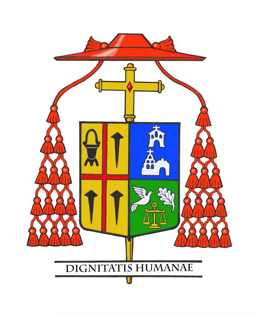
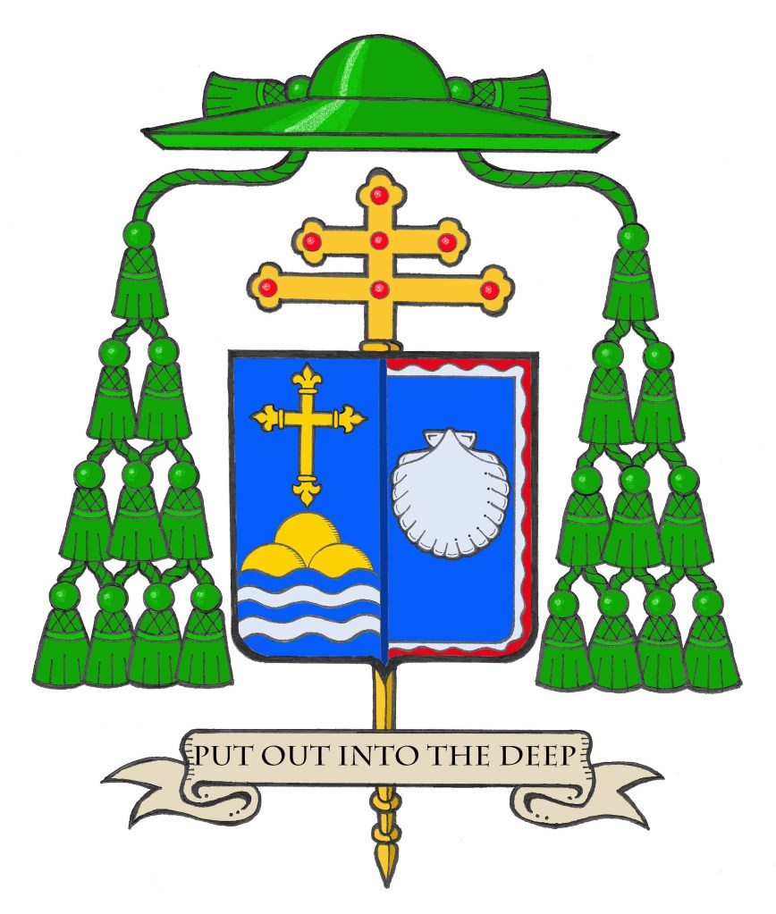
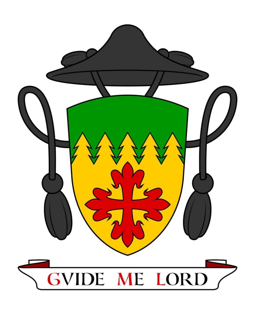
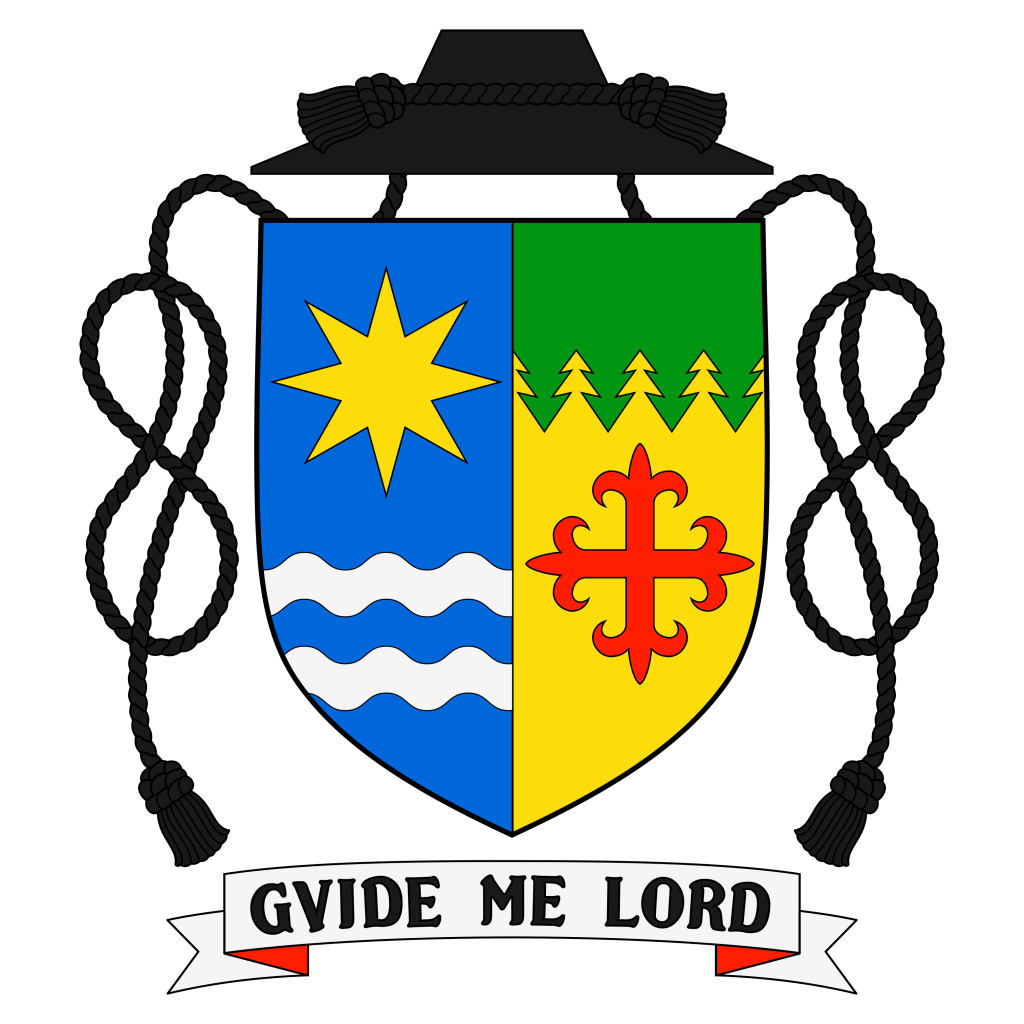
On January 14, 2025 the Most Rev. Jeffrey Grob (63), a priest and, since 2020 an Auxiliary Bishop of Chicago, will return to his native Wisconsin and be installed as the 12th Archbishop of Milwaukee, Wisconsin. The armorial bearings he assumed in 2020 were slightly modified and impaled with those of Milwaukee and are:
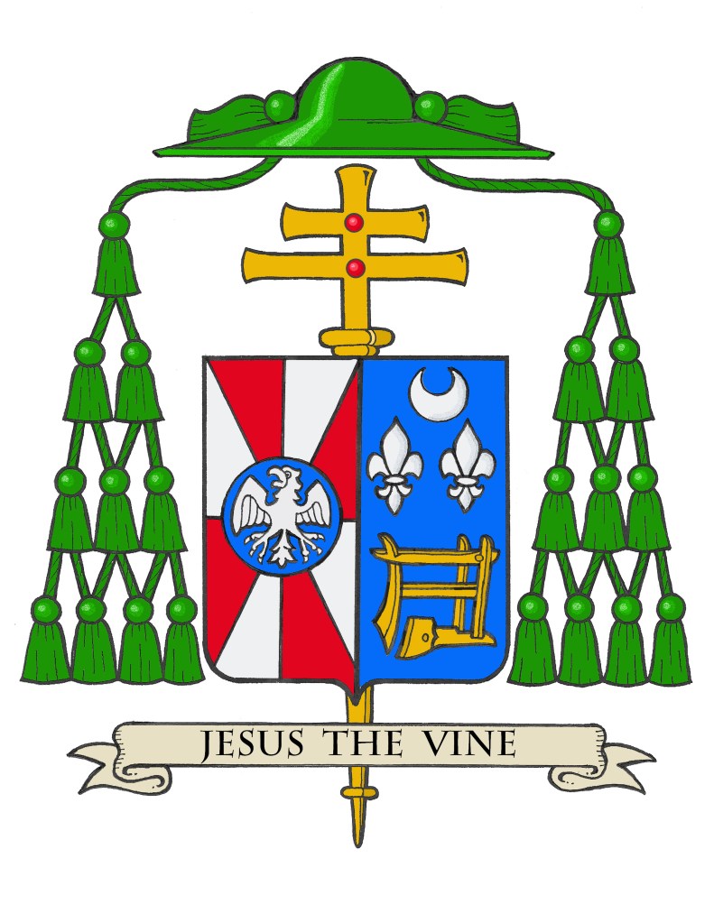
The blazon is: Arms impaled. In the dexter: Gyronny of eight Gules and Argent, at the counterpoint a hurt charged with an eagle displayed abaissé Argent. In the sinister: Azure in base an antique plow Or; in chief between two fleur-de-lis a crescent all Argent. The shield is ensigned with an archiepiscopal cross Or and an archbishop’s galero with cords and twenty tassels flanking the shield disposed in four rows of one, two, three and four all Vert. On a scroll below the shield is the motto, “Jesus The Vine”.
The armorial bearings of Archbishop Grob impale the coat of arms of his archiepiscopal See with his personal coat of arms. The coat of arms is composed of a shield with its charges (symbols), a motto and the external ornamentation. The shield is described (blazoned) in terms that are archaic to our modern language, and this description is presented as if given by the bearer with the shield being worn on the arm. Thus, where it applies, the terms dexter (right) and sinister (left) are reversed as the device is viewed from the front.
It is customary in heraldry that the arms of a Diocesan Bishop, or Ordinary, are joined side by side on the same shield with the arms of his See. In this case, these are the arms of the Archdiocese of Milwaukee. Such marshaling is called impalement and employs the same method used when joining the coats of arms of two people who are married. In this way, the coat of arms, like the episcopal ring, is symbolic of the archbishop being “married” to his archdiocese.
The arms of the Archdiocese of Milwaukee are composed of a field composed of eight sections in alternating colors of red and silver (white). The colors are taken from the flag of Switzerland, the birthplace of Milwaukee’s first Archbishop, John Henni. The four red sections meet at the center in a symbolic reference to the meeting of waters, the Milwaukee and Menomonee rivers and Lake Michigan in Milwaukee. Over the center point is a blue roundel called a “hurt” in heraldry. This, in turn, is charged with a silver (white) eagle with its wings spread out. This is a symbol of St. John, the titular patron of the cathedral church.
The personal coat of arms of Archbishop Grob symbolize his origins, his personal devotion and the place in which he has spent his ministry as a priest and auxiliary bishop. The field is blue and the main charge is a large gold (yellow) antique plow. This not only alludes to the ministry of spreading the Gospel as symbolized by plowing a field to prepare for seed to be sown but is an allusion to the bishop’s early life growing up on a Wisconsin dairy farm.
Above the plow are a silver (white) crescent, a symbol of Our Lady under her title of the Immaculate Conception who is the patroness of the USA. The two silver (white) fleur-de-lis represent several things. First, they are a symbol of St. Joseph to whom the bishop has a special devotion as a kind of patron saint because he was born on the Solemnity of St. Joseph (March 19). The fleur-de-lis is a stylized version of the lily and St. Joseph is often depicted holding a staff from which lilies are blossoming. Second, they allude to St. John XXIII who used them in his own coat of arms. The bishop has a devotion to this great 20th Century saint. Finally, there are two fleur-de-lis in the coat of arms of the Archdiocese of Chicago where the bishop had served as a priest and bishop.
The external ornaments include a gold archiepiscopal cross with two horizontal bars (sometimes referred to as a patriarchal cross) placed vertically behind the shield decorated with red jewels. This is often mistaken for a processional cross like the one used in liturgical processions. However, like other heraldic ornaments the archiepiscopal cross has its origins in something which is no longer actually used. At one time all bishops had, in addition to the processional cross at the head of the procession, another cross carried directly in front of them by a cleric. This other cross was a sign of the office of bishop. It originated as a custom that such a cross was carried before archbishops only. Later, the cross was adopted for use by all bishops so archbishop’s added a second horizontal bar to their crosses to distinguish them from the episcopal cross of simple bishops. While no longer actually used it has remained a symbol of the archiepiscopal office in heraldry.
Similarly, the broad-brimmed green galero was, at one time, worn by bishops in outdoor processions and cavalcades. No longer used it remains a heraldic symbol of the office of bishop and takes the place of the helmet, mantling and crest that would appear in the coat of arms of a layman. In Catholic heraldry the color and number of tassels on the galero indicates the rank of the bearer. The double barred archiepiscopal cross and the green galero with twenty tassels signifies the coat of arms of an archbishop according to the Instruction of the Holy See, “Ut Sive” issued in 1969.
The motto chosen by Archbishop Grob appears on a scroll below the shield, “Jesus The Vine”.
It was my privilege and my pleasure to design the archbishop’s original coat of arms in 2020 as well as to modify them (the original plow-blade alone was replaced with an entire antique plow) and marshal them to the arms of his See.