Category Archives: Bad Heraldry

Bishop Baldacchino

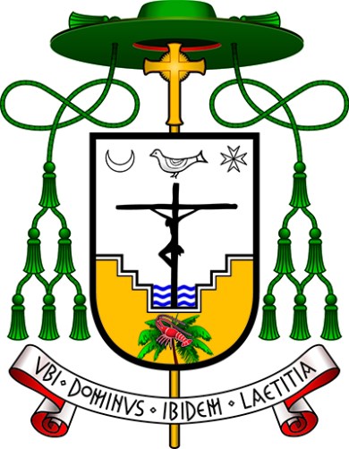
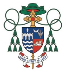
Below is an image from “The Florida Catholic” of the coat of arms of the newly ordained Auxiliary Bishop of Miami, the Most Rev. Peter Baldacchino. I am disappointed that the bishop chose to make no allusion to his baptismal patron, St. Peter, in the coat of arms. Similarly, I am disappointed that he passed up the obvious choice to have canting arms by depicting a baldacchino, or canopy, over an altar. In fact, it might have been interesting to depict the famous Bernini baldacchino of St. Peter’s Basilica as a way to combine the two. Instead, he has chosen a cluttered design filled with far too many charges in an attempt to create a “C.V. in pictures” which is precisely what a coat of arms is NOT.

Image

The description of the symbolism in the design is also from “The Florida Catholic”:

Dominating the coat of arms is Christ crucified. The Cross emerges as a sign of victory over death, represented by the waters of the baptismal font, the source of Christian life which communicates to every Christian the victory of Christ. The baptismal font is a reference also to his own rediscovery of baptism through the Neocatechumenal Way and to the work of evangelization: bringing people to live their baptism so that they may receive divine life.

Beneath the Cross and baptismal font is found an image of a palm tree upon which a lobster rests, a well-known symbol of the early Church, representing the mystery of salvation through baptism: a sea creature, accustomed to live in the waters of sin, through the work of the Holy Spirit, can leave behind its natural environment and live upon a palm tree, symbol of eternity and paradise.

Above the Cross hovers a dove, symbol of the Holy Spirit, who is the life of the Church, and without whom nothing can be done. In the upper part are found the moon, representing the Blessed Virgin Mary: “And a great sign was seen in heaven; a woman arrayed with the sun, and the moon under her feet, and upon her head a crown of twelve stars” (Rev 12:1); and the Cross of Malta, but also the star which leads the way to Christ. The palm tree is also a reference to the Archdiocese of Miami, and the lobster to the Turks and Caicos Islands, where Bishop Baldacchino ministered for 15 years. The coat of arms is completed by the three waves of the baptismal font representing the three rivers of the Archdiocese of Newark, where Bishop Baldacchino was ordained in 1996.

The motto translates to: “Where God is, there is joy”.

Two New Korean Bishops

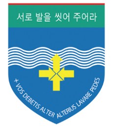
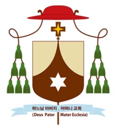
Two Auxiliary bishops of the Archdiocese of Seoul, Korea were ordained today. There coats of arms are interesting. They are Bishops Timothy Yu Gyoung-chon and Peter Chung Soon-taek, OCD. (that is, Order of Discalced Carmelites). The coat of arms of Bishop Timothy is unconventional bordering on the bizarre. It makes extensive use of writing and seems to have the motto on the shield itself. It also makes use of no external ornaments to indicate these are the arms of a bishop. On the other hand the coat of arms of Bishop Peter is more conventional in appearance. His arms are primarily composed of the coat of arms of the Order of Discalced Carmelites differenced by the exclusion of the two additional stars that usually appear in the upper left and right thirds of the shield. In addition, he employs a galero that is somewhat unique to Asian heraldry. The tassels are green as would be usual for a prelate with the rank of bishop. However, the hat is decidedly not green. Here it is a shade of red but sometimes a purple hat is used. This is to avoid the awkward and embarrassing situation that would arise from a bishop employing a green hat. To “wear a green hat” is a colloquial expression in many parts of Asia that means the man is a cuckold. To avoid this association with the well known expression many Asian bishops from various countries make use of a hat of some color other than green.

Image

Image

Bishop Caggiano UPDATE

Image

The diocese of Bridgeport, CT has finally released the coat of arms of Bishop Frank Caggiano which were posted here earlier. As has become increasingly frequent these days the bishop has chosen to completely redesign his personal arms in having them impaled (that is, marshaled together side-by-side on the same shield) with the arms of the See of Bridgeport. This is an ill-advised course of action. Nevertheless, many heraldic designers and artists who may be consulted to prepare the coat of arms of a bishop but who did not originally design the bishop’s personal arms encourage them to redesign their arms. One wonders if this is primarily because they wish to “have a crack at it” and improve on what they see to be an inferior design?

More often than not a competent artist can improve a poor design simply by the manner in which it is depicted artistically. This saves the unfortunate consequence of changing the personal arms of the bearer long after they have already become associated with him as his personal emblem. It can be seen as a repudiation of everything that came before. For a bishop this is, perhaps, not the best signal to send as it looks rather like he is negating all the ministry he did previous to the present moment and starting fresh rather than continuing in ministry. In fact, it was for this very reason that soon-to-be Saint John Paul II insisted on leaving the letter “M” in his coat of arms despite the protestations of the late great Bruno Heim that letters were inappropriate heraldic charges. John Paul II argued that even though it was heraldically a poor design he had already borne those arms for years and under Communist rule where the Church in Poland was seen as a haven for those who loved freedom. To change the arms upon election as pope might inadvertently send the signal that his stance against Communism would somehow modify or soften with his new position. This was something John Paul II wasn’t willing to risk even the appearance of. So, while he acquiesced to Heim’s suggestion of changing the colors from black on blue to gold on blue the “M” stayed.

So here we see that Bishop Caggiano, upon assuming the office of Diocesan Bishop of Bridgeport has chosen to mark the occasion not only by marshaling his personal arms with those of the diocese as is the usual custom in North America but also by abandoning the coat of arms he assumed upon becoming a bishop in favor of a redesigned coat of arms that retains the same basic elements rearranged in a new way…for reasons passing understanding.

If a redesign somehow greatly improves a coat of arms then it could be argued that it is justified. However, in this case any improvement is difficult to see.

Bishop Cozzens

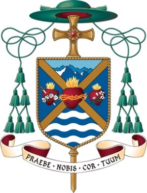
In an earlier post I noted how Auxiliary Bishop of St. Paul-Minneapolis, Andrew Cozzens, had his coat of arms carved into the crook of his crozier. Here now we see the coat of arms in its full achievement.

Hmmm. Less than wonderful.

The shield is divided by a saltire which is traditionally the X-shaped “St. Andrew Cross”. The three hearts represent the Sacred Heart of Jesus (center) the Immaculate Heart of Mary (to dexter) and the Heart of St. Joseph (to sinister). I have never heard of the latter being depicted either in heraldry or in any Catholic religious symbolism and art. Perhaps it was made up by the armiger to balance the other two? Either way, three hearts is a bit much and, if they were to be used, in heraldry it would have been better NOT to depict them in the traditional form with flames, roses, thorns, etc. and simply to depict three heart-shaped charges to stand for these three hearts.

The waves in base are from the arms of the See, which the bishop now serves and had served as a priest as well. However, the mountains in chief, to allude to his native Colorado, should be stylized and not depicted in a portrait landscape style. When…When…WHEN are people going to get it through their heads that you cannot simply take any image or picture you want, slap it onto a shield and call it heraldry???

The cord around the perimeter of the shield represents the bond of fraternity that the bishop has with a group of priests who form a priestly fraternity of which he is a member. That’s a perfectly good symbol for such a bond but should have been depicted within the edge of the shield as a bordure. Depicting it as the actual edge of the shield is heraldically unsupportable.

In the description of the achievement the episcopal cross is described as being Celtic. There are two problems there. The first is my often mentioned admonition that individual armigers are not free to determine the shape, style and manner of the depiction of the external ornaments. That creative freedom applies only to that which is on the shield. The second problem in this case is that the cross depicted is not even Celtic!

So, all in all there are nice ideas here and the charges were chosen to represent wonderful priestly and personal virtues but the overall effect is disappointing at best.

Image

When NOT to Use Heraldry Decoratively

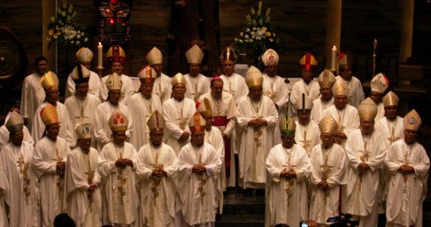
OK. I love heraldry. Can’t get enough of it. I like to see its use where and whenever I possibly can. I actually think it is underused in the Church. But, there are limits. As much as I love heraldry there are times and places when even I am forced to admit that slapping a coat of arms onto it is a bad idea. Case in point the photo below of the gathered bishops of Indonesia. The bishop in the back row third from the right and his fellow bishop in the front row third from the left look RIDICULOUS. Coats of arms on the front of a mitre? NO!

Image

Basilica of Regina Pacis, Brooklyn, NY

Image

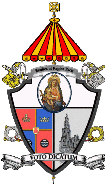
Arrrrrgh! This is horrible, Horrible, HORRIBLE!!! This coat of arms devised for the newly-designated Basilica Church of Regina Pacis in the Diocese of Brooklyn, NY is an excellent example of everything heraldry should NOT be. Do the “designers” (and I use the term loosely) of this monstrosity think that you simply take whatever images you want in whatever style you want and tack it to a shield and that’s called heraldry?

The only correct thing about this coat of arms is that basilica churches do, in fact, have the use of the ombrellino or pavilion and keys as external ornaments. Literally, everything else about it is horribly incorrect and completely lacking in imagination, creativity or even a passing knowledge of heraldic design.

The motto should not cross the shield but be depicted below it. Why is there a second scroll above the shield bearing only the name of the church? Is a coat of arms not identifying enough? The inclusion of the arms of the See of Brooklyn in its entirety is questionable but since it was done it would be good if part of it weren’t cut off! The pictorial images of Our Lady and of the church itself are wholly inappropriate and the whole is clearly a mish-mash of images cut and pasted together that don’t even match in style!

This is the worst kind of slap-dash, indifferent, ignorant heraldry that it sadly in use in far too many parts of the United States. IT STINKS!