In an earlier post I noted how Auxiliary Bishop of St. Paul-Minneapolis, Andrew Cozzens, had his coat of arms carved into the crook of his crozier. Here now we see the coat of arms in its full achievement.
Hmmm. Less than wonderful.
The shield is divided by a saltire which is traditionally the X-shaped “St. Andrew Cross”. The three hearts represent the Sacred Heart of Jesus (center) the Immaculate Heart of Mary (to dexter) and the Heart of St. Joseph (to sinister). I have never heard of the latter being depicted either in heraldry or in any Catholic religious symbolism and art. Perhaps it was made up by the armiger to balance the other two? Either way, three hearts is a bit much and, if they were to be used, in heraldry it would have been better NOT to depict them in the traditional form with flames, roses, thorns, etc. and simply to depict three heart-shaped charges to stand for these three hearts.
The waves in base are from the arms of the See, which the bishop now serves and had served as a priest as well. However, the mountains in chief, to allude to his native Colorado, should be stylized and not depicted in a portrait landscape style. When…When…WHEN are people going to get it through their heads that you cannot simply take any image or picture you want, slap it onto a shield and call it heraldry???
The cord around the perimeter of the shield represents the bond of fraternity that the bishop has with a group of priests who form a priestly fraternity of which he is a member. That’s a perfectly good symbol for such a bond but should have been depicted within the edge of the shield as a bordure. Depicting it as the actual edge of the shield is heraldically unsupportable.
In the description of the achievement the episcopal cross is described as being Celtic. There are two problems there. The first is my often mentioned admonition that individual armigers are not free to determine the shape, style and manner of the depiction of the external ornaments. That creative freedom applies only to that which is on the shield. The second problem in this case is that the cross depicted is not even Celtic!
So, all in all there are nice ideas here and the charges were chosen to represent wonderful priestly and personal virtues but the overall effect is disappointing at best.
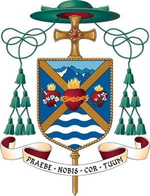

It looks more like three apples. The red on blue with a gold cross of St. Andrew sort of draws your eyes right to the center of the disorganization.
Concerning to me the most problematic elements in the crest-Cozzens are:
1. the mountains: a non-heraldic landscape.
2. The rope around the shield that is heraldic-idiot.
In “being overcrowded” this shield fits well in a “tradition” in bishops crests: the bearer wants to make his shield a full-colored story-magazine. That is a problem that every serious designer will meet and have to fight against. But that is a difficult task. Intellect is no match for dud.