Raffaele Cardinal Martino, the Proto Deacon of the College of Cardinals, passed away today at age 91. From 1986-2002 he was the Observer of the Holy See to the United Nations and lived in New York. May he rest in peace.
Raffaele Cardinal Martino, the Proto Deacon of the College of Cardinals, passed away today at age 91. From 1986-2002 he was the Observer of the Holy See to the United Nations and lived in New York. May he rest in peace.
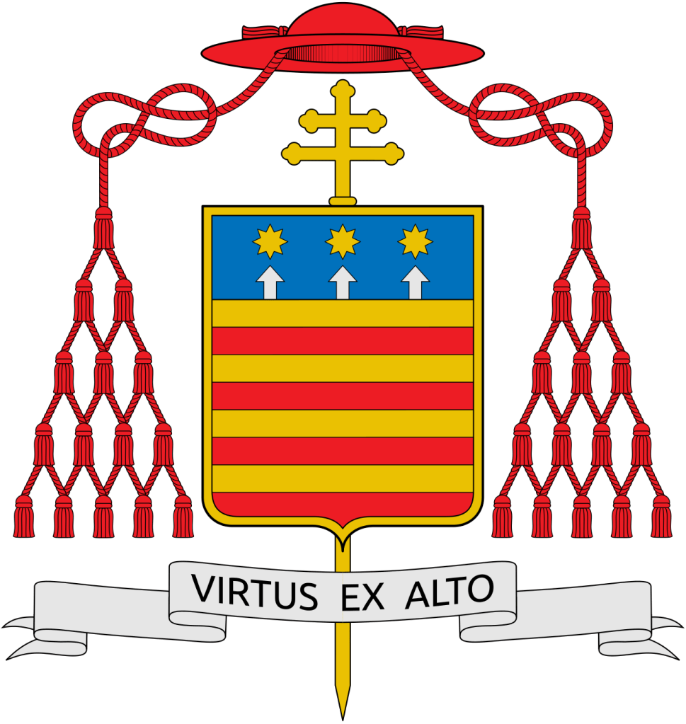
On October 24, the Most Rev. Wiesław Śmigiel (55) a priest of Pelplin, Poland who also served as Auxiliary Bishop there, and from 2017-2024 was the Bishop of Toruń, will be installed as the 6th Bishop and 4th Metropolitan Archbishop of Szczecin-Kamień.
His armorial bearings:
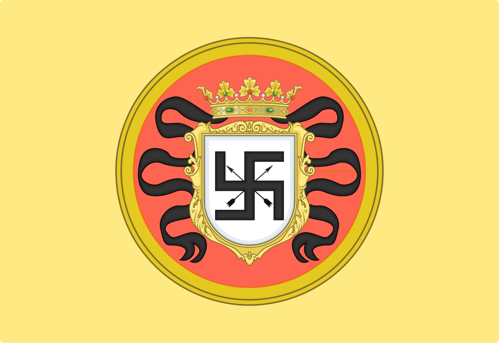
Not long ago, in my capacity as my bishop’s ecumenical & interfaith officer, I attended a meeting with representatives of the Hindu community here in central New Jersey in an ongoing effort to increase contacts with the Catholic community and people of other faiths. A small part of our conversation touched on general misunderstandings between faith communities and the swastika was used as an example. In the Hindu, Jain and Buddhist faiths the symbol is a positive one. For all time, it was ruined by its adoption by the nazi party in Germany. There it wasn’t actually a “swastika”. Rather, it was a hooked cross (hakenkreuz in German) which was not an uncommon form of the cross used in Europe until its association with the nazis ruined its connotation.
It is, I think, always important to absolutely repudiate the ideas of national socialism or its bizarre stepchild, neo-nazism, which, tragically, still exists. My intention by this post is not to offend, but to educate.
While its association with the horrors of WWII and the Holocaust will forever be with us the swastika (not the hakenkreuz), nevertheless, remains a religious symbol—and one without ANY nazi-related connotations—to other faiths. As such, it often has made its way into coats of arms in the past.
The image below depicts a banner with the armorial bearings of Hasekura Tsunenaga, also known as Don Felipe Francisco Hasekura after his conversion. He was a Japanese Samurai and emissary who traveled through the American continent and Europe in the 1600s. The arms and banner was granted to him after his conversion to Catholicism during his visit to Mexico City in 1614. An interesting blend of Japanese and European styles.
These days people would look upon this and THINK they know what it means…and be quite wrong. Such is the power of symbols. An positive religious symbol has been—in the West anyway—ruined forever because we cannot disconnect it from its terrible adoption by hateful people.
Back in 2015, I wrote a blog post about this same problem and the power of symbols which remain deeply rooted within us.
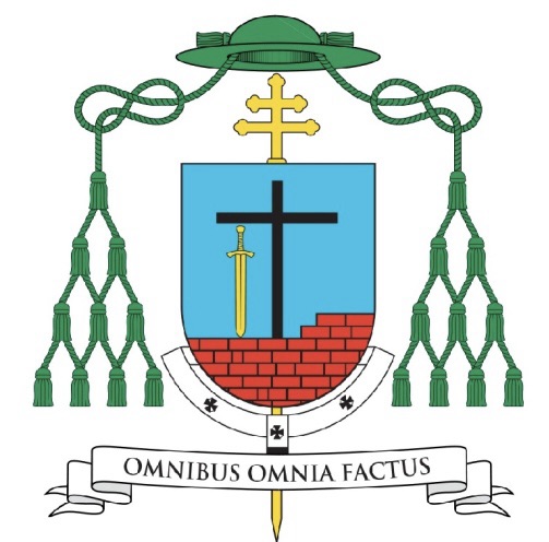
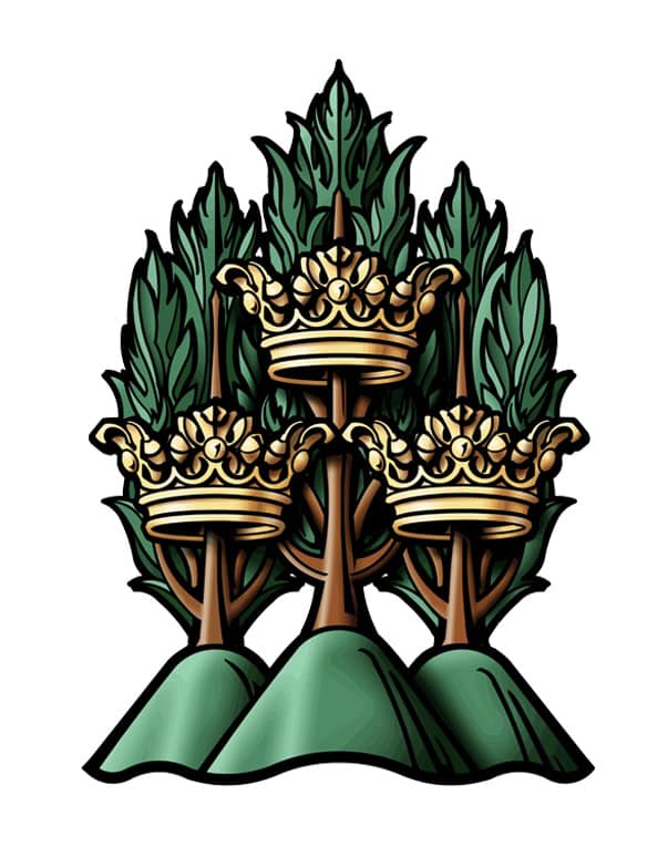
On November 6, 2024 the Most Rev. Dennis Spies, (56) a priest of the Diocese of Joliet in Illinois will be ordained as the Titular Bishop of Cenculiana and Auxiliary Bishop of Joliet. The Bishop-Elect’s appointment by the Pope was announced only on September 27 and he will very quickly be ordained to the office of bishop, well before Advent and the holiday season is upon us.
The armorial bearings he will be assuming are as follows:
The blazon of his coat of arms is: “Per saltire Or and Azure; overall two spears in saltire points upward tipped with fleurs-de-lis Counterchanged between, in chief and in base a heart facing the centerpoint Gules; and to dexter and sinister a garb of wheat, Or. Shield ensigned with an episcopal cross Or behind the shield and a bishop’s galero Vert cords and twelve tassels disposed in three rows of one, two and three all Vert. On a scroll below the shield the motto: “I Call You Friends”.
The main colors of the shield, blue & gold, are the colors primarily used in the coat of arms of the Diocese of Joliet. So, by means of their use the diocese the bishop has served as a priest (and now as a bishop) is alluded to. The shield is divided in a saltire (an “X” shape) and the two main charges are two spears crossed in saltire. The surname Spies is German in origin and in German and Dutch it is a metonymic occupational name for a spear maker. It is derived from Middle High German “spiez”, meaning ‘spear pike’ or an occupational name from the same word in the sense of a ‘soldier armed with a spear’. So, the two spears allude to the family name. They appear slightly different from the typical spear in that their heads, rather than depicting the usual blade, have heads that are shaped like the fleur-de-lis. This, too, is taken from the coat of arms of the Diocese of Joliet where two fleurs-de-lis appear. This is an ancient heraldic symbol of both the Blessed Virgin Mary and the Most Holy Trinity. Counterchanging (where the color of an object and the background are alternated) serves as a symbol of conversion…the daily conversion to which we are all called as followers of Christ.
Above and below are two red hearts symbolizing the Sacred Heart of Jesus and the Immaculate Heart of Mary. The hearts are depicted with their points toward the center of the shield. The two hearts–in a sense–“facing each other” symbolize the love that God has for all His creation and the love that His children return to Him by their faith and devotion. Love is both given and received. The disposition of the hearts indicates this.
A heart shape, although with different symbolism, also appears in the coat of arms of Bishop Hicks, the Diocesan Bishop whose ministry Bishop Spies will assist and support. It is an old custom in heraldry to borrow a charge from the coat of arms of a superior or patron as a way of honoring them. So, the heart shape being repeated in the coat of arms of Bishop Spies honors this custom.
To the left and right are two gold (yellow) garbs of wheat. The garbs of wheat are symbolic of agriculture generally and the Bishop grew up on a farm. In addition, they are also symbolic of the Eucharist, the center of our lives as Christians. So, they are a fitting symbol of both his background and his faith.
The motto below the shield is, “I Call You Friends” from John 15:15 where Jesus says, “I no longer call you slaves, because a slave does not know what his master is doing. I call you friends, because I have told you everything I have heard from my Father.”
The shield is also ensigned with those external ornaments that indicate the bearer is a bishop. The gold (yellow) cross is placed vertically behind and extending above and below the shield. This is often mistakenly thought to be a processional cross like those used in liturgical processions. That is not entirely right. In former times archbishops, and later all bishops, had a second cross mounted on a staff carried immediately in front of them while in procession or on solemn occasions. This cross was a symbol of their rank as bishop. While such an episcopal cross is no longer used practically it has been retained heraldically. In fact, there are other clerics who make use of the ecclesiastical hat with its many tassels but the one true heraldic emblem of a bishop, and the only essential one, is the episcopal cross placed behind the shield.
Above the shield is the ecclesiastical hat, called a galero which, in heraldry, replaces the martial helmet, mantling and crest. “The hat with six pendant tassels (green, purple or black) on each side is universally considered in heraldry as the sign of prelacy. It, therefore, pertains to all who are actually prelates.” (Heim, Bruno B., Heraldry in the Catholic Church 1978, page 114). The galero is green with green cords pendant from it and twelve green tassels arranged in a pyramid shape on either side of the shield. At one time in history bishops and archbishops wore green before adopting the more Roman purple we see today. In heraldry the green hat and tassels was retained for prelates with the rank of bishop according to the Instruction of the Secretariat of State, “Ut Sive” of March, 1969.
It was my great privilege and pleasure to work with Bishop Spies on the design and execution of his armorial bearings and also preparing the blazon and explanation.
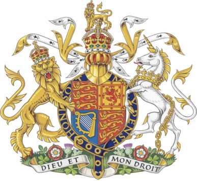
A new artistic rendering of the royal arms has been unveiled to be used during the reign of Charles III. The artwork is by the well known heraldic artist, Tim Noad, who also did the newer version of the arms of Queen Camilla as well as Charles III’s royal cipher.
The King made some changes to the appearance of the coat of arms, most notably by using the Tudor style crown in the achievement.
It has been very gratifying as a heraldist to have one project that I have been able to stay with through all its permutations. On October 31, the Most Rev. Richard G. Henning (60) who has served for the last 17 months as Bishop of Providence, R.I. and who was also Coadjutor of Providence for a further four months before that, and who was previously Auxiliary Bishop of Rockville Centre, N.Y., his native diocese where he became a priest in 1992, will be installed as the 10th Bishop and 7th Metropolitan Archbishop of the See of Boston, Massachusetts.
Back in 2018, the then Bishop-elect Henning contacted me to design a coat of arms for him. That’s not an unusual thing for me (I have designed coats of arms for three other bishops from Rockville Centre) but this one was more personal. I’m also a Long Island native and Archbishop Henning and I attended the same high school, Chaminade in Mineola, and we graduated together in the class of 1982. While not close friends, we have been acquainted with one another since we were teenagers. I was very happy to design his coat of arms for him. He entered the task with great enthusiasm and I think the coat of arms that we ended up with was simple, bold and very clear, all marks of good heraldry. On a personal not: at his episcopal ordination which I attended, the new Bishop, in his post-Communion remarks, thanked me publicly for assisting him in preparing his coat of arms. As I told him afterwards, that was very gratifying because in 39 years of doing this kind of work no bishop had ever done that before. I think it speaks volumes about what kind of person he is.
In late 2022 after he received the news of his appointment as Coadjutor of Providence I actually reached out to him to let him know that, as a Coadjutor, his coat of arms wouldn’t need any changes but that at some point in the future when he succeeded to the See, he’d have to modify his arms by marshaling them to the arms of the Diocese of Providence. He then asked me to begin on that right away because it was not certain when his succession would occur and he wanted to be prepared for that eventuality. I also thought that was “done and dusted” as they say and he was now set for the rest of his life.
However, in August of this year I was surprised and delighted to hear that the Holy Father had appointed him Archbishop of Boston. For the third time he contacted me. He said that several people in Boston assisting him with the needs of his transition had proposed people to prepare his coat of arms. But, he politely declined all those and said that he already had someone in mind. Again, I was really very pleased and honored at that. I see my designs as sort of my intellectual property. True, the coat of arms, once designed, is given over to the armiger to whom it truly belongs, but I feel like I still have a stake in it. So, I was very glad that I’d be able to assist Archbishop Henning yet again.
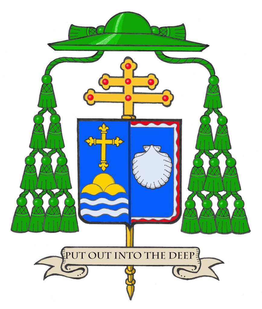
He retains the arms he first assumed in 2018. For this version, the escallop shell has been redrawn to a slightly more round shape and the bordure wavy has been slightly reduced in order to make more room for the shell which now occupies a much smaller field on one half of the shield. This is impaled with the arms of the See of Boston, designed by the great Dom Wilfrid Bayne, OSB of Portsmouth Abbey, R.I. in 1944. Because of the preponderance of blue in both coats of arms, the division line between the two is rendered in dark blue. It was decided that a black line looked a bit too jarring and the solution used for the same problem with the arms of the See of Providence which also has a blue field—a light, “bleu celeste” line—was seen as undesirable this time around. The blazon and explanation of the arms is as follows:
“BLAZON: Arms impaled. In the dexter: Azure, a Latin cross fleurettée Or, in base barry wavy of five Azure and Argent, issuing therefrom a mound of three coupeaux Or; In the sinister: Azure, within a bordure wavy parted wavy Argent and Gules an escallop shell Argent. The shield is ensigned with an archiepiscopal cross Or and an archbishop’s galero with cords and twenty tassels flanking the shield disposed in four rows of one, two, three and four all Vert. On a scroll below the shield is the motto, “Put Out Into The Deep”.
EXPLANATION: The armorial bearings of Archbishop Richard Henning impale the coat of arms of his archiepiscopal See with his personal coat of arms. These evoke his birthplace, his ministry and his personal devotion. The coat of arms is composed of a shield with its charges (symbols), a motto and the external ornamentation. The shield is described (blazoned) in terms that are archaic to our modern language, and this description is presented as if given by the bearer with the shield being worn on the arm. Thus, where it applies, the terms dexter (right) and sinister (left) are reversed as the device is viewed from the front.
It is customary in heraldry that the arms of a Diocesan Bishop, or Ordinary, are joined side by side on the same shield with the arms of his See. In this case, these are the arms of the Archdiocese of Boston. Such marshaling is called impalement and employs the same method used when joining the coats of arms of two people who are married. In this way, the coat of arms, like the episcopal ring, is symbolic of the archbishop being “married” to his archdiocese.
The arms of the Archdiocese of Boston are composed of a blue field on which are placed a gold (yellow) cross fleurettée, that is a Latin cross the arms of which are decorated on the ends with fleurs-de-lis. This is in honor of the titular of the cathedral, the Holy Cross as well as the first Bishop of Boston being from France. The cross is above a gold (yellow) mound composed of three smaller hills as a reference to Boston’s original name: Trimountaine which is, itself, a reference to the three hills on which the city is said to have been built. At the bottom the five wavy lines of blue and silver (white) alludes to Boston being a port city and that it is populated by people who arrived here from across the sea.
Bishop Henning’s personal coat of arms is composed of a design depicted in red (Gules), white (Argent) and blue (Azure) which are the national colors of the United States.
Both the blue background and the single escallop shell allude to the sea as evoking the Bishop’s own background and the shell is also borrowed from the coat of arms of the See of Rockville Centre, the diocese in which he was born and raised and which he served as a priest and auxiliary bishop. In addition, this same field of blue also recalls the blue field of the coat of arms of the See of Providence where he served as Coadjutor Bishop and later Diocesan Bishop. The shell image also recalls the Bishop’s heritage in the Diocese of Brooklyn, dedicated to its patron, St. James. The episcopal ordination of Bishop Henning took place on the eve of the Feast of St. James. In concert with the Bishop’s motto, the shell is a traditional symbol of baptism and pilgrimage. It is in the depths of these waters that Christians find their salvation in Jesus Christ.
The white wavy line surrounding the blue field is also taken from the arms of Rockville Centre and it alludes to the diocese’s location on Long Island, NY. Furthermore, it indicates the sea as the place where the barque of St. Peter, an image used to evoke the Church, is located.
The blue background also evokes the Bishop’s devotion to the Blessed Virgin Mary and his years of service as a Professor and Rector at the Seminary of the Immaculate Conception in Huntington, NY. The red wavy portion of the border evokes the Bishop’s devotion to the Most Sacred Heart of Jesus and his former service as the Director of the Sacred Heart Institute for the Ongoing Formation of the Catholic Clergy.”
It was, indeed, my profound pleasure , and my honor, once again to assist my old classmate, Archbishop Henning, with the preparation of his coat of arms.
I’m looking forward to attending the 36th International Congress of Genealogical & Heraldic Sciences (ICGHS) in Boston this week. The event is hosted by American Ancestors, a national center for family history, heritage & culture (specifically their Heraldry Committee) and FamilySearch, the world’s largest genealogy organization. This year’s Congress theme is: “Origins, Journeys, Destinations”. This will be the first time the ICGHS is held in the United States.
On September 14, the Feast of the Exaltation of the Holy Cross, the Benedictine Abbots from all over the world meeting in Congress at Sant’Anselmo in Rome elected the Most Rev. Jeremias Schröder, OSB (59) as the 11th Abbot-Primate of the Order.
Abbot Jeremias was elected the Archabbot of St. Ottilien in Germany from 2000. At that time the office of Præses (President) of the Congregation of St. Ottilien was ex officio joined to that of Archabbot. In 2012 it was decided to separate the two offices. Archabbot Jeremias resigned as Archabbot of the Archabbey and then continued as President of the Congregation of St. Ottilien until 2024. He succeeds Abbot-Primate Gregory Polan (74) who is an American and monk of Conception Abbey in Missouri.
The Abbot-Primate does not have juridical authority over the Order but serves as the titular head of the worldwide Benedictine Confederation of monks and nuns.
Using the armorial bearings he assumed as Archabbot, Abbot-Primate Jeremias would be entitled to impale his personal coat of arms with that used by the Order of St. Benedict.
Even in the world of ecclesiastical heraldry the horrible events of 9/11/2001 are commemorated. The Most Rev. Josu Iriondo, Auxiliary Bishop of New York, was ordained a bishop late in 2001 during the aftermath of that horrible terrorist attack on the city. A well-known cross formed by the intersection of two steel I-beams in the wreckage of the twin towers made up the principal charge in his assumed coat of arms.
May we always remember the tragic loss of innocent lives in that fateful day.
You may recall that in a post about several new bishops’ installations I wrote the following about the coat of arms of Bp. Martin of Charlotte, N.C.:
“May 29 saw the ordination and installation of the Most Rev. Michael Martin, OFMConv (62) as the fifth Bishop of Charlotte, North Carolina.
The diocesan website describes his personal arms, “To the viewer’s right is the Franciscan coat of arms. Featuring the traditional Franciscan Tau cross with two arms crossing one another, it is rich in symbolism. The two arms, one Christ’s and the other St. Francis of Assisi’s, both bear the stigmata. They symbolize God’s love and Francis’s loving response to the Word made incarnate, Taberski explained. It is an image found throughout the ministries, friaries, missions and sites served by the Franciscan order.
On the right side of the shield, the top (known as the “chief”) and the bottom (the “base”) feature references to George Calvert and his son Cecil Calvert – the first and second barons of Baltimore. The Calverts were among the first Catholics to arrive in colonial America. They established the then Province of Maryland as a safe place for English Catholics to emigrate to since they were no longer able to freely practice their faith at home. In the coat of arms, the use of six vertical stripes – alternately gold and black, with the diagonal stripe in color – recalls Bishop Martin’s hometown of Baltimore.”
A nice simple design but perhaps the arms of Calvert would have looked better depicted once in the main part of the field with the Franciscan symbols occupying a chief?“
Well, my friend and frequent collaborator, Mr. Sandy Turnbull of the Australian Heraldry Society, read that post and decided to have a bit of fun and create a new emblazonment of Bp. martin’s coat of arms that followed my advice. I’d say the result (below) speaks for itself. I was right! The whole achievement does look better as I suggested. See? One can’t just throw things onto a shield and call it heraldry. How the design is arranged—to be aesthetically pleasing as well as heraldically correct—is a large part of good heraldic design.
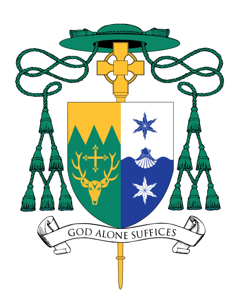
The Most Rev. James Beckman, (61) a priest of the Diocese of Nashville since 1990 was ordained a bishop and installed as the Fourth Bishop of Knoxville on July 26. For reasons I don’t fully understand, his installation Mass took place in a local convention center despite the fact that only a few years ago in 2018 the diocese undertook to build a $30 million dollar new cathedral with an area of 28,000 feet and a seating capacity of 1,358. It begs the question: what was the new cathedral for?
The armorial bearings he assumes upon becoming a bishop are the following. The diocesan coat of arms, designed when the diocese was established in 1988 are a dumpster fire and the less said about them the better. After all, this bishop had no hand in designing them and he wisely conformed to the convention of not changing them since they have been in use for 36 years already.
According to information from the Diocesan website his personal arms contain what they do because…
“Bishop-elect Beckman is an avid hiker and has a deep appreciation for the beauty of God’s creation. His coat of arms reflects this part of his life, in which he has found much solace and communion with God in prayer. His personal arms display a symbolic natural setting on a field of green (vert), which also has ties to the bishop’s heritage, and to Sacred Scripture.
The bishop’s surname is German, and derives from the word beck, which means a stream or brook. This is depicted by the wavy vertical lines (pale wavy) painted white and blue (argent and azure) in the center of the shield. This also recalls the prophecy related by St. John the Evangelist about the City of God, the New Jerusalem, which he sees in a vision near the end of the Book of Revelation: “Then the angel showed me, the river of the water of life, bright as crystal, flowing from the throne of God and of the Lamb through the middle of the street of the city” (Rev 22:1).
John also saw, “on either side of the river, the tree of life with its twelve kinds of fruit, yielding its fruit each month. The leaves of the tree were for the healing of the nations” (Rev 22:2). The tree of life and its fruit are alluded to here by twelve leaves of the tulip poplar (Liriodendron tulipifera). This was chosen as the state tree of Tennessee in 1947. It is an appropriate symbol for the state that comprises both the Diocese of Nashville, where Bishop-elect Beckman was born and served as a priest, and the Diocese of Knoxville, which he will serve as its bishop.
The charges were chosen for good reasons. The coat of arms is clear and uncomplicated. The only real down side is that they are impaled with the awful coat of arms of the See.
On July 25, the Feast of St. James the Apostle, the Most Rev. Kendrick J. Forbes (48), a priest of the Archdiocese of Nassau, Bahamas was ordained a bishop and installed as the tenth Bishop of Roseau, Dominica in the Antilles (West Indies).
Upon his ordination to the episcopacy he has assumed the following coat of arms:
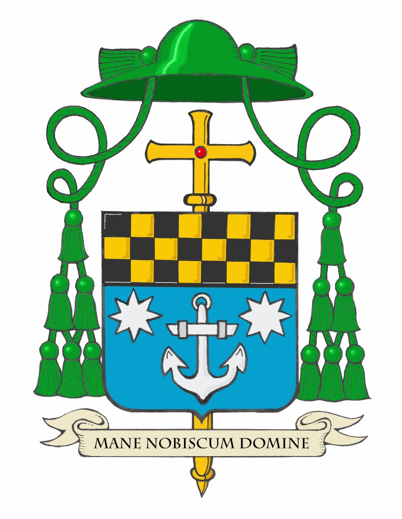
The personal coat of arms assumed by Bishop Forbes combines symbols that are meaningful to him reflecting his, origins, his spiritual life and priestly ministry. At present, the Bishop has elected to assume a personal coat of arms only. In the Catholic Church it is often customary for a diocesan bishop to combine his personal coat of arms side by side on the same shield with the coat of arms of his diocese in a form of marshaling called “impaling”. It represents his marriage to the diocese and his jurisdiction over it. However, this custom is far from a universal one and, at present, the Diocese of Roseau does not employ a unique coat of arms as a diocesan corporate symbol.
The main part of the shield shows a light blue field on which there is a silver (white) anchor. On either side of the anchor are two eight-pointed stars. For centuries, the anchor has been a symbol of hope used in art, in the liturgy and in heraldry. The eight-pointed star is borrowed from the coat of arms of Pope Francis who named Bishop Forbes to the episcopate. There are two for balance and symmetry. The upper third of the shield is called a “chief” in heraldry and it depicts the black and gold (yellow) checkered pattern borrowed from the coat of arms of the Archdiocese of Nassau where Bishop Forbes was ordained and served as a priest before becoming a bishop.
The motto below the shield is,“Mane Nobiscum Domine” taken from Luke 24:29 meaning “Stay with us Lord.”
It was both my privilege and my pleasure to design and to emblazon the bishop’s coat of arms for him.
Retired Archabbot of Saint Vincent Archabbey, Latrobe, Pennsylvania, Douglas R. Nowicki, O.S.B., (79), died Tuesday, July 23, in Allegheny General Hospital, Pittsburgh, following a brief illness. The eleventh Archabbot of Saint Vincent, he served from 1991 until he reached the retirement age of 75 in May of 2020, when he retired. He was the second longest-serving Archabbot in the 178-year history of Saint Vincent. With more than 150 monks, St. Vincent was the first Benedictine monastery in the United States, and is one of the largest monasteries in the world. He will be buried on July 29, 2024.
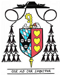
When he was elected in 1991 I was still a member of the monastic Community in Latrobe. My mentor—the late Géza Grosschmid, Ph.D.—and I were given the job of devising a coat of arms for the new Archabbot. Ultimately, Archabbot Douglas rejected the design Dr. Grosschmid suggested and went with a modified version of it devised by me. Essentially, it illustrated the motto, taken from St. John Henry Newman, “Cor Ad Cor Loquitur” which means “Heart Speaks To Heart”.
Above we see my original drawing of the coat of arms without the motto added. The dexter impalement depicts the coat of arms adopted by St. Vincent Archabbey in the early 20th Century under the abbatial term of the Rt. Rev. Alfred Koch, OSB, the 5th Archabbot of St. Vincent. It depicts the blue and silver elongated diamond-shaped fusils taken from the arms of the Royal House of Wittelsbach, the Kings of Bavaria. This alluded to the origin of the founding monk and first Archabbot of St. Vincent, Boniface Wimmer, OSB who was from St. Michael’s Abbey in Bavaria, as well as to the patronage and financial assistance given to the fledgling community through the Ludwigs-Missionverein, an organization established by King Ludwig I of Bavaria to support missionary efforts in the new world.
The black horizontal fess with three plates (white roundels) seen on the arms of William Penn is reshaped as an inverted chevron to form the letter “V” for Vincent and the three plates are charged with three crosses. The arms of the Archabbey are impaled—joined on the same shield—with the Archabbot’s personal arms. This marshaling of two separate coats of arms on the same shield employs the same method used for the coat of arms of two armigerous people who are married. It indicates the “marriage” of the armiger with the place of his jurisdiction with the arms of the jurisdiction occupying the place of the groom and the personal arms occupying the place of the bride.
The Archabbot’s personal arms, as I said, illustrate the motto.
I had also presented Archabbot Douglas with the option of displaying his arms ensigned by a galero with twenty tassels rather than merely twelve. In a manner similar to that of an archbishop using twenty tassels to a bishop’s twelve tassels, I proposed that as an Archabbot he also make use of this distinctive galero indicating his rank. Archabbots don’t actually have any greater jurisdiction or privileges over other Abbots (the one exception being that he may occupy a senior place in the procession whenever attending a gathering of several Abbots). In addition, none of the other previous ten Archabbots of St. Vincent made use of such a galero so, ultimately, he decided to honor that precedent and rejected the idea.
Although his two immediate predecessors had armorial achievements that did not display the usual veiled abbatial crozier Archabbot Douglas agreed with my suggestion he do so. When St. Paul VI reformed many things concerning the dress and externals of the hierarchy in 1969 one of his decisions included removing the mitre and crozier from the coats of arms of Cardinals, Archbishops and Bishops. They were seen as superfluous since episcopal coats of arms make use of the episcopal cross as the sign of the armiger holding the rank of (arch)bishop. However, it was not the intention to remove the use of the veiled crozier—a peculiarly abbatial heraldic symbol—from the coats of arms of Abbots. The veil became a symbol of abbatial croziers in a time before Abbots would have worn pontifical gloves when pontificating. The veil served the useful function of protecting the shaft of the crozier from dirt and oils from the hand. Later, even after pontifical gloves were used by Abbots, the veil, or sudarium, remained attached to the crozier to distinguish such a heraldic emblem from that of a bishop. Despite the reforms of St. Paul VI which referred to the coats of arms specifically of Cardinals, Archbishops and Bishops, the veiled crozier remains to this day as the heraldic emblem of Abbots and Abbesses.
As I said, Archabbot Douglas was happy to follow my advice in this regard. I noted on one of my subsequent visits to the Archabbey that the display of archabbatial coats of arms in the Archabbot’s outer office included a new rendering of Archabbot Douglas’ coat of arms with the veiled crozier omitted. It could be that there was simply an effort to have his coat of arms artistically conform to the pattern followed by his two immediate predecessors. One also is moved to wonder, however, if the person responsible was simply acting in ignorance? It would be hoped that the move was not a deliberate one. If it were, it would constitute an action displaying the most blatant ignorance of commonly accepted heraldic practices in the Church as laid out in the excellent and scholarly work of the late Bruno B. Heim, Heraldry in the Catholic Church, as well as in several other similar publications. In other words, don’t take my word for it! It’s verifiable independently of my opinion. In fact, my collaborator on this project for Archabbot Douglas, Dr. Grosschmid, was a close friend and collaborator of Archbishop Heim who was widely accepted as the foremost expert in Catholic ecclesiastical heraldry of his day. Dr. Grosschmid concurred with my assertion that the Archabbot’s coat of arms should employ the veiled crozier which is why I felt so comfortable advising the Archabbot in that way.
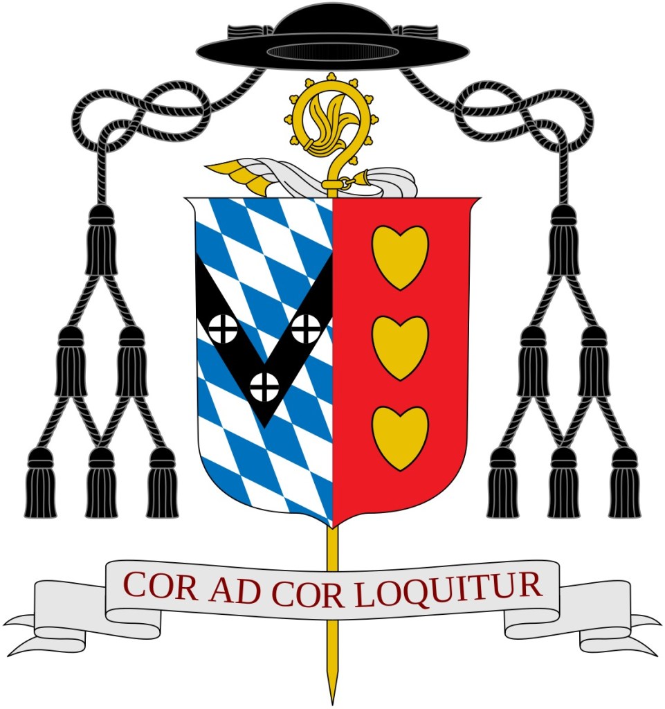
Nevertheless, in this later rendering it was omitted. I note, too, that Archabbot Douglas’ successor, Archabbot Martin de Porres Bartel, OSB, the twelfth Archabbot, similarly omits the veiled crozier from his armorial achievement, no doubt advised in the same manner that was (accidentally or deliberately) ignorant of the appropriate practices. I note, too, with some satisfaction that the Wikipedia article about Archabbot Douglas correctly displays his coat of arms according to the manner in which I designed it. (below)
May he Rest in Peace.
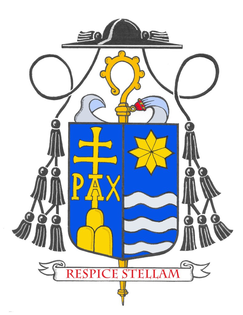
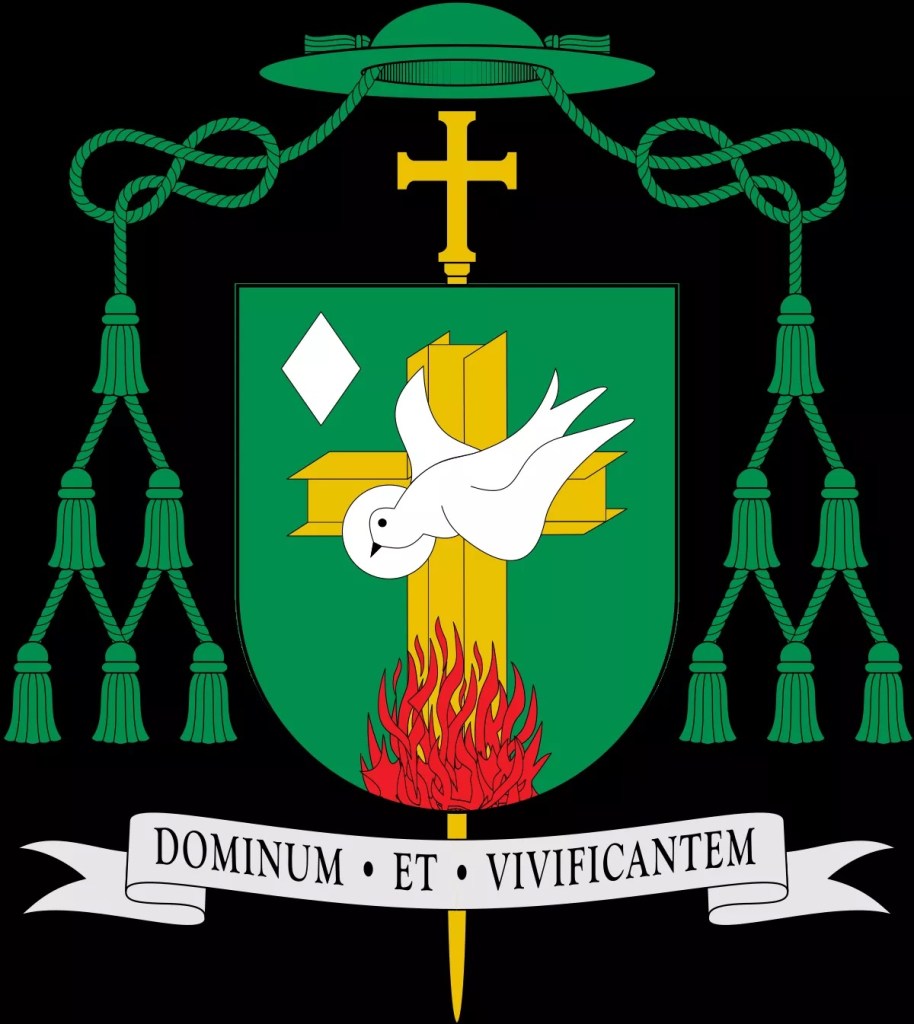
The Most Rev. John J. McDermott (61), a priest of the Diocese of Burlington, Vermont who recently served—twice—as diocesan administrator in the interim times between bishops, was ordained a bishop and installed as the XI Bishop of Burlington on July 15th.
His assumed armorial bearings are understated and impale well with the rather nice coat of arms of the diocese.
According to information provided by the Diocese: “the Bishop’s personal coat of arms is divided horizontally by a wavy line (per fess wavy)into two sections painted respectively white and blue (argent and azure). Following high school, Bishop McDermott attended the United States Coast Guard Academy in New London, Connecticut, and this allusion to the sea refers to those days as they were important to his discernment to become a priest, as well as to the waters of Lake Champlain.
Two six-pointed wavy stars (estoilles) appear, one in the “sky” to refer to Our Lady,the Star of the Sea, and the other in the “sea” itself. A six-pointed star is a traditional symbol not only of Our Lady but also of Saint Joseph, as a descendant of the royal house of King David. Its position here depicts the holiness of Saint Joseph as a reflection of that of his Immaculate spouse.
Between the stars is a scallop shell, a traditional attribute of Saint John the Baptist, the Bishop’s baptismal patron saint. The shell is divided along the same wavy line as the shield, as if it were being dipped into the water at the moment of conferring Baptism. The shell and the stars are all painted counterchanged, that is, blue where the field is white, and white where the field is blue.“
A pleasant coat of arms which kept things nice and simple, that is to say, clear.
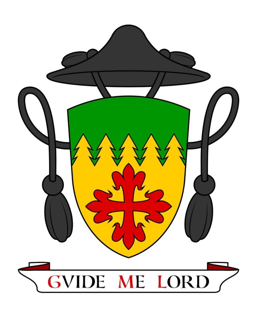
For quite a few years now I have collaborated with Messrs. Richard d’Apice, AM, KCSG, AIH and Sandy Turnbull on a small committee called the “Ecclesiastical Working Party” under the auspices of the Australian Heraldry Society. Together, we have created coats of arms for dioceses and bishops in Australia, and also in some other countries in the Pacific region, since some time around 2011.
Mr. d’Apice acts as the corresponding secretary, as it were, for the group. He is the point of contact and communication for the client with the group. In addition, an enthusiastic heraldist for much of his life, he has input into the designs we propose. That’s where I come in. Frequently I act as the consultant on the design either by proposing a different alternative to that of Mr. d’Apice; or by making suggestions to enhance or “tweak” his proposal. Together, we are able to reach consensus and present a single proposed design to the client. This, in turn, is still often modified further as the process continues. I also assist with the composition of the blazon.
For the artwork, we hand off to the talents of Mr. Turnbull. Occasionally, I might provide a sketch merely to illustrate the proposal or one of my suggestions. But, the initial draft as well as the final artwork is provided by Sandy.
He surprised me not long ago. After years of collaboration on numerous coats of arms he created a rendering in his own style of my armorial bearings and presented it to me. I’m very pleased with it and I’m happy to share it with you now.
For those not already familiar with it the blazon is:
Or, a Greek cross fleury; a chief sapiné Vert.
The line of fir trees suggests my surname, Selvester (originally Silvestri and later anglicized after emigrating to the U.S.) which means a forest dweller, or woodsman. It represents my paternal Italian heritage. The colors green and gold allude to my maternal Irish ancestry. The red cross of faith is the single charge but its arms terminate in fleurs-de-lis as symbolic of both Our Lady and the Blessed Trinity. The motto is a pun on my given name, Guy, which means “a guide”. The shield is ensigned with the galero of a priest.
It’s always nice to have one’s coat of arms rendered by different artists in their own distinctive style. I am especially pleased with this one.
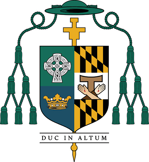
The Rev. Joseph Caddy (64) a priest of the Archdiocese of Melbourne in Australia will be ordained a bishop on August 15 and installed as the 10th Bishop of Cairns, Australia.
His armorial achievement, to be assumed upon episcopal ordination, is as follows:
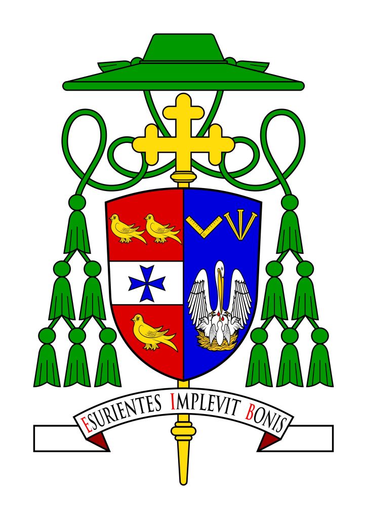
The existing arms of the diocese occupy the dexter impalement. The personal arms consist of the pelican in its piety. This is borrowed from the coat of arms of Corpus Christi College which was the seminary attended by the armiger. Its eucharistic imagery is also reflected in the motto which translates to, “He fills the hungry with good things”. The carpenter’s square in chief is a reference to his Baptismal patron, Joseph and because his father, grandfather, and one brother are/were all carpenters.
The three Passion nails meeting in base allude to the coat of arms traditionally used by the English Caddy family which depict three piles engrailed meeting in base. The square and the nails, then, are a reference to his given and family names.
I was happy to act as a consultant on the design of the bishop’s personal arms in conjunction with Mr. Richard d’Apice, AM, KCSG. The artwork was very nicely done by Mr. Sandy Turnbull of Australia. Both are members of the Australian Heraldry Society.
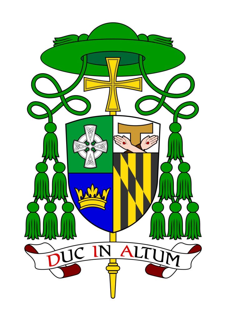
UPDATE: Thanks to a comment from a regular reader asking about the diocesan arms we made a change. His question prompted me to refer back to my collaborators. In turn, the Diocese of Cairns was contacted and I, myself, delved into the pretty good small library of my own which I have amassed over the last thirty years. It turns out that our original depiction showed an fimbriation that really shouldn’t have been there! So, it was back to the drawing board for Mr. Turnbull who promptly made the correction. The end result is the corrected , and I think improved, coat of arms for Bishop Caddy, well in time for his ordination & installation.
And all thanks to a reader of this blog!
The armorial bearings of the newly elected Abbot of St. Benedetto in Monte in Norcia, Italy, the American, Rt. Rev. Benedetto Nivakoff, OSB, which were designed and executed by Marco Foppoli. In chief are the armorial bearings of the Abbey and the personal arms in base refer to the motto.
June 10 is observed as “International Heraldry Day”. So, celebrate heraldry!
Fr. Guy Selvester's blog of Ecclesiastical Heraldry
Fr. Guy Selvester's blog of Ecclesiastical Heraldry
Fr. Guy Selvester's blog of Ecclesiastical Heraldry
Fr. Guy Selvester's blog of Ecclesiastical Heraldry
Fr. Guy Selvester's blog of Ecclesiastical Heraldry
Fr. Guy Selvester's blog of Ecclesiastical Heraldry
Fr. Guy Selvester's blog of Ecclesiastical Heraldry
Fr. Guy Selvester's blog of Ecclesiastical Heraldry
Fr. Guy Selvester's blog of Ecclesiastical Heraldry
Fr. Guy Selvester's blog of Ecclesiastical Heraldry
Fr. Guy Selvester's blog of Ecclesiastical Heraldry
Fr. Guy Selvester's blog of Ecclesiastical Heraldry
