Bishop Pham of San Diego

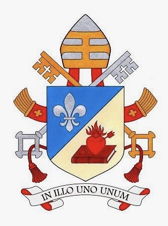
On July 17, 2025 the Most Rev. Michael Pham (58), a priest of the Diocese of San Diego who, since 2023 has also served as Auxiliary Bishop there, will be installed as the VII Bishop of San Diego.

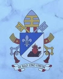
The arms that he assumed when he became a bishop in 2023 remain unchanged, as is most correct. They have, however, simply been marshaled with the existing, and very nice, coat of arms of the diocese.

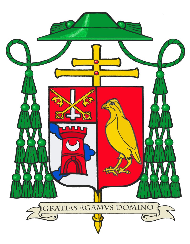
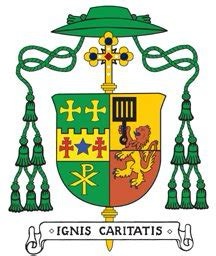
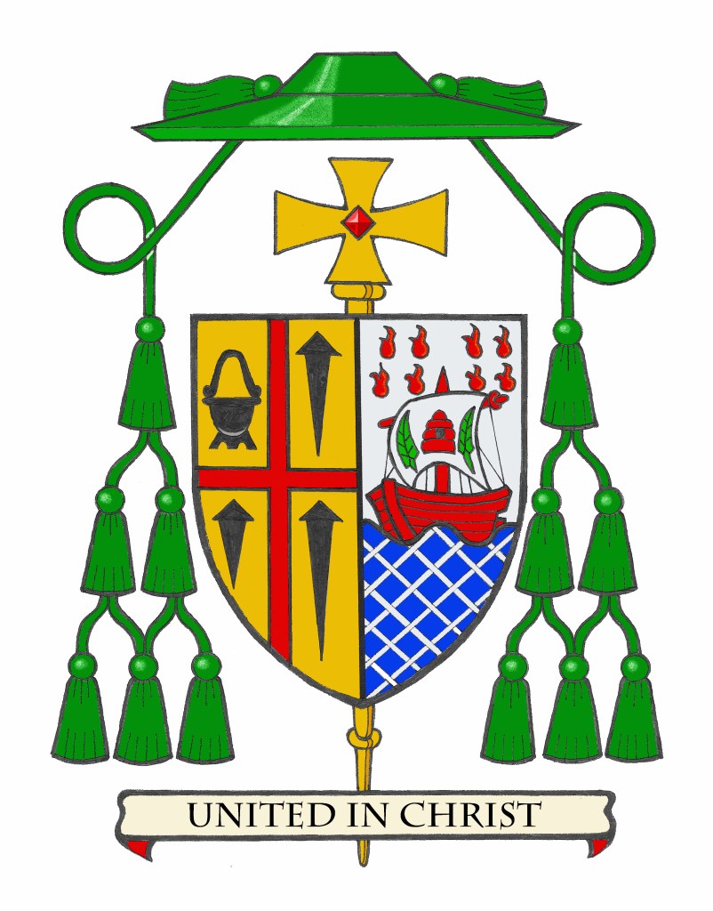
BLAZON: Arms impaled. In the dexter: Or, a cross throughout Gules between in the dexter chief quarter a Spanish stew pot and in the other three quarters a nail all Sable (San Diego) In the sinister: Per fess wavy Argent and Azure; in base fretty Argent; in chief a fishing boat Gules with a sail unfurled Argent charged with a beehive Gules flanked by two palm branches to dexter and sinister Vert; in chief eight tongues of fire all Gules. Shield ensigned with an episcopal cross Or behind the shield and a bishop’s galero Vert cords and twelve tassels disposed in three rows of one, two and three all Vert. On a scroll below the shield the motto: “United in Christ”.

EXPLANATION: The Bishop’s coat of arms, is composed of a shield upon which there are symbolic charges, a motto and the external ornaments of rank. The shield which is the most important feature of any heraldic device is blazoned (i.e. described) in heraldic language from the point of view of the bearer with the shield being held on his arm. Thus, where it applies, the term “dexter” (right) and “sinister” (left) are reversed as the device is viewed from the front.

By heraldic custom observed in North America, the arms of a diocesan bishop are “impaled” side by side on the same shield to the arms of his jurisdiction, in this case, the Diocese of San Diego. This signifies that the diocesan bishop is “married” to the See. The same method of impalement is employed in the coat of arms of two married people who are armigerous.

The coat of arms of the See of San Diego is composed of a gold (yellow) field and symbols of San Diego (St. Didacus in Latin), the diocesan patron saint. Diego was born to poor Spanish parents shortly before the year 1400. His love of poverty never left him. As a Franciscan brother he was a selfless servant of the poor and was known to heal the sick with the Sign of the Cross, the central charge of the diocesan coat of arms. The Spanish stew pot in the upper left quadrant indicates Diego’s boundless charity and tireless efforts to feed the hungry. San Diego had a special devotion to the Lord in his Passion, symbolized by the three nails in the other three quadrants. Diego died on Nov. 12, 1463, at the Franciscan monastery in Alcalá, Spain, pressing a crucifix to his heart and repeating the words of the Good Friday chant: “Dulce lignum, dulce ferrum, dulce pondus sustinet” (Precious the wood, precious the nails, precious the weight they bear.)

The personal coat of arms assumed by Bishop Pham when he was made Auxiliary Bishop in 2023 combines symbols that are meaningful to him. The shield is divided horizontally to depict a silver (white) sky above a blue wavy ocean. The ocean is criss-crossed by diagonal lines in order to create a pattern suggestive of a fisherman’s net. It represents that after 1975 while still living in Vietnam the bishop’s father became a fisherman to provide for his family. In addition, the net indicates not only the task of an apostle (or a successor to an apostle) of being a “fisher of men” but it also alludes to the New Evangelization where we are exhorted to put out into the deep (Duc in Altum). This symbolizes both the bishop’s priestly and episcopal ministry. 

In the upper part of the shield the boat also alludes to the work of a fisherman. In addition, a boat, in heraldry, is often used as a symbol of the Church itself, often referred to as the barque of Peter, who was himself, a fisherman. On the sail of the boat in the center is a red beehive flanked by two green palm branches. The beehive is a symbol of St. John Chrysostom, the bishop’s baptismal patron saint who was renowned for his inspiring preaching. So, he was known as a “honey-tongued” preacher. The palm branches are an ancient symbol of martyrdom. The bishop’s family comes from the first diocese in the north of Vietnam where his ancestors were among the first martyrs for the faith in that part of the world.

On either side and above the boat are eight red tongues of fire. They are symbols of the Holy Spirit which descended on the Apostles as tongues of fire at Pentecost. This was the beginning of their ministry to go out into the world to preach the Gospel so it is another symbol of Evangelization. Several flames represent a diversity of communities. Bishop Pham strengthened the cultural communities found in the diocese and shared them with the larger Catholic community. He has served as Episcopal Vicar of the Office of Ethnic & Intercultural Communities. So, symbols of the Holy Spirit were seen to appropriately reflect this ministry. It also reflects how, on Pentecost, when the Holy Spirit descended, people from different places, languages and cultures heard the Apostles speaking in their own languages. The red of the boat, the beehive and the tongues of fire is a further allusion to the blood of the martyrs.

It was my great pleasure to design and emblazon the bishop’s arms in 2023 when he became a bishop. At this time it was also my pleasure to marshal them to the arms of the See and emblazon them once again.

Update For a Promotion

In January of 2019 I posted about the very nice arms granted to a clergyman in the UK. Fr. Adam Gaunt had received beautiful Letters Patent for his fine coat of arms and was eager to share them with me.

I recently saw online that he posted about some modifications to the ornamentation of his arms reflecting the fact that he has recently been named a Canon of York in the Church of England. So the galero now has six red tassels pendant on either side.

(artwork by Danilo Martins)

Archbishop McKnight

The Most Rev. Shawn McKnight (56) was installed as the fifth Archbishop of Kansas City in Kansas on May 26. I already talked about the very nice version of his coat of arms prepared for that occasion by Matthew Alderman. Immediately after his installation, the archbishop contacted me and asked for another rendering of his arms done by me. While that is somewhat unusual it is not unprecedented. It’s not uncommon for an armiger to have and use different renditions of his coat of arms done by different artists.

So, I undertook to do an emblazonment of the archbishop’s coat of arms for his use.

BLAZON: Arms impaled. In the dexter: Argent, a chevron invected issuant from the dexter, overall a tower embattled Gules charged with a crescent Argent; on a chief Gules a Latin cross reversed Argent surmounted by two keys in saltire Or. In the sinister: Gules a quail statant Or. The shield is ensigned with an archiepiscopal cross Or and an archbishop’s galero with cords and twenty tassels flanking the shield disposed in four rows of one, two, three and four all Vert. On a scroll below the shield is the motto, “Gratias Agamus Domino”.


EXPLANATION: The armorial bearings of Archbishop McKnight impale the coat of arms of his archiepiscopal See with his personal coat of arms. The coat of arms is composed of a shield with its charges (symbols), a motto and the external ornamentation. The shield is described (blazoned) in terms that are archaic to our modern language, and this description is presented as if given by the bearer with the shield being worn on the arm. Thus, where it applies, the terms dexter (right) and sinister (left) are reversed as the device is viewed from the front.


It is customary in heraldry that the arms of a Diocesan Bishop, or Ordinary, are joined side by side on the same shield with the arms of his See. In this case, these are the arms of the Archdiocese of Kansas City. Such marshaling is called impalement and employs the samemethod used when joining the coats of arms of two people who are married. In this way, the coat of arms, like the episcopal ring, is symbolic of the archbishop being “married” to his archdiocese. The arms of the Archdiocese of Kansas City are composed of a silver (white) field on which there is a blue chevron issuing from the side. The sides of the chevron are “invected” which means a line that consists of a series of circular arcs curving in the same direction, meeting at angles, forming points inward. This is to symbolize the Missouri River. Laid over this chevron is a red tower with an open archway and an embattled top. Imposed on the tower is a silver (white) crescent. The tower is a symbol of Fort Leavenworth. The original designation of the Archdiocese was the Diocese of Leavenworth (1877) and the church of the Immaculate Conception was the titular of the cathedral there. The crescent moon in heraldry is a symbol of Our Lady’s Immaculate Conception. The upper third of the shield, called a “chief” contains two crossed gold (yellow) keys superimposed over a silver (white) Latin cross upside down. These are symbols of St. Peter, the titular patron of the cathedral church. The keys are the “keys of the kingdom” bequeathed by Christ to St. Peter and the upside down cross recalls the manner of his crucifixion.


The personal coat of arms of Archbishop McKnight illustrates his personal devotion. The field is red and the one and only charge is a large gold (yellow) quail. The red color alludes to the devotion of Archbishop McKnight to the Sacred Heart of Jesus as well as the Immaculate Heart of the Blessed Virgin Mary. Quail are a symbol of God’s providential blessing and an Old Testament prefiguration of the Eucharist, as the Lord provided for his people in the desert with manna in the morning and quail in the evening (see Exodus 16:11-13; Numbers 11:31-32; Psalm 78:27 and Psalm 105:40). Quail-hunting is also a favorite sport of the Archbishop, an activity which requires the use of pointing, flushing and retrieving hunting dogs, and through which he experiences the beauty, harmony and providence of God in nature.

The external ornaments include a gold archiepiscopal cross with two horizontal bars (sometimes referred to as a patriarchal cross) placed vertically behind the shield decorated with red jewels. This is often mistaken for a processional cross like the one used in liturgical processions. However, like other heraldic ornaments the archiepiscopal cross has its origins in something which is no longer actually used. At one time all bishops had, in addition to the processional cross at the head of the procession, another cross carried directly in front of them by a cleric. This other cross was a sign of the office of bishop. It originated as a custom that such a cross was carried before archbishops only. Later, the cross was adopted for use by all bishops so archbishop’s added a second horizontal bar to their crosses to distinguish them from the episcopal cross of simple bishops. While no longer actually used it has remained a symbol of the archiepiscopal office in heraldry. Similarly, the broad-brimmed green galero was, at one time, worn by bishops in outdoor processions and cavalcades. No longer used it remains a heraldic symbol of the office of bishop and takes the place of the helmet, mantling and crest that would appear in the coat of arms of a layman. In Catholic heraldry the color and number of tassels on the galero indicates the rank of
the bearer. The double barred archiepiscopal cross and the green galero with twenty tassels signifies the coat of arms of an archbishop according to the Instruction of the Holy See, “Ut Sive” issued in 1969.


The motto chosen by Archbishop McKnight appears on a scroll below the shield, “Gratias Agamus Domino”. This is taken directly from the opening dialogue of the preface at the beginning of the Eucharistic Prayer at Mass (“Let us give thanks to the Lord”), and is derived from Psalm 107:1 and Psalm 118:1 (“Give thanks to the Lord Who is good, Whose love endures forever”).

International Heraldry Day 2025

Happy International Heraldry Day!

International Heraldry Day was established in 2013 by the International Association of Amateur Heralds (IAAH). The date, June 10, was chosen to commemorate a significant event in heraldic history: on this day in 1128, Geoffrey Plantagenet, Count of Anjou, was knighted by King Henry I of England. During the ceremony, Geoffrey received a blue shield adorned with six golden lions, which is considered one of the earliest known examples of a fully formed coat of arms.

So, celebrate heraldry today!

Bishop Eckman of Pittsburgh (UPDATED)

Today, His Holiness, Pope Leo XIV appointed the Most Rev. Mark Anthony Eckman (66), a priest of Pittsburgh and since 2021 the Auxiliary Bishop of Pittsburgh, as the 13th Bishop of the Diocese of Pittsburgh.

His armorial bearings, which not only allude to St. Mark but also, by use of the checkerboard taken from the arms of the See of Pittsburgh (and which, in turn, are borrowed from the arms of William Pitt, where they allude to his tenure as Chancellor of the Exchequer) now line up with the same checkerboard when his arms are impaled with those of the See.

It looks a bit odd, however, that the fess in his personal arms is more narrow than that in the arms of the See. It would probably work better artistically, if the two were of the same width. That would give the appearance of a single fess that crosses the two impaled arms but that’s simply the way it will appear. That’s one of the pitfalls of choosing charges and ordinaries directly from another coat of arms. Of course, it must be said that at the time Bishop Eckman assumed his own arms he could have no idea that one day he’d be named Bishop of Pittsburgh and impale his arms with those of the diocese. His personal arms, in my opinion, harmonizes nicely with the diocesan coat of arms making for a pleasing achievement.

NOTE: I have now been reliably informed that the bishop has, in fact, decided to slightly modify the fess in his personal arms so that it is identical to the one in the diocesan arms. So, problem solved!

Archbishop McKnight of Kansas City

The Most Reverend Shawn McKnight (56), a priest of Wichita and who from 2018-2025 served as Bishop of Jefferson City, Missouri, was installed today as the 12th Bishop and 5th Metropolitan Archbishop of Kansas City in Kansas.

His very simple and striking coat of arms arms was marshaled to those of Kansas City and very ably rendered by Matthew Alderman.

Arms for a Basilica

The Mission Church of San Diego (St. Didacus) de Alcalá was the second Spanish Mission church founded in 1769 by St. Junípero Serra. The present (5th) church building was designated a Minor Basilica by St. Paul VI in 1976. Going without any armorial bearings of its own for several decades I was approached some time ago by one of the priests of the Mission basilica to design a coat of arms for the church. This was done with the approval of the (then) Bishop of San Diego, Robert Cardinal McElroy, now the Metropolitan Archbishop of Washington, DC.

The blazon of the coat of arms is: Gules, a cross formy throughout Or charged with five gouttes de sang at the center point and extremities; between in the dexter chief quarter a Spanish stew pot Argent; in the sinister base quarter a fleur-de-lis Argent and in the other quarters an acorn slipped Or. The shield is ensigned with the ornaments of a Minor Basilica which are, two keys crossed in saltire behind the shield to dexter Argent and to sinister Or, and an ombrellino Proper standing behind the shield.

The basic design borrows, and reverses the colors from the coat of arms of the Diocese of San Diego. Instead of a gold (yellow) field with a red cross there is now a red field with a gold cross. The cross, which has slightly flared ends, is charged with five drops of blood. These represent the founder of the Mission, Junípero Serra, who was a Franciscan friar. So, the five drops recall the five wounds of the stigmata received by St. Francis of Assisi. Serra, the founder of the Mission, is symbolized by making a  reference to the Order to which he (and San Diego) belonged. That also honors all the other Franciscan missionaries who carried on the work at the Mission throughout the centuries. In addition, the present Mission church–the one designated a basilica–is the fifth church building used by the Mission. So, the five drops of blood also allude to the basilica itself being the fifth building in use as a church.

In the upper left corner is the pot that is a symbol of San Diego (St. Didacus), the patron of the Mission Basilica (as well as the diocese). As a Franciscan brother he was a selfless servant of the poor and was known to heal the sick with the Sign of the Cross, the central charge, and the Spanish stew pot in the upper left also symbolizes him. It indicates Diego’s boundless charity and tireless efforts to feed the hungry. In the lower right corner we see a fleur-de-lis which is borrowed from the coat of arms of St. Paul VI, the pope who raised the Mission church to the rank of Minor Basilica in 1976. Both of these are silver (off-white). 

The other two quadrants are charged with a gold (yellow) acorn. This is to give the Native Americans, who received the Gospel from the Franciscans and became their collaborators throughout the Mission era, representation on the coat-of-arms. It is a symbol of the agrarian traditions of the Native Americans, and also represents the potential for spiritual growth and transformation. Just as an acorn can grow into a mighty oak tree, it represents the idea that even small acts of faith and virtue can lead to great spiritual maturity and strength. This aligns with the Catholic teaching on the importance of nurturing one’s faith and virtues over time and refers to the Mission’s humble beginnings and growth. In addition, the acorn’s humble beginnings remind Catholics of the virtues of humility and simplicity. These qualities are highly valued in Catholic teachings, as exemplified by the lives of saints, such as St. Francis, St. Didacus, St. Junipero Serra, and the Franciscan Padres who often started with humble beginnings and grew in holiness and influence through their faith and actions. The acorn also symbolizes God’s provision and sustenance as a reminder of His care and providence, ensuring that His creation is provided for.

The external ornaments are the two crossed keys (one gold and one silver) bound together by a red cord and the ombrellino. The keys are an ornament granted to basilica churches to show their connection to the Holy See. They are the same as the keys seen in the coat of arms of the Holy See and of the Pope, recalling the “keys to the kingdom” given by Christ to St. Peter; one to bind and one to loosen. The ombrellino, a large red and gold canopy, is also a symbol of the Holy See and used as a symbol of such whenever the See is vacant. It also used to be employed as a symbol of papal administration in the time of the Papal States. Originally, it was a ceremonial canopy carried in procession to cover a dignitary such as the pope while walking or riding in a cavalcade. It is primarily symbolic now but all basilica churches are expected to have one which is to be carried in procession in the event of a papal visit. 

This was a fun and interesting project which I completed, coincidentally, on the same day that the Pope appointed a new Bishop of San Diego to succeed Cardinal McElroy.

Bishop Lewandowski, CSsR of Providence

On May 20, the Most Rev. Bruce Lewandowski, CSsR (57), a Redemptorist and formerly Auxiliary Bishop of Baltimore, will be installed as the 10th Bishop of Providence, R.I. I had previously written about the bishop’s coat of arms when he was first made Auxiliary Bishop.

Now that he is moving to become a diocesan bishop his armorial bearings will now be marshaled to those of his diocese. The Bishop had employed his sister, a Felician Sister who “works in media” for her Province to design his coat of arms. As they were back then, so too, are they something of a dumpster fire, heraldically speaking.

In an interview for The Catholic Review, the Baltimore archdiocesan newspaper, in 2020 the Bishop said, “Why would I ask anyone else?” when asked why his sister was designing his coat of arms. I think I can answer that. How about: in order to turn to someone with knowledge of a specific topic that isn’t really a DIY project? How about that? In her own part of the same interview, Sr. Lewandowski remarked about some of the particular elements of her design:

The Holy Spirit is depicted as breaking the upper edge of the shield ‘as it is the privilege of the Holy Spirit to inspire new life and envision endless possibilities for the Church, God’s people,’ the description says. The designer noted that she was not sure if that was “allowed” but in her research she did not find any parameters that said it couldn’t be done that way.” (emphasis added)

All I can say is that must have been one quick and not very diligent Google search. Even the most cursory bit of online research should have clued her in to the fact that charges emerging through the edges of the field was a puerile and amateurish mistake. Quite frankly, I don’t see how she could have done any research and reached the conclusion that she did! There are numerous resources out there for someone unfamiliar with good heraldic practices, to say nothing of the huge online presence of groups and organizations that could have happily offered her assistance in her project.

But, this, instead, is the worst kind of so-called heraldry: heraldry as logo. (It summons up the bile just by thinking about it!).

In the same aforementioned article she said:

…she believes a bishop’s coat of arms should tell people who he is and what he stands for. And I believe it should be a more spiritual piece, not just a historical piece,” she said. “And a lot of the coats of arms that I’ve seen and that I kind of read into, it’s a real historical document, but it doesn’t always tell you who the bishop is. She said she tried to tie in Bishop-designate Lewandowski’s spirituality into the symbols she used.”

Well, she got the first part right. A coat of arms should tell people who the armiger is. But, then she rode that right off the rails with the second part. A coat of arms does not tell people what the armiger stands for. It is for identification alone. I have often mentioned that a coat of arms is not one’s C.V. in pictures. Similarly, it isn’t an expression of personal ideology; a manifesto of one’s own spirituality or (for the clergy) a catechetical tool that expresses one’s personal beliefs as a kind of pictorial homily. Unfortunately, that’s precisely how the Lewandowski kids decided to view this project, with disastrous results.

In the latest rendering the overcrowded and poorly composed original coat of arms now falls victim to, perhaps, my second favorite pet peeve: they were changed in order to combine well with the diocesan arms. That’s not an option, full stop. (I suppose Sister didn’t find anything in her research that said she couldn’t do that either!) In addition, the charges form the personal arms are still going beyond the divisions and boundaries of the shield and/or spilling over from one impalement to the other. Clearly, this is also the classic mistake of thinking that the diocesan arms now somehow “become” part of the bishop’s coat of arms rather than being an example of two distinct and separate coats of arms marshaled together on one shield so as to express the relationship between the two!

The list of things wrong with this just goes on and on, and on…

Suffice it to say that he had a poorly designed coat of arms to begin with which would have and could have benefitted greatly from some expertise and advice from an organization, an individual, or even a decent book on the subject in order to take the elements and arrange and depict them according to good heraldic practices. Now, that poorly designed coat of arms has been badly modified and marshaled inexpertly to the point that the diocesan coat of arms of the See of Providence is depicted incorrectly!

EPIC FAIL!

But…what do you expect when a coat of arms is approached as an exercise in graphic design to tell us who the armiger really is? I’ll leave that question unanswered, thank you.

What Do YOU Think of Pope Leo’s Coat of Arms?

This question has been posed to me by numerous people since the Holy See released the image of the Pope’s coat of arms as pope. My answer is simply this: it looks pretty much like I expected.

Pope Leo already had a very good coat of arms as a bishop. I’m glad to see he didn’t feel the need to entirely change the design as others have done in the past. A coat of arms is a means of identification. It identifies you. It becomes associated with you in such a way that it shouldn’t be changed cavalierly. A change of position should warrant the use of different external ornaments to signify the new rank, not a full scale change in what is on the shield itself. So, I’m happy to see that the Pope left alone the arms that he assumed as a bishop 11 years ago.

I was not surprised to see the papal tiara rendered in the form of a kind of mitre. This began with Pope Benedict XVI and continued with Pope Francis I. So, we have now seen this for twenty years and I assumed it would be continued. It is, perhaps, important to note that the tiara has not been replaced with a mitre. Rather, it is the papal tiara rendered as a kind of mitre/tiara hybrid. This occurred at all because of ignorance. The argument to Benedict XVI was that since the tiara is, practically speaking, no longer worn it should not be depicted in the coat of arms. Nothing could be farther from the truth. In fact, since it is no longer worn that’s all the more reason it should be used in the coat of arms. It remains a symbol of the papacy. Most of the world’s monarchs no longer actually wear a crown but the use of a crown heraldically remains. Cardinals and bishops no longer wear an actual galero but the galero remains a heraldic emblem. (It is worth noting here that the tiara with the keys remains the emblem of the Holy See.)

St. Paul VI, in his reforms of 1969, decreed that the mitre and crozier which used to be in the coats of arms of all bishops in addition to the galero and episcopal/archiepiscopal cross should no longer be used in the arms of such prelates. He reasoned that the crozier and mitre were still used liturgically as emblems of the episcopal office and their practical use made using them as heraldic symbols redundant and inappropriate. (NOTE: the same is also true for the pallium) Whereas, the episcopal cross and galero—used at one time—had fallen into practical disuse and so were very appropriate to be used purely as heraldic ornaments. By that logic the same is true of the papal tiara. Since recent popes have chosen not to be crowned the use of the tiara as a purely heraldic emblem makes all the more sense.

Yet, those advising Benedict XVI, principally among them Archbishop Piero Marini and the late Cardinal di Montezemolo, argued that the tiara should be modified in its appearance to show that it is no longer actually worn. This was bad advice then and it has now been codified into enduring, though still equally poor advice. Nevertheless, it was easy to anticipate that Pope Leo would simply follow suit. So…no real surprise there.

Similarly, the slight change in tincture of the division of the field in base from Argent (silver or white artistically) to a kind of beige or buff color shows an appalling lack of understanding of heraldry. This is also displayed in the description of this tincture as “light”. Just what, precisely, is THAT supposed to mean ?!?! There isn’t an actual blazon to help clarify this. The lack of a proper blazon could be because no one at the Vatican knows how to write one; they simply don’t find it important enough to care about; or they feel it would be too esoteric and unintelligible for the average person. One can only hope that the reason is one of the latter two rather than the former.

But there isn’t a lot of evidence to dissuade me. For example, the tiara and keys and motto banner are all clearly just a “cut & paste” job from the arms of Pope Francis I. Really? With all the many competent heraldic artists and heraldic experts available to them no one at the Vatican bothered to reach out to anyone and just figured this could all be handled “in house” by someone with a computer? Is that the most appropriate way to prepare a new pope’s coat of arms? it shouldn’t be a matter of who can get it done first but of who can do it best. What a shame that it has been deemed acceptable simply to cobble something together from existing images.

It’s also probably worth noting that—just like all bishops—all of the popes have had an episcopal motto. However, by longstanding tradition and custom a motto is not supposed to be included in the armorial achievement of the Pope. In his seminal work, Heraldry in the Catholic Church (1978) Archbishop Bruno Heim notes that, “It is widespread custom to put a motto under the shield. It is often held, wrongly, by those who know little about heraldry, that the motto is indispensable; yet it is an addition which does not properly belong to the armorial bearings themselves.” (page 80)

So we see that, all in all, the new Pope’s coat of arms is unsurprising in its composition, disappointing in its execution, and uninspiring in its depiction with numerous errors that could have been avoided with a little creativity and some consultation with people who know what they are doing.

For example, in the hands of an artist of some merit the same exact design can be rendered in a manner that looks considerably better just by the good use of composition and artistic style.

Take, for example, this sketch of the arms of Pope Leo XIV done on the evening of his election by the noted and competent heraldic artist, Marco Foppoli. We can see here that, in the hands of an expert with a great deal of experience, the original heraldic design can be rendered with the appropriate external ornaments in a way that maintains the simplicity that is desired while also creating a new and unique achievement for the armiger. Too bad that someone like Foppoli wasn’t consulted by officials at the Holy See.

Papal heraldry has been in a slow decline since the death of Archbishop Heim. It is sad but true. Unfortunately, at the outset of this new pontificate, there are no signs that this is going to change for the better anytime soon.

God Bless Pope Leo XIV!

Chamberlain of the Holy Roman Church

During the Sede Vacante the person in charge of the affairs of the Church is the Chamberlain (Camerlengo) of the Holy Roman Church. Since 2019 that man has been the (Irish-born) American, Kevin Cardinal Farrell, former Bishop of Dallas, Texas and also former Auxiliary Bishop of Washington, DC.

During the time of the Sede Vacante he functions as the caretaker of the Church and the Regent of the Vatican City-State. The symbol of the Church since the time of the existence of the Papal States, the crossed keys and ombrellino, are placed above his existing coat of arms in the achievement. These may always be used during his tenure in office but, practically speaking, most of those who are Camerlengo make use of these added ornaments only during the Sede Vacante. Special coins will be struck to mark this moment in the Church’s history bearing the arms of the Camerlengo.

This version of Farrell’s arms is by Marco Foppoli.

Novemdiales

In the midst of all the news out there about the death and burial of Pope Francis I didn’t bother to post anything. In addition, I was dealing with some personal matters during that time as well that prevented me from having the time for posting. We now find ourselves in the midst of the nine official days of mourning for a pope, the so-called Novemdiales. Now, the world waits the start of the Conclave which will commence on May 7.

I post here a funerary hatchment made by the Australian Heraldic Artist, Mr. Sandy Turnbull. May Pope Francis Rest in Peace.

Timothy Cardinal Radcliffe, OP

It took a bit of time but the arms used by Timothy Cardinal Radcliffe, OP the Dominican friar who was created cardinal just last autumn by the late pope and who will now be an elector in the upcoming Conclave, has now been published.

He has not been ordained a bishop so there is no episcopal cross behind the shield in the achievement. Overall, he has chosen very Dominican looking symbols and a differenced version of the arms of Radcliffe. A very handsome coat of arms.