The Solemnity of St. Joseph, patron saint of the Universal Church on March 19 will see the installation of the 10th Bishop of the Diocese of Rochester, New York. On that day the Most Rev. John Bonnici (61) a priest and, since 2022, Auxiliary Bishop of the Archdiocese of New York will become the successor to the great Bishop Joseph McQuaid, to Edward Mooney, later the Cardinal-Archbishop of Detroit and of the Venerable Archbishop Fulton J. Sheen, soon to be Beatified on the way to sainthood who served as Bishop of Rochester from 1966-1969.
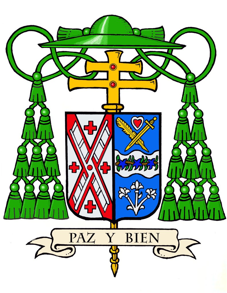
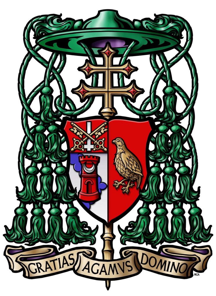
The coat of arms assumed by Bishop Bonnici in 2022 has now been marshaled to the arms of the See of Rochester.
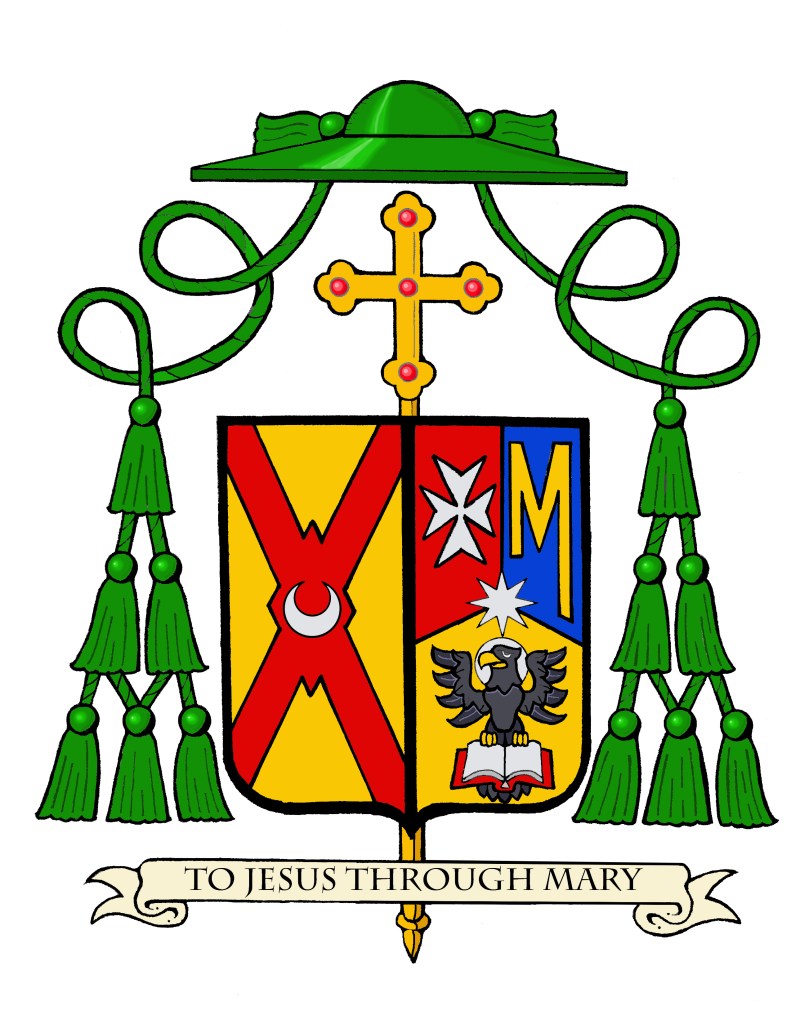
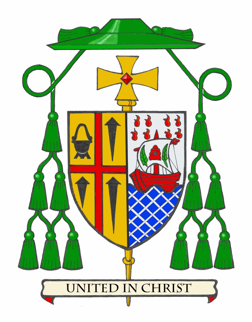
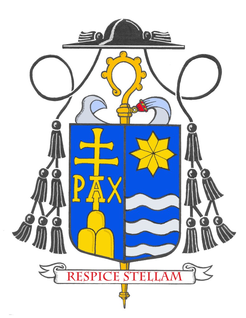
BLAZON: Arms impaled; in the dexter: Or, on a saltire quadrate Gules a crescent Argent (Rochester). In the sinister; Tierced in pall reversed Gules, Azure and Or; in dexter chief a Maltese Cross Argent; in sinister chief a block letter “M” Or; in base the eagle of St. John displayed Sable, armed Or, nimbused Argent and standing on an open book Argent, bound Gules. Overall at the fess point a mullet of eight points Argent. (Bonnici). Shield ensigned with an episcopal cross Or behind the shield and a bishop’s galero Vert cords and twelve tassels disposed in three rows of one, two and three all Vert. On a scroll below the shield the motto: “To Jesus Through Mary”.
EXPLANATION: The shield is described (blazoned) in terms that are archaic to modern language, and this description is presented as if given by the bearer with the shield being worn on the arm. Thus, where it applies, the terms dexter (right) and sinister (left) are reversed as the device is viewed from the front.
It is customary in heraldry that the arms of a Diocesan Bishop, or Ordinary, are joined side by side on the same shield with the arms of his See. In this case, these are the arms of the Diocese of Rochester. Such marshaling is called impalement and employs the same method used when joining the coats of arms of two people who are married. In this way, the coat of arms, like the episcopal ring, is symbolic of the bishop being “married” to his diocese.
On a gold (yellow) background we see a red saltire, a cross in the shape of an “X” the center of which also has a lozenge, or diamond shape superimposed on it. There is a silver (white) crescent placed in the center. The diocesan shield was designed in the 1930’s by Mr. Pierre de Chaignon la Rose. The saltire was taken from the coat of arms of the Diocese of Rochester, England, of which Saint Andrew was the principal Patron. The X-shaped cross is known heraldically as a “Cross of St. Andrew” because according to tradition the saint was crucified on a cross of this shape. La Rose distinguished or “differenced” the new coat of arms from the original by replacing a scallop shell in the center with the crescent, a symbol of the Blessed Virgin Mary, patroness of the United States of America, under her title of the Immaculate Conception.
The color red alludes to the Martyrdom of Saint Andrew, the first-called of the Apostles, and of Saint John Fisher, who was the Bishop of Rochester, England, both of whom heroically held to the truth and authentically handed on the Catholic and Apostolic Faith as preachers, pastors, and intercessors before the throne of God.
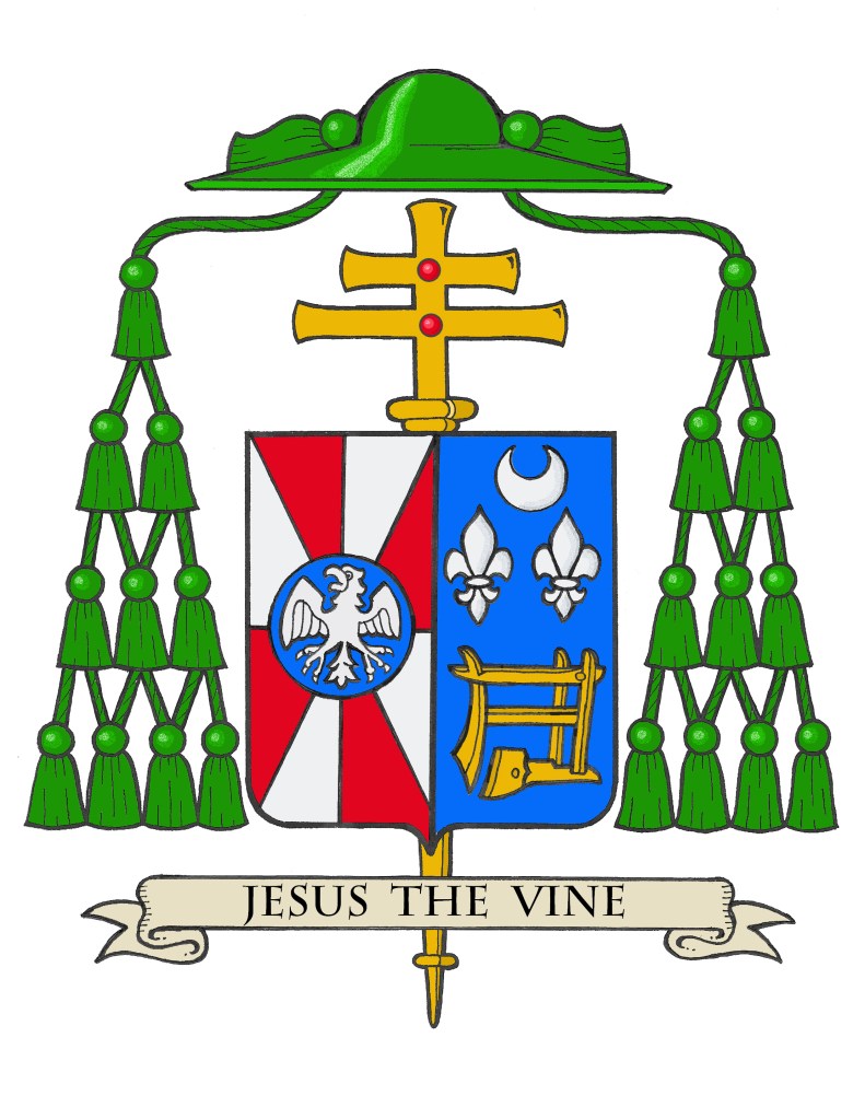
Bishop Bonnici’s personal arms were assumed at the time he became Auxiliary Bishop of New York in 2022. The arms are divided into three sections. The upper left shows a red background with the single charge of a silver (white) Maltese Cross which symbolizes the Bishop’s Maltese ethnicity. The upper right section shows a blue background on which there is a large, gold (yellow) and slightly skewed letter “M”. This is borrowed from the armorial bearings of St. John Paul II. Bishop Bonnici studied in Rome at the Pontifical John Paul II Institute and was ordained both a deacon and priest during the saintly pope’s pontificate. The “M” Honors Mary, the Mother of Priests and of the Church. The lower section has a gold (yellow) background showing the eagle which is a symbol of St. John the Evangelist, the Bishop’s baptismal patron. The black eagle is depicted with its wings spread and standing on the pages of an open book which is bound in red alluding to the Gospel written by St. John which has continuously been an inspiration to the Bishop in his life and ministry. Superimposed over all of this at the center is a silver (white) eight-pointed star. This is the “Stella Matutina” (Morning Star) which is a symbol of Mary. This charge is taken from the coat of arms of Pope Francis who had appointed the Bishop as a bishop and Auxiliary of New York.
The motto below the shield is, “To Jesus Through Mary”. The phrase emphasizes the role of the Virgin Mary in the Christian faith. It suggests that devotion to Mary can lead believers closer to Jesus Christ. This concept is rooted in the teachings of St. Louis de Montfort, who articulated that Mary serves as a bridge to Jesus, guiding the faithful in their spiritual journey. He popularized the phrase in his work “True Devotion to Mary,” where he described Mary as the most effective means of consecration to Jesus. The phrase is also personally meaningful to the Bishop because it was written in his own breviary by Mother Teresa when he was a seminarian and attended morning Mass at the Missionaries of Charity mission in Rome.
The shield is also ensigned with those external ornaments that indicate the bearer is a bishop. The gold (yellow) cross is placed vertically behind and extending above and below the shield. This is often mistakenly thought to be a processional cross like those used in liturgical processions, which is usually a crucifix bearing the corpus of Jesus. But that idea is not entirely right. In former times archbishops, and later all bishops, had an additional cross mounted on a staff carried immediately in front of them while in procession or on solemn occasions. This cross was a symbol of their rank as bishop. While such an episcopal cross is no longer used practically it has been retained heraldically. In fact, there are other clerics who make use of the ecclesiastical hat with its many tassels but the one true heraldic emblem of a bishop, and the only essential one, is the episcopal cross placed behind the shield.
Above the shield is the ecclesiastical hat, called a galero which, in heraldry, replaces the martial helmet, mantling and crest. “The hat with six pendant tassels (green, purple or black) on each side is universally considered in heraldry as the sign of prelacy. It, therefore, pertains to all who are actually prelates.” (Heim, Bruno B., Heraldry in the Catholic Church 1978, page 114) The galero is green with green cords pendant from it and twelve green tassels arranged in a pyramid shape on either side of the shield. At one time in history bishops and archbishops wore green before adopting the more Roman purple we see today. In heraldry the green hat and tassels was retained for prelates with the rank of bishop according to the Instruction of the Holy See’s Secretariat of State, “Ut Sive” of March, 1969.
It was my great pleasure to assist Bishop Bonnici with marshaling and emblazoning his coat of arms.