Category Archives: Bishops

The L.A. “Quad”

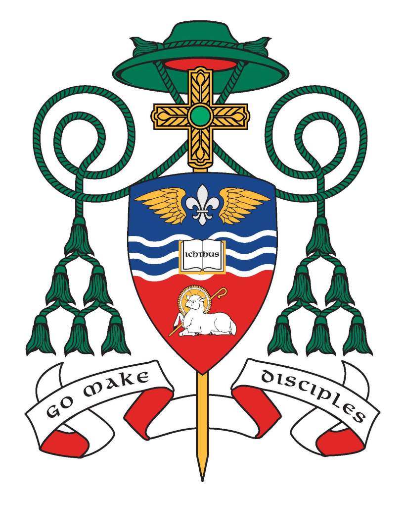
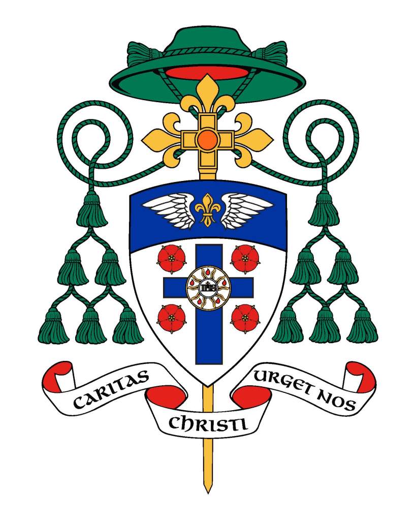
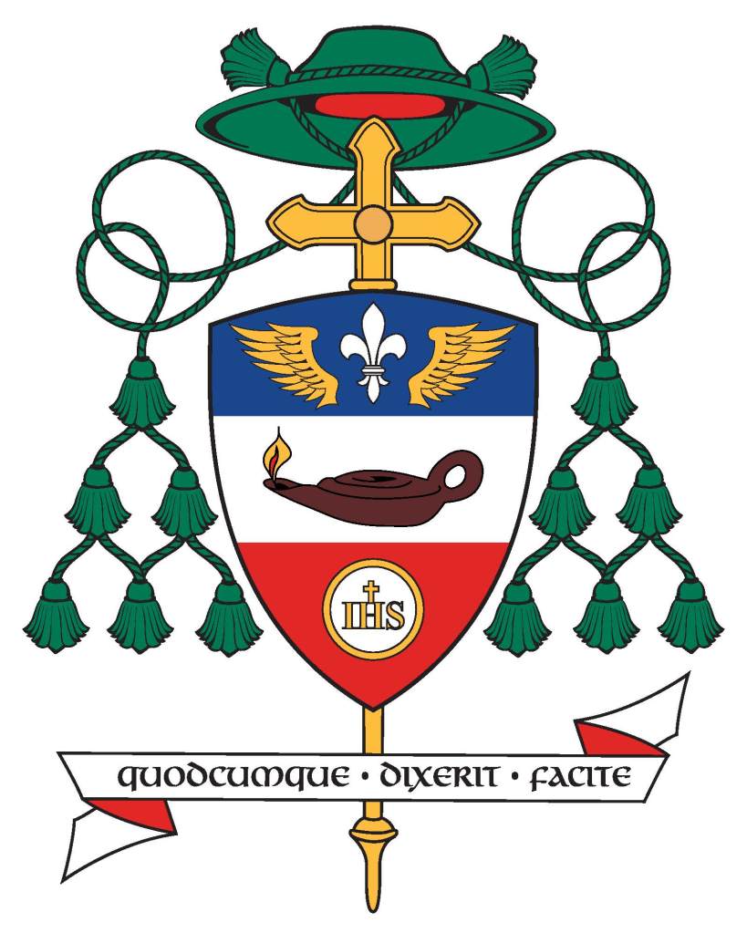
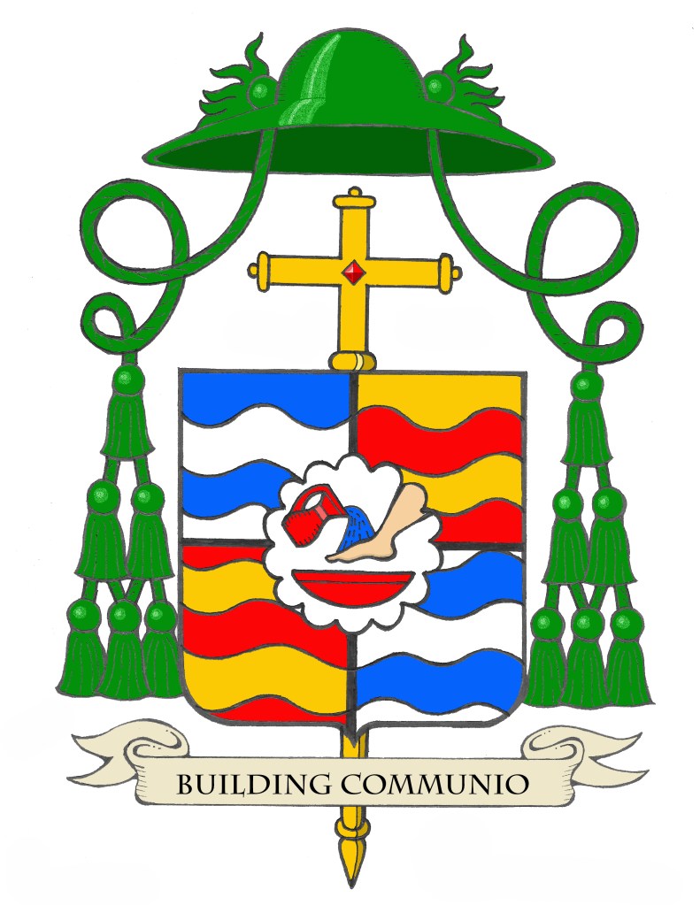
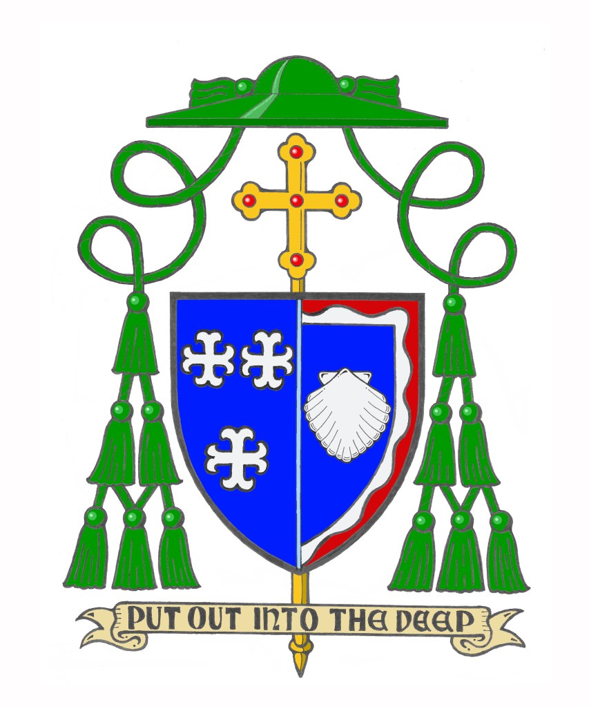
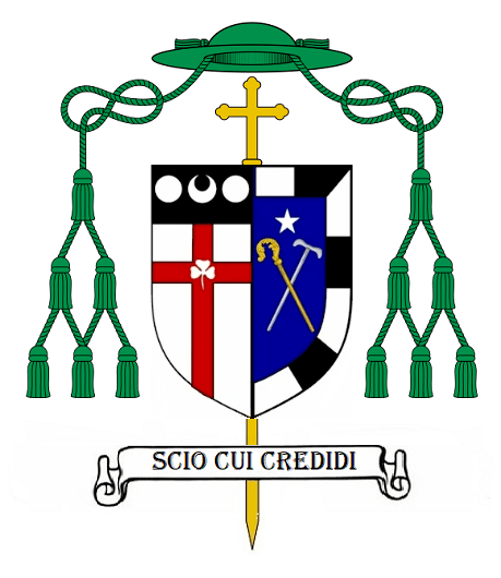
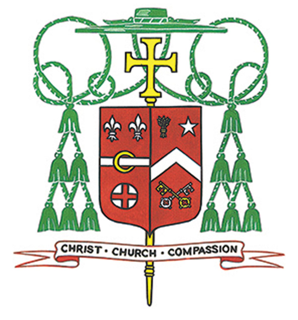
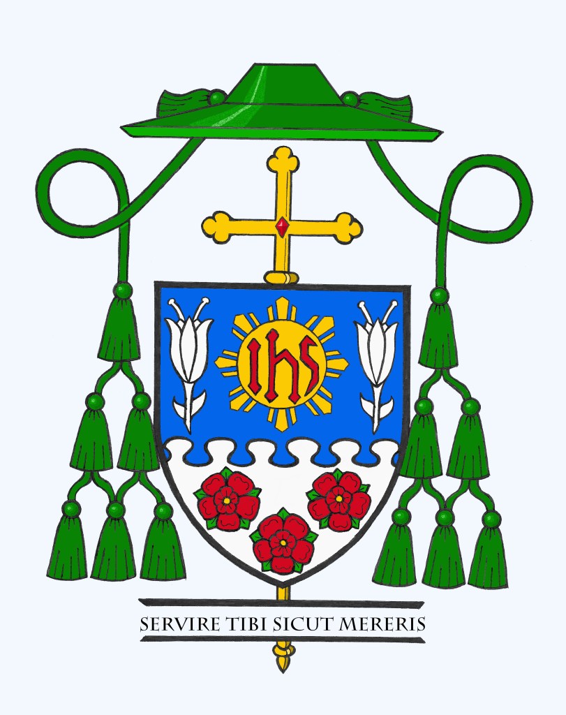
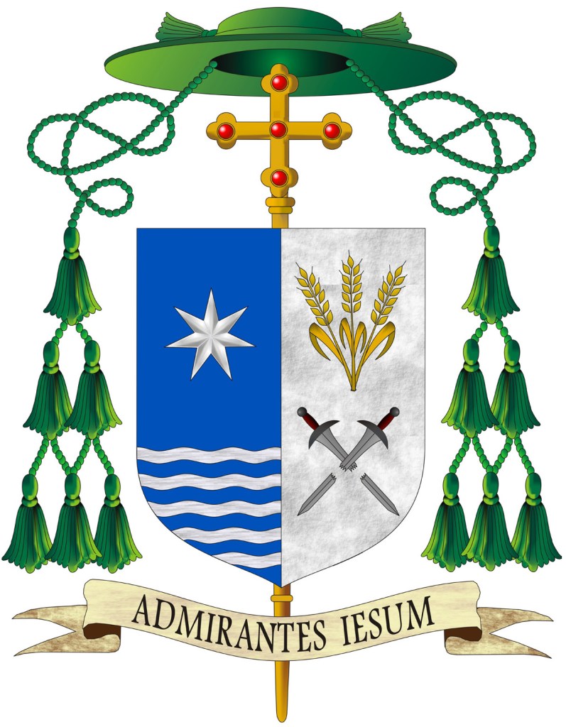
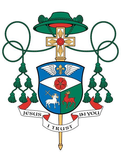
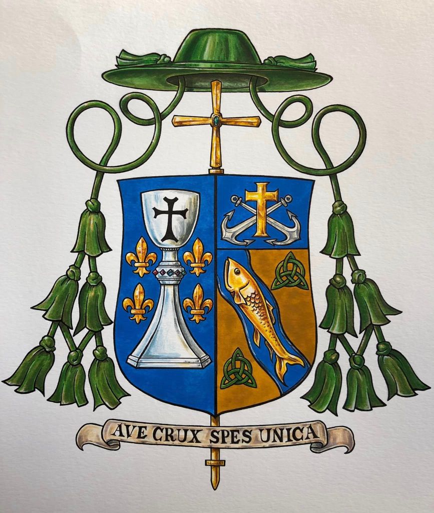
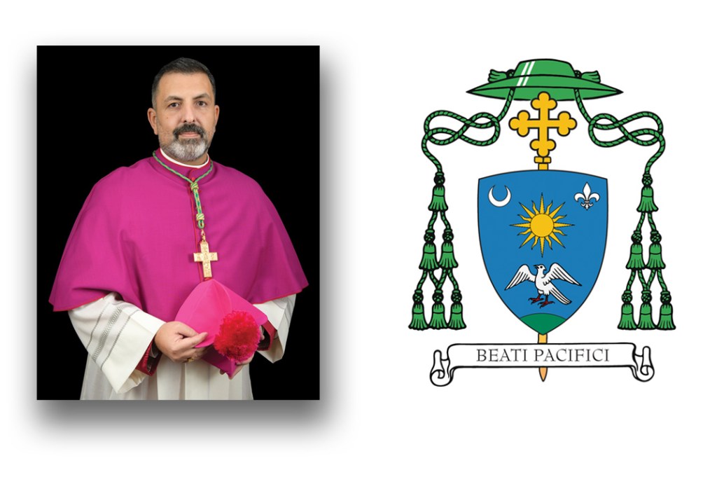
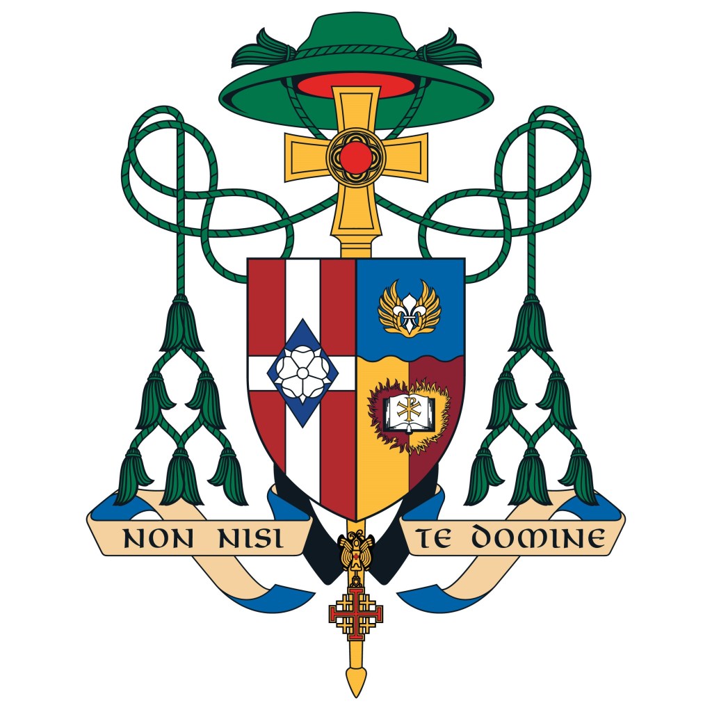
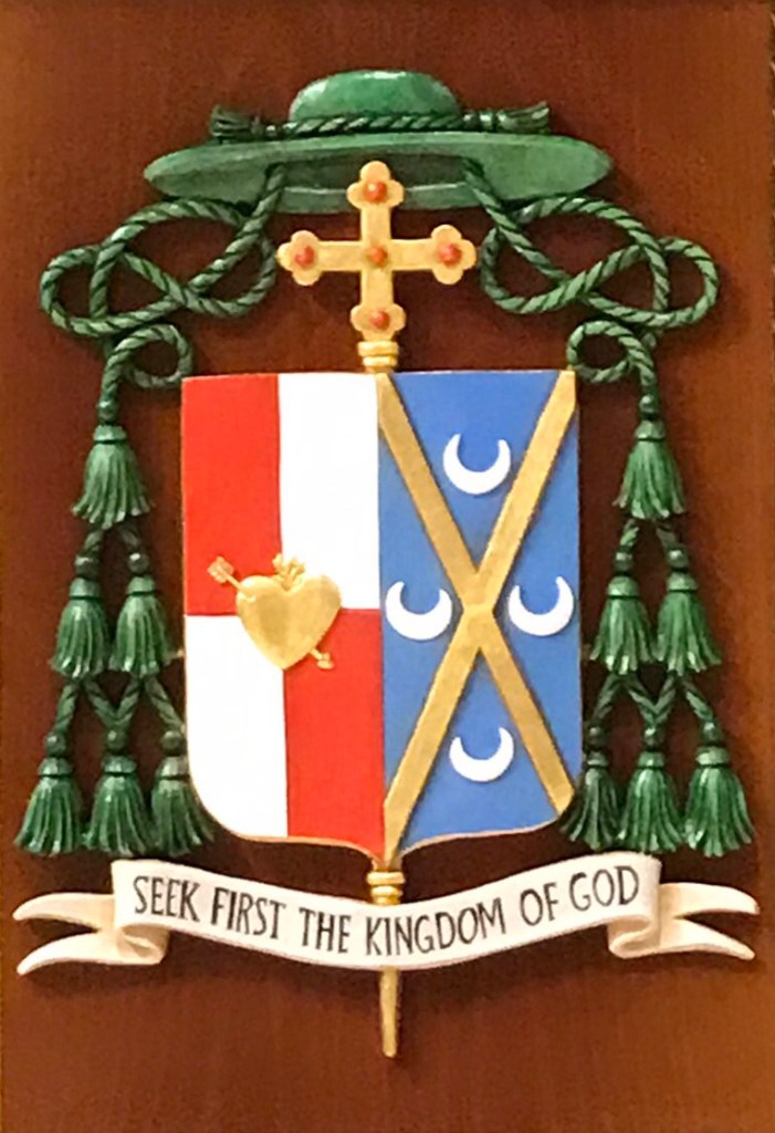
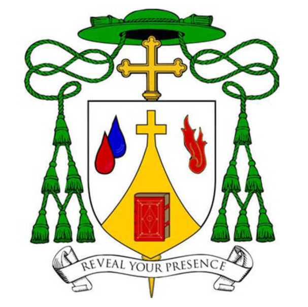
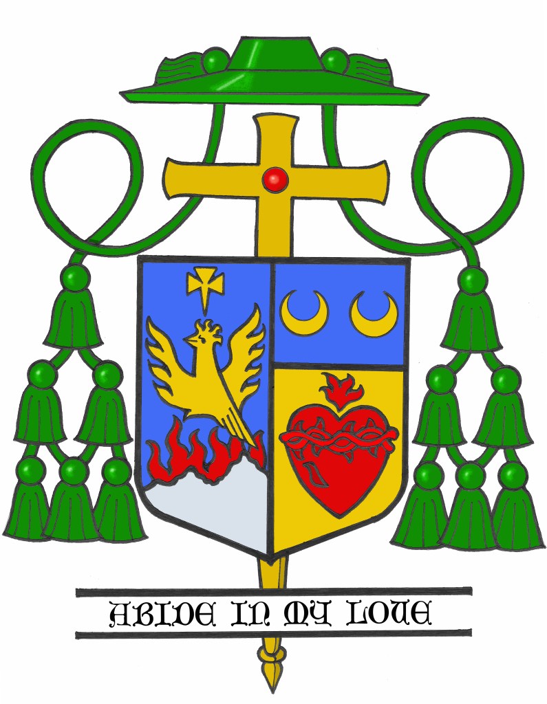
On September 26, in an unprecedented liturgy, the Archdiocese of Los Angeles received four new Auxiliary Bishops at the same time. While it is unusual for any diocese to receive so many new bishops at once it seems almost fitting for the U.S.’s largest archdiocese of well over 4 million Catholics to receive the needed assistance in episcopal ministry in order to serve the people of southern California adequately. Bishops Albert Bahhuth (66), Matthew Elshoff, OFM. Cap.(68), Brian Nunes (58) and Slawomir Szkredka (49) were all ordained to the episcopate by the Most Rev. José Gomez, Archbishop of Los Angeles.

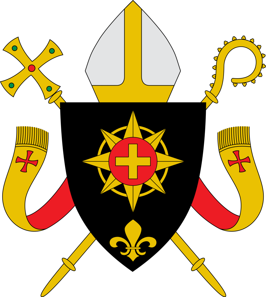
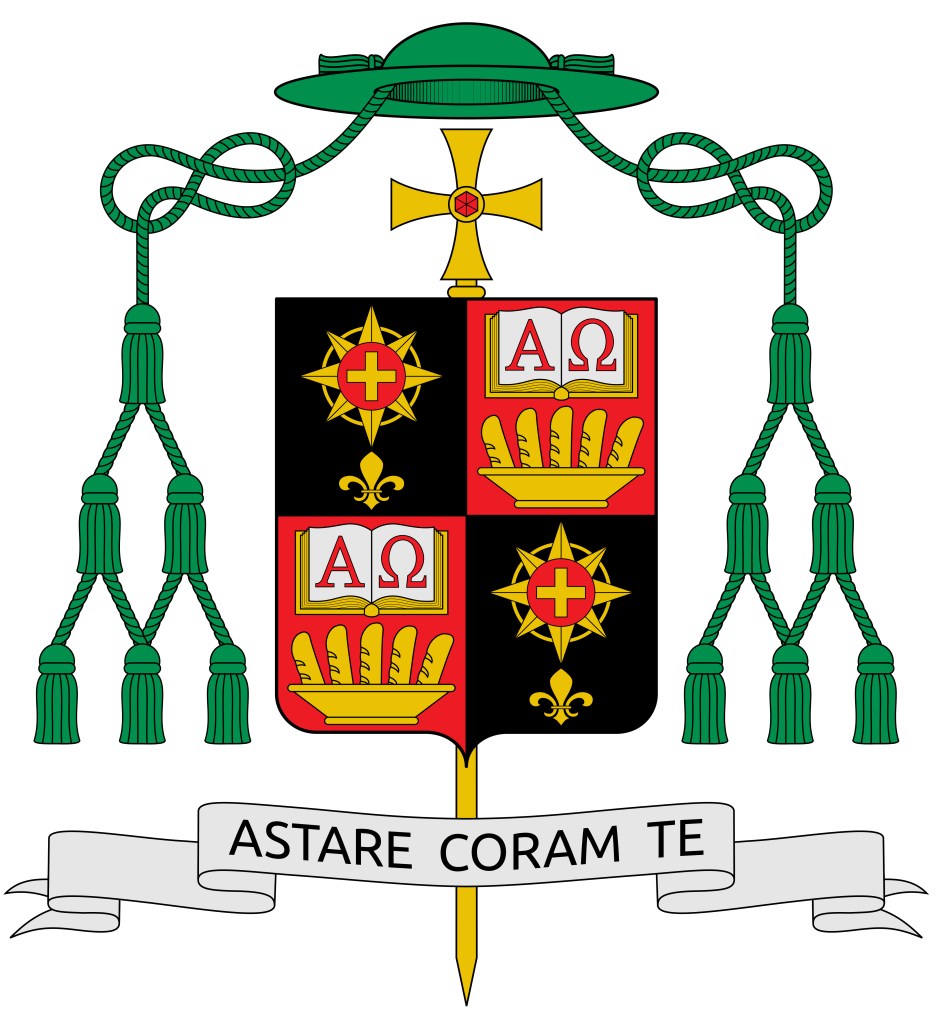
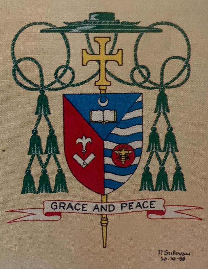
Their armorial bearings were all designed by James-Charles Noonan. As he usually does he makes a great deal about the shape of the episcopal cross in each achievement as well as the “significance” of the shape and color of the gemstone in each one. None of that is heraldically supportable. It may be his favorite idea but, as I have written about extensively in the past, the external ornaments in a coat of arms are not personalized not do they contain unique and special symbols particular to the armiger. That would require they be blazoned as such and would then have to be copied by any artist rendering the coat of arms. Only the charges on the shield are unique to the armiger.

Even there, Mr. Noonan has placed his own stamp on these four coats of arms. Acknowledging the unusual nature of four bishops being ordained at once he has included a similar chief in all four coats of arms as a means of tying them all together by the use of this similar charge. The idea in and of itself has some merit. The occasion was unique; something unique to mark it is a nice idea.

However, the coats of arms of auxiliary bishops do not contain charges that represent the jurisdiction in which they will serve as auxiliary bishop. A heraldic representation of possessing jurisdiction over a diocese belongs to the Ordinary of the diocese alone. In addition, a reference to the diocese (by borrowing a charge from the diocesan coat of arms) is quite common in heraldry. But, that isn’t what has occurred here. Instead of each coat of arms borrowing some charge from the arms of Los Angeles the four new bishop’s arms all bear an almost identical chief–an ordinary charge–in a manner not unlike those used to signify membership in a Religious Order or an Order of Chivalry.

Don’t misunderstand me: my criticism is not of the idea of heraldically marking the unusual circumstance of four bishops being ordained all at the same time. Rather, it is of the use of a near-identical charge, and one that sort of implies a kind of jurisdiction, that I am criticizing. It’s a clever devise. But, perhaps a bit “too clever” for its own good. In addition, one has to consider that all four of these bishops may not–indeed very likely will not–remain as auxiliaries of Los Angeles permanently. Once one of them is translated to another diocese the whole unifying symbolism uniting all four coats of arms begins to fall apart. Perhaps the use of a single similar charge employed differently in each of the coats of arms would have been a better solution?

The design of each of the rest of the four coats of arms is quite correct and very nice. As usual, Mr. Noonan’s regular collaborator in producing the artwork has shown herself capable of creating very fine work.

The following are the coats of arms of Bishops Bahhuth, Elshoff, Nunes and Szkredka:

Two for San Diego

On September 28 of this year the Most Rev. Michael Pham (56), a priest of the Diocese of San Diego, CA will be ordained a bishop and will serve as Titular Bishop of Cercina and Auxiliary Bishop of San Diego. On the same day, the Most Rev. Felipe Pulido (53), a priest of the Diocese of Yakima, WA will be ordained the Titular Bishop of Buffada and also serve as Auxiliary Bishop of San Diego.

I was happy to assist both of these new bishops with the creation of their respective coats of arms. The armorial bearings of Bishop Pham are:

The shield is divided horizontally to depict a silver (white) sky above a blue wavy ocean. The ocean is criss-crossed by diagonal lines in order to create a pattern suggestive of a fisherman’s net. This has more than one meaning. First, it represents that after 1975 while still living in Vietnam the bishop’s father became a fisherman to provide for his family. In addition, the net indicates not only the task of an apostle (or a successor to an apostle) of being a “fisher of men” but it also alludes to the New Evangelization where we are exhorted to put out into the deep (Duc in Altum). This symbolizes both the bishop’s priestly and episcopal ministry. 

In the upper part of the shield the main charge is a boat on the waves under full sail. The boat also alludes to the work of a fisherman. In addition, a boat, in heraldry, is often used as a symbol of the Church itself, often referred to as the barque of Peter, who was a fisherman himself. On the sail of the boat in the center is a red beehive surrounded by two green palm branches. The beehive is a symbol of St. John Chrysostom, the bishop’s baptismal patron saint. Chrysostom was the archbishop of Constantinople and renowned for his inspiring preaching. So, he was known as a “honey-tongued” preacher, hence the beehive as his symbol. The palm branches are an ancient symbol of martyrdom. The bishop’s family comes from the first diocese in the north of Vietnam where his ancestors were among the first martyrs for the faith in that part of the world.

On either side of the boat are eight red tongues of fire which also have more than one meaning. First, they are symbols of the Holy Spirit which, the Sacred Scriptures remind us, descended on the Apostles as tongues of fire at Pentecost. This was the beginning of their ministry to go out into the world to preach the Gospel so it is another symbol of Evangelization. Throughout his priestly ministry the bishop has worked with various groups of different ethnic and cultural backgrounds. Many flames represent a diversity of communities. Bishop Pham strengthened the cultural communities found in the diocese and shared them with the larger Catholic community. He has served as Episcopal Vicar of the Office of Ethnic & Intercultural Communities. Six years ago, he launched the first-ever Pentecost Mass for All Peoples, which has come to attract more than 2,000 faithful annually. So, symbols of the Holy Spirit were seen to appropriately reflect this ministry. It also reflects how, on Pentecost, when the Holy Spirit descended, people from many different and various places, languages and cultures heard the Apostles speaking in their own languages. The red of the boat, the beehive and the tongues of fire is a further allusion to the blood of the martyrs.

The motto below the shield is, “Hiệp Nhất trong Chúa Kitô” which means “One in Christ” or “United in Christ” in Vietnamese. This motto reflects the work the bishop has done throughout his priesthood to help various communities and to work towards the unity of diverse cultures and groups within the People of God.

The armorial bearings of Bishop Pulido are:

The shield is divided into four quarters with wavy horizontal lines from top to bottom. In the first and fourth quarters the lines alternate blue and silver (white) while in the other two quarters they alternate red and gold (yellow).

The blue and white lines represent the Blessed Virgin Mary. In addition, they suggest water which also alludes to Jesus washing the feet of His disciples. In addition, they can be seen as referring to the waters of Baptism. The red and gold (yellow) lines represent the Holy Spirit and fire. In addition, the colors can be seen as referring to the Blood (as well as water) that poured from the side of the Lord at His crucifixion. They are also seen as referring to bread (gold/yellow) and wine (red) as a reference to the Eucharist. In this way these lines also refer back to the foot washing because Jesus was showing His disciples the kind of self-sacrificing service they were called to which was about to be played out in His sacrifice on the cross and would be experienced for them in the future whenever they came together to share the Eucharist.

At the center of the shield is a silver (white) roundel called a plate. On this plate is a simple symbolic representation of the Mandatum (washing of the feet). The outer edge of this roundel, or plate is a line composed of small humps. Such a line is called “invected” in heraldry. It is borrowed from the coat of arms of the Diocese of Yakima, WA where Bishop Pulido served as a priest before being named a bishop.

The motto below the shield is, “Building Communio” which is what the bishop sees as the purpose and goal of his episcopal ministry.

Bishop Lohse of Kalamazoo

On July 25, the Feast of St. James, Rev. Mons. Edward M. Lohse (61) a priest of the Diocese of Erie, PA since 1989 (and a man who was two years ahead of me at St. Vincent Seminary) is being ordained and installed as the Fifth Bishop of Kalamazoo, Michigan.

The cross in chief is from the attributed arms of St. Edward the Confessor. The division line wavy is from the arms of the See of Erie and it represents the lakeshore where Erie lies. On the fess are symbols of the Jesuit Order and the Benedictine Order both of which profoundly influenced the bishop’s formation and spirituality. The base uses the blue and silver fusils from the arms of Wittelsbach and, by extension, of Bavaria to symbolize his family and faith, both of which have their origins in Bavaria.

The arms are simple, clear and contrast nicely with the somewhat unfortunate arms of the See of Kalamazoo. I think a better composition of the arms would have been to place the Bavarian fusils in chief with the wavy division line beneath them and then have blue field with the cross throughout and the two symbols of the orders in the first and fourth quarters. That’s merely an opinion, mind you, and in matters of taste there can be no real dispute. However, the pattern of fusils in bend looks better at the top of the shield where the eye is first naturally drawn. A solid chief with a patterned base makes a weak composition, in my opinion, because it looks top-heavy.

In addition, the essentially silver (white) backgrounds of both of the roundels placed on a silver fess looks washed out and weak. They would have contrasted better being on a blue field and “popped” a bit more. Also, the cross and lettering on the medal of St. Benedict should be black, rather than blue. I suppose the same could be asserted for the letters on the Jesuit symbol as well.

Overall, it is still a good design and Bishop Lohse certainly has a coat of arms that is better than many other US bishops. That’s not saying much, however, given the appallingly bad heraldry employed by most US bishops. Nevertheless, I think this is a decent coat of arms. My criticism is intended to convey only that it could have been a little better without changing any of the symbolism, but just arranging it better.

Bishop Henning of Providence

In 2018, the Most Rev. Richard Henning, a native and a priest of Long Island’s Diocese of Rockville Centre, NY (and a high school classmate of mine) became Auxiliary Bishop of that diocese. I was pleased and honored to assist him with the design of his personal coat of arms to be adopted upon ordination to the episcopate.

Last year, the Holy Father appointed him to be the Coadjutor Bishop of Providence, Rhode Island, just across Long Island Sound from his former diocese. A coadjutor bishop is appointed to share in the authority of the diocesan bishop in running the diocese and has the right of automatic succession to the See when the previous bishop dies or retires. (NOTE: there used to be such a thing as coadjutor without the right of succession, but such appointments are no longer made). Bishop Henning succeeded to the See of Providence on the first of May of this year upon the retirement of Bishop Thomas Tobin becoming the IX Bishop of Providence. So his armorial bearings have been altered to impale his personal arms with those of the See:

The arms of the Diocese of Providence are composed of a blue field on which are placed three silver (white) crosses with arms that appear to terminate in anchors. These crosses, heraldically known as “moline crosses,” are used to suggest an anchor. By employing the symbol of the State of Rhode Island this signifies that the Diocese of Providence encompasses all of the state it was established to serve. The crosses, three in number to signify The Trinity, are rendered in the traditional colors of water, blue and silver (white), because of the importance that water plays in the life of “The Ocean State.” These colors are also the traditional colors for the representation of the Blessed Virgin Mary, who, in her title of Our Lady of Providence, is Patroness of the Diocese and of the See City.

Bishop Henning’s personal coat of arms is composed of a design depicted in red (Gules), white (Argent) and blue (Azure) which are the national colors of the United States.

Both the blue background and the single escallop shell allude to the sea as evoking the Bishop’s own background and the shell is also borrowed from the coat of arms of the See of Rockville Centre, the diocese in which he was born and raised and which he served as a priest and auxiliary bishop. The shell image also recalls the Bishop’s heritage in the Diocese of Brooklyn, dedicated to its patron, St. James. The episcopal ordination of Bishop Henning took place on the eve of the Feast of St. James. In concert with the Bishop’s motto, the shell is a traditional symbol of baptism and pilgrimage. It is in the depths of these waters that Christians find their salvation in Jesus Christ.

The white wavy line surrounding the blue field is similarly taken from the arms of Rockville Centre and it alludes to the diocese’s location on Long Island, NY. Furthermore, it indicates the sea as the place where the barque of St. Peter, an image used to evoke the Church, is located.

The blue background also evokes the Bishop’s devotion to the Blessed Virgin Mary and his years of service as a Professor and Rector at the Seminary of the Immaculate Conception in Huntington, NY. The red wavy portion of the border evokes the Bishop’s devotion to the Most Sacred Heart of Jesus and his former service as the Director of the Sacred Heart Institute for the Ongoing Formation of the Catholic Clergy.

This situation was one of those times that chance presented a challenge. The bishop wanted to impale his arms with those of the See as is customary in N. America. In addition, he had no good reason to change the diocesan arms and no desire–correctly–to change his personal arms. Impaling them side-by-side presented an aesthetic challenge because they both employ blue fields. In addition, it is customary not to continue a bordure all the way around the field when the arms are impaled. Rather, there is a kind of dimidiation employed whereby the bordure is discontinued along the impalement line. In order to make the division between the two coats of arms more visible, and slightly less confusing a division line of very light blue (blue celeste, if you will) was employed for aesthetic reasons. This is really more of an artistic style choice rather than a heraldic one. Once again, it was my pleasure to assist him with this project.

Bishop Senior of Harrisburg

The Most Rev. Timothy C. Senior (63) a priest of Philadelphia who has served as Auxiliary Bishop there since 2009 was installed as the 12th Bishop of Harrisburg, Pennsylvania. His arms, assumed in 2009, are now impaled with those of his See. The black and white bordure in his personal arms are an interesting allusion to his love of playing the piano.

Bishop Edward Cullen of Allentown: RIP

The Most Rev. Edward Cullen, a priest of Philadelphia who served as Auxiliary Bishop there from 1994-1997 and who went on to become the Third Bishop of Allentown, PA from 1997-2009, passed away on May 9, 2023 at age 90. RIP.

The coat of arms he assumed upon becoming a bishop in 1994 is simple enough. Because so many bishops want to include as much symbolism as they can he decided against symmetry by having the garb and the star next to each other. The problem is that symmetry is an important aspect of heraldic art. It might have been better to place the star in the center between two garbs. Even though that increases the number of charges it provides for a more symmetrical look and avoids the appearance of a bunch of charges merely splayed across a shield. The garb may only represent one thing but having two of them would still have looked better.

Some might say, “But then it is as if they represent two separate things.” Only if you are being tiresomely literal. Solely for the sake of symmetry and a better composition and appearance, two garbs with a star between them would have been a better choice.

It is unfortunate that the personal arms and the diocesan arms both had fields Gules. But, sometimes that kind of thing happens. It would not have been a good idea to change the field in the personal arms to something else. Occasionally, the luck of the draw created some unfortunate combinations when marshaling arms together. That’s just the way it is. In such situations a bishop could consider not impaling his arms with those of the See or the artist could get creative with the depiction of the coat of arms by doing something like employing a division line of a color other than merely black to separate the two impalements.

Overall he had a nice coat of arms but with a little bit of help it could have been even better.

Bishop Celino, New Auxiliary of El Paso

The Most Rev. Anthony Cerdan Celino, (50) a priest of the Diocese of El Paso, Texas will be ordained the Titular Bishop of Maronana and Auxiliary of El Paso on March 31.

Bishop Celino’s armorial bearings represent his family name and symbols of his origins and his own devotional life. The main part of the shield is composed of a blue field and a silver (white) base with a distinctive division line called “nebuly” that is used in heraldic art to represent clouds. Together these elements suggest the sky as an allusion to the Bishop’s family name—Celino—which means a little sky.

The largest object in the daytime sky is, of course the sun. The main charge on the upper part of the shield is a gold (yellow) sun on which appears the three letters “IHS” in red. This sunburst charged with the monogram for the Holy Name of Jesus is used as a symbol for St. Ignatius Loyola, the founder of the Society of Jesus. The Bishop has had a particular devotion to St. Ignatius since his own confirmation. In addition, the particular way the sun is drawn is taken from the image of the sun on the coat of arms and the flag of the Philippines, the country where the Bishop was born.

On either side of the sun are two silver (white) lilies. The lily is traditionally used in heraldry to represent St. Anthony of Padua, the Bishop’s baptismal patron. In addition, having been born on the feast of St. Catherine of Siena (April 29) the Bishop has always had a devotion to her as well. Coincidentally, the heraldic symbol for St. Catherine is also a lily. So, the two lilies represent the Bishop’s patron saints.

The lower half shows three red roses on a silver (white) background which represents a cloud. The roses are symbols of Our Lady of Guadalupe, patroness of the Americas. In connection with the appearance of Our Lady to Juan Diego the miraculous blooming of roses in December occurred. Throughout his priesthood he has had a strong devotion to Mary specifically under this title.

The motto below the shield is “Servire Tibi Sicut Mereris” (To Serve You as You deserve) from the Prayer of Generosity attributed to St. Ignatius Loyola, as a further allusion to the Bishop’s great devotion to and inspiration from that saint..

The shield is ensigned with those external ornaments that indicate the bearer is a bishop. The gold (yellow) episcopal cross, not to be confused with a processional cross, is placed vertically behind and extending above and below the shield. In former times archbishops, and later all bishops, had a cross mounted on a staff carried immediately in front of them while in procession or on solemn occasions. This cross was a symbol of their rank as bishop. While such an episcopal cross is no longer used practically it has been retained heraldically. In fact, there are other clerics who make use of the ecclesiastical hat with its many tassels but the one true heraldic emblem of a bishop, and the only essential one, is the episcopal cross placed behind the shield.

Above the shield is the ecclesiastical hat, called a galero which, in heraldry, replaces the martial helmet, mantling and crest. “The hat with six pendant tassels (green, purple or black) on each side is universally considered in heraldry as the sign of prelacy. It, therefore, pertains to all who are actually prelates.” (Heim, Bruno B., Heraldry in the Catholic Church 1978, page 114) The galero is green with green cords pendant from it and twelve green tassels arranged in a pyramid shape on either side of the shield. At one time in history bishops and archbishops wore green before adopting the Roman purple we see today. In heraldry the green hat and tassels was retained for prelates with the rank of bishop according to the Instruction of the Secretariat of State, “Ut Sive” of March, 1969.

I was privileged to assist Bishop Celino with the design and execution of his coat of arms.

Bishop of Trieste

The Rev. Enrico Trevisi (59) a priest of Cremona was ordained a bishop on March 25 and will be installed as the 59th Bishop of Trieste on April 23. His coat of arms is:

I love the simplicity and boldness of the whole achievement. However, impalement is an odd choice considering the dexter impalement is not the diocesan coat of arms. Also, can you have Argent (silver) swords–keeping in mind grey is not a heraldic tincture or metal–on a field Argent?

No, no you can’t.

(The arms were designed and emblazoned by Renato Poletti and Gianluigi Di Lorenzo.)

Bishop Neary of St. Cloud

On February 21, the Most Reverend Patrick Michael Neary, C.S.C. (age 59) a priest of the Congregation of the Holy Cross (the gang that runs Notre Dame) originally from Indiana was ordained a bishop and installed as the 11th Bishop of St. Cloud, Minnesota.

The armorial bearings he has assumed were designed and marshaled to those of his diocese by Fr. Pachomius Meade, OSB, a monk of Conception Abbey.

I had nothing to do with this coat of arms but Fr. Pachomius, a friend of mine, was kind enough to show me the sketches while he was working on them. I think he has done excellent work on this achievement.

New Auxiliaries for D.C.

On February 21 His Eminence, Wilton Cardinal Gregory, Archbishop of Washington, D.C. will ordain two new Auxiliary Bishops for the Archdiocese.

The Most Rev. Juan Esposito-Garcia

The Most Rev. Evelio Menjivar-Ayala

When one considers how awful most of the coats of arms assumed in recent years by American bishops are these two are refreshingly well done. The arms of Bishop Esposito-Garcia run the risk of becoming a bit like what is known as the “lucky charms’ type of coat of arms. It is often a mistake made by the amateur designer or the first-time armiger to use many different charges in the desire to include as much symbolism as possible. What is often forgotten is the importance of symmetry in heraldic design as well as the desire to use as few charges as possible rather than as many. In addition, the small hill in the base of the arms really shouldn’t be green on a blue field. In heraldry, things do not have to be depicted as they are in nature. The hill should have been either Argent or Or.

Having said that, I reiterate that these two designs are relatively simple and clear. They are, for the most part, uncomplicated and they are certainly far better than many of the coats of arms being assumed by bishops in the USA today.

Bishop of the North Pole?

At this festive time of year it is a bit of fun to wonder if there is a bishop in the Church who can claim to have jurisdiction over the North Pole and, thus, be Santa Claus’ pastor. I think such a claim might be made by the Territorial Prelature of Tromsø which is in the northernmost part of Norway. A portion of the territory of the prelature is above the arctic circle.

The Prelature is currently served by Bishop Berislav Grgić who is a native of Croatia. He can make a credible claim to be “Santa’s Bishop”.

Two Recent Installations

The Most Rev. Robert Barron (62), a priest of Chicago and, since 2015, Auxiliary Bishop of Los Angeles was installed as the 9th Bishop of Winona-Rochester, Minnesota on July 29. His arms impaled with those of the diocese:

On July 22, the Most Rev. Erik Pohlmeier (51), a priest of Little Rock, Arkansas was ordained a bishop and installed as the 12th Bishop of Florida’s venerable Diocese of St. Augustine. The arms he has assumed impaled with the diocesan arms:

Both bishops are fortunate to have diocesan coats of arms that are clear and simple and don’t clutter up the shield by impalement. (That’s a rarity in the US!) and they both have clear and uncomplicated personal coats of arms.

Full Disclosure: while I did not do the design or the artwork for Bishop Pohlmeier, because of this blog, he did consult with me in order to ask numerous questions and seek my advice on what he was hoping to use in his personal coat of arms.

The coat of arms of Bishop Barron was designed by James Noonan and emblazoned by his long-time collaborator, Linda Nicholson. The arms of Bishop Pohlmeier were designed by Renato Poletti.

Bishop Woost of Cleveland

On August 4 the Most Rev. Michael G. Woost (63) was ordained as the Titular Bishop of Sertei and Auxiliary Bishop of the Diocese of Cleveland, OH where the had previously served as a priest.

His arms are blazoned: “Argent, a cross emerging from a pile embowed reversed Or, charged in base with a closed book Gules, in dexter chief a gutté d’eau surmounted in bend sinister by a gutté de sang, and in sinister chief a tongue of flame Proper.”

I don’t concern myself with the artwork here. In addition, the charges chosen are all clear and the overall design is simple. I do know that many, myself included, might take issue with the two droplets, one of water and the other of blood, slightly overlapping each other. As a general rule charges should not do that but it is done in a very minor way that I don’t think really detracts from the overall design or the ability to discern what they are. That, after all, is what is most important for a coat of arms.

No, my only issue –and it is admittedly a very minor one– is with the blazon. Now, it must be said at the outset that the art of blazon is not as precise as some might assert. That is to say there is often more than one way to blazon the same coat of arms. There can be slight differences in the way a phrase is turned, etc. While the essence of a coat of arms “lives” in the blazon rather than in the emblazonment that does not mean there can only be one single way to blazon a particular coat of arms.

My issue is with the use of the word “gutté” to refer to a single drop or droplet. Generally speaking a single drop is a “goutte” and the word “gutté” indicates a field or a charge that is covered with numerous drops of whatever liquid is being depicted. So, my minor criticism is that the blazon should read, “…in dexter chief a goutte d’eau surmounted in bend sinister by a goutte de sang…”

Nit picky? Perhaps. But, the blazon should try to be as precise as it can be assuming that someone who is familiar with the language of blazon could depict the coat of arms without ever having seen it just by following the blazon. Since gutté means covered with several drops and these arms contain a single drop each of water and of blood the blazon is confusing.

Cardinal McElroy

On August 27, in Rome, Pope Francis will create twenty-one new Cardinals of the Holy Roman Church. Among these, the Most Rev. Robert W. McElroy (68) a priest and Auxiliary Bishop in San Francisco who has, since 2015, served as the 6th Bishop of San Diego, California will receive the red hat. He assumed arms when he was made Auxiliary of San Francisco in 2010 and he later modified his coat of arms after he was translated to San Diego. He has decided to make two minor adjustments to his existing coat of arms by changing the episcopal cross which had previously been of a specific shape to a more general form and to change the oak leaf in the base of his shield from green on green to a contrasting color to make it easier to see.

His coat of arms as a Cardinal Priest are:

By heraldic custom observed in North America, the arms of a diocesan bishop are “impaled” side by side on the same shield to the arms of his jurisdiction, in this case, the Diocese of San Diego. This signifies that the diocesan bishop, in this case, the cardinal, is “married” to the See. The same method of impalement is employed in the coat of arms of two married people who are armigerous.

The coat of arms of the See of San Diego is composed of a gold (yellow) field and symbols of San Diego (St. Didacus in Latin), the diocesan patron saint. Diego was born to poor Spanish parents shortly before the year 1400. His love of poverty never left him. As a Franciscan brother he was a selfless servant of the poor and was known to heal the sick with the Sign of the Cross, the central charge of the diocesan coat of arms. The Spanish stew pot in the upper left quadrant indicates Diego’s boundless charity and tireless efforts to feed the hungry. San Diego had a special devotion to the Lord in his Passion, symbolized by the three nails in the other three quadrants. Diego died on Nov. 12, 1463, at the Franciscan monastery in Alcalá, Spain, pressing a crucifix to his heart and repeating the words of the Good Friday chant: “Dulce lignum, dulce ferrum, dulce pondus sustinet” (Precious the wood, precious the nails, precious the weight they bear.)

For his personal arms Cardinal McElroy uses the design he assumed in 2015 upon becoming Bishop of San Diego reflecting his priestly ministry and interests. The arms are composed of two sections of the field. In the upper portion, on a blue background, are stylized depictions of two California Missions. The upper is Mission San Francisco and the lower is Mission San Diego. Prior to becoming Bishop of San Diego the cardinal served as Auxiliary Bishop of San Francisco. The lower part of the field shows a green background. On this field we see a silver (white) dove in flight which symbolizes peace; a silver (white) oak leaf used as a symbol of life and the gold (yellow) scales symbolizing justice. These three virtues are important to the life, work and ministry of the cardinal.

For his motto, Cardinal McElroy has selected the phrase “DIGNITATIS HUMANAE”  (Of the Dignity of the Human Person) which is also the title of the Second Vatican Council’s “Declaration on Religious Freedom”. 

The shield is ensigned with a gold (yellow) episcopal cross. Such crosses resemble  contemporary processional crosses but they are, in fact, different. In the Middle Ages such a cross, without a corpus, was carried directly in front of all metropolitan archbishops and Papal Legates as a symbol of their authority. Eventually all bishops began using this emblem and adopted it in their coats of arms as well. The episcopal cross ceased to be used in the late XIX Century but the cross behind the shield continues to be used by bishops in ecclesiastical heraldry. The cardinal retains the use of an episcopal cross, with a single horizontal bar, because while the Holy Father has promoted him to the dignity of the Sacred College of Cardinals he retains his office as Bishop of San Diego. In the armorial bearings of a Cardinal of the Holy Roman Church the external ornaments around the shield reflect the office exercised by the individual cardinal. Those cardinals who are also archbishops use a cross with two horizontal bars; those who are bishops use one with a single horizontal bar. In the rare case of a cardinal who does not possess the episcopal office no cross at all appears in his coat of arms.

In addition, above the shield is the red ecclesiastical hat called a “galero” with fifteen tassels pendant on either side. This is the singular heraldic emblem that distinguishes the coat of arms of a cardinal. This broad brimmed hat, once worn in cavalcades, is no longer used but remains as a heraldic emblem. The galero was first bestowed on the Cardinals of the Roman Church by Pope Innocent IV at the First Council of Lyon in 1245. It was the first hat to be distinguished by the use of a specific color (scarlet) and it was also to be adorned with tassels. However, originally the number of tassels was not fixed. There are various examples of cardinals’ coats of arms that show as few as two tassels suspended from the galero and as many as seventy-two! What marked these coats of arms as those belonging to cardinals was that the galero, cords and tassels were red and nothing else. No one else could use such a red hat except a cardinal regardless of how many tassels were suspended from it. The number eventually was fixed at thirty (usually depicted as fifteen suspended on either side of the shield in a pyramidal pattern) only in 1832. A system for distinguishing the ranks of other clergy based on the color of the hat, of the cords and the number of the tassels did not come into existence until the Instruction of Pope St. Pius X “Inter Multiplices” in 1905. 

These external ornaments are those used for a prelate with the rank of cardinal who is a diocesan bishop while not being a metropolitan archbishop according to the Instruction of the Holy See, “Ut Sive“, of March, 1969.

It was my great pleasure to advise the Cardinal on his armorial achievement and to assist him in preparing this version upon his elevation to the Sacred Purple.

Bishop Dolan Translated To Phoenix

On August 2 the Most Reverend John Patrick Dolan (60), originally a priest of San Diego and, since 2017 Auxiliary Bishop of that same diocese, will be installed as the fifth Bishop of Phoenix, Arizona. His armorial bearings are:

The bishop’s coat of arms, is composed of a shield upon which there are symbolic charges, a motto and the external ornaments of rank. By heraldic custom observed in North America, the arms of the diocesan bishop are “impaled” side by side on the same shield to the arms of his jurisdiction, in this case, the Diocese of Phoenix. This signifies that the bishop is “married” to the See. The same method of impalement is employed in the coat of arms of two married people who are armigerous.

The coat of arms of the See of Phoenix is composed of a blue field on which is placed a silver (white) mountain to represent Camelback Mountain, a significant aspect of the backdrop of the See City. Arising from the mountain is a gold (yellow) bird that is coming forth from red flames to represent the mythological phoenix, that arose from the ashes, and for which the See city is named. Above the phoenix is a gold cross formy fitchée (three arms of a cross and one resembling a spike), which is taken from the arms of the Diocese of Tucson to signify that it was from the territory of Tucson that the Diocese of Phoenix was created in 1969.

For his personal arms Bishop Dolan has adopted a design to reflect his religious devotion, priestly ministry and family. The arms are composed of a gold (yellow) field on which there is a single charge of the Sacred Heart of Jesus depicted wounded, surrounded by a crown of thorns and enflamed all colored red. This reflects the bishop’s devotion to the Sacred Heart which is also symbolic of the mercy of God which he tries to reflect in his priestly ministry. All priests are exhorted to conform themselves more closely to Christ and strive to be shepherds after His own heart. The gold field is borrowed from the coat of arms of the diocese of San Diego to recall the local church he had served as a priest and auxiliary bishop. The chief (upper third of the shield) replicates the blue field and crescents traditionally associated with the arms of Dolan in Irish heraldry. Here the usually silver crescents have been colored gold (yellow) and reduced in number from three to two for differencing. These charges are merely borrowed to act as an allusion to the bishop’s family name.

For his motto, Bishop Dolan has selected the phrase “ABIDE IN MY LOVE”.

The shield is ensigned with a gold (yellow) episcopal cross. Such crosses resemble  contemporary processional crosses but they are, in fact, different. In the Middle Ages such a cross, without a corpus, was carried directly in front of all metropolitan archbishops and Papal Legates as a symbol of their authority. Eventually all bishops began using this emblem and adopted it in their coats of arms as well. The episcopal cross ceased to be used in the late XIX Century but the cross behind the shield is the true emblem of episcopal heraldry. In addition, above the shield is the green ecclesiastical hat called a “galero” with six tassels pendant on either side. This broad brimmed hat, once worn in cavalcades, is no longer used but remains as a heraldic emblem. The original color worn by bishops and archbishops was green, not purple. This “episcopal color” is retained in heraldry. These external ornaments are those used for a prelate with the rank of bishop according to the Instruction of the Holy See, “Ut Sive”, of March, 1969.

I was pleased to design the bishop’s personal arms in 2017 when he became a bishop and was also happy to marshal them to those of his new diocese shortly after his appointment to Phoenix.

Bishop Emil Wcela RIP

The Most Rev. Emil Wcela (pronounced “Sella”), Titular Bishop of Filaca and Auxiliary Bishop of Rockville Centre, NY since 1988 passed away on May 21 at age 91. Bishop Wcela was born on Long Island and was, in fact, the first native of what is now the Diocese of Rockville Centre to be named a bishop. Born May 1, 1931 in Bohemia, NY (somewhat fittingly as he was of Czech origin) he was ordained in 1956 for the Diocese of Brooklyn for the simple reason that the Diocese of Rockville Centre didn’t yet exist! In that year all of Long Island was still the Diocese of Brooklyn. In 1957 Pope Pius XII separated the two easternmost counties of Long Island from Brooklyn and erected the Diocese of Rockville Centre and Wcela was immediately incarnated into the new diocese.

I had the privilege of knowing Bishop Wcela. We met in 1993 when we were students together at the Language Institute that was then run by the Diocese of Brooklyn for those in ministry. We were both in Spanish class together.

Reluctant to become a bishop (he refused the first time it was offered to him) the arms that he assumed were reflective of things meaningful to him. I know from talking with him that he pretty much was told simply to sketch out on paper what he wanted and then the late Deacon Paul Sullivan “cleaned it up” a bit, painted it and wrote up a blazon. Considering the bishop was no expert in heraldry he didn’t do half badly! It is a bit crowded and it is definitely a “CV coat of arms”. Nevertheless, there is some logic to it and even a clever image thrown in as well.

The field is composed of the tripartite Czech flag which is red, white and blue. The book and crescent in chief evoke his many years serving as a Scripture professor and also Rector at the Seminary of the Immaculate Conception in Huntington, NY. The carpenter’s square and lily to dexter evoke St. Joseph whom the bishop looked to as a special patron and intercessor. To the sinister the blue wavy lines on the silver (white) field evoke the sea and the torteau in the center of it resembles an island. This is to signify his being the first native Long Islander raised to the episcopate. The bee on the torteau is for his surname, Wcela which is a variation of the Czech word “vcela” which means honeybee.

The motto, Grace and Peace, is a typical greeting used by St. Paul. Grace is the sum total of the gifts bestowed on humanity by God culminating in the gift of Jesus Christ and the Holy Spirit. Peace designates wholeness and the rightness of all relationships. God’s grace results in peace so the Church is the instrument of God’s Grace & Peace.

Bishop Wcela was a kind man; a good priest; a gentle shepherd. May he Rest in Peace.