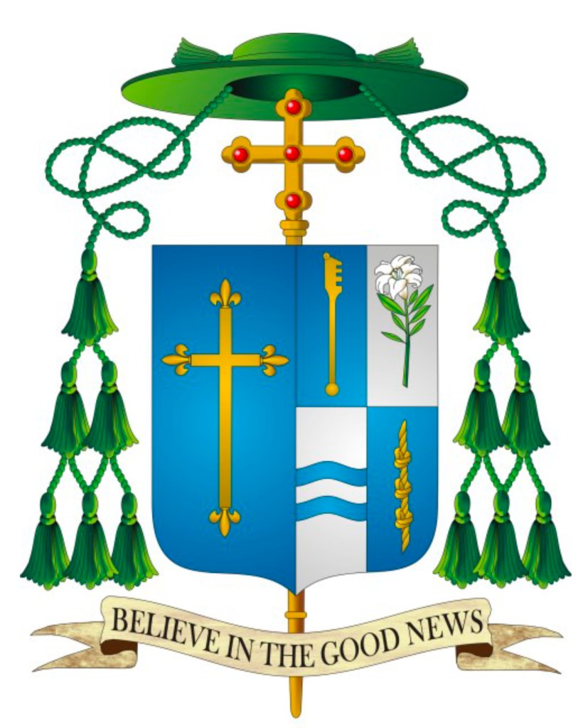
On May 20 the Most Rev. Daniel Felton (66), a priest of the diocese of Green Bay, Wisconsin will be ordained a bishop and installed as the XI Bishop of Duluth, Minnesota. The coat of arms he is assuming, impaled with the coat of arms of the diocese is:
Not thrilling, but not horrible either.

A little too breezy and un-heraldic. I’d like to see the blazon for it. I don’t know why American prelates treat their arms like a charm bracelet full of life’s events.
Because…they continue to go to people who don’t really know enough about heraldry to properly design a coat of arms for them AND even when they do use someone competent they cling to their misguided notions of what a coat of arms is supposed to be. I’m curious to know what you mean when you write “un-heraldic”?
Shaded or toned azure coloring, gray or off-white for argent. It may be very trendy and makes for a nice wall print, but it is not heraldic.
Well, that has more to do with the way the artist has depicted it. In the hands of a different artist the same coat of arms would take on a different look. And, to be fair, while Argent is often depicted simply as pure white strictly speaking that isn’t entirely correct. Argent is supposed to be a slightly off-white or even tending toward grey in tone since it is meant to be depicting silver. But, the commonly accepted convention is that plain white is usually used for Argent.
That is the most boring Diocesan coat of arms I’ve seen. It appears that they simply took the cross fleury and blue background colors from the coat of arms of the Boston and St. Louis Archdiocese and placed it on a shield. And I’ve been trying to find a blazon for the arms without any success.
Simple is GOOD in heraldry. There’s nothing wrong with a simple coat of arms for the diocese. If it’s OK for Boston and St. Louis to use a cross fleuretty then it should be OK for Duluth too, or is there some reason you think otherwise?
No, it’s just that it doesn’t look unique and creative. I found the meaning of the Diocesan Arms from the Diocesan Website(Liturgical Program of the Episcopal Consecration and Installation:https://uploads.weconnect.com/mce/6e75d23a0574afce62799aab4afcd882f53d6680/Communications/Bishop%20Daniel%20Felton%20Ordination%20Mass%20Program.pdf) and it seems that the symbolism of the Diocesan Arms could have been expressed in a way that was not only heraldic correct, but also creative and more colorful manner.
…and Boston(Mass), Saint-Louis and Duluth have all three a same historical roots: France. So these three coa’s are correct for more reasons: they are simple ánd historical correct. Gold-on-blue is meant as the colors of France (fleurs de lys).