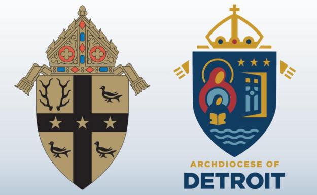
By now so many people have seen the redesign of the archdiocesan coat of arms undertaken by the Archdiocese of Detroit and unveiled last Saturday (below, right).
Where does one even begin? Perhaps a good place to start is by saying that this was done in conjunction with the release of Archbishop Vigneron’s post-synodal pastoral letter entitled, “Unleash the Gospel”. This letter addresses issues that arose during the archdiocesan synod and outlines the pastoral approaches to be implemented by the archdiocese as it faces the future. As a part of this entire effort someone had the idea that redesigning the coat of arms to reflect the current “realities” of the archdiocese and certain aspects of the archdiocese’s identity would be a good idea. I suppose the thinking was that with a new approach should come a new symbol. The archdiocese’s Moderator of the Curia, Msgr. Robert McClory, who was in charge of the redesign, said, “Initially, we thought about, ‘What is the identity of the archdiocese?’ When people think of the Archdiocese of Detroit, what do they think of, and what visuals are connected to that?”
So, it seems clear that this jettisoning of the former coat of arms and redesigning an entirely new one was done with all the very best of intentions. That seems abundantly clear and, I think, it’s worth pointing out and keeping in mind. There was no malicious iconoclasm motivating a desire to discard outmoded symbolism. Rather, there seems to have been a sincere effort to look to the future in a positive manner with a symbol for the local church that would be more evocative to both members of that local community and those outside of it as well. They were trying to do something good, and new, and fresh.
More is the pity. It is precisely all these good intentions that underscores the appalling ignorance with which this process, in the works for more than a year, proceeded. An article in the archdiocese’s publication, “The Michigan Catholic” indicates the following:
“Archbishop Vigneron consulted with a wide range of people, including laity and the archdiocesan Presbyteral Council, before deciding to go ahead with the changes, Msgr. McClory said. While the archdiocese enlisted the help of a Cleveland-based design firm for the project, the process also benefited from Archbishop Vigneron’s experience redesigning the coat of arms of the Diocese of Oakland, Calif., where he served as bishop from 2003-09.”
Apparently, the Archbishop’s previous experience left him feeling confident in doing a wide and varied consultation with just about everyone, except someone well versed in the customs, rules and traditions of good heraldic design. That really baffles me. In these days even a simple Google search will easily yield at least some possibilities of contacting a group or individual who has some knowledge or expertise in designing a coat of arms. Consulting such a person or group really wouldn’t be so difficult. I have to ask why it was deemed important to solicit the opinions of laity and the Presbyteral Council? What experience or learning do they possess that would enable them to determine a good heraldic design? I can appreciate the Archbishop’s desire to avoid making such a change by episcopal fiat and to seek the input of various people in his archdiocese. Nevertheless, the way to design or redesign a coat of arms is not by committee. I think the end result is clear evidence of that.
What they have come up with is, simply put, bad. The artwork is cartoonish and dated. The overall composition bears little to no resemblance to anything remotely like a coat of arms. The mitre on top has the appearance more of a royal crown than an episcopal mitre. The confusing miss-mash of charges float all over the place on the field. You cannot simply take a bunch of logo-like symbols, slap them onto a shield and call it “heraldry”!
Most of all, however, I think the epic fail has its origins in a basic misunderstanding of the nature and purpose of a coat of arms in the first place. Monsignor McClory goes on to say:
“A major difference between the old coat of arms and the new, Msgr. McClory said, is one’s ability to tell the story of faith using its symbols: Starting with the Old Testament in St. Anne and continuing through the revelation of the New Testament through her daughter, Mary, one comes to Christ through the waters of baptism and is invited through the open doors of the Church to bring others with them to their ultimate fulfillment with the Father, Son and Holy Spirit in heaven. I think you can really tell a story with this. You can’t do it with the old coat of arms.”
And there you have it. Once again, because something is connected to the Church it becomes about “telling a story”, or “tracing a history”. Not everything connected to the Church has to be a catechetical tool; not everything is a means of evangelization. Just as a personal coat of arms is not supposed to be one’s pictorial C.V. so, too, a corporate coat of arms is not supposed to be a visual mission statement or pictorial history.
Heraldry was developed as a means of creating a unique identifying mark. Full stop.
In addition, because even modern heraldry still hearkens back to the medieval period in which heraldry has its origins there is supposed to be both a timelessness and a sense of permanence to heraldry. It’s quite wrong to change a coat of arms simply because it was designed and adopted in a different time and because the thinking has changed about what should be on it. A coat of arms doesn’t have to “tell a story”; it doesn’t have to “reflect present realities”; it is supposed to be immutable. Since it becomes the identifying mark of the individual or corporate body that uses it the permanent character of it must be respected.
That is not to say that there are no instances of changes being made to a coat of arms. Even within the science of heraldry itself techniques such as marshaling (combining two or more coats of arms on the same shield), augmentation (adding a new element to an existing coat of arms to reflect an honor, event or accomplishment) and differencing (slightly changing an initial design to indicate its use by a relative, descendant, or protégé) exist to make changes within the accepted framework of heraldic custom and practice. But, simply throwing out the former coat of arms and redesigning the thing from scratch is foreign to the nature of heraldry. Let me be clear: it is sometimes done and whenever it is, it is always wrong.
Rather, the archdiocese has fallen victim to a not uncommon phenomenon present today. That is, equating heraldry with a logo. Corporate logos frequently change. Whether it’s to mark the takeover of the corporate body by another, or simply to refresh and renew the artwork, or to indicate the corporate body embarking on a new phase or vision the transitory nature of corporate logos almost necessitates their periodic updating or full-scale redesign. I note that the archdiocese consulted with a Cleveland based design firm. But, what does this firm know of heraldry? How much experience do they have designing a heraldic achievement? I would hazard a guess that its very little compared with their experience of coming up with a first time logo or doing a redesign for a group interested in “re-branding”. But, a coat of arms is neither a logo nor a brand.
The simplest solution to their present situation would have been to leave their diocesan coat of arms alone and design a logo which would be used not only for the roll out of this most recent pastoral letter and the ensuing archdiocesan efforts at implementing it but could have also become the favored symbol used by the archdiocese in place of the coat of arms. Things like letterhead, signage, etc. could easily have borne this newer logo and simply ignored the coat of arms. Its not the solution that those of us who prefer heraldry might like but it certainly is far from unprecedented. Numerous ecclesiastical institutions have desired a symbol that was considered more in keeping with the times. They have chosen to respect the existence of a previously adopted coat of arms and merely make minimal use of it in favor of the newer logo they have adopted as more fitting to their situation.
The Archdiocese of Detroit could have done the same. They could have tried, with the help of a competent heraldic designer, to truly re-design the present coat of arms. They could have, for example retained the gold field, the black cross and three gold stars on the cross and removed the antlers and martlets. Then in those now empty quadrants they could have placed charges symbolic of what they desired. They could have augmented the current coat of arms by means of placing a smaller shield at the center of the design bearing whatever symbols they wanted. They could have adopted a kind of heraldic badge (a symbol composed of heraldic charges but separate from a shield) and used that in conjunction with the archdiocesan coat of arms as well as had new artwork prepared for both. They could have decided to adopt an archdiocesan logo to be used instead of the coat of arms while leaving the former alone.
Instead, they chose the ill-advised path of completely throwing out the coat of arms first adopted 80 years ago and used regularly throughout the archdiocese in many ways and in many places, and coming up with an entirely new design, poorly executed, which bears little to no resemblance to the original and destroys any visual continuity with what had been used.
It has been announced that over time the former coat of arms will slowly but systematically be expunged and the Archbishop plans to have a new rendering of his own coat of arms impaled with this mess. I think that’s a very bad idea. Rather, if he wishes no longer to use the older archdiocesan arms the Archbishop should simply use his personal arms on the shield alone. That way, if his successor wishes to correct this error and revert to the former coat of arms he can do so easily.
I suppose that it shouldn’t really come as a surprise that this kind of thing happened considering what the archdiocese did to redesign what had been its beautiful cathedral of the Most Blessed Sacrament. Much of that renovation is quite nice (I’m thinking in particular of the floor of the sanctuary) but most of it doesn’t fit at all with the style of a neo-gothic structure. Once again in the interest of “updating” the archdiocese has an epic fail on its hands. What I find particularly sad is the failure isn’t because of a difference of opinion regarding taste. Rather, the fail occurred because of inexcusable ignorance of the subject at hand. They simply don’t get what a coat of arms is supposed to be. What they’ve ended up with is unheraldic and ugly.

What a pity !
Non-heraldic and horrible. It looks like a felt banner on a church wall in the 1960s during a guitar Mass. The mitre looks like an archducal crown. Since the Archdiocese of Detroit borders Canada, the crown no doubt indicates marcher rights.
Redesigning and adopting an entirely new coat of arms in the first place is problematic.
I think his successor will reverse this. It’s tremendously ugly. One might also consider rendering the current arms in a contemporary way. I might hate it, but most ecclesiastical arms look the same and stale, although the colors and charges of the arms of the archdiocese actually are a welcome change from most of the arms used by American prelates and dioceses, including the nicer ones.
Dear Father Guy,
I am in the Archdiocese of Detroit and I am in pain seeing this new “coat of arms”. The original coat of arms being replaced was our heritage. I never looked at it to teach me anything; it was just there, and it was something I felt we inherited. It was something to passed along, not changed like a pair of shoes to fit the times.
I’m further pained at the thought that future bishops will inherit this cartoon.
But what is also maddening is that money we donated, most likely to the CSA or capital campaigns, is going to be wasted on changing out the current coat of arms with this dreadful logo. And, it will be dated in a few years. There is not only stationary, but the coat of arms is embedded in the archbishop’s chair, the marble floor, on signs, and possibly even in some of the wood carvings at places like Sacred Heart Seminary (maybe).
No doubt the Cleveland-based Design Firm has already profited a considerable amount off of your money. Typical Church priorities – sink tons of money into stuff that absolutely has no impact on those most in need of the saving presence of Christ.
“it will be dated in a few years”
It was “dated” as soon as the decade changed to 1970.
Gag. I hate this style of artwork. There’s nothing attractive about it and it’s everywhere–in our stained glass windows, on our missalettes, the front of the bulletin, etc. When will we ever ditch the 60s? So sorry for you, Detroit.
Pingback: Are you KIDDING?!? | Fr. Z's Blog
Coke vs New Coke … That’s it in a nutshell
All part of of the death march of those who embrace Vatican II. Return to Tradition, people, via SSPX and never look back. It’s a state of emergency.
Yes. The SSPX provides a lifeboat in a sea of heresy and apostasy. Has anything improved since VII?
Detroit was founded by the French. i wonder why no reference in either COA.? just a fleur-de-lis or som’thun. Seems they could have simply ‘tweeked’ the original like replace two of the birds with other symbols…
Detroit’s a monarchy now! Or at least a county-palatine! (And if it isn’t…. then the designer should be told that the point of symbols is that, as words, they say something.) It is always dangerous to write in languages one does not understand. And it is not always as humorous and anecdotal as Kennedy proclaiming he was a German doughnut 🙂
It’s fresh and contemporary in a way that only the latest in 1980’s graphic design can achieve.
Oh my! It looks like pieces cut from felt and pasted together by the 3rd grade cathechism class.
How can they dare call that heraldry?
Yikes! That’s not even a good Catholic elementary school banner. Are those figures teletubbies?
The very best of 1970’s felt-banner design, combined with 1980’s coloring book feel-good theology (do what you want, but stay inside the lines). Just plain pitiful.
JMJ When we place self before Jesus, we get Ugly! (Sin)
Sad, but perhaps not surprising, given the logo for World Youth Day, which looks like a duck head with dandruff. See the logo, and Simcha Fisher’s take on it: https://www.simchafisher.com/2017/05/18/the-panama-world-youth-day-logo-is-ongepotchket/
Well, looking at the new one, it seems to say “The Catholics have left via this open door, and all that is left here is a couple of Muslim ladies in Burkas” This being Detroit, not far from Dearborn, this seems entirely appropriate. Due to the laxness that is in the church, people in Detroit are leaving, and soon all our churches will be made into mosques. This is the perfect symbol, well done!
I agree that the new coat of arms is cartoonish. Our coat of arms in Tucson is not much better. It has a dancing goat on it that looks somewhat satanic.
Hi Fr.
I too am in detroit. This is hidious and ugly; ugh! This is typical of how we are run these days. There are a lot of unhappy campers here in the D. I can guarentee that the advisors were hand picked with no disentors. I agree with another post, this reminds me of the kiddie art banners of the 70’s
Water/bottom part of it is very similar to the Univ. of Notre Dame Coat of Arms.
Guest notices the water. Detroit is encamped on a river. The name is a short version of ‘fort on the strait’.
Utterly ghastly!
In other words, it looks Protestant.
Good heraldry is not determined by ecclesiology.
I suspect the new diocesan arms were designed (or at least approved) by the same people responsible for the “renovation” of the cathedral in Detroit. Which is risibly awful.
Growing up in Detroit [near Epiphany Elementary, which my good friend Kenny attended] I wasn’t aware that his Church had a coat of arms, or that it needed one.
Why does it need one, pretty or ugly?
The heraldry next to the name of the author, below, reminds me of the Warner Bros. cartoon alien.
This seems to be a “logo” rather than a coat of arms. Fine. It’s Detroit’s choice. BUT–aren’t coats of arms outdated?
Hardly. Most Americans’ perception of a coat of arms is that it’s something belonging to kings and princes, or that it’s from a time long ago with no connection to the modern world. Nothing could be farther from the truth. The Church is one of those places where heraldry is alive, and well and used as the primary means of identification. It’s both a science and an art which continues to update itself and evolve while at the same time providing a touch stone to the past.
The key to the opinions stated here is the following statement: “The simplest solution to their present situation would have been to leave their diocesan coat of arms alone and design a logo…” There are two different types of identities being talked about here. A Coat of Arms or a logo. For those interested, visit this webpage http://www.logodesignlove.com/brand-identity-style-guides with links to brand identities. Some links listed on the page go to Universities that have been in existence for a longtime and have a coat of arms. They still maintain their coat of arms, but have included a new branding identity.
As an artist, I have to disagree with the comments that the new Detroit coat of arms is dated. It may not fit in heraldic custom, but it very much resembles infographic style that is on trend today. So, yes it will become outdated, and that may not be the best choice for a diocesan symbol, but it is relevant and visually appealing in it’s use of stylized graphics, symbolic use of color as well as applying the science of color theory to the different elements. The only thing that bothers me visually about the new “logo” is the amount of negative space surrounding the shield and the mitre – it’s too large.
I may have misused the word. What I meant by “dated” was to say it was very much identified with a particular time, whether that time was in the recent past or right now, and would, therefore, easily and quickly become outdated. To put it another way, it would have a very brief “shelf-life”. I accept as true that the infographic style employed is trending today but I do think that style itself hearkens back to the recent past (as trends are wont to do with certain styles slipping in and out of fashion rapidly) and by doing so loses sight of the timelessness and permanence that should mark all good heraldry. Looking at something in the future and being able to peg it as from the early 21st Century may indeed be fine for a corporate logo but its not a desirable quality in a coat of arms. It’s a shame, for example, the the archdiocese didn’t decide simply to have a new rendering of their coat of arms done in the trending infographic style as a means of marking a new era, a new chapter, if you will, in their history. That style may still not have universal appeal but it wouldn’t have destroyed their coat of arms and when it became outdated could have simply been discontinued.
this could have been a school art project with the winner receiving a monitory reward and money could have gone to a worthy student
Thank you for the article. Although most in the Archdiocese that have spoken up seem to dislike this new “coat of arms,” there are many rushing to defend something that the faithful don’t want. They say, “Look over here though, read the letter from the Archbishop! That is what is important!” NO! Continuing to push this dated, uninspired garbage that made many people, myself included, feel like the Church was irrelevant, is not going to work. I rediscovered the beauty of the traditions of the Church through a few pockets that work hard to bring a true sense of beauty to the liturgy.
What do we get though? More felt banners, more streamers (or whatever all the short haired old women that still remain in the emptying churches put up to “decorate” for the different liturgical seasons), more terrible musicians trying desperately to make the music relevant! What happens? Nobody practices the faith, and they are over here, defending the mediocrity while yelling, “We need to Evangelize!” To be honest, most of these folks could care less about the Catholic Church. They are Protestant in mind and spirit.
I sent the coat of arms to a few friends of mine. The most charitable comment I received in response:
“Typical. Bland, meaningless and lacking in anything purposeful. Very effeminate.”
While I don’t care for this particular coat of arms at all, I’m wondering if you would care to comment on the very idea of a contemporary reworking of a coat or arms. The archdioceses of Chicago and Saint Paul and Minneapolis have done the same in recent years. I find them more successful and intriguing.
There can be no excuse for a coat of arms being so aesthetically unappealing and boring to boot.
I know that one ought not to take the Lord’s name in vain, but … OH LORD!
Pingback: More odds and ends – Zoopraxiscope
At first glance, I thought it was a sign for a battered-women’s shelter in Berkeley, CA. The blue shield makes the dissected cartoon mitre and the name fade into the background.
-u
As expected, Archbishop Vigneron’s personal coat of arms have now been impaled with the new so-called archdiocesan “coat of arms.” There were no changes made to the charges in the Archbishop’s personal arms or their layout, other than a color change to match the archdiocesan “arms.” I certainly hope the next Archbishop of Detroit tries to clean up and undo this mess.
http://www.aod.org/our-archdiocese/archbishop-allen-vigneron/coat-of-arms/
I hope so too. It’s really rather sad but I think I’ve made my opinion of this “reboot” well known.
Pingback: Archbishop Vigneron’s Arms | EXARANDORUM