A few days ago I posted on the very nice coat of arms of the diocese of Fall River, MA. Yesterday, their new bishop, the Most Rev. Edgar da Cunha was installed. He was formerly the auxiliary bishop of Newark, NJ.
A few days ago I posted on the very nice coat of arms of the diocese of Fall River, MA. Yesterday, their new bishop, the Most Rev. Edgar da Cunha was installed. He was formerly the auxiliary bishop of Newark, NJ.
Fr. Guy Selvester's blog of Ecclesiastical Heraldry
Fr. Guy Selvester's blog of Ecclesiastical Heraldry
Fr. Guy Selvester's blog of Ecclesiastical Heraldry
Fr. Guy Selvester's blog of Ecclesiastical Heraldry
Fr. Guy Selvester's blog of Ecclesiastical Heraldry
Fr. Guy Selvester's blog of Ecclesiastical Heraldry
Fr. Guy Selvester's blog of Ecclesiastical Heraldry
Fr. Guy Selvester's blog of Ecclesiastical Heraldry
Fr. Guy Selvester's blog of Ecclesiastical Heraldry
Fr. Guy Selvester's blog of Ecclesiastical Heraldry
Fr. Guy Selvester's blog of Ecclesiastical Heraldry
Fr. Guy Selvester's blog of Ecclesiastical Heraldry

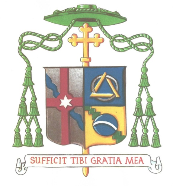
Up to me both the drawing and the design are wonderful because of their simplicity ánd their originality. But there is one thing I regret and that concerns also to other contempory bishops crests: I miss here the famous family crest Da Cunha:gold with 3 x 3 blue trapezoids (wedges). There are more such crests: O’Hara, the new auxiliarians bishop of New York and mgr. Kopacz, where could be worked in their wonderful family crests in a simple pattern. Family crests can be quite well for original surprising and varying ecclesiastical heraldry.
But however: hurray for the crest in Fall River!
I assume when you write “crest” you mean “coat of arms”. Those two are not synonymous.
Yes, I mean ‘coats of arms’. But I see very much that in English texts ‘crest’ was used where one meant ‘coat of arms’. So your native language is also not always very clear.
I hope to see somewhere also the coats of arms that msgr. Da Cunha used as auxiliarian bishop until 2014.
That’s why I point it out. It is not a problem with the language. Crest means crest and coat of arms means coat of arms. The terms are used interchangeably by those who don’t know better. It is not a language issue as much as it is an issue of correct knowledge. Since this blog is also designed to educate it is important to me to correct such errors when I see them. Just because you have seen something in print does not make it correct.
What an interesting coat of arms. Can you blazon the personal arms? I assume the charges and colours in the base are some reference to Brazil, but what is the charge in the chief?
thanks.
The blue field is for Mary and the other symbols are associated with the Society of Divine Vocations of which da Cunha is a member. The circle represents the world and the triangle the Trinity.
Thank you, that is very interesting. I particularly like the way the triangle and the circle are interlaced, and understanding the symbolism adds to my appreciation of the charge and the overall achievement.