Category Archives: Work of Other Artists

Another Great Example of What NOT To Do!

It never ceases to amaze me how people use and abuse heraldry especially when they usually begin almost any discussion of the topic by saying, “Well, I really don’t know much about heraldry, BUT…”. In particular, it is those who are frequently charged with displaying, disseminating, or publishing a particular coat of arms who decide to make the biggest mistakes in the interest of “making it look better”.

Now, I should pause here and state, categorically, that once I have designed and prepared a coat of arms the armiger is absolutely free to do with it as he/she pleases. There is no rule about taking the coat of arms they commissioned me to prepare and displaying it exclusively in the manner in which I gave it to them. To be frank, there are far better heraldic artists out there than me. I have never claimed to be an accomplished artist. My stated area of expertise is in devising a good and sound heraldic design; one that is in accord with good heraldic practices and accepted heraldic customs and conventions. That’s actually harder than most people think it is. You can’t just slap a bunch of symbols randomly onto a shield and call it a coat of arms!

I first began preparing artwork merely in the form of sketches to illustrate my design ideas for clients. In fact, when I originally started designing coats of arms for others I used to collaborate with a local artist to do the finished product. It was he who encouraged me to start doing the artwork myself. To this day I frequently prepare the design of a coat of arms but it is a different person who prepares the final artwork. Indeed, I have long said that the idea of slavishly copying one original, so-called “official” version of a coat of arms is antithetical to the whole concept of heraldic art. There isn’t only one way to depict a coat of arms, least of all in the manner it was originally rendered when first put into use. In addition, there is a vast difference between the work of a heraldic designer (the herald) and the work of preparing the artwork (the heraldic artist). The very concept of one person doing it all, like the “singer/song writer” is, and should be, rare. Most of the world’s greatest experts in the science of heraldry can’t draw to save their lives and the world’s foremost heraldic artists are frequently not well-versed in the concepts of heraldic design.

So, it’s really not unusual for a client of mine to have their coat of arms rendered again by a different artist. This is especially true because, these days, everyone wants digital art and I am still “old school” and actually draw the coats of arms I prepare. But, printing has moved into a new era, and the usual medium of communicating now is the internet. Having a vector image of a coat of arms allows it to be used on different platforms, or even in varying kinds of media at different sizes without the loss of resolution. So, dinosaurs like me may soon be out of a job.

I’ve grown accustomed to the idea that a client may, upon further reflection decide that they like the artistic style of another artist better (although, they do have ample opportunity to see examples of my work before commissioning me so they can’t claim to be surprised at how my artwork turns out!). In addition, as already stated, sometimes it is the desire to have the coat of arms in a digital format that causes clients to seek out the assistance of another (digital) artist.

However, there is also the person who decides that they’ll just do a hatchet job and cobble together an achievement from various sources. This offender is the worst kind. Take, for example, a recent commission of mine for a bishop in the United States. After commissioning me and receiving the finished coat of arms he decided that there was a slight error in the spelling of one of the words in his motto and he wanted that corrected. Fair enough, however, he didn’t ask me to do the correction. Instead he must have relied on someone in the diocese to which he was going which was, no doubt, preparing all sorts of materials surrounding his upcoming installation. But the motto wasn’t the only thing that got changed.

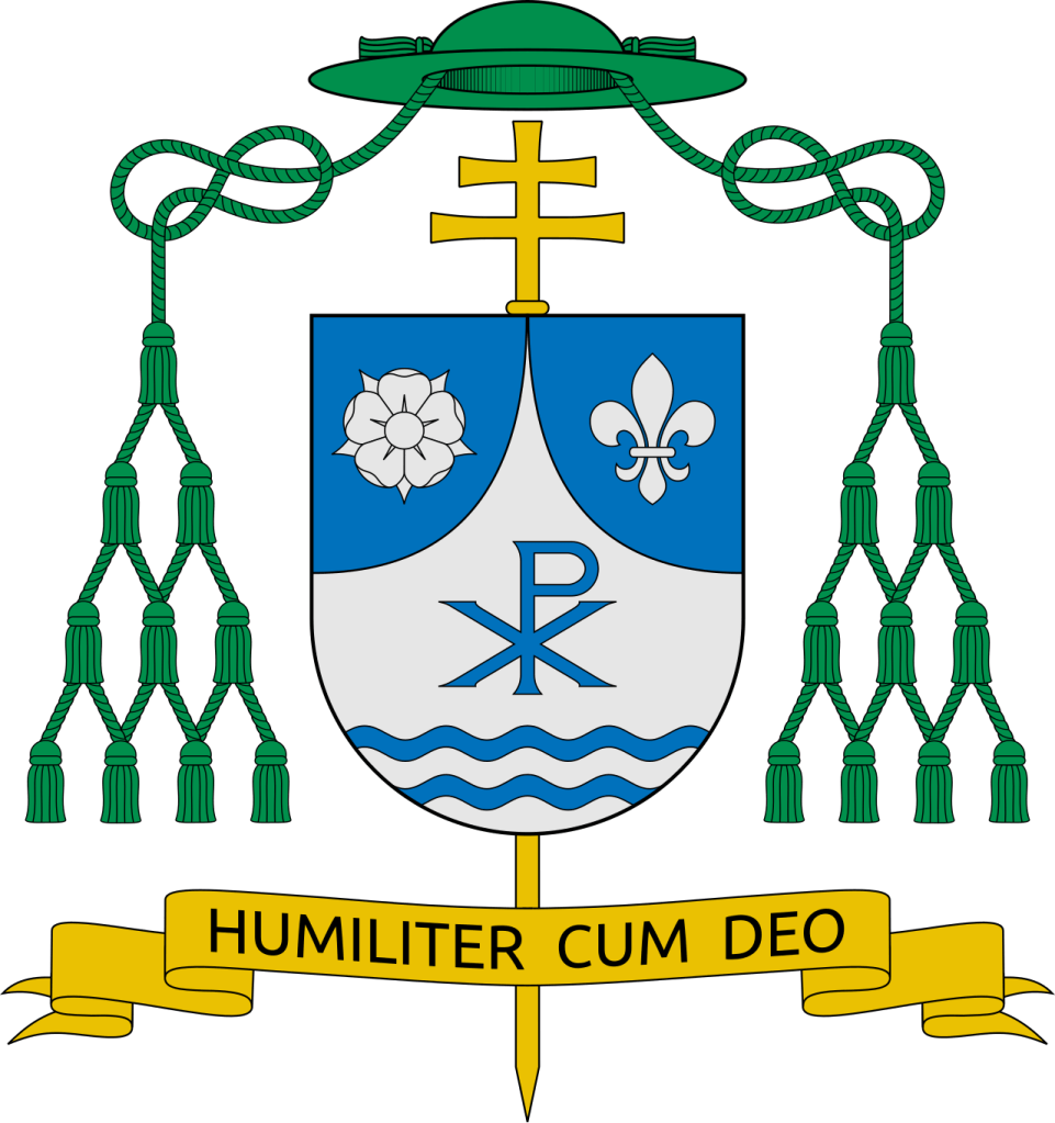
At some point a decision was made—I don’t know by whom, but it doesn’t really matter— not to use the artwork I had prepared. Apparently someone decided they liked the artwork of the coat of arms of the previous bishop which had been done by a heraldist who is now deceased. So what they decided to do, in addition to correcting the spelling in the motto, was to use the artwork of the previous bishop’s coat of arms and “cut and paste” my artwork of the sinister impalement containing the new bishop’s coat of arms onto this new achievement!

Now, as I have said, if it was desired to use a different artist’s work that’s fine. If it was desired to prepare a digital version of the coat of arms that’s fine too. But to simply lift my artwork and impose it onto another artist’s work to create some kind of Frankenstein’s monster of a final achievement is an example of what NOT to do! It’s insulting to me and to the deceased artist who did the previous bishop’s coat of arms and to the whole concept of good heraldic practice. This is to say nothing of the ethical questions involved with using someone else’s intellectual property and/or possible violations of copyright issues. In other words; it’s absolutely the wrong and stupid thing to do!

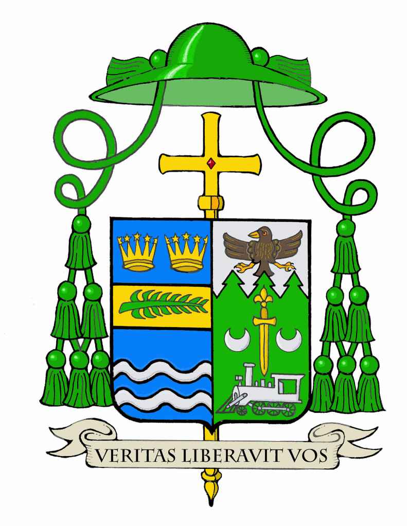
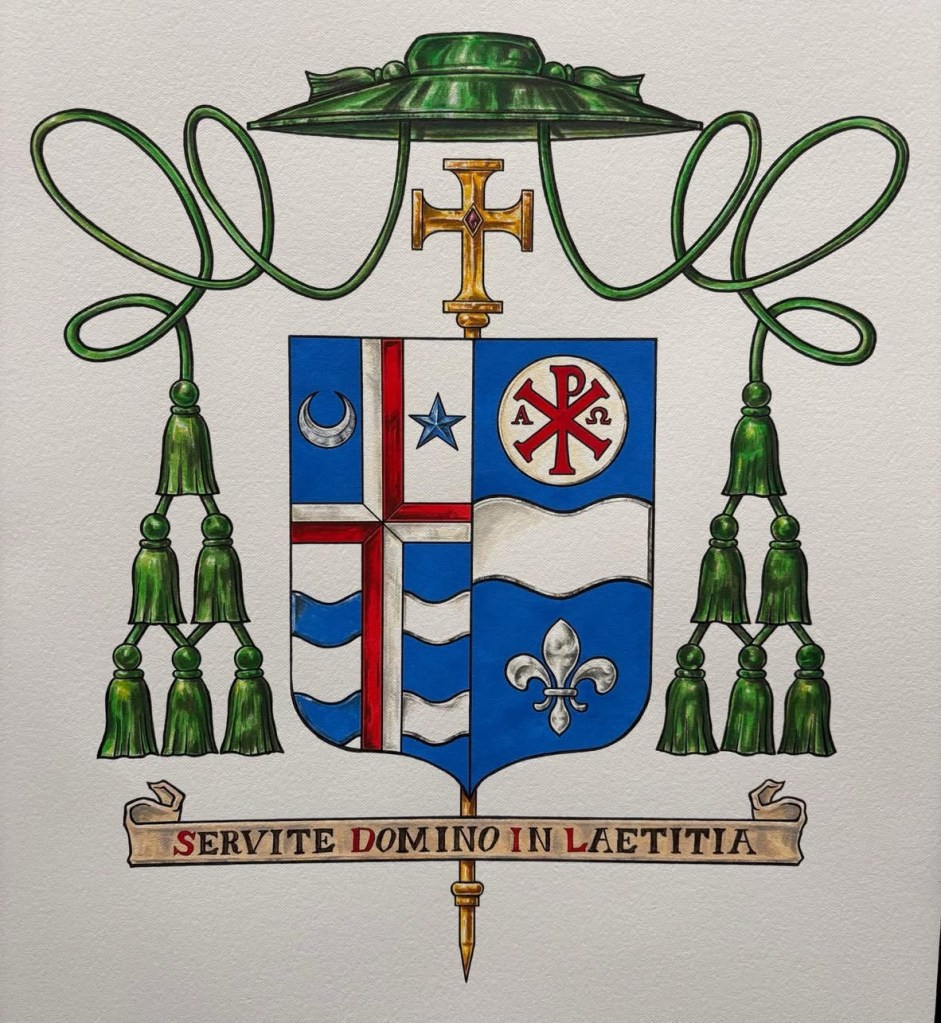
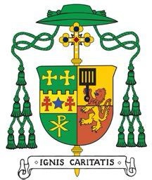
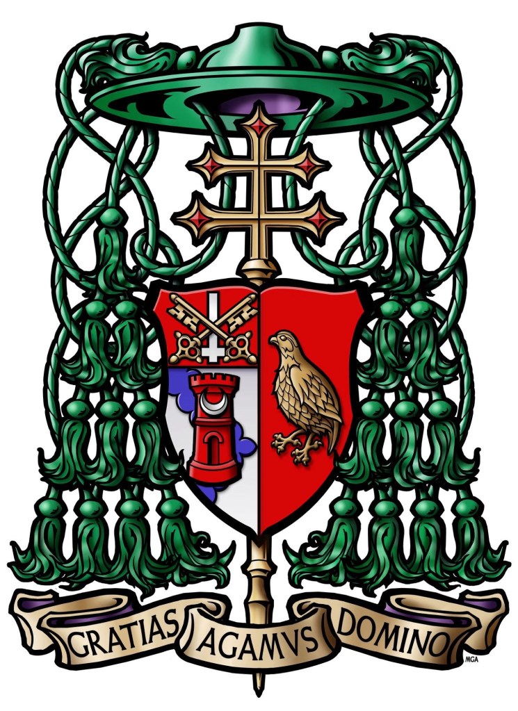
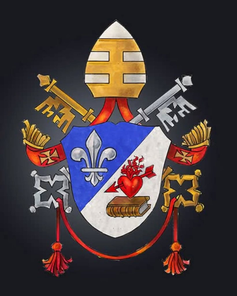
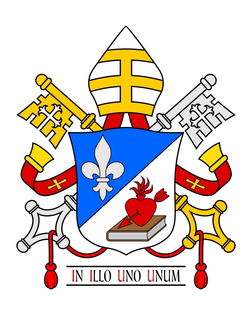
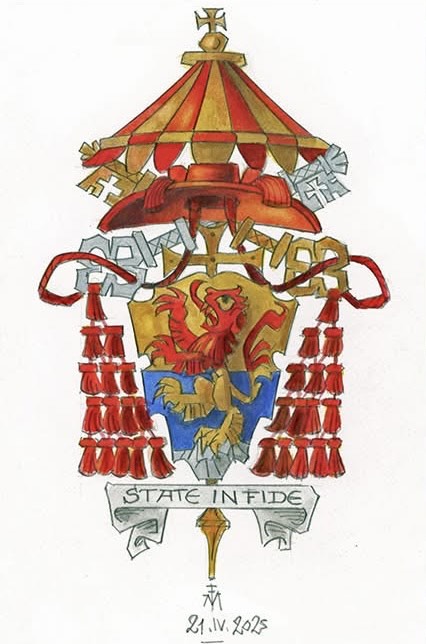
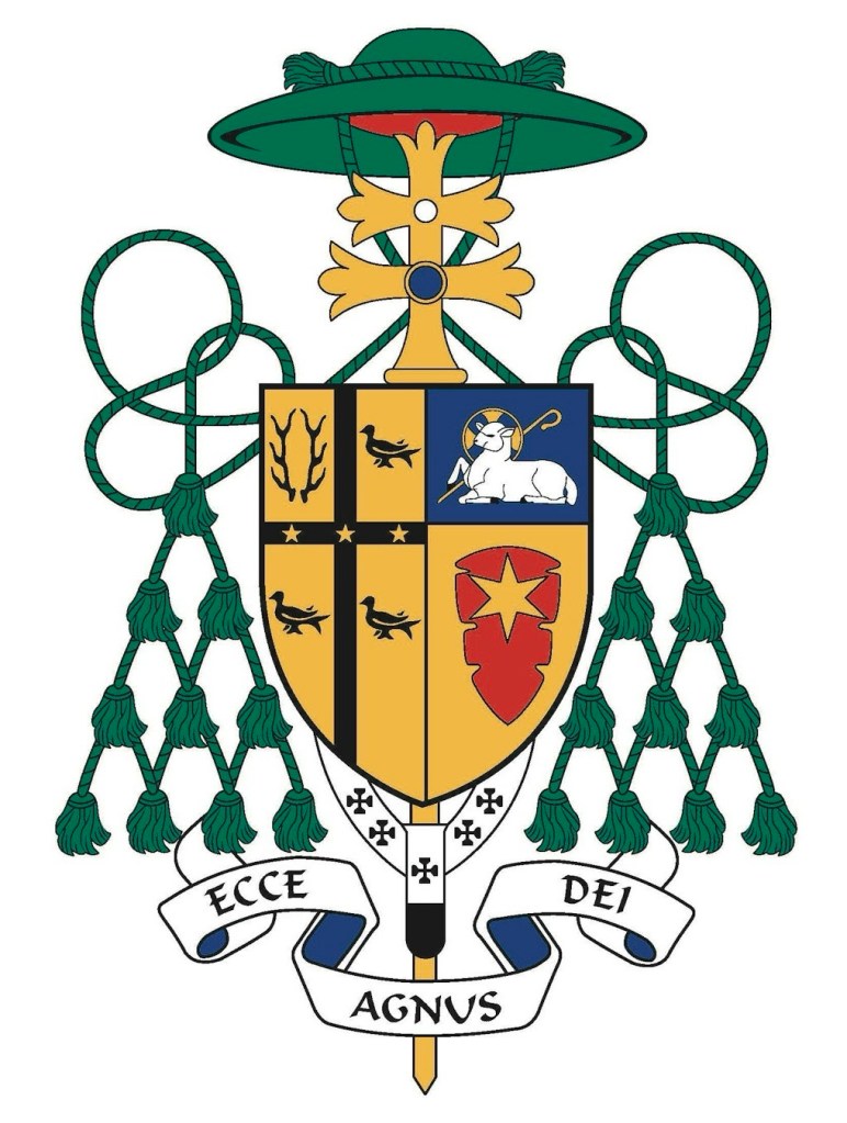
On the left we can see the version of the coat of arms as designed and rendered by me. This is what the client received. On the right we can see what ended up being used by the client. It contains the galero, cross and dexter impalement of the arms of the See done by the deceased artist as well as my artwork of the sinister impalement of the personal arms and the motto scroll with the word “Liberabit” spelled with a “b” instead of a “v” as originally requested by the client.

First off, it’s incredibly obvious that the arms of the See and the personal arms were drawn by two different people! In addition (and I understand I am prejudiced here) the overall appearance looks like it has been combined from different sources. The scroll is hugely and disproportionately outsized in comparison to the shield. The artwork of the personal arms looks to have a bad resolution and has also been distorted to fit a shield shape for which it was not intended. Yeah…even something like the shape of the shield goes into the design decisions made by me so that the charges aren’t just “crammed in” to a space on the shield.

Now, obviously, I prefer that my artwork be contained in an achievement that has been entirely prepared by me. But I will repeat that once I have delivered a coat of arms to a client they are perfectly free to have it rendered by a different artist. However, I feel quite comfortable in saying that the solution in this instance would have been to have a different artist render the entire coat of arms in his/her own style. One of the unfortunate consequences of the coming of the internet, online communication, the manipulation of images, etc. is the commonly accepted idea that simply “copy and paste” is an acceptable practice.

Well…it ISN’T. It’s ethically questionable, it’s insulting to the person who created the original, it creates substandard results and it looks cheap and ridiculous. By all means if you don’t like one artist’s work then go out and hire a different artist to give you what you want. But, to have the temerity and the presumption to slice up the work of various artists and then combine them is a textbook example of what NOT to do!

Bishop Misko of Tucson

James Misko (55), a priest of the Diocese of Austin, Texas will be ordained a bishop of February 20 and installed as the 9th Bishop of Tucson, Arizona.

Bishop Misko’s assumed coat of arms, impaled with those of the See of Tucson,  symbolizes his devotion to Jerusalem. The design suggests the ancient walls of Jerusalem and the Sheep (Lion’s) Gate, symbolizing Christ as the Lamb of God and the gateway to salvation. Marian devotion is alluded to through the blue field, and the gate also evokes Mary’s role as the living gate through whom Christ entered the world. 
  
The chief displays the flaming heart of St. Augustine, representing Bishop Misko’s devotion to the saint who is also the titular patron of the Diocese and Cathedral of Tucson, as well as an allusion to his home diocese of Austin (the name being derived from the name Augustine). The motto, Domine tuus sum ego (“Lord, I am Yours”), expresses total dependence on God. Pendant from the shield is insignia of the Equestrian Order of the Holy Sepulchre of Jerusalem, another connection to the Holy Land. 

The coat of arms is nicely done and the slight violation of the the so-called tincture rule (really more of a general norm than a hard rule) can be overlooked in this case.

Jefferson City’s New Bishop

On October 28 the Most Rev. Ralph Bernard O’Donnell (56), a priest of the Archdiocese of Omaha since 1997, will be ordained a bishop and installed as the 5th Bishop of Jefferson City, Missouri.

The arms that he has assumed which are impaled to the recently redesigned arms of the See of Jefferson City were designed and emblazoned by Dom Pachomius Meade, OSB of Conception Abbey. He also worked on the redesign of the diocesan coat of arms.

Another UK Archbishop

After seeing my recent post about the coat of arms of the Archbishop of Southwark another readers reader of this blog pointed out to me the coat of arms of another prelate from the UK. Archbishop Paul Gallagher (71) is the Secretary for Relations with States & International Organisations, in the Secretariat of State of the Holy See.

Ordained for Liverpool in 1977 he entered the diplomatic corps of the Holy See in 1984. Gallagher previously served as Nuncio to Burundi, to Guatemala and to Australia. He had also served as an official in Tanzania, Uruguay and the Philippines and became an archbishop in 2004.

Archbishop of Liverpool (updated)

After recently posting the armorial achievement of the Archbishop of Southwark another reader of this blog was kind enough to send me the armorial bearings of the Most Rev. John Sherrington (67), the current Metropolitan Archbishop of Liverpool. Archbishop Sherrington, installed last May was previously an Auxiliary Bishop of Westminster and, prior to that, was a priest of the Diocese of Nottingham.

(artwork: Quentin Peacock)

Archbishop of Southwark, UK

One of my regular readers recently sent me this rendering of the armorial bearings of the Most Rev. John Wilson (57), the current Metropolitan Archbishop of Southwark. The archdiocese takes in everything in London south of the River Thames and the County of Kent. (London north of the Thames is the Archdiocese of Westminster, making London one of the only cities to contain not only more than one diocese but actually to contain two ARCHdioceses).

It is interesting to note the quartering with the pall (pallium). This mirrors the original use of the pall. In the days before diocesan coats of arms the pall was employed by any Metropolitan Archbishop as a heraldic charge indicating his status as a Metropolitan.

Update For a Promotion

In January of 2019 I posted about the very nice arms granted to a clergyman in the UK. Fr. Adam Gaunt had received beautiful Letters Patent for his fine coat of arms and was eager to share them with me.

I recently saw online that he posted about some modifications to the ornamentation of his arms reflecting the fact that he has recently been named a Canon of York in the Church of England. So the galero now has six red tassels pendant on either side.

(artwork by Danilo Martins)

Archbishop McKnight of Kansas City

The Most Reverend Shawn McKnight (56), a priest of Wichita and who from 2018-2025 served as Bishop of Jefferson City, Missouri, was installed today as the 12th Bishop and 5th Metropolitan Archbishop of Kansas City in Kansas.

His very simple and striking coat of arms arms was marshaled to those of Kansas City and very ably rendered by Matthew Alderman.

Bishop Lewandowski, CSsR of Providence

On May 20, the Most Rev. Bruce Lewandowski, CSsR (57), a Redemptorist and formerly Auxiliary Bishop of Baltimore, will be installed as the 10th Bishop of Providence, R.I. I had previously written about the bishop’s coat of arms when he was first made Auxiliary Bishop.

Now that he is moving to become a diocesan bishop his armorial bearings will now be marshaled to those of his diocese. The Bishop had employed his sister, a Felician Sister who “works in media” for her Province to design his coat of arms. As they were back then, so too, are they something of a dumpster fire, heraldically speaking.

In an interview for The Catholic Review, the Baltimore archdiocesan newspaper, in 2020 the Bishop said, “Why would I ask anyone else?” when asked why his sister was designing his coat of arms. I think I can answer that. How about: in order to turn to someone with knowledge of a specific topic that isn’t really a DIY project? How about that? In her own part of the same interview, Sr. Lewandowski remarked about some of the particular elements of her design:

The Holy Spirit is depicted as breaking the upper edge of the shield ‘as it is the privilege of the Holy Spirit to inspire new life and envision endless possibilities for the Church, God’s people,’ the description says. The designer noted that she was not sure if that was “allowed” but in her research she did not find any parameters that said it couldn’t be done that way.” (emphasis added)

All I can say is that must have been one quick and not very diligent Google search. Even the most cursory bit of online research should have clued her in to the fact that charges emerging through the edges of the field was a puerile and amateurish mistake. Quite frankly, I don’t see how she could have done any research and reached the conclusion that she did! There are numerous resources out there for someone unfamiliar with good heraldic practices, to say nothing of the huge online presence of groups and organizations that could have happily offered her assistance in her project.

But, this, instead, is the worst kind of so-called heraldry: heraldry as logo. (It summons up the bile just by thinking about it!).

In the same aforementioned article she said:

…she believes a bishop’s coat of arms should tell people who he is and what he stands for. And I believe it should be a more spiritual piece, not just a historical piece,” she said. “And a lot of the coats of arms that I’ve seen and that I kind of read into, it’s a real historical document, but it doesn’t always tell you who the bishop is. She said she tried to tie in Bishop-designate Lewandowski’s spirituality into the symbols she used.”

Well, she got the first part right. A coat of arms should tell people who the armiger is. But, then she rode that right off the rails with the second part. A coat of arms does not tell people what the armiger stands for. It is for identification alone. I have often mentioned that a coat of arms is not one’s C.V. in pictures. Similarly, it isn’t an expression of personal ideology; a manifesto of one’s own spirituality or (for the clergy) a catechetical tool that expresses one’s personal beliefs as a kind of pictorial homily. Unfortunately, that’s precisely how the Lewandowski kids decided to view this project, with disastrous results.

In the latest rendering the overcrowded and poorly composed original coat of arms now falls victim to, perhaps, my second favorite pet peeve: they were changed in order to combine well with the diocesan arms. That’s not an option, full stop. (I suppose Sister didn’t find anything in her research that said she couldn’t do that either!) In addition, the charges form the personal arms are still going beyond the divisions and boundaries of the shield and/or spilling over from one impalement to the other. Clearly, this is also the classic mistake of thinking that the diocesan arms now somehow “become” part of the bishop’s coat of arms rather than being an example of two distinct and separate coats of arms marshaled together on one shield so as to express the relationship between the two!

The list of things wrong with this just goes on and on, and on…

Suffice it to say that he had a poorly designed coat of arms to begin with which would have and could have benefitted greatly from some expertise and advice from an organization, an individual, or even a decent book on the subject in order to take the elements and arrange and depict them according to good heraldic practices. Now, that poorly designed coat of arms has been badly modified and marshaled inexpertly to the point that the diocesan coat of arms of the See of Providence is depicted incorrectly!

EPIC FAIL!

But…what do you expect when a coat of arms is approached as an exercise in graphic design to tell us who the armiger really is? I’ll leave that question unanswered, thank you.

What Do YOU Think of Pope Leo’s Coat of Arms?

This question has been posed to me by numerous people since the Holy See released the image of the Pope’s coat of arms as pope. My answer is simply this: it looks pretty much like I expected.

Pope Leo already had a very good coat of arms as a bishop. I’m glad to see he didn’t feel the need to entirely change the design as others have done in the past. A coat of arms is a means of identification. It identifies you. It becomes associated with you in such a way that it shouldn’t be changed cavalierly. A change of position should warrant the use of different external ornaments to signify the new rank, not a full scale change in what is on the shield itself. So, I’m happy to see that the Pope left alone the arms that he assumed as a bishop 11 years ago.

I was not surprised to see the papal tiara rendered in the form of a kind of mitre. This began with Pope Benedict XVI and continued with Pope Francis I. So, we have now seen this for twenty years and I assumed it would be continued. It is, perhaps, important to note that the tiara has not been replaced with a mitre. Rather, it is the papal tiara rendered as a kind of mitre/tiara hybrid. This occurred at all because of ignorance. The argument to Benedict XVI was that since the tiara is, practically speaking, no longer worn it should not be depicted in the coat of arms. Nothing could be farther from the truth. In fact, since it is no longer worn that’s all the more reason it should be used in the coat of arms. It remains a symbol of the papacy. Most of the world’s monarchs no longer actually wear a crown but the use of a crown heraldically remains. Cardinals and bishops no longer wear an actual galero but the galero remains a heraldic emblem. (It is worth noting here that the tiara with the keys remains the emblem of the Holy See.)

St. Paul VI, in his reforms of 1969, decreed that the mitre and crozier which used to be in the coats of arms of all bishops in addition to the galero and episcopal/archiepiscopal cross should no longer be used in the arms of such prelates. He reasoned that the crozier and mitre were still used liturgically as emblems of the episcopal office and their practical use made using them as heraldic symbols redundant and inappropriate. (NOTE: the same is also true for the pallium) Whereas, the episcopal cross and galero—used at one time—had fallen into practical disuse and so were very appropriate to be used purely as heraldic ornaments. By that logic the same is true of the papal tiara. Since recent popes have chosen not to be crowned the use of the tiara as a purely heraldic emblem makes all the more sense.

Yet, those advising Benedict XVI, principally among them Archbishop Piero Marini and the late Cardinal di Montezemolo, argued that the tiara should be modified in its appearance to show that it is no longer actually worn. This was bad advice then and it has now been codified into enduring, though still equally poor advice. Nevertheless, it was easy to anticipate that Pope Leo would simply follow suit. So…no real surprise there.

Similarly, the slight change in tincture of the division of the field in base from Argent (silver or white artistically) to a kind of beige or buff color shows an appalling lack of understanding of heraldry. This is also displayed in the description of this tincture as “light”. Just what, precisely, is THAT supposed to mean ?!?! There isn’t an actual blazon to help clarify this. The lack of a proper blazon could be because no one at the Vatican knows how to write one; they simply don’t find it important enough to care about; or they feel it would be too esoteric and unintelligible for the average person. One can only hope that the reason is one of the latter two rather than the former.

But there isn’t a lot of evidence to dissuade me. For example, the tiara and keys and motto banner are all clearly just a “cut & paste” job from the arms of Pope Francis I. Really? With all the many competent heraldic artists and heraldic experts available to them no one at the Vatican bothered to reach out to anyone and just figured this could all be handled “in house” by someone with a computer? Is that the most appropriate way to prepare a new pope’s coat of arms? it shouldn’t be a matter of who can get it done first but of who can do it best. What a shame that it has been deemed acceptable simply to cobble something together from existing images.

It’s also probably worth noting that—just like all bishops—all of the popes have had an episcopal motto. However, by longstanding tradition and custom a motto is not supposed to be included in the armorial achievement of the Pope. In his seminal work, Heraldry in the Catholic Church (1978) Archbishop Bruno Heim notes that, “It is widespread custom to put a motto under the shield. It is often held, wrongly, by those who know little about heraldry, that the motto is indispensable; yet it is an addition which does not properly belong to the armorial bearings themselves.” (page 80)

So we see that, all in all, the new Pope’s coat of arms is unsurprising in its composition, disappointing in its execution, and uninspiring in its depiction with numerous errors that could have been avoided with a little creativity and some consultation with people who know what they are doing.

For example, in the hands of an artist of some merit the same exact design can be rendered in a manner that looks considerably better just by the good use of composition and artistic style.

Take, for example, this sketch of the arms of Pope Leo XIV done on the evening of his election by the noted and competent heraldic artist, Marco Foppoli. We can see here that, in the hands of an expert with a great deal of experience, the original heraldic design can be rendered with the appropriate external ornaments in a way that maintains the simplicity that is desired while also creating a new and unique achievement for the armiger. Too bad that someone like Foppoli wasn’t consulted by officials at the Holy See.

Papal heraldry has been in a slow decline since the death of Archbishop Heim. It is sad but true. Unfortunately, at the outset of this new pontificate, there are no signs that this is going to change for the better anytime soon.

God Bless Pope Leo XIV!

Chamberlain of the Holy Roman Church

During the Sede Vacante the person in charge of the affairs of the Church is the Chamberlain (Camerlengo) of the Holy Roman Church. Since 2019 that man has been the (Irish-born) American, Kevin Cardinal Farrell, former Bishop of Dallas, Texas and also former Auxiliary Bishop of Washington, DC.

During the time of the Sede Vacante he functions as the caretaker of the Church and the Regent of the Vatican City-State. The symbol of the Church since the time of the existence of the Papal States, the crossed keys and ombrellino, are placed above his existing coat of arms in the achievement. These may always be used during his tenure in office but, practically speaking, most of those who are Camerlengo make use of these added ornaments only during the Sede Vacante. Special coins will be struck to mark this moment in the Church’s history bearing the arms of the Camerlengo.

This version of Farrell’s arms is by Marco Foppoli.

Novemdiales

In the midst of all the news out there about the death and burial of Pope Francis I didn’t bother to post anything. In addition, I was dealing with some personal matters during that time as well that prevented me from having the time for posting. We now find ourselves in the midst of the nine official days of mourning for a pope, the so-called Novemdiales. Now, the world waits the start of the Conclave which will commence on May 7.

I post here a funerary hatchment made by the Australian Heraldic Artist, Mr. Sandy Turnbull. May Pope Francis Rest in Peace.

Timothy Cardinal Radcliffe, OP

It took a bit of time but the arms used by Timothy Cardinal Radcliffe, OP the Dominican friar who was created cardinal just last autumn by the late pope and who will now be an elector in the upcoming Conclave, has now been published.

He has not been ordained a bishop so there is no episcopal cross behind the shield in the achievement. Overall, he has chosen very Dominican looking symbols and a differenced version of the arms of Radcliffe. A very handsome coat of arms.

Archbishop Weisenburger of Detroit

On March 18 the Most Reverend Edward J. Weisenburger (64), originally a priest of Oklahoma City, former Bishop of Salina, Kansas, and most recently Bishop of Tucson, Arizona, will be installed as the 10th Bishop and 6th Archbishop of Detroit, Michigan.

His immediate predecessor, Archbishop Allen Vigneron, had the archdiocese’s coat of arms redesigned into a logo-like emblem in 2017.

Thankfully, Archbishop Weisenburger has chosen to impale his personal arms with the traditional version of the archdiocesan coat of arms adopted in 1937 to indicate a sense of continuity with his predecessors. Excellent choice!