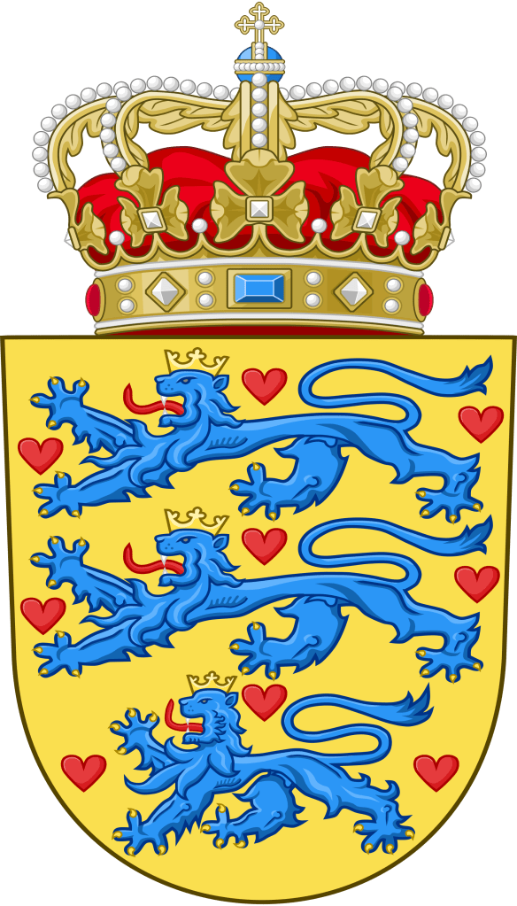
HM, King Frederik X has undertaken to issue a new, updated version of the Danish royal coat of arms dated December 20, 2024. The new version, prepared by Ronny Skov Andersen, simplifies the overall design.
It removes the three crowns of the Kalmar union and gives the arms of the Faeroe Islands and Greenland their own quarterings. It also places the arms of Denmark, originally the arms of the House of Estridsen, in the first quarter and instead of repeating it in the fourth quarter the arms of Schleswig are placed there. In addition, the Dannebrog, the cross that divides the shield into four quarters, has been returned to a more traditional form with the ends of the arms slightly flared. Overall, there remains the dynastic inescutcheon for the arms of the House of Oldenburg. The new version is:
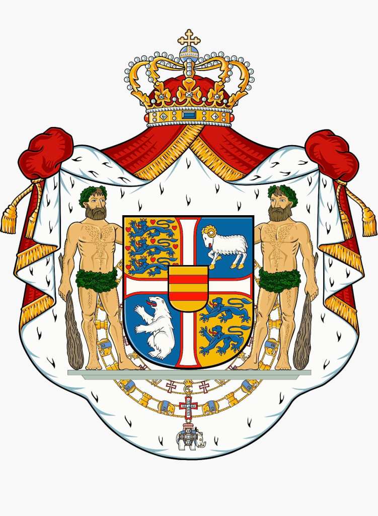
The blason could be written as: A shield quartered by a cross pattée throughout Argent fimbriated Gules; first quarter Or, three lions passant in pale Azure crowned and armed Or langued Gules, nine hearts Gules (for Denmark); second quarter Azure a ram passant Argent armed and unguled Or (for the Faroe Islands); third quarter, Azure a polar bear rampant Argent (for Greenland); fourth quarter, Or two lions passant in pale Azure armed Or langued Gules (for Schleswig). Overall an escutcheon Or two bars Gules (for Oldenburg) the whole surrounded by the Collars of the Order of the Dannebrog and the Order of the Elephant. Supporters two woodwoses armed with clubs Proper standing on a pedestal. All surrounded by a mantle Gules doubled Ermine crowned with a royal crown and tied up with tasseled strings Or.
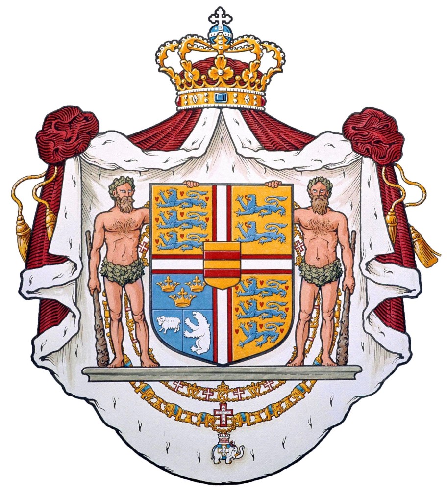
This replaces the version of the coat of arms that had been modified after the reign of King Frederik IX by Queen Margrethe which had been in use since 1972. (below)
I think this updated version is aesthetically more pleasing. It is a slightly less busy composition and the juxtaposition of the arms of Denmark and those of Schleswig provide a more pleasing visual. There is no longer the multiplication of lions and the two quarters with fields Or look better on a diagonal from each other, as do the two quarters with fields Azure. It all seems less imbalanced. I also happen to think the style of the cross looks better that the simple cross throughout.
It is exciting to see heraldry—long erroneously thought by the ignorant to be stagnant and encrusted with the weight of history and therefore irrelevant to today’s society—being updated and dynamic. The current situation calls for an updated symbol of the monarchy. This was true in 1972 and it is just as true some 52 years later. I applaud the efforts of His Majesty and also Ronny Andersen and those who worked with him to devise this updated coat of arms.