Category Archives: Heraldic Mistakes

Archbishop Etienne’s Mistake

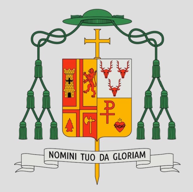
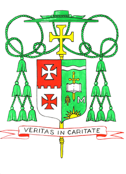
On November 9, 2016 the Most Reverend Paul D. Etienne was installed as the fourth Metropolitan Archbishop of Anchorage, Alaska. Since December of 2009, the 57-year-old Indiana native had been serving as the Bishop of Cheyenne, Wyoming. At the time of his election as a bishop he assumed a coat of arms which he bore during his tenure as Bishop of Cheyenne:
anc

The design was, in my opinion, a bit crowded and fell victim to the usual problem with most of the heraldry of the American hierarchy. Namely, he tried to include too much. Time and time again I warn on this blog and elsewhere against the practice of trying to have a coat of arms be a “CV in pictures”. Sadly, that advice seems to frequently go unheeded.

I noticed that when His Excellency was translated and promoted to Anchorage that he has assumed a new personal coat of arms:
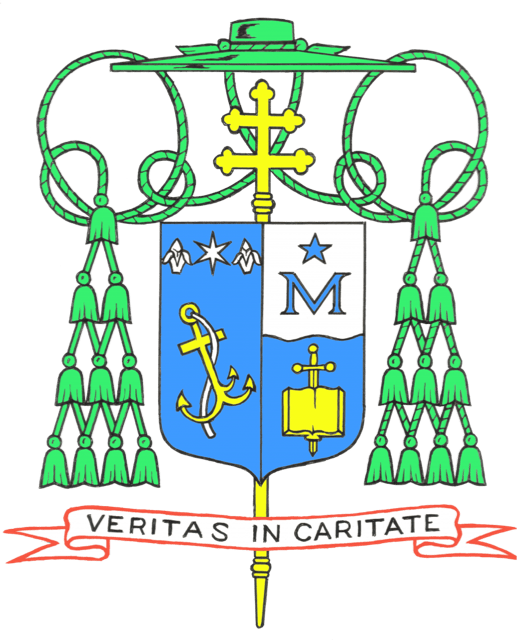
anc2

I must say that the overall design is surely more simple and more clear. In addition, it seems apparent that upon further reflection he realized that he had included too many charges and decided that there were, indeed, some he could live without. I think its unfortunate that he decided to discard the green field because just as it contrasted so nicely with the red-dominated arms of the See of Cheyenne, similarly, the contrast with the predominantly blue arms of the See of Anchorage would have been more striking.

The overall appearance of the coat of arms as it is now is most definitely better. However, the “mistake” I believe the archbishop has made is in entirely changing the original design. He has, in fact, assumed a second new coat of arms. Many prelates feel that when they change assignments that this is a perfectly acceptable practice. It’s as if “a new coat of arms for the new job” is their thought. In addition, after having assumed arms originally, often hastily because of the unfortunate expectation that a bishop in the USA will have his coat of arms prepared and ready to be displayed at the time of his ordination and/or installation, which is an unreasonable and unnecessary expectation, the armiger has had a chance for second thoughts and wishes to make modifications. But there is a problem.

You CANNOT.

That is to say, you really REALLY shouldn’t. A coat of arms isn’t a “logo” which companies often feel free to update, modify or even discard in favor of a new one. A coat of arms is a personal mark of identification and it becomes identified with the particular armiger to whom it belongs. In places like the USA where arms are not granted by a heraldic authority but are legally and quite appropriately assumed (i.e. adopted) great care must be taken to design a coat of arms with which the armiger is happy at the time they are assumed and made public.

In the case of a bishop the personal arms should not be designed to harmonize with the arms of the See with which they will be impaled for the simple reason that bishops sometimes move and re-designing the personal arms to “go better” with the arms of the See is ill-advised. (see the three different versions of the personal arms borne by Cardinal Cupich of Chicago or Bishop Libasci of Manchester, NH. Cardinal O’Brien, the Grandmaster of the Order of the Holy Sepulcher has changed his coat of arms no less than four times!). Part of the problem is the truncated timeline with which so many bishops have to contend when the design process begins. It is not unheard of for there to be as little as six weeks in between the announcement of his appointment and the ordination/installation. The poor heraldic designer must then contend with constant pressure from diocesan officials and committee members demanding the finished artwork for use on things like invitations, programs and in press packets.

But, designing a good coat of arms takes time. Frequently the designer and the armiger will go through three or four sketches (or more) before settling on a proper design. More frequently because of the time constraint (and occasionally because of a complete lack of interest in the subject on the part of the new bishop) something deemed to be “good enough” is cobbled together in a slap-dash manner and the result is, at best, a less-than-perfect design and, at worst, downright ugly and/or ridiculous!

When designing a coat of arms for someone who is not on a three week deadline I often encourage them to use what is jokingly referred to as “the refrigerator test”. That is, they are asked to take a sketch of the coat of arms and put it somewhere, like their refrigerator, where they will see it everyday. The idea is to live with it for a time and keep seeing it over and over to see if the initial ideas have staying power. In the case of Archbishop Etienne such a test might have enabled him to see that the original design was cluttered and that those things he wanted to represent in his coat of arms could have been done with a simpler design. Part of the solution here is to abandon the idea that a new bishop’s coat of arms must be available immediately, in a manner of weeks, and in time for his ordination/installation. I can assure you that in places where arms are granted by a heraldic authority such an authority feels no obligation to do their work with such a ridiculous deadline. There is absolutely nothing that requires a bishop’s coat of arms to be finished and ready by the day of his ordination/installation. A few more weeks to get it right won’t kill anybody.

Part of this problem could be solved by bishops seeking the advice of those competent and well-versed in the principles, customs and traditions of good heraldic practice. More often than not they don’t. They need to stop turning to the myriad of lawyers, engineers, seminarians and other enthusiasts who have read “a whole book” on heraldry and have declared themselves to be “expert” in heraldic design. In addition, the computer age has also led to the advent of a plethora of the heraldic equivalent of the singer/songwriter: those people who are competent artists but who don’t really know the first thing about heraldry or its rules. They can create really nice artistic renderings but should be collaborating with a competent designer instead of trying to do it all. Expertise in DESIGNING a coat of arms and in DEPICTING that design are two very different things.

Finally, it has to be said that, in the Church anyway, it is unfortunate that those who make the most use of heraldry, prelates, are frequently the ones who both know the least about it and also frequently have little interest in learning about its proper use and application. (You know, once they make you a bishop they take the bone out of your head that allows you to remember you can occasionally still be taught something). As mentioned above, a coat of arms can’t simply be changed after several years because one feels like it. Despite the fact that it belongs to the armiger and, in many cases, was devised by him as well as adopted by him he is not free capriciously to change the design on a whim especially not after having borne a particular coat of arms for years. It is akin to deciding to use an alias after years of being known as something else. While there is no “heraldry police” in the Church to stop you it is, nevertheless, wrong to change the design of a personal coat of arms even when such changes result in the general improvement of the design.

Rather, the task is to have a well-designed and pleasing coat of arms the first time around and to use that same coat of arms no matter how often a bishop might be transferred to a new diocese. It is important to remember that impaling the personal arms with the arms of the See is a custom, not a requirement, and not even a universal one at that. It predominates in N. America but it is far from the usual custom throughout the world. When impalement is employed bishops need to remember that the dexter impalement (the arms of the See) does not become part of their coat of arms. Instead, by impaling there are two distinct coats of arms being displayed on one shield. It is a form of marshaling two or more coats of arms and even at that it lasts only for their tenure in that office. A bishop-emeritus of a given diocese has no right whatsoever to continue impaling his personal arms with the arms of the See once he has resigned that See.

The best process to use is the same one which circumstance forces onto those bishops who first become Auxiliary Bishops. Namely, they design and assume a personal coat of arms alone which fills the entire shield. Later, if they are promoted to be a Diocesan Bishop then they may choose to impale their personal arms with the arms of their diocese. If, by chance, such an impalement makes for an aesthetically unpleasing combination then the solution is NOT to change their personal arms (or the diocesan one for that matter). The better option would be for the bishop in question simply to bear his personal arms alone and not impale them at all. It is important, however, for the armiger to maintain that coat of arms which he first assumed and which has become identified with him as much as his signature or the appearance of his face. As already stated above even when the temptation is strong to re-design the coat of arms for the purpose of improving the design after further reflection such an impulse must be stifled and ignored. Once the arms have been assumed it is, frankly, too late. That’s why its better to be sure of what is being assumed in the first place; it cannot, and should not be changed later.

I have written in these pages extensively about the idea of employing various versions of a coat of arms to suit the occasion and/or office held. Sometimes, coats of arms receive legitimate augmentations to reflect some event or change in status. Frequently, the external ornaments in a heraldic achievement, even of a bishop, change or are added to in order to reflect an honor received. All of these are legitimate modifications. However, for a bishop who has assumed a coat of arms and several years later is then moved to a different diocese or some other such position within the Church simply to say to himself, “You know, I’ve had second thoughts about including thus-and-such in my coat of arms. If I had to do it over again I’d use something different. Let me take advantage of this change and the fact that new artwork has to be prepared to redesign the whole thing” is egregiously wrong and is, realistically, a gigantic abuse of his authority. After all, in the Church what a bishop wants is rarely questioned and even more rarely denied.

Nevertheless, it is of utmost importance to get it right the first time, that is, at the time of assuming the coat of arms. Changing it later ISN’T an option and bishops who ignore that are making a mistake.

(The artwork for Archbishop Etienne’s coats of arms is by Deacon Paul Sullivan)


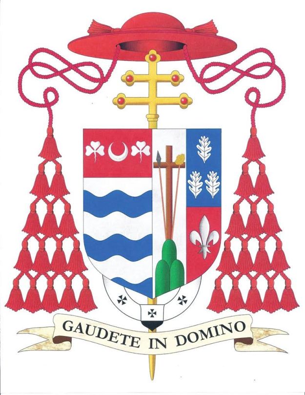
Cardinal Tobin of Newark

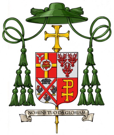
On Friday, January 6, 2017 His Eminence, Joseph Cardinal Tobin,  CSsR the Cardinal Priest of Santa Maria delle Grazie a Via Trionfale and former metropolitan archbishop of Indianapolis, age 64, will be installed as the tenth bishop and sixth metropolitan archbishop of Newark, New Jersey.

A Redemptorist by Religious Profession he makes the same, long-standing error of including the arms of his Religious Order in his personal arms implying jurisdiction over it. At one time he did actually serve as General Superior of his Order and could have arguably impaled a personal coat of arms with the Order’s arms. However, he did not become a bishop, and assume a coat of arms, until after his tenure as General. As I say, it is a common error for Religious prelates but it is, nevertheless, most definitely an error.

tobin

John Cardinal Ribat, MSC, KBE

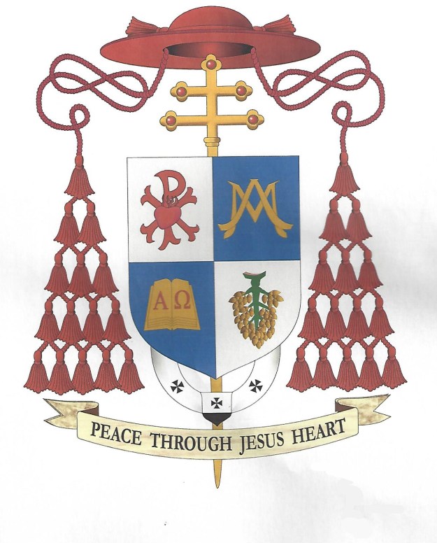
(Sir) John Ribat, MSC, KBE currently the Archbishop of Port Moresby, Papua New Guinea, will be elevated to the Sacred Purple and created Cardinal of the Holy Roman Church on November 19, 2016. We’re not concerned with his coat of arms as they would have appeared upon his ordination to the episcopacy as Auxiliary Bishop of Bereina, PNG in 2001. Rather, since 2008 when he succeeded as Archbishop of Port Moresby he has born the arms:

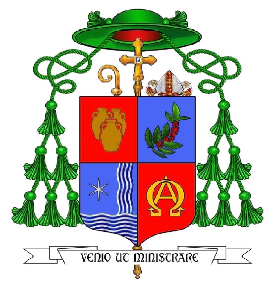
Quartered; 1) Argent, the Sacred Heart of Jesus enflamed superimposed on the Greek letters Chi and Rho all Gules, 2) Azure, the monogram of Our Lady Or, 3) Azure an open book Or the pages charged with the Greek letters Alpha and Omega Gules, 4) Argent, a branch of betel nut Proper.

0

These arms had been rendered for him by Renato Poletti, a Roman lawyer who, like many amateur heraldic enthusiasts, dabbles in heraldic design and produces his artwork on computer. He took it upon himself, unsolicited, to produce a new rendering of the Cardinal-designate’s coat of arms with the external ornaments of a Cardinal (above). However, Archbishop Ribat had already been contacted by Mr. Richard d’Apice of the Australian Heraldry Society to discuss a re-working of the emblazonment of his arms to reflect his new honor. Such projects have frequently been undertaken by Mr. d’Apice before as well as the designs of new coats of arms for many prelates and laypeople in his own Australia. Mr. d’Apice, as he often does, consulted with me to seek some advice and input.

While I do not particularly like the design of the arms I advised that it would be best at this point for a man who has been a bishop for fifteen years and an archbishop for eight to retain the arms he has been using. The deplorable habit so many bishops have today of completely redesigning their coats of arms every time they move or are promoted is to be avoided at all costs, even at the cost of maintaining a coat of arms of an inferior design. Simply to change one’s personal arms because there has been a change in office or rank goes against the whole point of heraldry as a mark of personal identification. While external ornaments correctly change to indicate a change in rank and personal arms may be marshaled with other coats of arms simply deciding after several years that one would like to adopt a different coat of arms is, in a word, wrong.

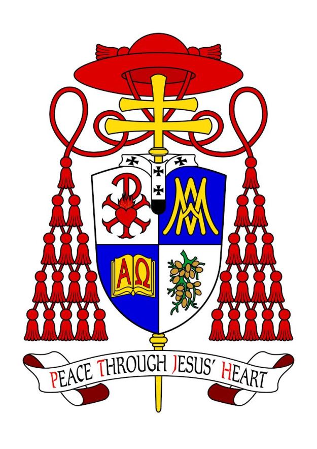
However, it is often the case that a different artist can emblazon a coat of arms in a manner that will make it both aesthetically more pleasing as well as heraldically more bearable (pun intended). This is the case with the arms of Cardinal Ribat. Mr. d’Apice and I agreed that perhaps the best thing we could do was to advise His soon-to-be Eminence to have the arms rendered by the artist with whom we usually work, Mr. Sandy Turnbull, also a member of the Australian Heraldry Society who also works in computer generated artwork. The result of Mr. Turnbull’s efforts may be seen below.

ribat

The overall shape of the achievement and the rendering of the charges, in particular the fact that they fill the field in each quarter better, as well as the depiction of the branch of betel nut are definitely an improvement. The placement of the pallium (which, for the record, I oppose in any heraldic achievement) is also better. In addition, the color palette and vibrancy of the colors is, in my opinion, also superior. The Cardinal-designate was so pleased that he communicated to Mr. d’Apice through his Vicar General that Mr. Turnbull’s rendering will be used, in particular, on his letterhead and official documents. It is indeed difficult to make a silk purse out of a sow’s ear but, on occasion, the solution to what to do about a less than happy heraldic design is simply to emblazon the arms in a better fashion.

Abbess of Regina Laudis

The coat of arms used by the Third Abbess of the Abbey of Regina Laudis in Connecticut, Rev. Mother Lucia Kuppens, OSB. She was elected February 1 of 2015 and received the abbatial blessing on the following May 10th from the Archbishop of Hartford.

AbbesLucia

The Abbess describes the design (executed by Mother Alma Egger, OSB) as follows:

The book symbolizes my maternal ancestry, one hundred percent Irish, from Galway in the west of Ireland. A strong Celtic influence permeated my home. From these roots I received my love of the word, of poetry, of learning, education, culture, and music. The book could be interpreted to represent Scripture, or The Rule, literature itself or the works of Shakespeare, the particular focus of my doctoral dissertation. On a practical level, the book refers to much of my work in the Abbey, which includes supporting others in their studies, hosting student groups, directing the Monastic Internship Program, and when called for, writing about the Abbey. My Clothing and Profession ceremonies were both on the Advent feast of “O Sapientia” in celebration of Wisdom. The book is open, conveying the imagination and intellect open to the Wisdom of the Holy Spirit.

The roof truss at the top of the shield symbolizes my paternal ancestry. The dominant national identity in my father’s family was Alsatian, from northeastern France, just a stone’s throw from the German border. They were a people who suffered and survived much in war, as their borders continually changed. From my father’s family comes a rootedness in the earth, an appreciation of manual work, a respect for practical solutions and love for what is essential in life. From him comes my attraction to the other main area of my monastic service, the Cellarer’s Office. Until fairly recently my father worked all over the Abbey helping repair and build things. Through my involvement with a Lay Oblate Community (The Closed Community) prior to entering the Abbey, I had many experiences of participating in building on the Abbey land, notably the Chapter House on the Hill. Since 2009 I have been working with others to renovate the original monastic buildings and envision this being a major work for the whole community for the next ten years.

Continuity with Lady Abbess and Abbess David is represented by the wavy line in the center that marks the pine hill, which was on both of their shields as well. The hill is the central feature of our land. It is where our church was built and it represents the spiritual center and heart of the monastery. The three stars, which also appeared on Abbess David’s shield represent the continued commitment to build the triadic nature of our authority structure composed of Abbess, Prioress, and Subprioress.

The consecration lamp is an ancient and rich symbol of consecrated virginity and therefore seemed an apt symbol for representing the light of St. Lucy, Virgin and Martyr. Each nun receives such a lamp, made by our potter, at the time of her Consecration, when the church bestows its blessing and affirmation on the fruitfulness of her vows. The burning oil lamp symbolizes the gift of self, consumed in the fire of love. Two flames rise from this lamp symbolizing for me that the gift of one’s love to Christ is never solitary, but is given in relationship to others. The consecration lamp unifies the whole shield, mediating between the speculative and practical polarities of my genealogy and bringing our attention to the meaning of the motto, which is taken from the Office of St. Scholastica, sister of St. Benedict and a consecrated virgin. As told in the Dialogues of St. Gregory the Great, one night she prevailed on her brother to disobey his Rule and instead of returning to his monastery, stay with her talking and praying. Though she did not tell him why, she knew her death was near. He refused her, but her tears of supplication to God caused a sudden storm that prevented St. Benedict from leaving. Thus in that moment, she prevailed over him and St. Gregory says of her, ‘Plus potuit quia plus amavit,’ which is translated: ‘She was able to do more because she loved more.’ The banner of the motto embraces the whole shield and all the symbols on it, signifying that all we do is possible only through love and the grace of God.

Why the decision to use a simple oval shield alone without the external ornament of the veiled crozier pale wise behind the shield is a mystery. It is the only heraldic ornament that would mark this as the coat of arms of an abbess. Without it, these are simply the arms of a woman and a motto. Similarly, the previous abbess’ coat of arms used no crozier but employed supporters! It causes one to wonder if there is a lack of proper heraldic knowledge amongst the nuns. It is a shame they have not been advised better.

The abbey itself has a fine coat of arms designed and emblazoned by the late great practitioner of the science and art of heraldry, Dom Wilfrid Bayne, OSB, a monk of Portsmouth Abbey in R.I.

crestTrans

Bishop J. Gregory Kelly

On February 11 the Most Rev. (John) Gregory Kelly was ordained as Auxiliary Bishop of Dallas. The description of the coat of arms (from the diocesan website):

“Bishop Kelly’s arms are based on the Kelly family design where the shield is silver (white) and the charges are black. For difference, and for his deep devotion to the Blessed Virgin Mary, the chevron is now blue. The chevron is reminiscent of the mountains of Colorado, so dear to His Excellency’s youth and the chevron is charged with two estoiles (special, six pointed stars) that are taken from the mantle of the image of Our Lady of Guadalupe to remind all of the profound Hispanic influence in Texas, the “Lone Star State“, represented by the single star below the chevron. Above the chevron are a fleur-de-lis and a trefoil (the heraldic representation of a shamrock) to honor the Bishop’s Irish and French-Canadian heritage.”

Once again we see here an example of the increasingly popular (and completely WRONG!) trend of personalizing one of the external ornaments, in this case, with the addition of the triquetra on the episcopal cross (erroneously referred to as a “processional” cross in the description) to represent the Holy Trinity because it was the name of the seminary the bishop attended.

It is necessary to repeat that the only thing subject to having charges particular to the bearer is the shield. The external ornaments may NOT be personalized in a heraldic achievement of this type and all those who advocate such a practice are both incorrect and foolish! The heraldic artist is completely free, in future, to depict this bishop’s coat of arms with an episcopal cross of any shape and manner he might wish. This is what happens when armigers turn to those who do not know what they are doing for the devisal of their coats of arms.

Kelly-COA

Artwork: P. Sullivan

Archbishop Zuppi of Bologna

zuppi-matteo-maria-stemma-arcivescovo-bologna

The coat of arms of the new Archbishop of Bologna, the Most Rev. Matteo Zuppi.

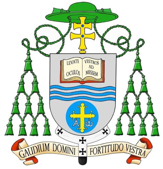
The shield depicts the Book of the Gospels, a river and the cross of Constantine. The book is open to John 4:34-35.  Jesus at Jacob’s well with the Samaritan woman said , “My food is to do the will of him who sent me and to finish his work. Do you not say perhaps four more months and then the harvest? Behold, I say to you, lift up your eyes and look at the fields! They are ripe for harvest.” The river evokes the Tiber and Rome. The sign of water and the river runs through the Scriptures from Genesis to Revelation. The Cross with Alpha and Omega is a sign evoking Christ crucified and risen, the beginning and end of all things. This cross is above the triumphal arch of Santa Maria in Trastevere in Rome where Archbishop Zuppi has lived for most of his priestly ministry.

The scroll below shows the motto chosen by Archbishop Zuppi “Gaudium Domini Fortitudo Vestra.” The joy of the Lord is your strength. (Neh 8:10)

The pallium is both unnecessary and very ill-placed.