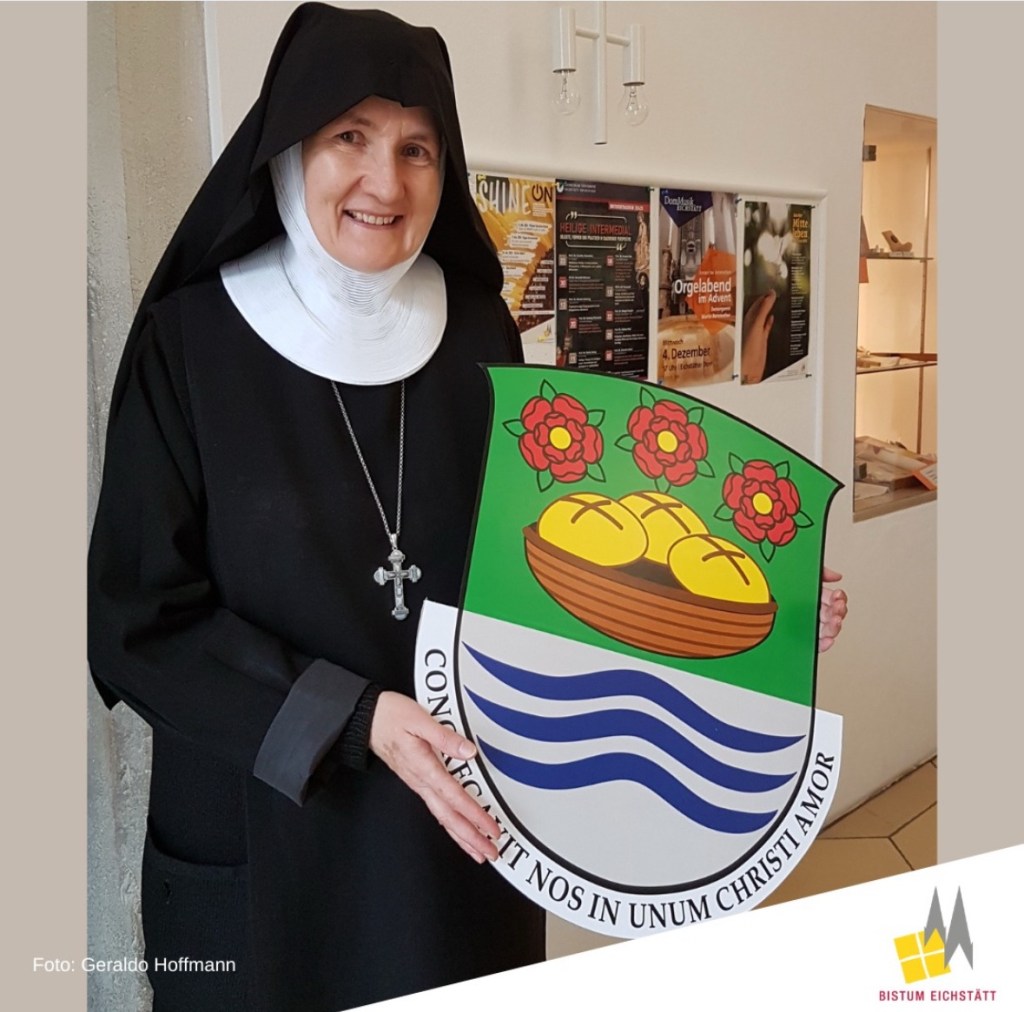
The Benedictine nuns of St. Walburga Abbey, Eichstätt elected Mother Elizabeth Hartwig, OSB as their abbess on October 28 of last year. On November 30 she received the abbatial blessing from the Rt. Rev. Barnabas Bögle, OSB, Abbot of Ettal.
Her assumed coat of arms depicts, in chief, the bread and roses that are symbols of her patroness, St. Elizabeth of Thuringia. In base the three wavy lines represent rivers from three places of importance in her life: the Elbe in Torgau where she grew up; the Saale in Jena where she studied; the Altmühl in Eichstätt where she became a nun. The motto says “We are bound together by the love of Christ”.
The coat of arms was designed by one of the nuns of the Abbey, Sister Caritas Dirr.
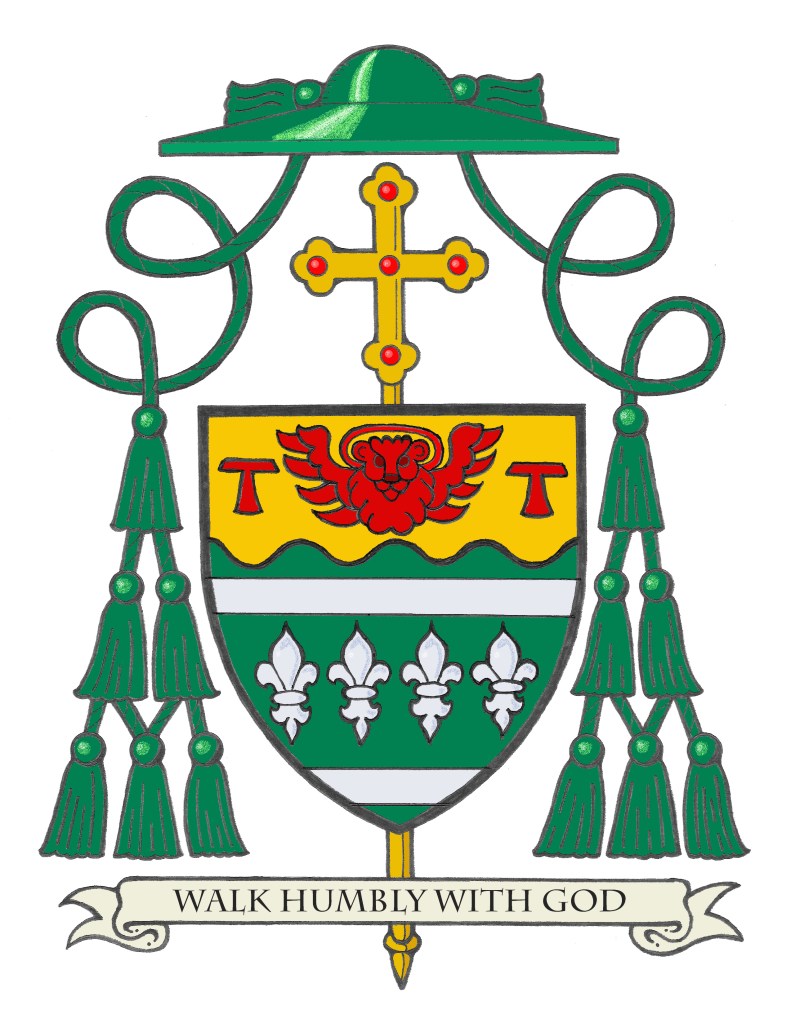
On Wednesday, February 26 the Most Rev. Lawrence John Sullivan (59), a priest of the Archdiocese of Chicago for the last 33 years, will be ordained as the Titular Bishop of Lamphua and Auxiliary Bishop of the Archdiocese of Chicago. Bishop-Elect Sullivan is one of five new auxiliary bishops appointed for the archdiocese by Pope Francis.
The blazon of the arms is: Vert, between two bars in chief and in base, four fleurs-de-lis fess wise all Argent; on a chief wavy Or between two Tau crosses the winged head of the lion of St. Mark all Gules.Shield ensigned with an episcopal cross Or behind the shield and a bishop’s galero Vert cords and twelve tassels disposed in three rows of one, two and three all Vert. On a scroll below the shield the motto: ”Walk Humbly With God”.
The armorial bearings of Bishop Sullivan symbolize his birthplace, his personal devotions and the place in which he has spent his life and ministry as a priest.
The basic design of the field echoes the design on the flag of Chicago, his native place. The background color has been changed to green as a nod to the Irish heritage of the Bishop. The two blue bars and four red stars on the Chicago flag have been differenced here and changed to two silver (white) bars and four silver (white) fleurs-de-lis. These fleurs-de-lis represent multiple things. One fleur-de-lis is taken from the coat of arms of Joseph Cardinal Bernardin who ordained the Bishop a priest; the second is taken from the coat of arms of Blaise Cardinal Cupich who will be the principal consecrator ordaining him to the episcopacy; the third is from the coat of arms of Mundelein Seminary where he received his priestly formation; the fourth is not from a coat of arms but is a heraldic symbol of St. Joseph, the patron saint of his College Seminary. It goes without saying that the fleurs-de-lis also figure prominently in the coat of arms of the archdiocese of Chicago. So, the design combines symbols from the city and the archdiocese where Bishop Sullivan was born, grew up and has served as a priest and will now serve as a bishop. Lastly, the fleur-de-lis is, itself, a heraldic symbol of Our Lady.
The upper third of the shield, called a “chief” is separated from the rest of the field by a wavy line alluding to both Lake Michigan and the Chicago River. On this gold (yellow) chief are two red crosses in the famous Tau shape. These represent the Bishop’s devotion to St. Francis of Assisi. This shape of cross is associated with the saint because he himself used it. Whenever writing anything, St. Francis placed a Tau cross at the top of the page.
Between these two crosses is the haloed head and wings of the Lion of St. Mark also depicted in red. This magnificent creature is symbolic of St. Mark as referenced in the prophecy of Ezekiel 1-2 and also in the Book of Revelation. St. Mark is the Bishop’s favorite evangelist and he likes and is drawn to the very human side of Christ depicted so well in Mark’s gospel. In addition, in his own personal spirituality Bishop Sullivan feels we are called to see Christ present in the world and that we see this in others and we, too, are called to be that presence of Christ for others, revealing the face of God–the very human God in Christ– to them. The combination of the colors green, gold and red are also used on the national flag of Lithuania and so they are a recognition of the Bishop’s Lithuanian ancestry as well.
The motto below the shield is “Walk Humbly With God”
The shield is also ensigned with those external ornaments that indicate the bearer is a bishop. The gold (yellow) episcopal cross, not to be confused with a processional cross, is placed vertically behind and extending above and below the shield. In former times archbishops, and later all bishops, had a cross mounted on a staff carried immediately in front of them while in procession or on solemn occasions. This cross was a symbol of their rank as bishop. While such an episcopal cross is no longer used practically it has been retained heraldically. In fact, there are other clerics who make use of the ecclesiastical hat with its many tassels but the one true heraldic emblem of a bishop, and the only essential one, is the episcopal cross placed behind the shield.
Above the shield is the ecclesiastical hat, called a galero which, in heraldry, replaces the martial helmet, mantling and crest. “The hat with six pendant tassels (green, purple or black) on each side is universally considered in heraldry as the sign of prelacy. It, therefore, pertains to all who are actually prelates.” (Heim, Bruno B., Heraldry in the Catholic Church 1978, page 114) The galero is green with green cords pendant from it and twelve green tassels arranged in a pyramid shape on either side of the shield. At one time in history bishops and archbishops wore green before adopting the more Roman purple we see today. In heraldry the green hat and tassels was retained for prelates with the rank of bishop according to the Instruction of the Secretariat of State, “Ut Sive” of March, 1969.
It was my pleasure and my privilege to assist Bishop-Elect Sullivan with the creation of his coat of arms. I was responsible for the design and also provided the artwork.
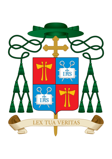
The Most Rev. Frederik Hansen (45) was ordained a bishop on January 18 and became Coadjutor Bishop of Oslo, Norway with the automatic right of succession to Bishop Bernt Ivar Eidsvig, CRSA, who is currently 71. When he succeeds to the See, Bishop Hansen will be the 9th Bishop of Oslo.
In the interests of full disclosure, the new bishop, who spent some time working for the diplomatic corps of the Holy See and was in residence in a parish in my native diocese of Rockville Centre, NY contacted me upon his appointment to design his coat of arms. However, he later was informed that the diocese of Oslo had already secured the services of another heraldist, Archbishop Charles Scicluna of Malta.
The Bishop’s arms are quartered with those of the Diocese of Oslo, somewhat unusually for someone who is not yet the diocesan bishop but more of a “diocesan bishop-in-waiting”. This will, of course, save him the trouble of having a new rendering made when the time comes that he succeeds to the See. nevertheless, it is unusual because he does not yet possess jurisdiction over the See.
For his personal arms, seen in the second and third quarters, the heraldic colors, blue and silver, are from Drammen’s city coat of arms. The “IHS” is the monogram of the name “Jesus” and points to Jesus’ holy name and Bishop Hansen’s devotion to “the name above all names” (Phil 2,9–10) which is given to mankind for salvation (see Acts 4,12). The open book refers to Bishop Hansen’s work in church administration and in priestly formation and teaching. The two croziers allude to two Norwegian saint-bishops: St. Torfinn, bishop of Hamar, and St. Eystein, Primate-Archbishop of Nidaros.
Despite not having worked on this project I’d say the bishop was in good hands and has achieved an excellent result (pun intended).
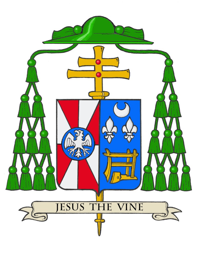
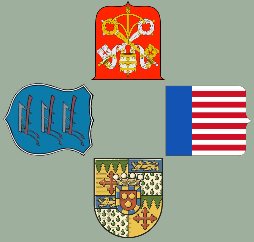
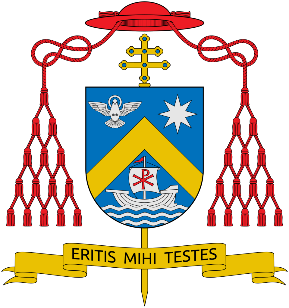
On January 14, 2025 the Most Rev. Jeffrey Grob (63), a priest and, since 2020 an Auxiliary Bishop of Chicago, will return to his native Wisconsin and be installed as the 12th Archbishop of Milwaukee, Wisconsin. The armorial bearings he assumed in 2020 were slightly modified and impaled with those of Milwaukee and are:
The blazon is: Arms impaled. In the dexter: Gyronny of eight Gules and Argent, at the counterpoint a hurt charged with an eagle displayed abaissé Argent. In the sinister: Azure in base an antique plow Or; in chief between two fleur-de-lis a crescent all Argent. The shield is ensigned with an archiepiscopal cross Or and an archbishop’s galero with cords and twenty tassels flanking the shield disposed in four rows of one, two, three and four all Vert. On a scroll below the shield is the motto, “Jesus The Vine”.
The armorial bearings of Archbishop Grob impale the coat of arms of his archiepiscopal See with his personal coat of arms. The coat of arms is composed of a shield with its charges (symbols), a motto and the external ornamentation. The shield is described (blazoned) in terms that are archaic to our modern language, and this description is presented as if given by the bearer with the shield being worn on the arm. Thus, where it applies, the terms dexter (right) and sinister (left) are reversed as the device is viewed from the front.
It is customary in heraldry that the arms of a Diocesan Bishop, or Ordinary, are joined side by side on the same shield with the arms of his See. In this case, these are the arms of the Archdiocese of Milwaukee. Such marshaling is called impalement and employs the same method used when joining the coats of arms of two people who are married. In this way, the coat of arms, like the episcopal ring, is symbolic of the archbishop being “married” to his archdiocese.
The arms of the Archdiocese of Milwaukee are composed of a field composed of eight sections in alternating colors of red and silver (white). The colors are taken from the flag of Switzerland, the birthplace of Milwaukee’s first Archbishop, John Henni. The four red sections meet at the center in a symbolic reference to the meeting of waters, the Milwaukee and Menomonee rivers and Lake Michigan in Milwaukee. Over the center point is a blue roundel called a “hurt” in heraldry. This, in turn, is charged with a silver (white) eagle with its wings spread out. This is a symbol of St. John, the titular patron of the cathedral church.
The personal coat of arms of Archbishop Grob symbolize his origins, his personal devotion and the place in which he has spent his ministry as a priest and auxiliary bishop. The field is blue and the main charge is a large gold (yellow) antique plow. This not only alludes to the ministry of spreading the Gospel as symbolized by plowing a field to prepare for seed to be sown but is an allusion to the bishop’s early life growing up on a Wisconsin dairy farm.
Above the plow are a silver (white) crescent, a symbol of Our Lady under her title of the Immaculate Conception who is the patroness of the USA. The two silver (white) fleur-de-lis represent several things. First, they are a symbol of St. Joseph to whom the bishop has a special devotion as a kind of patron saint because he was born on the Solemnity of St. Joseph (March 19). The fleur-de-lis is a stylized version of the lily and St. Joseph is often depicted holding a staff from which lilies are blossoming. Second, they allude to St. John XXIII who used them in his own coat of arms. The bishop has a devotion to this great 20th Century saint. Finally, there are two fleur-de-lis in the coat of arms of the Archdiocese of Chicago where the bishop had served as a priest and bishop.
The external ornaments include a gold archiepiscopal cross with two horizontal bars (sometimes referred to as a patriarchal cross) placed vertically behind the shield decorated with red jewels. This is often mistaken for a processional cross like the one used in liturgical processions. However, like other heraldic ornaments the archiepiscopal cross has its origins in something which is no longer actually used. At one time all bishops had, in addition to the processional cross at the head of the procession, another cross carried directly in front of them by a cleric. This other cross was a sign of the office of bishop. It originated as a custom that such a cross was carried before archbishops only. Later, the cross was adopted for use by all bishops so archbishop’s added a second horizontal bar to their crosses to distinguish them from the episcopal cross of simple bishops. While no longer actually used it has remained a symbol of the archiepiscopal office in heraldry.
Similarly, the broad-brimmed green galero was, at one time, worn by bishops in outdoor processions and cavalcades. No longer used it remains a heraldic symbol of the office of bishop and takes the place of the helmet, mantling and crest that would appear in the coat of arms of a layman. In Catholic heraldry the color and number of tassels on the galero indicates the rank of the bearer. The double barred archiepiscopal cross and the green galero with twenty tassels signifies the coat of arms of an archbishop according to the Instruction of the Holy See, “Ut Sive” issued in 1969.
The motto chosen by Archbishop Grob appears on a scroll below the shield, “Jesus The Vine”.
It was my privilege and my pleasure to design the archbishop’s original coat of arms in 2020 as well as to modify them (the original plow-blade alone was replaced with an entire antique plow) and marshal them to the arms of his See.
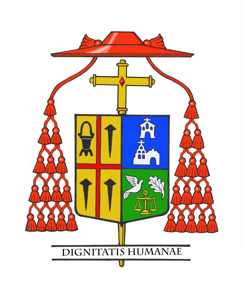
Today, the Holy Father announced to transfer of Robert Cardinal McElroy (70), the Bishop of San Diego, to succeed Wilton Cardinal Gregory (77) as Metropolitan Archbishop of Washington, DC.
I did not design the Cardinal’s coat of arms but I did prepare the current emblazoning on his elevation to the College of Cardinals.
In addition to a new impalement and the addition of an archiepiscopal cross it will be interesting to see if the Cardinal modifies his personal arms at all. The two charges in chief represent two California historic Mission Churches in San Francisco (where he served as a priest) and in San Diego (where he has been serving as diocesan bishop).
Of course I’m no fan of bishops modifying their arms when they move but I could see how he might wish to eliminate these two very Californian references. On the other hand, they both also serve to honor the places of his origin and previous ministry. So, retaining them could also be a good thing. Time will tell.
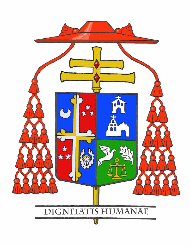
Below is how his coat of arms may appear after he is installed in Washington:
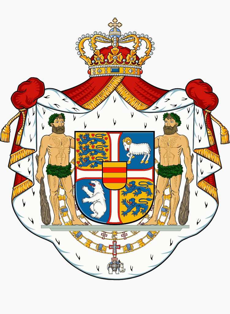
HM, King Frederik X has undertaken to issue a new, updated version of the Danish royal coat of arms dated December 20, 2024. The new version, prepared by Ronny Skov Andersen, simplifies the overall design.
It removes the three crowns of the Kalmar union and gives the arms of the Faeroe Islands and Greenland their own quarterings. It also places the arms of Denmark, originally the arms of the House of Estridsen, in the first quarter and instead of repeating it in the fourth quarter the arms of Schleswig are placed there. In addition, the Dannebrog, the cross that divides the shield into four quarters, has been returned to a more traditional form with the ends of the arms slightly flared. Overall, there remains the dynastic inescutcheon for the arms of the House of Oldenburg. The new version is:
The blason could be written as: A shield quartered by a cross pattée throughout Argent fimbriated Gules; first quarter Or, three lions passant in pale Azure crowned and armed Or langued Gules, nine hearts Gules (for Denmark); second quarter Azure a ram passant Argent armed and unguled Or (for the Faroe Islands); third quarter, Azure a polar bear rampant Argent (for Greenland); fourth quarter, Or two lions passant in pale Azure armed Or langued Gules (for Schleswig). Overall an escutcheon Or two bars Gules (for Oldenburg) the whole surrounded by the Collars of the Order of the Dannebrog and the Order of the Elephant. Supporters two woodwoses armed with clubs Proper standing on a pedestal. All surrounded by a mantle Gules doubled Ermine crowned with a royal crown and tied up with tasseled strings Or.
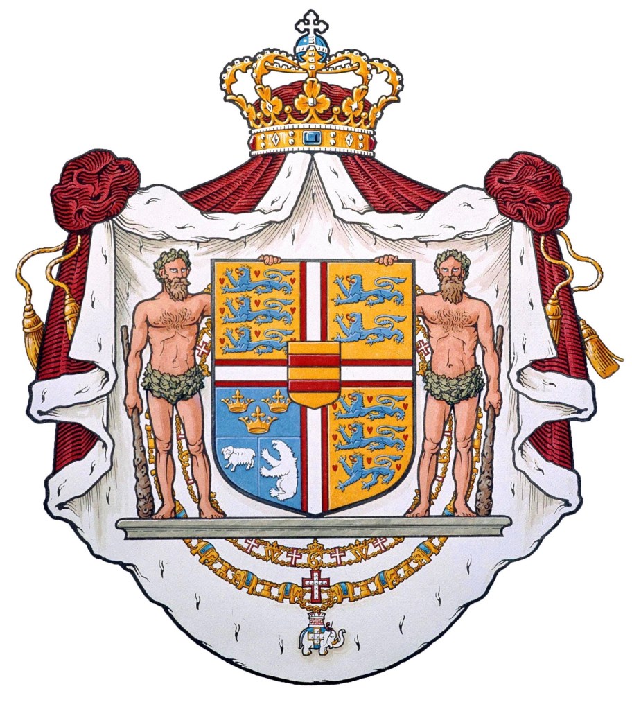
This replaces the version of the coat of arms that had been modified after the reign of King Frederik IX by Queen Margrethe which had been in use since 1972. (below)
I think this updated version is aesthetically more pleasing. It is a slightly less busy composition and the juxtaposition of the arms of Denmark and those of Schleswig provide a more pleasing visual. There is no longer the multiplication of lions and the two quarters with fields Or look better on a diagonal from each other, as do the two quarters with fields Azure. It all seems less imbalanced. I also happen to think the style of the cross looks better that the simple cross throughout.
It is exciting to see heraldry—long erroneously thought by the ignorant to be stagnant and encrusted with the weight of history and therefore irrelevant to today’s society—being updated and dynamic. The current situation calls for an updated symbol of the monarchy. This was true in 1972 and it is just as true some 52 years later. I applaud the efforts of His Majesty and also Ronny Andersen and those who worked with him to devise this updated coat of arms.
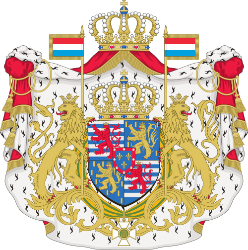
In his annual Christmas greeting, His Royal Highness the Grand Duke Henri of Luxembourg announced he will abdicate in favor of his son and heir, Hereditary Grand Duke, Guillaume.
The royal coat of arms consists of the arms of Luxembourg, (Barry of ten Argent and Azure, a Lion rampant queue forchée Gules crowned, armed and langued Or), quartered with the arms of the House of Nassau, (Azure billetty Or, a lion or armed and langued Gules). In the greater version of the coat of arms there is an inescutcheon overall of the arms of the dynastic house of Bourbon-Parma (Azure three fleurs-de-lis Or within a bordure Gules charged with eight escallops Argent). The dynastic arms of Bourbon-Parma are not usually included in the middle and lesser versions of the Grand Ducal coat of arms.
The Grand Duke of Luxembourg is the head of state of Luxembourg. Luxembourg has been a grand duchy since March 15,1815, when it was created from territory of the former Duchy of Luxembourg. It was in personal union with the Kingdom of the Netherlands until 1890 under the House of Orange-Nassau. Luxembourg is the world’s only sovereign grand duchy and since 1815, there have been nine monarchs.
The grand ducal family consists of heirs and descendants of the House of Nassau-Weilburg, whose sovereign territories passed cognatically from the House of Nassau to the House of Bourbon-Parma, itself a branch of the Spanish royal house which is agnatically a cadet branch of the House of Capet which originated in France.
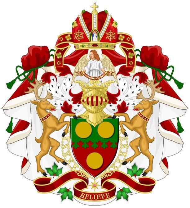
Some years back there was a discussion about the devisal of attributed arms for St. Nicholas of Myra (aka Santa Claus). My fellow heraldry enthusiast, Michael Quigley, proposed this design.
Attributed arms are created for individuals who didn’t bear a coat of arms themselves. Either, they are fictitious characters, they simply didn’t have a coat of arms or they may have lived prior to the development of heraldry.
St. Nicholas was definitely a real person but he lived from A.D. 270 – 343, roughly nine hundred years before heraldry existed.
This fanciful coat of arms employs an Eastern mitre and the traditional 3 gold coins associated with St. Nicholas from the story of him ransoming three children from being sold into slavery. It also uses deer (reindeer) supporters, fir twigs and the colors green and red so associated with the legend of Santa Claus and Western Christmas lore and custom.
His Eminence, Mykola Bychok, CSsR (44) is a Ukrainian Catholic who serves as Eparch of Ss. Peter & Paul of Melbourne since 2020. On December 7 he will become the Church’s youngest cardinal.
The arms he assumed upon becoming a bishop were designed by others for him and he was not entirely satisfied with them. With his upcoming creation as a cardinal he saw this as an opportunity to tweak the design of his coat of arms.
The redesigned coat of arms does not depart that much from what he originally had but cleans it up a bit and adds the external ornament unique to Cardinals.
The blazon is: Tierced in pall; in chief, Gules a rose Argent, barbed and seeded Or between three bezants; in dexter base Azure a trident (tryzub) topped with a Greek cross, all Or; in sinister base Or a Latin cross on a perch of a staff topped by a sponge in bend and a spear in sinister bend all Azure. The shield is ensigned with the galero of a cardinal of the holy Roman Church with cords and 30 tassels disposed in five rows of one, two, three, four and five all Gules; the whole within a mantle Gules lined ermine surmounted by the Eastern mitra Gules; in saltire behind the mantle a crozier and a cross both Or.
The charges in chief symbolize the place he is from; the trident (differenced by the addition of a cross) is a symbol of Ukraine; the cross, sponge and spear are borrowed from the arms of the Redemptorist Order of which he is a member.
I was very happy to consult on this redesign and work to put it together with Mr. Richard d’Apice of the Australian Heraldry Society. As with all our collaborations the artwork has been deftly provided by Mr. Sandy Turnbull, also of the Australian Heraldry Society.
The new Cardinal Protodeacon of the Church—who announces the election of a new pope and who invests the pope with the pallium at his Installation (or coronation if there is one)—is the Frenchman, Dominique Mamberti (72).
Raffaele Cardinal Martino, the Proto Deacon of the College of Cardinals, passed away today at age 91. From 1986-2002 he was the Observer of the Holy See to the United Nations and lived in New York. May he rest in peace.
On October 24, the Most Rev. Wiesław Śmigiel (55) a priest of Pelplin, Poland who also served as Auxiliary Bishop there, and from 2017-2024 was the Bishop of Toruń, will be installed as the 6th Bishop and 4th Metropolitan Archbishop of Szczecin-Kamień.
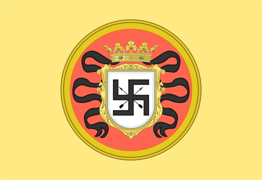
Not long ago, in my capacity as my bishop’s ecumenical & interfaith officer, I attended a meeting with representatives of the Hindu community here in central New Jersey in an ongoing effort to increase contacts with the Catholic community and people of other faiths. A small part of our conversation touched on general misunderstandings between faith communities and the swastika was used as an example. In the Hindu, Jain and Buddhist faiths the symbol is a positive one. For all time, it was ruined by its adoption by the nazi party in Germany. There it wasn’t actually a “swastika”. Rather, it was a hooked cross (hakenkreuz in German) which was not an uncommon form of the cross used in Europe until its association with the nazis ruined its connotation.
It is, I think, always important to absolutely repudiate the ideas of national socialism or its bizarre stepchild, neo-nazism, which, tragically, still exists. My intention by this post is not to offend, but to educate.
While its association with the horrors of WWII and the Holocaust will forever be with us the swastika (not the hakenkreuz), nevertheless, remains a religious symbol—and one without ANY nazi-related connotations—to other faiths. As such, it often has made its way into coats of arms in the past.
The image below depicts a banner with the armorial bearings of Hasekura Tsunenaga, also known as Don Felipe Francisco Hasekura after his conversion. He was a Japanese Samurai and emissary who traveled through the American continent and Europe in the 1600s. The arms and banner was granted to him after his conversion to Catholicism during his visit to Mexico City in 1614. An interesting blend of Japanese and European styles.
These days people would look upon this and THINK they know what it means…and be quite wrong. Such is the power of symbols. An positive religious symbol has been—in the West anyway—ruined forever because we cannot disconnect it from its terrible adoption by hateful people.
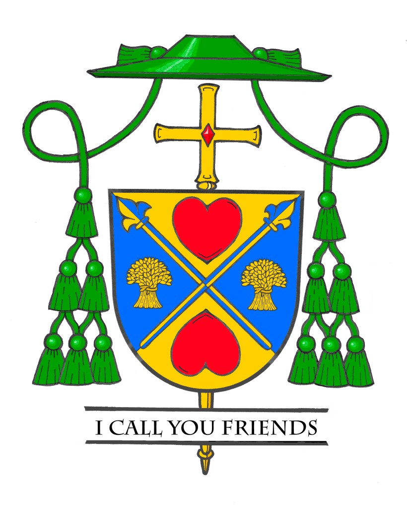
On November 6, 2024 the Most Rev. Dennis Spies, (56) a priest of the Diocese of Joliet in Illinois will be ordained as the Titular Bishop of Cenculiana and Auxiliary Bishop of Joliet. The Bishop-Elect’s appointment by the Pope was announced only on September 27 and he will very quickly be ordained to the office of bishop, well before Advent and the holiday season is upon us.
The armorial bearings he will be assuming are as follows:
The blazon of his coat of arms is: “Per saltire Or and Azure; overall two spears in saltire points upward tipped with fleurs-de-lis Counterchanged between, in chief and in base a heart facing the centerpoint Gules; and to dexter and sinister a garb of wheat, Or. Shield ensigned with an episcopal cross Or behind the shield and a bishop’s galero Vert cords and twelve tassels disposed in three rows of one, two and three all Vert. On a scroll below the shield the motto: “I Call You Friends”.
The main colors of the shield, blue & gold, are the colors primarily used in the coat of arms of the Diocese of Joliet. So, by means of their use the diocese the bishop has served as a priest (and now as a bishop) is alluded to. The shield is divided in a saltire (an “X” shape) and the two main charges are two spears crossed in saltire. The surname Spies is German in origin and in German and Dutch it is a metonymic occupational name for a spear maker. It is derived from Middle High German “spiez”, meaning ‘spear pike’ or an occupational name from the same word in the sense of a ‘soldier armed with a spear’. So, the two spears allude to the family name. They appear slightly different from the typical spear in that their heads, rather than depicting the usual blade, have heads that are shaped like the fleur-de-lis. This, too, is taken from the coat of arms of the Diocese of Joliet where two fleurs-de-lis appear. This is an ancient heraldic symbol of both the Blessed Virgin Mary and the Most Holy Trinity. Counterchanging (where the color of an object and the background are alternated) serves as a symbol of conversion…the daily conversion to which we are all called as followers of Christ.
Above and below are two red hearts symbolizing the Sacred Heart of Jesus and the Immaculate Heart of Mary. The hearts are depicted with their points toward the center of the shield. The two hearts–in a sense–“facing each other” symbolize the love that God has for all His creation and the love that His children return to Him by their faith and devotion. Love is both given and received. The disposition of the hearts indicates this.
A heart shape, although with different symbolism, also appears in the coat of arms of Bishop Hicks, the Diocesan Bishop whose ministry Bishop Spies will assist and support. It is an old custom in heraldry to borrow a charge from the coat of arms of a superior or patron as a way of honoring them. So, the heart shape being repeated in the coat of arms of Bishop Spies honors this custom.
To the left and right are two gold (yellow) garbs of wheat. The garbs of wheat are symbolic of agriculture generally and the Bishop grew up on a farm. In addition, they are also symbolic of the Eucharist, the center of our lives as Christians. So, they are a fitting symbol of both his background and his faith.
The motto below the shield is, “I Call You Friends” from John 15:15 where Jesus says, “I no longer call you slaves, because a slave does not know what his master is doing. I call you friends, because I have told you everything I have heard from my Father.”
The shield is also ensigned with those external ornaments that indicate the bearer is a bishop. The gold (yellow) cross is placed vertically behind and extending above and below the shield. This is often mistakenly thought to be a processional cross like those used in liturgical processions. That is not entirely right. In former times archbishops, and later all bishops, had a second cross mounted on a staff carried immediately in front of them while in procession or on solemn occasions. This cross was a symbol of their rank as bishop. While such an episcopal cross is no longer used practically it has been retained heraldically. In fact, there are other clerics who make use of the ecclesiastical hat with its many tassels but the one true heraldic emblem of a bishop, and the only essential one, is the episcopal cross placed behind the shield.
Above the shield is the ecclesiastical hat, called a galero which, in heraldry, replaces the martial helmet, mantling and crest. “The hat with six pendant tassels (green, purple or black) on each side is universally considered in heraldry as the sign of prelacy. It, therefore, pertains to all who are actually prelates.” (Heim, Bruno B., Heraldry in the Catholic Church 1978, page 114). The galero is green with green cords pendant from it and twelve green tassels arranged in a pyramid shape on either side of the shield. At one time in history bishops and archbishops wore green before adopting the more Roman purple we see today. In heraldry the green hat and tassels was retained for prelates with the rank of bishop according to the Instruction of the Secretariat of State, “Ut Sive” of March, 1969.
It was my great privilege and pleasure to work with Bishop Spies on the design and execution of his armorial bearings and also preparing the blazon and explanation.
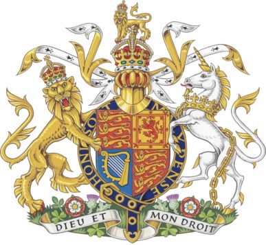
A new artistic rendering of the royal arms has been unveiled to be used during the reign of Charles III. The artwork is by the well known heraldic artist, Tim Noad, who also did the newer version of the arms of Queen Camilla as well as Charles III’s royal cipher.
The King made some changes to the appearance of the coat of arms, most notably by using the Tudor style crown in the achievement.
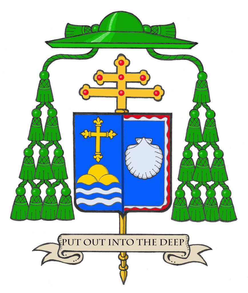
It has been very gratifying as a heraldist to have one project that I have been able to stay with through all its permutations. On October 31, the Most Rev. Richard G. Henning (60) who has served for the last 17 months as Bishop of Providence, R.I. and who was also Coadjutor of Providence for a further four months before that, and who was previously Auxiliary Bishop of Rockville Centre, N.Y., his native diocese where he became a priest in 1992, will be installed as the 10th Bishop and 7th Metropolitan Archbishop of the See of Boston, Massachusetts.
Back in 2018, the then Bishop-elect Henning contacted me to design a coat of arms for him. That’s not an unusual thing for me (I have designed coats of arms for three other bishops from Rockville Centre) but this one was more personal. I’m also a Long Island native and Archbishop Henning and I attended the same high school, Chaminade in Mineola, and we graduated together in the class of 1982. While not close friends, we have been acquainted with one another since we were teenagers. I was very happy to design his coat of arms for him. He entered the task with great enthusiasm and I think the coat of arms that we ended up with was simple, bold and very clear, all marks of good heraldry. On a personal not: at his episcopal ordination which I attended, the new Bishop, in his post-Communion remarks, thanked me publicly for assisting him in preparing his coat of arms. As I told him afterwards, that was very gratifying because in 39 years of doing this kind of work no bishop had ever done that before. I think it speaks volumes about what kind of person he is.
In late 2022 after he received the news of his appointment as Coadjutor of Providence I actually reached out to him to let him know that, as a Coadjutor, his coat of arms wouldn’t need any changes but that at some point in the future when he succeeded to the See, he’d have to modify his arms by marshaling them to the arms of the Diocese of Providence. He then asked me to begin on that right away because it was not certain when his succession would occur and he wanted to be prepared for that eventuality. I also thought that was “done and dusted” as they say and he was now set for the rest of his life.
However, in August of this year I was surprised and delighted to hear that the Holy Father had appointed him Archbishop of Boston. For the third time he contacted me. He said that several people in Boston assisting him with the needs of his transition had proposed people to prepare his coat of arms. But, he politely declined all those and said that he already had someone in mind. Again, I was really very pleased and honored at that. I see my designs as sort of my intellectual property. True, the coat of arms, once designed, is given over to the armiger to whom it truly belongs, but I feel like I still have a stake in it. So, I was very glad that I’d be able to assist Archbishop Henning yet again.
He retains the arms he first assumed in 2018. For this version, the escallop shell has been redrawn to a slightly more round shape and the bordure wavy has been slightly reduced in order to make more room for the shell which now occupies a much smaller field on one half of the shield. This is impaled with the arms of the See of Boston, designed by the great Dom Wilfrid Bayne, OSB of Portsmouth Abbey, R.I. in 1944. Because of the preponderance of blue in both coats of arms, the division line between the two is rendered in dark blue. It was decided that a black line looked a bit too jarring and the solution used for the same problem with the arms of the See of Providence which also has a blue field—a light, “bleu celeste” line—was seen as undesirable this time around. The blazon and explanation of the arms is as follows:
“BLAZON: Arms impaled. In the dexter: Azure, a Latin cross fleurettée Or, in base barry wavy of five Azure and Argent, issuing therefrom a mound of three coupeaux Or; In the sinister: Azure, within a bordure wavy parted wavy Argent and Gules an escallop shell Argent. The shield is ensigned with an archiepiscopal cross Or and an archbishop’s galero with cords and twenty tassels flanking the shield disposed in four rows of one, two, three and four all Vert. On a scroll below the shield is the motto, “Put Out Into The Deep”.
EXPLANATION: The armorial bearings of Archbishop Richard Henning impale the coat of arms of his archiepiscopal See with his personal coat of arms. These evoke his birthplace, his ministry and his personal devotion. The coat of arms is composed of a shield with its charges (symbols), a motto and the external ornamentation. The shield is described (blazoned) in terms that are archaic to our modern language, and this description is presented as if given by the bearer with the shield being worn on the arm. Thus, where it applies, the terms dexter (right) and sinister (left) are reversed as the device is viewed from the front.
It is customary in heraldry that the arms of a Diocesan Bishop, or Ordinary, are joined side by side on the same shield with the arms of his See. In this case, these are the arms of the Archdiocese of Boston. Such marshaling is called impalement and employs the same method used when joining the coats of arms of two people who are married. In this way, the coat of arms, like the episcopal ring, is symbolic of the archbishop being “married” to his archdiocese.
The arms of the Archdiocese of Boston are composed of a blue field on which are placed a gold (yellow) cross fleurettée, that is a Latin cross the arms of which are decorated on the ends with fleurs-de-lis. This is in honor of the titular of the cathedral, the Holy Cross as well as the first Bishop of Boston being from France. The cross is above a gold (yellow) mound composed of three smaller hills as a reference to Boston’s original name: Trimountaine which is, itself, a reference to the three hills on which the city is said to have been built. At the bottom the five wavy lines of blue and silver (white) alludes to Boston being a port city and that it is populated by people who arrived here from across the sea.
Bishop Henning’s personal coat of arms is composed of a design depicted in red (Gules), white (Argent) and blue (Azure) which are the national colors of the United States.
Both the blue background and the single escallop shell allude to the sea as evoking the Bishop’s own background and the shell is also borrowed from the coat of arms of the See of Rockville Centre, the diocese in which he was born and raised and which he served as a priest and auxiliary bishop. In addition, this same field of blue also recalls the blue field of the coat of arms of the See of Providence where he served as Coadjutor Bishop and later Diocesan Bishop. The shell image also recalls the Bishop’s heritage in the Diocese of Brooklyn, dedicated to its patron, St. James. The episcopal ordination of Bishop Henning took place on the eve of the Feast of St. James. In concert with the Bishop’s motto, the shell is a traditional symbol of baptism and pilgrimage. It is in the depths of these waters that Christians find their salvation in Jesus Christ.
The white wavy line surrounding the blue field is also taken from the arms of Rockville Centre and it alludes to the diocese’s location on Long Island, NY. Furthermore, it indicates the sea as the place where the barque of St. Peter, an image used to evoke the Church, is located.
The blue background also evokes the Bishop’s devotion to the Blessed Virgin Mary and his years of service as a Professor and Rector at the Seminary of the Immaculate Conception in Huntington, NY. The red wavy portion of the border evokes the Bishop’s devotion to the Most Sacred Heart of Jesus and his former service as the Director of the Sacred Heart Institute for the Ongoing Formation of the Catholic Clergy.”
It was, indeed, my profound pleasure , and my honor, once again to assist my old classmate, Archbishop Henning, with the preparation of his coat of arms.