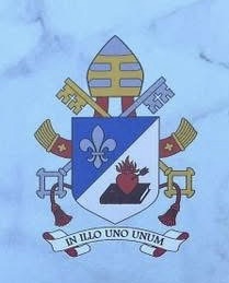
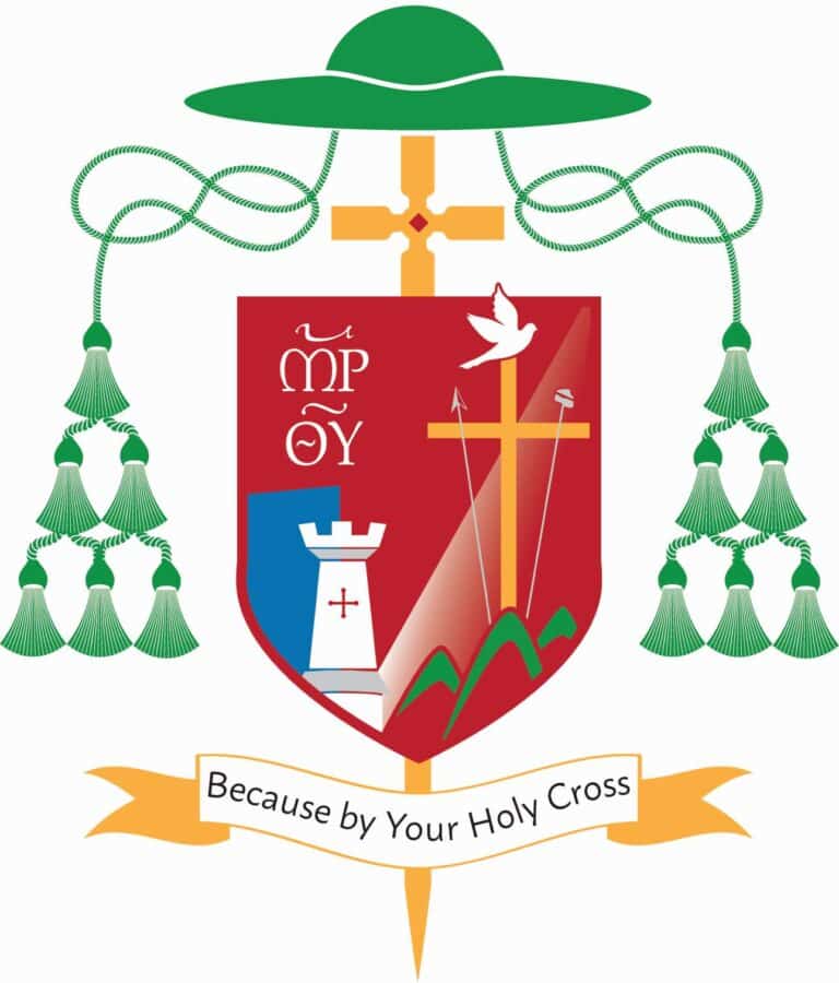
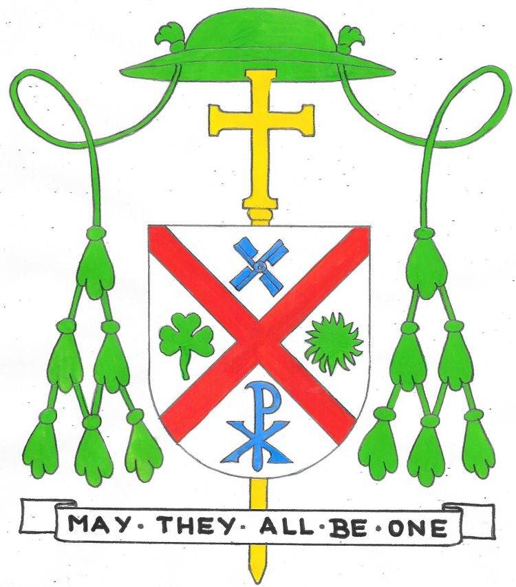
On September 8 the Rev. P. Bismarck Chau (58) will be ordained a Bishop in the Church and become the Titular Bishop of Catrum and Auxiliary Bishop to HE, Joseph Cardinal Tobin, Archbishop of the Metropolitan See of Newark, NJ.
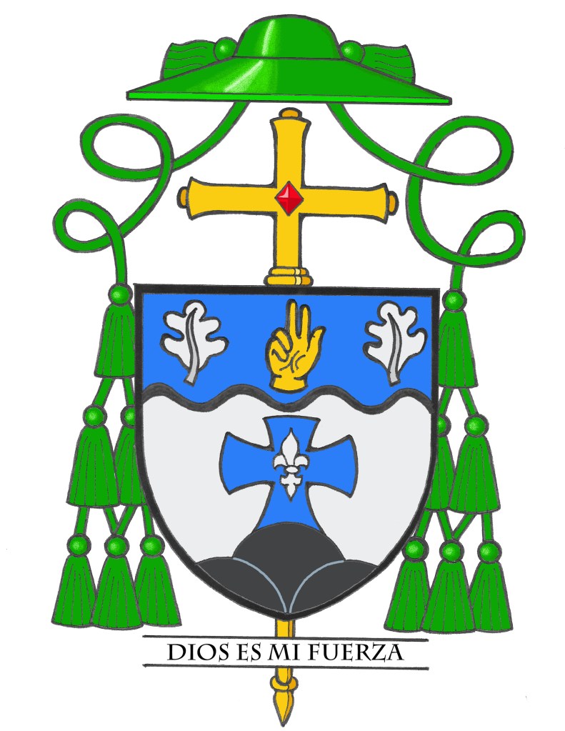
BLAZON: Argent on a triple mound issuant in base Sable a Latin cross Azure charged with a fleur-de-lis Argent; on a chief wavy Azure flanked by oak leaves Argent a human hand couped with the first two fingers raised in an attitude of benediction Or. Shield ensigned with an episcopal cross Or behind the shield and a bishop’s galero Vert cords and twelve tassels disposed in three rows of one, two and three all Vert. On a scroll below the shield the motto: “Dios Es Mi Fuerza”. (God is my strength)
EXPLANATION: The armorial bearings of Bishop Bismarck Chau reflect his family name, his Baptismal patron, the country of his birth and his ministry. The shield is composed primarily of the colors blue and white. These are the colors of the flag of Nicaragua where the bishop and his family originate. In the lower portion of the shield on a silver (white) background we see rising from the bottom of the shield a mound of three black hillocks. The three stylized hills represent that Nicaragua is known as a land of volcanoes. The hills create a kind of stylized mountain and the black color represents the black volcanic ash.
In addition, this stylized mound of rocks is also a nod to St. Peter whom Jesus called “the rock” on which He would build His church. Pedro (Peter) is the Bishop’s baptismal name. The black color of the rocks also has another meaning. The Chau–or Zhou–dynasty in China from which the family name is derived, was known for establishing an
extensive system of bronze metal-working. The black color emulates the dark color of bronze and so pays tribute to the Bishop’s family name.
Rising from the mound is the blue cross of faith charged with a silver (white) fleur-de-lis. The Bishop sees this as symbolizing the fact that he is who he is because of Christ; because he died on the Cross to give us life and made us all into a new creation. The cross not only symbolizes salvation and freedom, but also strength. God gave Jesus strength to carry his cross to the end. The fleur-de-lis has long been used in heraldry as a symbol of Our Lady. Mary was also a source of strength for Jesus, at calvary especially, at the foot of the Cross. It is worth noting that of all the symbols of Our Lady that could have been chosen the fleur-de-lis was used because it is a heraldic charge that also appears in the coat of arms of Pope Leo XIV who appointed Bishop Chau to the episcopacy as well as the coat of arms of Cardinal Tobin, whom the Bishop will serve and support by his own episcopal ministry. Thus, it honors those two figures important in the life of Bishop Chau.
The upper third of the shield, called a “chief” is separated from the rest by a wavy line representing water. The water alludes to Nicaragua being also known as a land of lakes, and is also symbolic of the waters of Baptism through which we all pass to become part of the Body of Christ. On this chief we see a gold (yellow) colored hand in blessing. This is symbolic of the divine blessing on all the Bishop’s endeavors. Gold is a color often used in heraldry to evoke divinity. In addition, this divine hand in blessing is also an allusion to the Bishop’s work with the Deaf Community. American Sign Language uses the hands arranged in different gestures to communicate. The hand is flanked by two silver (white or gray-ish) oak leaves. These are borrowed directly from the coat of arms of Bismarck as a representation of the Bishop’s given middle name which he most often uses and by which he is most commonly known and called.
The motto below the shield is taken from Isaiah 49:5 saying (in Spanish), “Dios Es Mi Fuerza”, which, in English, translates to: “God is My Strength”.
It was my great pleasure and honor to design the Bishop’s armorial bearings and to prepare the artwork as well.