In 2018, the Most Rev. Richard Henning, a native and a priest of Long Island’s Diocese of Rockville Centre, NY (and a high school classmate of mine) became Auxiliary Bishop of that diocese. I was pleased and honored to assist him with the design of his personal coat of arms to be adopted upon ordination to the episcopate.
Last year, the Holy Father appointed him to be the Coadjutor Bishop of Providence, Rhode Island, just across Long Island Sound from his former diocese. A coadjutor bishop is appointed to share in the authority of the diocesan bishop in running the diocese and has the right of automatic succession to the See when the previous bishop dies or retires. (NOTE: there used to be such a thing as coadjutor without the right of succession, but such appointments are no longer made). Bishop Henning succeeded to the See of Providence on the first of May of this year upon the retirement of Bishop Thomas Tobin becoming the IX Bishop of Providence. So his armorial bearings have been altered to impale his personal arms with those of the See:
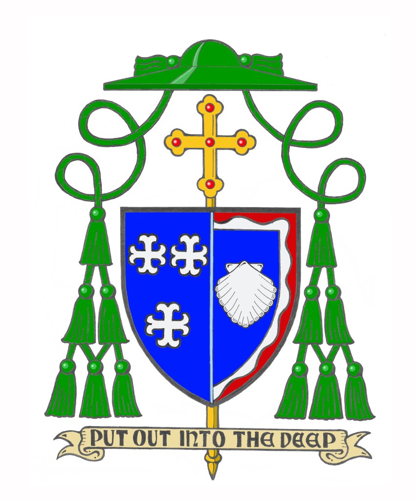
The arms of the Diocese of Providence are composed of a blue field on which are placed three silver (white) crosses with arms that appear to terminate in anchors. These crosses, heraldically known as “moline crosses,” are used to suggest an anchor. By employing the symbol of the State of Rhode Island this signifies that the Diocese of Providence encompasses all of the state it was established to serve. The crosses, three in number to signify The Trinity, are rendered in the traditional colors of water, blue and silver (white), because of the importance that water plays in the life of “The Ocean State.” These colors are also the traditional colors for the representation of the Blessed Virgin Mary, who, in her title of Our Lady of Providence, is Patroness of the Diocese and of the See City.
Bishop Henning’s personal coat of arms is composed of a design depicted in red (Gules), white (Argent) and blue (Azure) which are the national colors of the United States.
Both the blue background and the single escallop shell allude to the sea as evoking the Bishop’s own background and the shell is also borrowed from the coat of arms of the See of Rockville Centre, the diocese in which he was born and raised and which he served as a priest and auxiliary bishop. The shell image also recalls the Bishop’s heritage in the Diocese of Brooklyn, dedicated to its patron, St. James. The episcopal ordination of Bishop Henning took place on the eve of the Feast of St. James. In concert with the Bishop’s motto, the shell is a traditional symbol of baptism and pilgrimage. It is in the depths of these waters that Christians find their salvation in Jesus Christ.
The white wavy line surrounding the blue field is similarly taken from the arms of Rockville Centre and it alludes to the diocese’s location on Long Island, NY. Furthermore, it indicates the sea as the place where the barque of St. Peter, an image used to evoke the Church, is located.
The blue background also evokes the Bishop’s devotion to the Blessed Virgin Mary and his years of service as a Professor and Rector at the Seminary of the Immaculate Conception in Huntington, NY. The red wavy portion of the border evokes the Bishop’s devotion to the Most Sacred Heart of Jesus and his former service as the Director of the Sacred Heart Institute for the Ongoing Formation of the Catholic Clergy.
This situation was one of those times that chance presented a challenge. The bishop wanted to impale his arms with those of the See as is customary in N. America. In addition, he had no good reason to change the diocesan arms and no desire–correctly–to change his personal arms. Impaling them side-by-side presented an aesthetic challenge because they both employ blue fields. In addition, it is customary not to continue a bordure all the way around the field when the arms are impaled. Rather, there is a kind of dimidiation employed whereby the bordure is discontinued along the impalement line. In order to make the division between the two coats of arms more visible, and slightly less confusing a division line of very light blue (blue celeste, if you will) was employed for aesthetic reasons. This is really more of an artistic style choice rather than a heraldic one. Once again, it was my pleasure to assist him with this project.
