On July 25, the Feast of St. James, Rev. Mons. Edward M. Lohse (61) a priest of the Diocese of Erie, PA since 1989 (and a man who was two years ahead of me at St. Vincent Seminary) is being ordained and installed as the Fifth Bishop of Kalamazoo, Michigan.
The cross in chief is from the attributed arms of St. Edward the Confessor. The division line wavy is from the arms of the See of Erie and it represents the lakeshore where Erie lies. On the fess are symbols of the Jesuit Order and the Benedictine Order both of which profoundly influenced the bishop’s formation and spirituality. The base uses the blue and silver fusils from the arms of Wittelsbach and, by extension, of Bavaria to symbolize his family and faith, both of which have their origins in Bavaria.
The arms are simple, clear and contrast nicely with the somewhat unfortunate arms of the See of Kalamazoo. I think a better composition of the arms would have been to place the Bavarian fusils in chief with the wavy division line beneath them and then have blue field with the cross throughout and the two symbols of the orders in the first and fourth quarters. That’s merely an opinion, mind you, and in matters of taste there can be no real dispute. However, the pattern of fusils in bend looks better at the top of the shield where the eye is first naturally drawn. A solid chief with a patterned base makes a weak composition, in my opinion, because it looks top-heavy.
In addition, the essentially silver (white) backgrounds of both of the roundels placed on a silver fess looks washed out and weak. They would have contrasted better being on a blue field and “popped” a bit more. Also, the cross and lettering on the medal of St. Benedict should be black, rather than blue. I suppose the same could be asserted for the letters on the Jesuit symbol as well.
Overall, it is still a good design and Bishop Lohse certainly has a coat of arms that is better than many other US bishops. That’s not saying much, however, given the appallingly bad heraldry employed by most US bishops. Nevertheless, I think this is a decent coat of arms. My criticism is intended to convey only that it could have been a little better without changing any of the symbolism, but just arranging it better.
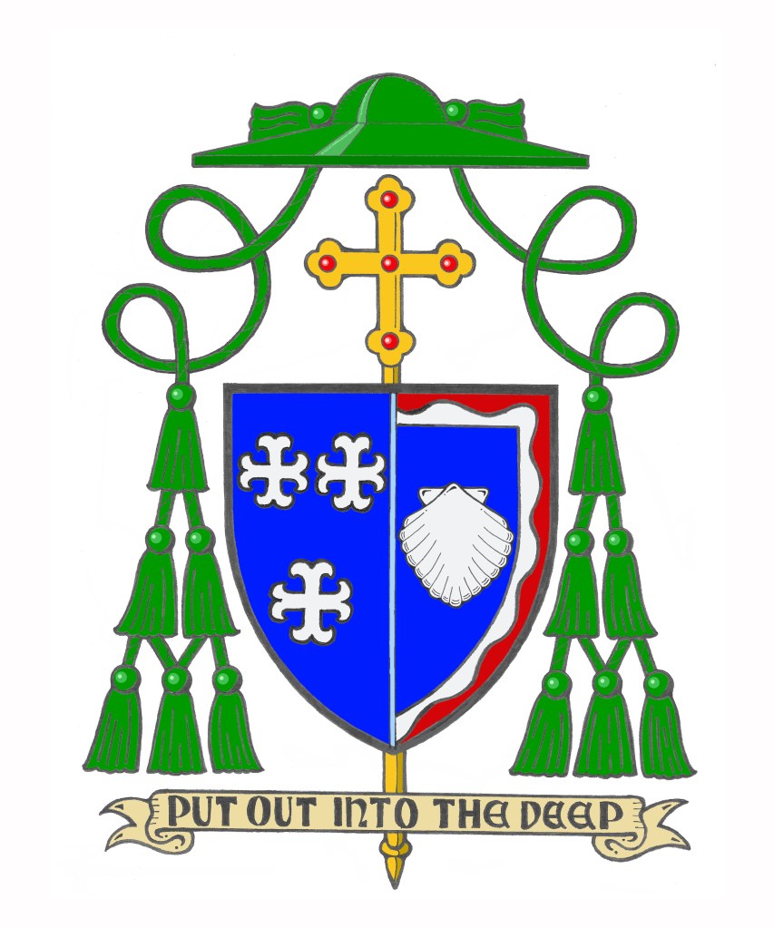
In 2018, the Most Rev. Richard Henning, a native and a priest of Long Island’s Diocese of Rockville Centre, NY (and a high school classmate of mine) became Auxiliary Bishop of that diocese. I was pleased and honored to assist him with the design of his personal coat of arms to be adopted upon ordination to the episcopate.
Last year, the Holy Father appointed him to be the Coadjutor Bishop of Providence, Rhode Island, just across Long Island Sound from his former diocese. A coadjutor bishop is appointed to share in the authority of the diocesan bishop in running the diocese and has the right of automatic succession to the See when the previous bishop dies or retires. (NOTE: there used to be such a thing as coadjutor without the right of succession, but such appointments are no longer made). Bishop Henning succeeded to the See of Providence on the first of May of this year upon the retirement of Bishop Thomas Tobin becoming the IX Bishop of Providence. So his armorial bearings have been altered to impale his personal arms with those of the See:
The arms of the Diocese of Providence are composed of a blue field on which are placed three silver (white) crosses with arms that appear to terminate in anchors. These crosses, heraldically known as “moline crosses,” are used to suggest an anchor. By employing the symbol of the State of Rhode Island this signifies that the Diocese of Providence encompasses all of the state it was established to serve. The crosses, three in number to signify The Trinity, are rendered in the traditional colors of water, blue and silver (white), because of the importance that water plays in the life of “The Ocean State.” These colors are also the traditional colors for the representation of the Blessed Virgin Mary, who, in her title of Our Lady of Providence, is Patroness of the Diocese and of the See City.
Bishop Henning’s personal coat of arms is composed of a design depicted in red (Gules), white (Argent) and blue (Azure) which are the national colors of the United States.
Both the blue background and the single escallop shell allude to the sea as evoking the Bishop’s own background and the shell is also borrowed from the coat of arms of the See of Rockville Centre, the diocese in which he was born and raised and which he served as a priest and auxiliary bishop. The shell image also recalls the Bishop’s heritage in the Diocese of Brooklyn, dedicated to its patron, St. James. The episcopal ordination of Bishop Henning took place on the eve of the Feast of St. James. In concert with the Bishop’s motto, the shell is a traditional symbol of baptism and pilgrimage. It is in the depths of these waters that Christians find their salvation in Jesus Christ.
The white wavy line surrounding the blue field is similarly taken from the arms of Rockville Centre and it alludes to the diocese’s location on Long Island, NY. Furthermore, it indicates the sea as the place where the barque of St. Peter, an image used to evoke the Church, is located.
The blue background also evokes the Bishop’s devotion to the Blessed Virgin Mary and his years of service as a Professor and Rector at the Seminary of the Immaculate Conception in Huntington, NY. The red wavy portion of the border evokes the Bishop’s devotion to the Most Sacred Heart of Jesus and his former service as the Director of the Sacred Heart Institute for the Ongoing Formation of the Catholic Clergy.
This situation was one of those times that chance presented a challenge. The bishop wanted to impale his arms with those of the See as is customary in N. America. In addition, he had no good reason to change the diocesan arms and no desire–correctly–to change his personal arms. Impaling them side-by-side presented an aesthetic challenge because they both employ blue fields. In addition, it is customary not to continue a bordure all the way around the field when the arms are impaled. Rather, there is a kind of dimidiation employed whereby the bordure is discontinued along the impalement line. In order to make the division between the two coats of arms more visible, and slightly less confusing a division line of very light blue (blue celeste, if you will) was employed for aesthetic reasons. This is really more of an artistic style choice rather than a heraldic one. Once again, it was my pleasure to assist him with this project.
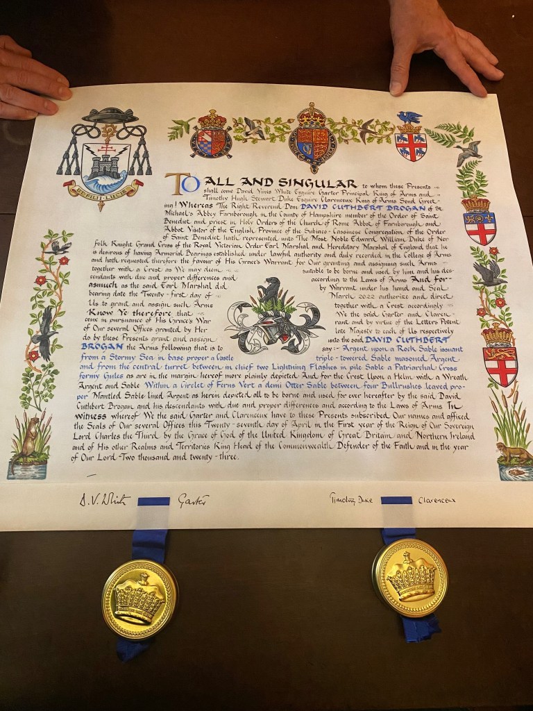
The Right Reverend Dom Cuthbert Brogan, OSB who first became Prior-Administrator of St. Michael’s Abbey at Farnborough in England in 1996 and was elected as its Abbot in 2006 has–at long last–finally become armigerous! Four years ago he was elected Abbot Visitor of the English-speaking Province of the Subiaco Congregation, to which his monastery belongs. At that time he finally decided to begin the process of applying for a grant of arms from HM College of Arms in London.
This is neither a quick (nor, I must admit an inexpensive) proposition. Nevertheless, those who live in countries where there is an official heraldic authority, such as the College of Arms, are subject to its jurisdiction and are not simply free to assume a coat of arms like those who live in places without a heraldic authority, like the USA for example. Here in the US an abbot may simply assume arms. In those places where there is a state-sponsored heraldic authority it may be illegal to do so, depending on the country.
Last week, Dom Cuthbert received his grant of arms and it is magnificent!
As is usually the custom (though not a necessity) a beautiful custom-made, illuminated document for the Letters Patent of the grant was produced. This one bears the royal arms at the top using the “Tudor style” crown preferred by His Majesty between the arms of the Earl marshal, the Duke of Norfolk and the College itself. The margins are decorated with the arms of office of Garter Principal King-of-Arms as well as Clarenceux King-of-Arms who also signed the Letters Patent. The margins also contain bullrushes and otters. The otters are symbolic of St. Cuthbert, the Abbot’s patron. He was born on the feast of St. Cuthbert. Otters warmed the saint’s feet with their breath when he emerged from the North Sea after a night of singing psalms. The bullrushes are for Rushmoor Borough, in which Farnborough Abbey is located. In addition, the raven is a symbol of St. Benedict, the roses are for England and the ducks are another animal alluding to St. Cuthbert.
The College of Arms is in the habit of also providing a crest even for their ecclesiastical clients despite the fact that the galero replaces helm, mantling and crest in the achievement of a cleric. Here the crest is also composed of a demi-otter and ferns and bullrushes (already explained). While it is not used in the achievement, the Abbot is free to use his crest as a stand alone symbol, or even adapt it and use it as a heraldic badge.
It is a nice touch, too, that the grant was dated March 21, 2022 which is the feast day commemorating the Death of St. Benedict.
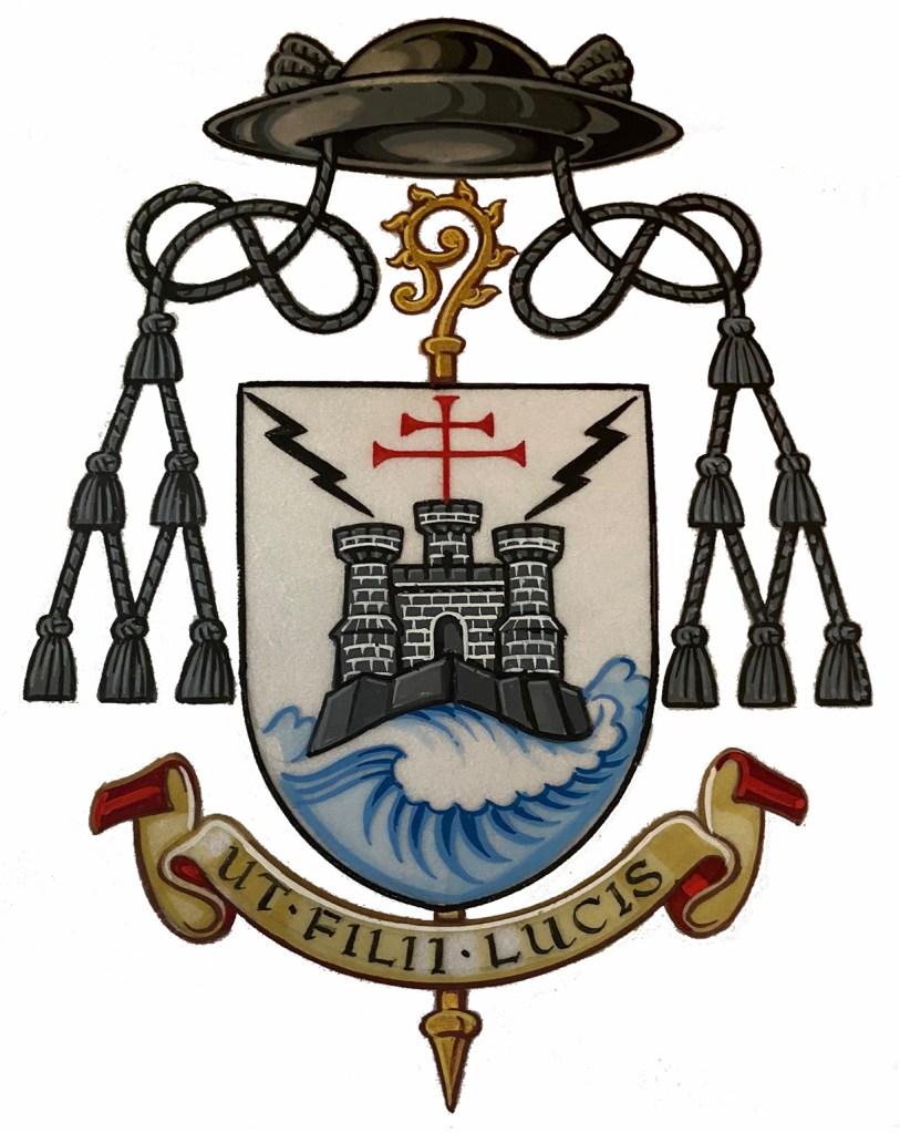
The arms themselves are explained by Abbot Cuthbert thusly: “The fortress is the monastic life – the house built on rock of the gospels. This keeps in certain values and excludes others. The island represents a number of islands – England, Lindisfarne, Mont St Michel, and Caldey – all associated with me or our monastery. The island also represented the fuga mundi – separation from the world which marks the monastic life. The patriarchal cross is from the arms of the Subiaco Cassinese Congregation. The stormy sea expresses how the monastery stands unchanging amongst the vicissitudes of church and world. The two bolts of lightning recall assaults on my monastery from two sources in the past. But the house stood firm“.
The motto below the shield translates as “The Children of Light”.
I am very pleased to say that I was one of the people encouraging Abbot Cuthbert over the years to apply for a grant of arms. It pleases me to no end that after quite a few years he did, indeed, follow my advice. I think the final result was worth the wait. The design is good; clear and simple. In addition, rather than falling prey to the temptation into which so many prelates fall by making their coat of arms a CV in pictures, this coat of arms is filled with significance while using simple imagery. The Abbot chose to symbolize concepts and events of significance to his life rather than his name, or his family name, or the many jobs and/or accomplishments or associations he has had. That’s where so many prelates fail. They insist on symbols of everything and everyone with whom they have been associated throughout theirs lives no matter how slight the association has been.
Abbot Cuthbert has avoided that pitfall and ended up with a bold, clear and very good coat of arms. His abbey also makes use of a fine coat of arms for the abbey itself (see below). Now I’ll have to start needling him to have a rendering done of his arms impaled with those of his abbey!